W↓
All docs
🔑
Sign Up/Sign In
vscode-elements.github.io/guides/ (+1)
Public Link
Apr 9, 2025, 3:40:42 AM - complete - 391.6 kB
Created by:
****ad@vlad.studio
Starting URLs:
https://vscode-elements.github.io/guides/framework-integrations/react/
Crawl Prefixes:
https://vscode-elements.github.io/guides/
https://vscode-elements.github.io/components/
## Page: https://vscode-elements.github.io/guides/framework-integrations/react/ ## React 18 and older In React 18 and earlier, custom elements were not fully supported. Properties and custom events had to be added imperatively using the useEffect hook. To simplify this process, a separate package was created, providing wrapper components based on the @lit/react package. To integrate these wrapper components into your React app, install the package via npm: npm i @vscode-elements/react-elements ### Using the components Wrapper component names follow the PascalCase convention, derived from the tag names of the corresponding web components. import { VscodeSplitLayout } from "@vscode-elements/react-elements";export default function MyComponent() { return ( <div> <VscodeSplitLayout initialHandlePosition="50%" onVscSplitLayoutChange={(event) => { console.log(event); }} ></VscodeSplitLayout> </div> );} For more examples, please visit the project repository. ## Recent React version From React 19, web components are fully supported. If you use custom tag names, you must configure the TypeScript parser to recognize the custom elements. An example TypeScript definition is available in the examples repository. To ensure proper functionality, keep the following rules in mind: * Props are treated as properties if they exist on the element instance; otherwise, they are assigned as attributes. * Unlike native HTML elements, use the `class` and `for` props instead of `className` and `htmlFor`. * Custom events are prefixed with `on` without further modification. For example, the `vsc-split-layout-change` event becomes `onvsc-split-layout-change`. ### Example import "@vscode-elements/elements/dist/vscode-split-layout";export default function MyComponent() { return ( <div> <vscode-split-layout initialHandlePosition="50%" onvsc-split-layout-change={(event) => { console.log(event); }} ></vscode-split-layout> </div> );} ## Install Webview Playground (Optional) VSCode Elements components are unstyled by default. To apply the same styles used in the VSCode webview during development, you can install the Webview Playground developer tools. ### Install the package npm i -D @vscode-elements/webview-playground ### Adding to the application The following example assumes the use of Vite as the bundler. if (import.meta.env.DEV) { await import("@vscode-elements/webview-playground");}function App() { return ( <> {import.meta.env.DEV ? <vscode-dev-toolbar></vscode-dev-toolbar> : null} <div> Rest of the app... </div> </> )}export default App; --- ## Page: https://vscode-elements.github.io/guides/getting-started ## What is VSCode Elements? The “webview API” enables extensions to build entirely customizable views within Visual Studio Code. While the VSCode API grants access to different UI elements, none of these UI widgets are functional in the “webview.” VSCode Elements addresses this by re-implementing these UI controls as web components (aka custom elements), and introducing some new ones. This allows for the creation of user interfaces that look like the native user interface of VSCode. ## You may not need VSCode Elements If you prefer traditional HTML and CSS over JavaScript, or if you’d rather avoid adding a new dependency, consider checking out the VSCode Elements Lite project. It offers a collection of HTML and CSS snippets that, in many cases, are perfectly suitable. This approach is both simple and robust. ## Installation You can access the library as NPM package: npm i @vscode-elements/elements ### Including the bundled version This is the most straightforward method, and while it may not be the most optimized, it gets the job done. <script src="node_modules/@vscode-elements/elements/dist/bundled.js" type="module"></script> ### Importing only necessary components import "@vscode-elements/elements/dist/vscode-button/index.js"; ## Usage The imported components will be automatically registered. Once registered, Vscode Elements can be used like standard HTML elements. A standard default view can be provided using the `:defined()` pseudo-class until the element is registered. vscode-buttton:not(:defined) { display: inline-block; height: 26px; visibility: hidden; width: 100px;} ### Properties and attributes Custom elements are configurable through properties and attributes. Properties used in JavaScript while attributes are used in HTML. An example of using a property: const badge = document.querySelector("vscode-badge");badge.variant = "activity-bar-counter"; An attribute example <vscode-badge variant="activity-bar-counter"></vscode-badge> The attribute name may differs from the property name. In the API documentation, the attribute corresponding to the property is always indicated if it exists. #### Attribute and property reflection Property reflection means that the related attribute will be synchronized when the property is changed. When a property is reflected it will be indicated with the reflects badge in the API documentation. ### Methods Methods are callable functions on the element instances. const textfield = document.querySelector("vscode-textfield");textfield.reportValidity(); ### Events Most of the components dispatch events. const tabs = document.querySelector("vscode-tabs");tabs.addEventListener("vsc-tabs-select", () => { console.log("A tab has been selected.");}); Most of the components use native events if possible. When a component has a custom event, the event is exported as a TypeScript type. All exported events are descendants of the `CustomEvent` class. import type { VscTabsSelectEvent } from "@vscode-elements/elements/dist/vscode-tabs/vscode-tabs"; ### Slots Slots are used to accept HTML content. The default slot, which is the content between the HTML tags, is the most common slot: <vscode-button>Click here</vscode-button> Many components have named slots. In the following example the badge component is placed in the `decorations` slot. <vscode-collapsible title="Decorations example" class="collapsible"> <vscode-badge variant="counter" slot="decorations">99</vscode-badge> <p> Suspendisse potenti. Maecenas eu egestas metus. Nulla eget placerat mi, et efficitur augue. </p></vscode-collapsible> ### Custom CSS properties The appearance of VSCode elements can be configured using custom CSS properties. These variables are provided by VSCode, and in most cases, it is not recommended to change them manually, although they can be modified if necessary. vscode-button { --vscode-button-hoverBackground: red;} --- ## Page: https://vscode-elements.github.io/guides/working-with-forms Form controls in VSCode Elements are designed to be used like standard HTML form elements. The following components can serve as fully functional form controls: * Button * Single Select * Multi Select * Textfield * Textarea * Radio * Checkbox ## Basic example Form controls in VSCode Elements work just like native form controls without requiring additional JavaScript. * HTML <form action="/working-with-forms" method="get" enctype="application/x-www-form-urlencoded"> <vscode-label for="query">Search query:</vscode-label> <vscode-textfield id="query" name="query"></vscode-textfield> <vscode-button type="submit">Search</vscode-button></form> ## Processing form data In a typical Webview-based extension, the form data is usually submitted in the background without reloading the page. In certain scenarios, it might not be submitted at all. In such cases, the FormData interface can be utilized to access the form data. * HTML * JavaScript <form id="form1"> <vscode-form-group variant="vertical"> <vscode-label for="form1-title">Title</vscode-label> <vscode-textfield name="title" id="form1-title"></vscode-textfield> </vscode-form-group> <vscode-form-group variant="vertical"> <vscode-label for="form1-category">Category</vscode-label> <vscode-single-select name="category" id="form1-category"> <vscode-option value="page">Page</vscode-option> <vscode-option value="article">Article</vscode-option> <vscode-option value="blog">Blog Post</vscode-option> </vscode-single-select> </vscode-form-group> <vscode-form-group variant="vertical"> <vscode-label for="form1-body">Body</vscode-label> <vscode-textarea name="body" id="form1-body" rows="10"></vscode-textarea> </vscode-form-group> <vscode-form-group variant="vertical"> <vscode-checkbox label="Draft" name="draft" id="form1-draft" ></vscode-checkbox> </vscode-form-group> <vscode-form-group variant="vertical"> <vscode-button type="submit">Submit</vscode-button> </vscode-form-group> <pre id="form1-output"></pre></form> ## Built-in form validation VSCode Elements supports the HTML form validation features built into browsers. The example below demonstrates how the MDN form validation sample application is re-implemented using VSCode Elements form controls. * HTML * JavaScript <form action="/introduction/working-with-forms" method="get" enctype="application/x-www-form-urlencoded" id="form2"> <vscode-form-group variant="vertical"> <vscode-label required>Do you have a driver's license?</vscode-label> <vscode-radio-group> <vscode-radio label="Yes" name="driver" value="yes" required ></vscode-radio> <vscode-radio label="No" name="driver" value="no" required></vscode-radio> </vscode-radio-group> </vscode-form-group> <vscode-form-group variant="vertical"> <vscode-label for="form2-age">Age</vscode-label> <vscode-textfield type="number" min="12" max="120" step="1" id="form2-age" name="age" pattern="\d+"></vscode-textfield> </vscode-form-group> <vscode-form-group variant="vertical"> <vscode-label for="form2-fruit" required >What's your favorite fruit?</vscode-label > <vscode-single-select name="fruit" id="form2-fruit" combobox required> <vscode-option value="banana">Banana</vscode-option> <vscode-option value="cherry">Cherry</vscode-option> <vscode-option value="apple">Apple</vscode-option> <vscode-option value="strawberry">Strawberry</vscode-option> <vscode-option value="lemon">Lemon</vscode-option> <vscode-option value="orange">Orange</vscode-option> </vscode-single-select> </vscode-form-group> <vscode-form-group variant="vertical"> <vscode-label for="form2-email">What's your email address?</vscode-label> <vscode-textfield type="email" name="email" id="form2-email" ></vscode-textfield> </vscode-form-group> <vscode-form-group variant="vertical"> <vscode-label for="form2-message">Leave a short message</vscode-label> <vscode-textarea id="form2-message" name="msg" maxlength="140" rows="5" ></vscode-textarea> </vscode-form-group> <vscode-form-group variant="vertical"> <vscode-button type="submit">Submit</vscode-button> </vscode-form-group> <pre id="form2-output"></pre></form> --- ## Page: https://vscode-elements.github.io/guides/framework-integrations/react ## React 18 and older In React 18 and earlier, custom elements were not fully supported. Properties and custom events had to be added imperatively using the useEffect hook. To simplify this process, a separate package was created, providing wrapper components based on the @lit/react package. To integrate these wrapper components into your React app, install the package via npm: npm i @vscode-elements/react-elements ### Using the components Wrapper component names follow the PascalCase convention, derived from the tag names of the corresponding web components. import { VscodeSplitLayout } from "@vscode-elements/react-elements";export default function MyComponent() { return ( <div> <VscodeSplitLayout initialHandlePosition="50%" onVscSplitLayoutChange={(event) => { console.log(event); }} ></VscodeSplitLayout> </div> );} For more examples, please visit the project repository. ## Recent React version From React 19, web components are fully supported. If you use custom tag names, you must configure the TypeScript parser to recognize the custom elements. An example TypeScript definition is available in the examples repository. To ensure proper functionality, keep the following rules in mind: * Props are treated as properties if they exist on the element instance; otherwise, they are assigned as attributes. * Unlike native HTML elements, use the `class` and `for` props instead of `className` and `htmlFor`. * Custom events are prefixed with `on` without further modification. For example, the `vsc-split-layout-change` event becomes `onvsc-split-layout-change`. ### Example import "@vscode-elements/elements/dist/vscode-split-layout";export default function MyComponent() { return ( <div> <vscode-split-layout initialHandlePosition="50%" onvsc-split-layout-change={(event) => { console.log(event); }} ></vscode-split-layout> </div> );} ## Install Webview Playground (Optional) VSCode Elements components are unstyled by default. To apply the same styles used in the VSCode webview during development, you can install the Webview Playground developer tools. ### Install the package npm i -D @vscode-elements/webview-playground ### Adding to the application The following example assumes the use of Vite as the bundler. if (import.meta.env.DEV) { await import("@vscode-elements/webview-playground");}function App() { return ( <> {import.meta.env.DEV ? <vscode-dev-toolbar></vscode-dev-toolbar> : null} <div> Rest of the app... </div> </> )}export default App; --- ## Page: https://vscode-elements.github.io/guides/framework-integrations/vue Skip to content Work in progress. --- ## Page: https://vscode-elements.github.io/components/badge * Docs * API ## Explanation of badge styles The following badge styles have been implemented based on the VSCode UI: 1. Default style 2. Activity bar counter 3. Counter 4. Tab bar counter 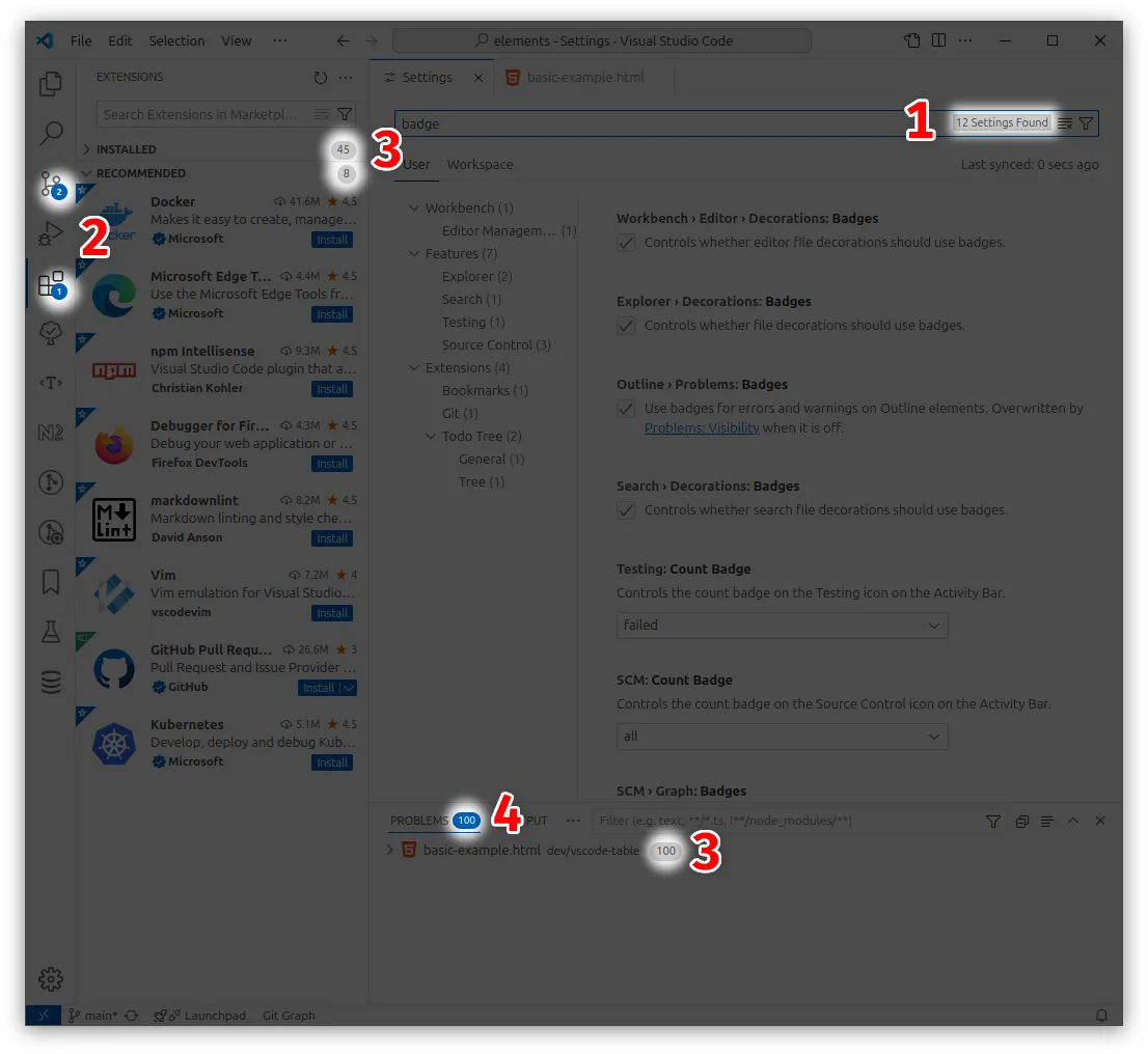 ## Default style 308 Settings Found * HTML <vscode-badge>308 Settings Found</vscode-badge> ## Counter 42 * HTML <vscode-badge variant="counter">42</vscode-badge> ## Activity bar counter 42 * HTML <vscode-badge variant="activity-bar-counter">42</vscode-badge> ## Tab header counter 42 * HTML <vscode-badge variant="tab-header-counter">42</vscode-badge> --- ## Page: https://vscode-elements.github.io/components/button ## Basic example Button * HTML <vscode-button>Button</vscode-button> ## Secondary button Secondary button * HTML <vscode-button secondary>Secondary button</vscode-button> ## Disabled button Disabled button * HTML <vscode-button disabled>Disabled button</vscode-button> ## Icons To use the icons, the codicons.css file must be included in the page: <link rel="stylesheet" href="path/to/codicon.css" id="vscode-codicon-stylesheet"> Icons * HTML <vscode-button icon="account" icon-after="chevron-right">Icons</vscode-button> ## Customized styles Styles can be tweaked. Add item Commit * HTML * CSS <vscode-button class="settings-button-example">Add item</vscode-button><vscode-button class="scm-button-example" icon="check">Commit</vscode-button> --- ## Page: https://vscode-elements.github.io/components/checkbox * Docs * API ## Basic example * HTML <vscode-checkbox label="Checkbox example" value="testvalue1" checked></vscode-checkbox> ## Indeterminate state * HTML <vscode-checkbox label="Indeterminate example" indeterminate></vscode-checkbox> ## Slotted content **Hello** World! * HTML <vscode-checkbox> <b>Hello</b> World!</vscode-checkbox> --- ## Page: https://vscode-elements.github.io/components/checkbox-group * Docs * API ## Horizontal Group <vscode-checkbox-group> <vscode-checkbox label="Lorem"></vscode-checkbox> <vscode-checkbox label="Ipsum"></vscode-checkbox> <vscode-checkbox label="Dolor"></vscode-checkbox></vscode-checkbox-group> ## Vertical Group <vscode-checkbox-group variant="vertical"> <vscode-checkbox label="Lorem"></vscode-checkbox> <vscode-checkbox label="Ipsum"></vscode-checkbox> <vscode-checkbox label="Dolor"></vscode-checkbox></vscode-checkbox-group> --- ## Page: https://vscode-elements.github.io/components/collapsible ## Basic example Open by default Suspendisse potenti. Maecenas eu egestas metus. Nulla eget placerat mi, et efficitur augue. * HTML * CSS <vscode-collapsible title="Basic example" open> <p>Open by default</p></vscode-collapsible><vscode-collapsible title="Basic example"> <p>Suspendisse potenti. Maecenas eu egestas metus. Nulla eget placerat mi, et efficitur augue.</p></vscode-collapsible> ## Toggle event A custom event is dispatched when the visibility of content changes. Test content * HTML * JavaScript <vscode-collapsible title="Dispatch toggle event" id="toggle-event-example"> <p>Test content</p></vscode-collapsible> ## Actions Clickable action icons. Please review the developer console for logged messages. These icons are visible exclusively when the component is in the opened state. Suspendisse potenti. Maecenas eu egestas metus. Nulla eget placerat mi, et efficitur augue. * HTML * CSS * JavaScript <vscode-collapsible title="Actions example" class="collapsible" open> <vscode-icon name="file-add" action-icon aria-role="button" id="btn-file-add" title="New File" slot="actions"></vscode-icon> <vscode-icon name="refresh" action-icon aria-role="button" id="btn-refresh" title="Refresh" slot="actions"></vscode-icon> <p> Suspendisse potenti. Maecenas eu egestas metus. Nulla eget placerat mi, et efficitur augue. </p></vscode-collapsible> ## Decorations Elements in the `decorations` slot are always visible, in contrast to the `actions` slot. 99 Suspendisse potenti. Maecenas eu egestas metus. Nulla eget placerat mi, et efficitur augue. * HTML * CSS <vscode-collapsible title="Decorations example" class="collapsible"> <vscode-badge variant="counter" slot="decorations">99</vscode-badge> <p> Suspendisse potenti. Maecenas eu egestas metus. Nulla eget placerat mi, et efficitur augue. </p></vscode-collapsible> ## Overflown content The overflown content of the Collapsible component is hidden by default. Sometimes, this behavior can be problematic. In such cases, it is useful that the Collapsible body is customizable. Lorem ipsum dolor sit amet, consectetur adipiscing elit. Lorem Ipsum Dolor Sit Et Amur Sadispcing Lorem ipsum dolor sit amet, consectetur adipiscing elit. * HTML * CSS <vscode-collapsible title="Customized CSS part example" class="css-part-example" open> <p>Lorem ipsum dolor sit amet, consectetur adipiscing elit.</p> <vscode-single-select> <vscode-option>Lorem</vscode-option> <vscode-option>Ipsum</vscode-option> <vscode-option>Dolor</vscode-option> <vscode-option>Sit</vscode-option> <vscode-option>Et</vscode-option> <vscode-option>Amur</vscode-option> <vscode-option>Sadispcing</vscode-option> </vscode-single-select> <p>Lorem ipsum dolor sit amet, consectetur adipiscing elit.</p></vscode-collapsible> ## Displaying large amounts of data Long content can be managed by the Scrollable component. * HTML * CSS * JavaScript <vscode-collapsible title="Timeline" description="vscode-collapsible.ts" class="collapsible complex-example" open> <vscode-icon name="pin" action-icon slot="actions" id="pin-icon" ></vscode-icon> <vscode-icon name="refresh" action-icon slot="actions" id="refresh-icon" ></vscode-icon> <vscode-icon name="filter" action-icon slot="actions" id="filter-icon" ></vscode-icon> <vscode-scrollable> <vscode-tree id="tree-example"></vscode-tree> </vscode-scrollable></vscode-collapsible> --- ## Page: https://vscode-elements.github.io/components/context-menu * Docs * API * HTML * CSS * JavaScript <div class="menu-wrapper"> <vscode-icon name="menu" size="32" id="toggle-menu-button" action-icon title="Toggle Menu" class="toggle-menu-button" ></vscode-icon> <vscode-context-menu id="context-menu" class="context-menu" ></vscode-context-menu></div> --- ## Page: https://vscode-elements.github.io/components/context-menu-item * Docs * API ContextMenuItem is part of the ContextMenu component. --- ## Page: https://vscode-elements.github.io/components/divider Praesent ultrices mauris lectus, eu molestie erat lacinia vitae. Phasellus vestibulum pellentesque ligula malesuada sollicitudin. Vivamus vitae erat eget nulla laoreet porttitor. Nullam sit amet leo et velit molestie maximus. Vestibulum arcu leo, tempor nec pretium id, vehicula id odio. Etiam ultricies ligula dolor, in tincidunt nunc maximus at. Curabitur tincidunt nulla in magna pharetra commodo. Donec vestibulum mollis quam, ut consequat dolor finibus ac. Nulla suscipit ac sem non fringilla. Nullam eros ante, suscipit hendrerit molestie a, tempor nec turpis. Morbi eget erat suscipit, blandit nibh nec, molestie augue. Aenean consectetur dapibus mauris, eget ultricies sapien porttitor nec. Praesent ultrices mauris lectus, eu molestie erat lacinia vitae. Phasellus vestibulum pellentesque ligula malesuada sollicitudin. Vivamus vitae erat eget nulla laoreet porttitor. Nullam sit amet leo et velit molestie maximus. Vestibulum arcu leo, tempor nec pretium id, vehicula id odio. Etiam ultricies ligula dolor, in tincidunt nunc maximus at. Curabitur tincidunt nulla in magna pharetra commodo. Donec vestibulum mollis quam, ut consequat dolor finibus ac. Nulla suscipit ac sem non fringilla. Nullam eros ante, suscipit hendrerit molestie a, tempor nec turpis. Morbi eget erat suscipit, blandit nibh nec, molestie augue. Aenean consectetur dapibus mauris, eget ultricies sapien porttitor nec. --- ## Page: https://vscode-elements.github.io/components/form-container Form container has two purposes. The first one is adjusting the layout of the child form controls in responsive mode. The second one is collecting the values of the child controls. The second one has no significance since when the ElementInternals API is implemented and the form controls are as fully functional as standard HTML form elements. If responsive mode is unnecessary, it is recommended to use the standard `<form>` element. ## Responsive mode Lorem ipsum: Lorem ipsum `let dolor = sit amet`, consectetur adipiscing elit. Suspendisse faucibus imperdiet sapien, a gravida dolor. * Lorem * Ipsum * Dolor Dolor sit: Duis eget erat accumsan: Lorem Ipsum Dolor Duis eget erat accumsan: Lorem Ipsum Dolor Phasellus quam arcu: Duis ullamcorper Phasellus quam arcu: Lorem ipsum Donec mi risus Nullam tincidunt eros sit amet sollicitudin pharetra. Ut quis rutrum enim, non finibus odio. Morbi tempus lacus neque, eget rutrum sapien porttitor vitae. Vivamus placerat nisl eu turpis tristique, eu consectetur libero finibus. Duis vitae orci at risus ultrices gravida. Ut vitae nulla velit. Mauris sed enim eleifend, euismod tortor vitae, vehicula odio. Phasellus quam arcu: Lorem ipsum Donec mi risus Duis ullamcorper Phasellus quam arcu: Lorem ipsum Donec mi risus Duis ullamcorper Save Cancel Resize it --- ## Page: https://vscode-elements.github.io/components/form-group ## Basic example The form group serves as a container component for organizing form widgets, employing CSS adjustments to neatly arrange the elements. The default layout is horizontal. Lorem ipsum: Lorem ipsum `let dolor = sit amet`, consectetur adipiscing elit. Suspendisse faucibus imperdiet sapien, a gravida dolor. * HTML <vscode-form-group> <vscode-label for="basic-textfield-01"> Lorem <span class="normal">ipsum</span>: </vscode-label> <vscode-textfield id="basic-textfield-01" placeholder="Placeholder example" ></vscode-textfield> <vscode-form-helper> <p> Lorem ipsum <code>let dolor = sit amet</code>, consectetur adipiscing elit. <span class="error">Suspendisse</span> faucibus imperdiet sapien, a gravida <a href="#">dolor</a>. </p> </vscode-form-helper></vscode-form-group> ## Vertical layout In vertical mode the elements are arranged vertically. Lorem ipsum: Lorem ipsum `let dolor = sit amet`, consectetur adipiscing elit. Suspendisse faucibus imperdiet sapien, a gravida dolor. * HTML <vscode-form-group variant="vertical"> <vscode-label for="vertical-textfield-01"> Lorem <span class="normal">ipsum</span>: </vscode-label> <vscode-textfield id="vertical-textfield-01" placeholder="Placeholder example" ></vscode-textfield> <vscode-form-helper> <p> Lorem ipsum <code>let dolor = sit amet</code>, consectetur adipiscing elit. <span class="error">Suspendisse</span> faucibus imperdiet sapien, a gravida <a href="#">dolor</a>. </p> </vscode-form-helper></vscode-form-group> ## Settings page group To create a custom settings page, the “Settings page” variant is recommended. This method enables the creation of interfaces that resemble the appearance of the native settings page. The recommended order is: label, helper text, form control. Lorem ipsum: Lorem ipsum `let dolor = sit amet`, consectetur adipiscing elit. Suspendisse faucibus imperdiet sapien, a gravida dolor. * HTML <vscode-form-group variant="settings-group"> <vscode-label for="settings-textfield-01"> Lorem <span class="normal">ipsum</span>: </vscode-label> <vscode-form-helper> <p> Lorem ipsum <code>let dolor = sit amet</code>, consectetur adipiscing elit. <span class="error">Suspendisse</span> faucibus imperdiet sapien, a gravida <a href="#">dolor</a>. </p> </vscode-form-helper> <vscode-textfield id="settings-textfield-01" placeholder="Placeholder example" ></vscode-textfield></vscode-form-group> --- ## Page: https://vscode-elements.github.io/components/form-helper The Form Helper offers additional help text for Form Group and can include HTML content. ## Basic example Lorem ipsum `let dolor = sit amet`, consectetur adipiscing elit. Suspendisse faucibus imperdiet sapien, a gravida dolor. * Lorem * Ipsum * Dolor * HTML <vscode-form-helper> <p> Lorem ipsum <code>let dolor = sit amet</code>, consectetur adipiscing elit. <span class="error">Suspendisse</span> faucibus imperdiet sapien, a gravida <a href="#">dolor</a>. </p> <ul> <li>Lorem</li> <li>Ipsum</li> <li>Dolor</li> </ul></vscode-form-helper> --- ## Page: https://vscode-elements.github.io/components/icon To use the icons, the codicons.css file must be included in the page: <link rel="stylesheet" href="path/to/codicon.css" id="vscode-codicon-stylesheet"> ## Basic example * HTML <!-- Download codicons from https://github.com/microsoft/vscode-codicons Note the required `id` on the link element! To use web fonts in web components, the component needs to include the font stylesheet in addition to the page. This id serves as a lookup so the icon component can automatically create and insert it's own link tag.--><link rel="stylesheet" href="path/to/codicon.css" id="vscode-codicon-stylesheet"/><vscode-icon name="account"></vscode-icon><vscode-icon name="account" size="32"></vscode-icon><vscode-icon name="account" size="48"></vscode-icon><vscode-icon name="account" size="64"></vscode-icon> ## Action icons * HTML <vscode-icon name="account" action-icon></vscode-icon><vscode-icon name="add" action-icon></vscode-icon><vscode-icon name="git-compare" action-icon></vscode-icon> ## Animated icons * HTML <vscode-icon name="loading" spin spin-duration="1"></vscode-icon><vscode-icon name="sync" spin></vscode-icon><vscode-icon name="gear" spin spin-duration="2"></vscode-icon> ## List of icons For the searchable list, see the project page. --- ## Page: https://vscode-elements.github.io/components/label * Docs * API ## Basic example Label font weight is bold by default. It can be changed to normal by wrapping it into `<span class="normal"></span>` element. Editor: Font Size * HTML <vscode-label for="select-01" required> <span class="normal">Editor:</span> Font Size</vscode-label> --- ## Page: https://vscode-elements.github.io/components/multi-select ## Basic example Lorem Ipsum Dolor * HTML * JavaScript <vscode-multi-select id="select-example"> <vscode-option description="Consectetur adipiscing elit"> Lorem </vscode-option> <vscode-option selected description="Donec elit odio"> Ipsum </vscode-option> <vscode-option description="Aliquam ac vulputate eros"> Dolor </vscode-option></vscode-multi-select> ## Combobox mode Search method: Afghanistan Albania Algeria Andorra Angola Antigua and Barbuda Argentina Armenia Australia Austria Azerbaijan Bahamas Bahrain Bangladesh Barbados Belarus Belgium Belize Benin Bhutan Bolivia Bosnia and Herzegovina Botswana Brazil Brunei Bulgaria Burkina Faso Burundi Côte d'Ivoire Cabo Verde Cambodia Cameroon Canada Central African Republic Chad Chile China Colombia Comoros Congo (Congo-Brazzaville) Costa Rica Croatia Cuba Cyprus Czechia (Czech Republic) Democratic Republic of the Congo Denmark Djibouti Dominica Dominican Republic Ecuador Egypt El Salvador Equatorial Guinea Eritrea Estonia Eswatini (fmr. "Swaziland") Ethiopia Fiji Finland France Gabon Gambia Georgia Germany Ghana Greece Grenada Guatemala Guinea Guinea-Bissau Guyana Haiti Holy See Honduras Hungary Iceland India Indonesia Iran Iraq Ireland Israel Italy Jamaica Japan Jordan Kazakhstan Kenya Kiribati Kuwait Kyrgyzstan Laos Latvia Lebanon Lesotho Liberia Libya Liechtenstein Lithuania Luxembourg Madagascar Malawi Malaysia Maldives Mali Malta Marshall Islands Mauritania Mauritius Mexico Micronesia Moldova Monaco Mongolia Montenegro Morocco Mozambique Myanmar (formerly Burma) Namibia Nauru Nepal Netherlands New Zealand Nicaragua Niger Nigeria North Korea North Macedonia Norway Oman Pakistan Palau Palestine State Panama Papua New Guinea Paraguay Peru Philippines Poland Portugal Qatar Romania Russia Rwanda Saint Kitts and Nevis Saint Lucia Saint Vincent and the Grenadines Samoa San Marino Sao Tome and Principe Saudi Arabia Senegal Serbia Seychelles Sierra Leone Singapore Slovakia Slovenia Solomon Islands Somalia South Africa South Korea South Sudan Spain Sri Lanka Sudan Suriname Sweden Switzerland Syria Tajikistan Tanzania Thailand Timor-Leste Togo Tonga Trinidad and Tobago Tunisia Turkey Turkmenistan Tuvalu Uganda Ukraine United Arab Emirates United Kingdom United States of America Uruguay Uzbekistan Vanuatu Venezuela Vietnam Yemen Zambia Zimbabwe * HTML * JavaScript <p> <label for="search-method">Search method:</label> <select name="search-method-selector" id="search-method-selector"> <option value="contains">contains</option> <option value="fuzzy">fuzzy</option> <option value="startsWith">startsWith</option> <option value="startsWithPerTerm">startsWithPerTerm</option> </select></p><vscode-multi-select id="combobox-example" combobox> <vscode-option>Afghanistan</vscode-option> <vscode-option>Albania</vscode-option> <vscode-option>Algeria</vscode-option> ...</vscode-multi-select> --- ## Page: https://vscode-elements.github.io/components/option * Docs * API Selectable item for Single Select and Multi Select. --- ## Page: https://vscode-elements.github.io/components/progress-ring <vscode-progress-ring></vscode-progress-ring> --- ## Page: https://vscode-elements.github.io/components/radio The Radio component is intended to select a single option from a set of options. It is designed to be used together with the Radio Group component. For a large number of options, the Single Select is recommended. ## Horizontal layout Default layout is horizontal. * HTML <vscode-radio-group> <vscode-radio label="Lorem" name="horizontal-example"></vscode-radio> <vscode-radio label="Ipsum" name="horizontal-example"></vscode-radio> <vscode-radio label="Dolor" name="horizontal-example"></vscode-radio></vscode-radio-group> ## Vertical layout * HTML <vscode-radio-group variant="vertical"> <vscode-radio label="Lorem" name="vertical-example"></vscode-radio> <vscode-radio label="Ipsum" name="vertical-example"></vscode-radio> <vscode-radio label="Dolor" name="vertical-example"></vscode-radio></vscode-radio-group> --- ## Page: https://vscode-elements.github.io/components/radio-group * Docs * API A container component for grouping multiple Radio components. --- ## Page: https://vscode-elements.github.io/components/scrollable Scrollable component is designed to display content that is too large for the area into which it is loaded. Lorem ipsum dolor sit amet, consectetur adipiscing elit. Cras at orci condimentum, malesuada justo id, dapibus ex. Vivamus eu mattis nisl. Aenean facilisis bibendum tellus a tincidunt. Vestibulum maximus turpis quis semper condimentum. Duis et quam faucibus, gravida mauris vitae, vestibulum dui. Vivamus est lorem, vulputate et dignissim at, interdum at tellus. Nunc imperdiet ultrices mauris, tristique semper libero elementum volutpat. Praesent euismod imperdiet euismod. Duis ac imperdiet neque. Suspendisse euismod laoreet nisl, at tempor magna condimentum ac. In nec posuere mauris, non luctus risus. Morbi fermentum vitae velit in aliquam. Aenean malesuada condimentum tempus. Fusce ultricies libero nunc, id interdum dui tincidunt non. Sed ac accumsan eros, sit amet pharetra sem. Donec malesuada diam nec nibh laoreet, iaculis iaculis turpis semper. Aliquam malesuada rhoncus nulla ac vulputate. Morbi erat lacus, pretium sed magna non, porta porttitor metus. Pellentesque auctor vitae libero a bibendum. Nulla risus mauris, consequat at dictum sit amet, scelerisque vel massa. Nullam faucibus nisl eu eros finibus euismod. Nunc tincidunt justo ut est semper faucibus quis eu leo. Donec porta eleifend euismod. Pellentesque justo felis, elementum et rhoncus in, pulvinar id sem. Nulla leo sem, congue vel vehicula in, elementum vel urna. Curabitur ornare eu elit eget faucibus. Ut posuere pharetra enim, ac varius odio. Nulla facilisi. Vivamus semper sodales nulla non condimentum. Nullam suscipit gravida pretium. Phasellus hendrerit eget ante ac gravida. Etiam at eros hendrerit, sollicitudin nunc id, sagittis tortor. Donec sollicitudin in diam in malesuada. Quisque bibendum consectetur nibh at interdum. Nulla eros magna, commodo vel eros quis, cursus ornare velit. Nam vitae vehicula libero, vitae commodo dui. Fusce id tempus ligula. Integer pulvinar purus ut ultrices tincidunt. Aenean sed eros at orci euismod facilisis et ut nibh. Fusce ac semper dui, elementum convallis ipsum. Duis nec felis elit. Cras sit amet libero massa. Curabitur condimentum odio vitae augue condimentum, nec egestas nunc aliquam. Maecenas quis lacinia sapien, sed feugiat enim. Maecenas sagittis fringilla augue eu auctor. Etiam eu porta nibh. Mauris quis leo elit. Curabitur nec enim bibendum, consectetur ipsum nec, lacinia purus. Donec in nisl bibendum, lacinia urna et, suscipit dui. Nullam consectetur mollis dolor, nec hendrerit magna posuere eu. Etiam vitae iaculis sem, et tincidunt arcu. Praesent fermentum justo ac scelerisque pharetra. Etiam mauris erat, tempus et accumsan at, aliquam id augue. Phasellus fermentum magna nulla, eu tristique lacus auctor at. Maecenas in dolor dui. Maecenas eget nisl nec dui feugiat fermentum. Suspendisse varius facilisis dui, quis posuere eros sollicitudin a. --- ## Page: https://vscode-elements.github.io/components/single-select ## Basic example Lorem Ipsum Dolor * HTML * JavaScript <vscode-single-select id="select-example"> <vscode-option description="Consectetur adipiscing elit">Lorem</vscode-option> <vscode-option selected description="Donec elit odio">Ipsum</vscode-option> <vscode-option description="Aliquam ac vulputate eros">Dolor</vscode-option></vscode-single-select> ## Combobox mode Search method: Afghanistan Albania Algeria Andorra Angola Antigua and Barbuda Argentina Armenia Australia Austria Azerbaijan Bahamas Bahrain Bangladesh Barbados Belarus Belgium Belize Benin Bhutan Bolivia Bosnia and Herzegovina Botswana Brazil Brunei Bulgaria Burkina Faso Burundi Côte d'Ivoire Cabo Verde Cambodia Cameroon Canada Central African Republic Chad Chile China Colombia Comoros Congo (Congo-Brazzaville) Costa Rica Croatia Cuba Cyprus Czechia (Czech Republic) Democratic Republic of the Congo Denmark Djibouti Dominica Dominican Republic Ecuador Egypt El Salvador Equatorial Guinea Eritrea Estonia Eswatini (fmr. "Swaziland") Ethiopia Fiji Finland France Gabon Gambia Georgia Germany Ghana Greece Grenada Guatemala Guinea Guinea-Bissau Guyana Haiti Holy See Honduras Hungary Iceland India Indonesia Iran Iraq Ireland Israel Italy Jamaica Japan Jordan Kazakhstan Kenya Kiribati Kuwait Kyrgyzstan Laos Latvia Lebanon Lesotho Liberia Libya Liechtenstein Lithuania Luxembourg Madagascar Malawi Malaysia Maldives Mali Malta Marshall Islands Mauritania Mauritius Mexico Micronesia Moldova Monaco Mongolia Montenegro Morocco Mozambique Myanmar (formerly Burma) Namibia Nauru Nepal Netherlands New Zealand Nicaragua Niger Nigeria North Korea North Macedonia Norway Oman Pakistan Palau Palestine State Panama Papua New Guinea Paraguay Peru Philippines Poland Portugal Qatar Romania Russia Rwanda Saint Kitts and Nevis Saint Lucia Saint Vincent and the Grenadines Samoa San Marino Sao Tome and Principe Saudi Arabia Senegal Serbia Seychelles Sierra Leone Singapore Slovakia Slovenia Solomon Islands Somalia South Africa South Korea South Sudan Spain Sri Lanka Sudan Suriname Sweden Switzerland Syria Tajikistan Tanzania Thailand Timor-Leste Togo Tonga Trinidad and Tobago Tunisia Turkey Turkmenistan Tuvalu Uganda Ukraine United Arab Emirates United Kingdom United States of America Uruguay Uzbekistan Vanuatu Venezuela Vietnam Yemen Zambia Zimbabwe * HTML * JavaScript <p> <label for="search-method">Search method:</label> <select name="search-method-selector" id="search-method-selector"> <option value="contains">contains</option> <option value="fuzzy">fuzzy</option> <option value="startsWith">startsWith</option> <option value="startsWithPerTerm">startsWithPerTerm</option> </select></p><vscode-single-select id="combobox-example" combobox> <vscode-option>Afghanistan</vscode-option> <vscode-option>Albania</vscode-option> ...</vscode-single-select> --- ## Page: https://vscode-elements.github.io/components/split-layout ## Split vertically Left Right * HTML * CSS <vscode-split-layout> <div slot="start">Left</div> <div slot="end">Right</div></vscode-split-layout> ## Split horizontally Top Bottom * HTML * CSS <vscode-split-layout split="horizontal"> <div slot="start">Top</div> <div slot="end">Bottom</div></vscode-split-layout> ## Nested layouts Left Right Top Right Bottom * HTML * CSS <vscode-split-layout> <div slot="start"> Left </div> <vscode-split-layout split="horizontal" slot="end"> <div slot="start"> Right Top </div> <div slot="end"> Right Bottom </div> </vscode-split-layout></vscode-split-layout> ## Fixed pane Left Right Resize it * HTML * CSS <vscode-split-layout fixed-pane="start"> <div slot="start">Left</div> <div slot="end">Right</div></vscode-split-layout> --- ## Page: https://vscode-elements.github.io/components/tab-header * Docs * API Header of the Tabs component. --- ## Page: https://vscode-elements.github.io/components/tab-panel * Docs * API Content container of the Tabs component. --- ## Page: https://vscode-elements.github.io/components/table The unique feature of the Table component, as compared to the standard table element, is its fixed header and resizable columns. ## Basic example First name Last name Email Vincenza Lindgren Delia21@yahoo.com Clark Breitenberg Nat\_Moore@gmail.com Fiona Wintheiser Asa30@gmail.com * HTML <vscode-table zebra bordered-rows> <vscode-table-header slot="header"> <vscode-table-header-cell>First name</vscode-table-header-cell> <vscode-table-header-cell>Last name</vscode-table-header-cell> <vscode-table-header-cell>Email</vscode-table-header-cell> </vscode-table-header> <vscode-table-body slot="body"> <vscode-table-row> <vscode-table-cell>Vincenza</vscode-table-cell> <vscode-table-cell>Lindgren</vscode-table-cell> <vscode-table-cell>Delia21@yahoo.com</vscode-table-cell> </vscode-table-row> <vscode-table-row> <vscode-table-cell>Clark</vscode-table-cell> <vscode-table-cell>Breitenberg</vscode-table-cell> <vscode-table-cell>Nat_Moore@gmail.com</vscode-table-cell> </vscode-table-row> <vscode-table-row> <vscode-table-cell>Fiona</vscode-table-cell> <vscode-table-cell>Wintheiser</vscode-table-cell> <vscode-table-cell>Asa30@gmail.com</vscode-table-cell> </vscode-table-row> </vscode-table-body></vscode-table> ## Scrollable body If the table is assigned a fixed height and the content exceeds the table’s height, the content will become scrollable. First name Last name Vincenza Lindgren Clark Breitenberg Fiona Wintheiser Kareem Wintheiser Margot Koepp Dominique Kuhlman Elisa Leannon Holden Gleichner Robyn Jast Anjali Friesen Remington Beatty Demond Marks Gerda Boyle Micah Feest Nicolette Johnston Joe Balistreri Willy Turcotte Willie Stroman Brigitte Hirthe Celestino Weber * HTML <vscode-table class="scrollable-example"> <vscode-table-header slot="header"> <vscode-table-header-cell>First name</vscode-table-header-cell> <vscode-table-header-cell>Last name</vscode-table-header-cell> </vscode-table-header> <vscode-table-body slot="body"> <vscode-table-row> <vscode-table-cell>Vincenza</vscode-table-cell> <vscode-table-cell>Lindgren</vscode-table-cell> </vscode-table-row> ... </vscode-table-body></vscode-table> ## Responsive layout The table switch to compact layout mode when its narrower than the set breakpoint. First name Last name Vincenza Lindgren Clark Breitenberg Fiona Wintheiser Kareem Wintheiser Margot Koepp Dominique Kuhlman Elisa Leannon Holden Gleichner Robyn Jast Anjali Friesen Remington Beatty Demond Marks Gerda Boyle Micah Feest Nicolette Johnston Joe Balistreri Willy Turcotte Willie Stroman Brigitte Hirthe Celestino Weber Resize it * HTML <vscode-table class="responsive-example" bordered-columns zebra responsive breakpoint="400"> <vscode-table-header slot="header"> <vscode-table-header-cell>First name</vscode-table-header-cell> <vscode-table-header-cell>Last name</vscode-table-header-cell> </vscode-table-header> <vscode-table-body slot="body"> <vscode-table-row> <vscode-table-cell>Vincenza</vscode-table-cell> <vscode-table-cell>Lindgren</vscode-table-cell> </vscode-table-row> ... </vscode-table-body></vscode-table> ## Resizable columns First name Last name Vincenza Lindgren Clark Breitenberg Fiona Wintheiser * HTML <vscode-table class="resizable-example" zebra bordered-columns resizable> <vscode-table-header slot="header"> <vscode-table-header-cell>First name</vscode-table-header-cell> <vscode-table-header-cell>Last name</vscode-table-header-cell> </vscode-table-header> <vscode-table-body slot="body"> <vscode-table-row> <vscode-table-cell>Vincenza</vscode-table-cell> <vscode-table-cell>Lindgren</vscode-table-cell> </vscode-table-row> ... </vscode-table-body></vscode-table> ## Delayed resizing First name Last name Vincenza Lindgren Clark Breitenberg Fiona Wintheiser * HTML <vscode-table class="resizable-example" zebra bordered-columns resizable delayed-resizing> <vscode-table-header slot="header"> <vscode-table-header-cell>First name</vscode-table-header-cell> <vscode-table-header-cell>Last name</vscode-table-header-cell> </vscode-table-header> <vscode-table-body slot="body"> <vscode-table-row> <vscode-table-cell>Vincenza</vscode-table-cell> <vscode-table-cell>Lindgren</vscode-table-cell> </vscode-table-row> ... </vscode-table-body></vscode-table> ## Complex content It is also suitable for displaying large amounts of data and complex content. Profile First name Last name Email Introduction CD Carmelo Dooley Colby55@yahoo.com Cum et aut assumenda. Temporibus voluptas facilis sed et accusamus est nisi harum minus. Dolor modi quos soluta laborum repellendus exercitationem voluptas cum. Dolorem explicabo eveniet incidunt dolorum atque ut. ES Erik Shields Lorenz.Mertz@yahoo.com Possimus quidem ea ut. Necessitatibus qui occaecati explicabo hic non id ut ea. Voluptatem in quasi incidunt aut sed deserunt iste tempore consequatur. Aliquid explicabo deleniti saepe omnis quos aut suscipit ex et. Cupiditate nemo tenetur possimus corrupti. MC Monserrate Cronin Conrad38@hotmail.com Consequatur ex ipsa vero ut aliquid assumenda. Sapiente dignissimos molestias facilis dolores at quaerat incidunt et. Consectetur dolorum rerum porro necessitatibus rerum. MJ Mossie Jacobson Monserrate.Zieme@gmail.com Non dolores et ad id incidunt. A temporibus amet eius dolores laudantium fugiat. Maxime aliquam dolores laboriosam est eos nihil. LH Leda Haag Felicia.Batz73@yahoo.com Quis cupiditate ut inventore dolor. Suscipit est qui. Quae dolores enim consequatur nostrum. Temporibus soluta aperiam asperiores a autem similique culpa. TB Theodora Bechtelar Sarah84@yahoo.com Atque sit minima id et veritatis vero commodi et recusandae. Sit nemo blanditiis velit. Quasi molestias in dolorem et consequatur distinctio voluptas. Nihil et optio maiores eius id aspernatur commodi praesentium deleniti. Voluptatibus veritatis repellat dignissimos quasi. NH Nasir Hessel Santina\_Langosh5@gmail.com Saepe sit iure iure aliquid est quam recusandae distinctio. Illo non ut rerum. Et ducimus est doloribus sed sint in. EV Evans Vandervort Camilla43@yahoo.com Sapiente saepe dolorum magnam sequi aperiam est. Et ratione unde nesciunt rerum rerum beatae. Et a tempora dicta ut qui odit eum explicabo. Aut expedita eveniet. LQ Lavern Quitzon Cory28@hotmail.com Excepturi quia repudiandae. Voluptatem numquam aut ad voluptatum voluptas consequatur. Voluptatem dolore et soluta beatae eveniet tempore laboriosam. WB Willie Beahan Anabelle.Nienow@yahoo.com Eos aspernatur repellendus error doloribus dolorem sint dolorum consectetur. Est minus ab sed. Perferendis asperiores eos placeat. NJ Nola Jast Toy\_Walter@gmail.com Sed voluptatum officia quo quo. Fugiat odit eius voluptas consequuntur non voluptatem et. Quos quam ab et consequatur. Molestias omnis cupiditate ut dolores et quia. MW Merle Watsica Misty\_Bergnaum@hotmail.com Quis culpa cum sed maiores omnis et non. Architecto sequi excepturi ad qui. Assumenda ipsam officia laudantium dolor et ratione quam nam. Dolores molestiae quod. LB Laverna Bogisich Natalia\_Brakus74@yahoo.com Cumque dolores dolore quia deserunt. Laudantium sed distinctio sunt. Voluptatum et qui. Velit non illo expedita omnis quod vero et possimus harum. Nulla eum possimus est. NB Nathanial Boyle Emilie65@hotmail.com Voluptatum quibusdam omnis veniam velit sint quia quia consequatur. Voluptate sit dolor sed totam eligendi. Sit est ex a eos. Enim voluptas perferendis minus quasi eius. Deleniti quod est quas itaque nulla cum sit at libero. KJ Kiara Jones Cecile16@hotmail.com Sed nesciunt voluptas voluptates consequuntur laudantium non voluptates sint illo. Nam officiis nihil doloribus. Sunt magnam qui molestias voluptas. PK Pearlie Kunde Rhoda1@hotmail.com Laborum autem minima optio quod dolores nesciunt et aspernatur. Est commodi provident aut cupiditate illo. Laudantium doloremque tempora repellendus asperiores qui. DH Daija Hilll Jazmyne\_Dach83@gmail.com Qui fugiat nihil. Alias doloremque quia esse provident. Delectus ullam esse et sed qui facere dolores et. Facilis commodi aliquam esse ratione beatae magnam. Sit quia ut quae et totam quisquam eum ut possimus. KG Katrine Greenholt Frederique.McDermott85@gmail.com Quas sapiente cum. Assumenda sint animi qui perspiciatis. Sint beatae qui earum iusto in officiis non nihil. Tempore pariatur non est illum ut. Fugit aut autem nemo. JS Jean Steuber Fritz53@hotmail.com Iure dolorem atque repellendus eum architecto ipsam. Pariatur ea unde explicabo. Quae autem rerum ad veritatis error nemo repellat quasi. Quibusdam repellendus voluptatum sint. DH Derrick Heller Tatyana.Roob@gmail.com Velit laboriosam adipisci vero eum reprehenderit voluptatum. Eum eligendi quia laudantium ut et. Illo culpa corrupti reprehenderit quis. LR Lenore Ritchie Lila.Hackett@gmail.com Enim deserunt et. Saepe maxime ut et quia mollitia temporibus et nihil cupiditate. Adipisci ipsa voluptate assumenda dolor exercitationem pariatur nulla. MK Maribel Koepp Stacy\_Abbott@hotmail.com Laboriosam similique illum neque ea reiciendis. Explicabo officia distinctio. Facilis est velit. Vitae exercitationem earum quidem. Laboriosam tempora optio laborum et nulla deserunt modi. FE Felicity Erdman Mellie91@gmail.com Amet beatae sint magni ipsa animi natus sequi. Ut iste ratione non quia assumenda et porro ea facilis. Unde unde ut blanditiis exercitationem non eos ut. Vitae quis culpa deserunt facere tempora rerum atque qui explicabo. RM Rachelle McCullough Tremaine11@hotmail.com Et facere vel. Natus ipsum maxime ex consequatur atque sit at. Fugit exercitationem voluptate debitis earum accusamus. Aspernatur quasi ad. Sed perferendis ipsum atque eos magnam dolor. Quia enim ex quo vel. GK Gracie Kilback Noe45@hotmail.com Molestiae magni harum et sunt autem ut. Est omnis mollitia nostrum quo molestiae quae dolor ut. Atque cum minus. Numquam et quod sunt sed. MF Marco Franecki Edward.Sanford27@yahoo.com Ad non dolorem expedita sunt cupiditate voluptatem vero eos aut. Nobis distinctio beatae et voluptatibus earum placeat dolor quos nesciunt. Aspernatur qui praesentium. MC Monte Cole Domenica22@hotmail.com Assumenda voluptatibus repellendus et enim sint error. Voluptatem et ipsum. Voluptas accusamus ipsum et exercitationem dignissimos odio. Dolorum ex similique mollitia optio vel quia. Sint esse nihil hic voluptate ducimus molestias consequatur velit. KO Karson Oberbrunner Newton61@gmail.com Quibusdam veniam sapiente occaecati consequuntur illum nulla voluptatem aut. Aut est perspiciatis. Delectus atque est esse. EG Emmanuelle Goodwin Elouise\_Koss@hotmail.com Qui repellendus tempora. Animi in et placeat officiis fugiat explicabo officia ab. Nihil aperiam maiores eum consequatur non. Quo et corporis eos eveniet nulla assumenda ut. Aut quia corporis. AS Aniya Schaefer Nettie.Bashirian@yahoo.com Reiciendis perferendis delectus fuga. Et ut debitis doloremque earum. Non maiores deleniti dolores. Vel quis vitae pariatur quaerat est saepe rerum et vero. Omnis eligendi minus. JH Jillian Hand Ivory41@hotmail.com Neque dicta sunt omnis quis. Accusamus ratione iste. Atque recusandae doloremque deserunt vel laborum consequuntur provident ducimus tenetur. Molestiae iure ratione harum. AG Alvera Grant Dena.Wisoky46@yahoo.com Id omnis vel iusto. Corporis vero libero quis in cupiditate eum sit. Temporibus inventore iure aspernatur odio sequi sed eos. Ex molestiae repellat est similique illum quia sunt culpa. Totam nemo autem. Et est aut qui omnis suscipit. KO Kamron Ondricka Gabe.Shields@hotmail.com Labore quia vitae ut ratione id et tempora. Omnis exercitationem qui nihil dolore. Quia rerum consequatur repudiandae voluptatem sit quas iste ad impedit. TW Tyra Wuckert Gennaro.Swaniawski@yahoo.com Voluptas ab repudiandae sequi deleniti voluptatem qui unde. Nulla et quia id non similique adipisci ex est. Temporibus dolore magni recusandae atque repellat. GC Gus Conroy Freddy77@yahoo.com Commodi aut dolores quis harum deleniti. Autem hic possimus ut et voluptas error totam odit. Enim rem libero veritatis velit incidunt recusandae porro est maxime. JD Jordi Douglas Macy61@hotmail.com Omnis nam consequatur enim sit illo provident vitae. Quibusdam quia eius. Qui facilis dolor enim. FB Favian Beahan Estel62@yahoo.com Nesciunt cum corporis ipsam sit sequi voluptatem ex. Est voluptas possimus tempore. Aliquam natus ut non ipsa unde sint. OW Orlo Wisoky Felipe9@yahoo.com Neque velit dolor distinctio quis ut molestiae odit sed quidem. Sit assumenda aut eaque id. Eum dolorem animi in. Distinctio corrupti recusandae eum ex provident vitae error at. Impedit assumenda ut velit sit quisquam esse eos voluptas. Qui animi mollitia et quos. MR Manuel Roberts Anastacio67@gmail.com Et rerum est molestiae in nihil sunt. Impedit aut ullam magnam sed nemo numquam porro. In aut nihil voluptate nemo unde est veritatis distinctio. WO Wayne Oberbrunner Karen\_Gleichner@hotmail.com Neque hic qui. Rerum corrupti quis deleniti et repellat quis ipsum doloremque. Voluptate sapiente et iure facilis reiciendis rerum. Animi nam velit autem. Repudiandae repellendus incidunt possimus eveniet qui rerum nostrum rerum. VK Vena Kertzmann Juanita\_Hoeger@yahoo.com Dolore est perferendis ut et aut fuga recusandae. Et maxime ipsam libero exercitationem aliquid ex totam ut. Qui numquam magnam velit sunt eius iste nam. HL Heaven Leffler Kaia.Leannon@hotmail.com Dolorem quis asperiores et veniam ut similique ad iure. Rerum quo ratione tempore. Ad ut et voluptas quos culpa. Ipsam magnam et nulla autem a alias facilis. Odit tempore sit id. Voluptatum dolores est exercitationem consequatur cumque nihil. NM Nelson Mueller Armani\_Vandervort@yahoo.com Consectetur quisquam facere perspiciatis laudantium. Aspernatur alias sint. Similique numquam eos voluptatem aut mollitia occaecati. MW Maximillia Wiza Murphy.Hayes12@yahoo.com Reiciendis delectus officia natus possimus. Optio iste distinctio eos animi ipsum tempore optio aut. Porro nemo et. Itaque exercitationem consequatur. LS Lazaro Schultz Angie26@yahoo.com Natus eveniet quo accusamus repellat sit. Velit quis et laudantium quibusdam numquam aut inventore quos. Consequatur sit ut sint molestias. BB Bernie Bauch Abagail\_Kihn62@gmail.com Voluptas consequatur nihil vitae. Eveniet animi commodi a ut similique magni. Vel unde impedit odio aut. Ullam fugit et culpa sint repudiandae nihil eligendi totam rerum. Impedit expedita amet iste laudantium molestiae. MW Mohammed Welch Sibyl.Nader49@hotmail.com Est quam neque. Voluptates iure nostrum. Eos exercitationem vel odit eum voluptas. Optio voluptatibus velit dignissimos maiores labore. Eos sit commodi in rerum laboriosam odit perspiciatis accusamus. Deleniti fugiat eveniet rerum consequuntur debitis expedita commodi illum. MD Mireille Douglas Chelsey\_Gutkowski@yahoo.com Veritatis quibusdam non fuga sunt accusantium rem id. Aut laborum voluptates cumque minus qui et molestiae sit velit. Quia deserunt a quo quod rerum quos. Aut sit similique non a laborum sed soluta earum ut. Placeat animi placeat quia cupiditate dolorem ut sint quis. Doloribus dolores vero magni fugiat optio exercitationem commodi enim. SB Stephany Bartoletti Dayna\_Treutel@yahoo.com Qui earum sit consequatur officiis rerum consequatur culpa. Ipsum suscipit ut et. In ut iste animi eaque dolor et voluptates nam libero. MS Mabelle Schroeder Ruby71@yahoo.com Quas omnis magni ut dicta ipsum. Facilis corrupti aut. Rerum voluptate et neque autem. Sapiente molestiae et aliquam aliquid et aut molestiae minima saepe. Ducimus explicabo minima cupiditate vel. Facere et accusantium explicabo ratione. * HTML * CSS <vscode-table class="complex-table-example" columns='["52px", "80px", "80px"]' bordered-columns zebra min-column-width="5"> <vscode-table-header slot="header"> <vscode-table-header-cell >Profile <picture></picture> </vscode-table-header-cell> <vscode-table-header-cell>First name</vscode-table-header-cell> <vscode-table-header-cell>Last name</vscode-table-header-cell> <vscode-table-header-cell>Email</vscode-table-header-cell> <vscode-table-header-cell>Introduction</vscode-table-header-cell> </vscode-table-header> <vscode-table-body slot="body"> <vscode-table-row> <vscode-table-cell> <div style="align-items:center;background-color:#2c7500;color:#fff;display:flex;justify-content:center;height:32px;width:32px;" > CD </div> </vscode-table-cell> <vscode-table-cell>Carmelo</vscode-table-cell> <vscode-table-cell>Dooley</vscode-table-cell> <vscode-table-cell>Colby55@yahoo.com</vscode-table-cell> <vscode-table-cell >Cum et aut assumenda. Temporibus voluptas facilis sed et accusamus est nisi harum minus. Dolor modi quos soluta laborum repellendus exercitationem voluptas cum. Dolorem explicabo eveniet incidunt dolorum atque ut.</vscode-table-cell > </vscode-table-row> ... </vscode-table-body></vscode-table> --- ## Page: https://vscode-elements.github.io/components/table-body * Docs * API Table Body is part of the Table component. --- ## Page: https://vscode-elements.github.io/components/table-cell * Docs * API Table Cell is part of the Table component. --- ## Page: https://vscode-elements.github.io/components/table-header * Docs * API Table Header is part of the Table component. --- ## Page: https://vscode-elements.github.io/components/table-header-cell * Docs * API Table Header Cell is part of the Table component. --- ## Page: https://vscode-elements.github.io/components/table-row * Docs * API Table Row is part of the Table component. --- ## Page: https://vscode-elements.github.io/components/tabs ## Basic example Lorem Lorem ipsum dolor sit amet, consectetur adipiscing elit. Cras at orci condimentum, malesuada justo id, dapibus ex. Vivamus eu mattis nisl. Aenean facilisis bibendum tellus a tincidunt. Vestibulum maximus turpis quis semper condimentum. Duis et quam faucibus, gravida mauris vitae, vestibulum dui. Vivamus est lorem, vulputate et dignissim at, interdum at tellus. Nunc imperdiet ultrices mauris, tristique semper libero elementum volutpat. Praesent euismod imperdiet euismod. Duis ac imperdiet neque. Suspendisse euismod laoreet nisl, at tempor magna condimentum ac. In nec posuere mauris, non luctus risus. Morbi fermentum vitae velit in aliquam. Aenean malesuada condimentum tempus. Fusce ultricies libero nunc, id interdum dui tincidunt non. Sed ac accumsan eros, sit amet pharetra sem. Donec malesuada diam nec nibh laoreet, iaculis iaculis turpis semper. Ipsum2 Aliquam malesuada rhoncus nulla ac vulputate. Morbi erat lacus, pretium sed magna non, porta porttitor metus. Pellentesque auctor vitae libero a bibendum. Nulla risus mauris, consequat at dictum sit amet, scelerisque vel massa. Nullam faucibus nisl eu eros finibus euismod. Nunc tincidunt justo ut est semper faucibus quis eu leo. Donec porta eleifend euismod. Pellentesque justo felis, elementum et rhoncus in, pulvinar id sem. Nulla leo sem, congue vel vehicula in, elementum vel urna. Curabitur ornare eu elit eget faucibus. Ut posuere pharetra enim, ac varius odio. Dolor Nulla facilisi. Vivamus semper sodales nulla non condimentum. Nullam suscipit gravida pretium. Phasellus hendrerit eget ante ac gravida. Etiam at eros hendrerit, sollicitudin nunc id, sagittis tortor. Donec sollicitudin in diam in malesuada. Quisque bibendum consectetur nibh at interdum. Nulla eros magna, commodo vel eros quis, cursus ornare velit. Nam vitae vehicula libero, vitae commodo dui. Fusce id tempus ligula. Integer pulvinar purus ut ultrices tincidunt. Aenean sed eros at orci euismod facilisis et ut nibh. Fusce ac semper dui, elementum convallis ipsum. Duis nec felis elit. Cras sit amet libero massa. * HTML <vscode-tabs selected-index="1"> <vscode-tab-header slot="header">Lorem</vscode-tab-header> <vscode-tab-panel> <p> Lorem ipsum dolor... </p> </vscode-tab-panel> <vscode-tab-header slot="header"> Ipsum<vscode-badge variant="counter" slot="content-after">2</vscode-badge> </vscode-tab-header> <vscode-tab-panel> <p> Aliquam malesuada rhoncus nulla... </p> </vscode-tab-panel> <vscode-tab-header slot="header">Dolor</vscode-tab-header> <vscode-tab-panel> <p> Nulla facilisi. Vivamus... </p> </vscode-tab-panel></vscode-tabs> ## Panel mode The `panel` attribute gives the component panel-like appearance. Output2 2022-11-06 11:17:37.568 \[info\] Validating found git in: C:\\Program Files\\Git\\cmd\\git.exe 2022-11-06 11:17:37.568 \[info\] Using git 2.36.0.windows.1 from C:\\Program Files\\Git\\cmd\\git.exe 2022-11-06 11:17:37.568 \[info\] > git rev-parse --show-toplevel \[340ms\] 2022-11-06 11:17:37.758 \[info\] > git rev-parse --git-dir --git-common-dir \[363ms\] 2022-11-06 11:17:37.765 \[info\] Log level: Info 2022-11-06 11:17:37.765 \[info\] Open repository: c:\\workspace\\vscode-webview-elements 2022-11-06 11:17:38.624 \[info\] > git status -z -uall \[825ms\] 2022-11-06 11:17:38.628 \[info\] > git config --get commit.template \[751ms\] 2022-11-06 11:17:38.659 \[info\] > git for-each-ref --sort -committerdate --format %(refname) %(objectname) %(\*objectname) \[880ms\] 2022-11-06 11:17:38.682 \[info\] > git rev-parse --show-toplevel \[840ms\] 2022-11-06 11:17:38.693 \[info\] > git remote --verbose \[907ms\] 2022-11-06 11:17:39.566 \[info\] > git rev-parse --show-toplevel \[874ms\] 2022-11-06 11:17:39.614 \[info\] > git for-each-ref --format=%(refname)%00%(upstream:short)%00%(objectname)%00%(upstream:track)%00%(upstream:remotename)%00%(upstream:remoteref) refs/heads/rel-0.8.0 refs/remotes/rel-0.8.0 \[830ms\] 2022-11-06 11:17:40.648 \[info\] > git rev-parse --show-toplevel \[1046ms\] 2022-11-06 11:17:40.662 \[info\] > git for-each-ref --sort -committerdate --format %(refname) %(objectname) %(\*objectname) \[903ms\] 2022-11-06 11:17:40.678 \[info\] > git check-ignore -v -z --stdin \[1205ms\] 2022-11-06 11:17:40.734 \[info\] > git remote --verbose \[847ms\] 2022-11-06 11:17:40.939 \[info\] > git status -z -uall \[959ms\] 2022-11-06 11:17:41.068 \[info\] > git config --get commit.template \[930ms\] 2022-11-06 11:17:41.181 \[info\] > git rev-parse --show-toplevel \[522ms\] 2022-11-06 11:17:41.212 \[info\] > git for-each-ref --format=%(refname)%00%(upstream:short)%00%(objectname)%00%(upstream:track)%00%(upstream:remotename)%00%(upstream:remoteref) refs/heads/rel-0.8.0 refs/remotes/rel-0.8.0 \[657ms\] 2022-11-06 11:17:41.618 \[info\] > git rev-parse --show-toplevel \[407ms\] 2022-11-06 11:17:42.116 \[info\] > git rev-parse --show-toplevel \[486ms\] 2022-11-06 11:17:42.438 \[info\] > git config --local branch.rel-0.8.0.github-pr-owner-number \[488ms\] 2022-11-06 11:17:42.601 \[info\] > git rev-parse --show-toplevel \[417ms\] 2022-11-06 11:17:42.926 \[info\] > git rev-parse --show-toplevel \[303ms\] 2022-11-06 11:17:43.124 \[info\] > git rev-parse --show-toplevel \[186ms\] 2022-11-06 11:17:43.334 \[info\] > git rev-parse --show-toplevel \[198ms\] 2022-11-06 11:17:43.592 \[info\] > git ls-files --stage -- C:\\workspace\\vscode-webview-elements\\docs-src\\components\\vscode-tabs\\index.md \[236ms\] 2022-11-06 11:17:43.653 \[info\] > git show --textconv :docs-src/components/vscode-tabs/index.md \[308ms\] 2022-11-06 11:17:43.926 \[info\] > git cat-file -s 4c1e90e114a3131bb812d660615e092b1257ffb5 \[301ms\] 2022-11-06 11:17:44.007 \[info\] > git config --local branch.rel-0.8.0.github-pr-owner-number \[292ms\] 2022-11-06 11:18:00.933 \[info\] > git remote --verbose \[109ms\] 2022-11-06 11:18:00.935 \[info\] > git for-each-ref --sort -committerdate --format %(refname) %(objectname) %(\*objectname) \[115ms\] 2022-11-06 11:18:00.940 \[info\] > git config --get commit.template \[101ms\] 2022-11-06 11:18:00.960 \[info\] > git for-each-ref --format=%(refname)%00%(upstream:short)%00%(objectname)%00%(upstream:track)%00%(upstream:remotename)%00%(upstream:remoteref) refs/heads/rel-0.8.0 refs/remotes/rel-0.8.0 \[114ms\] 2022-11-06 11:18:00.988 \[info\] > git status -z -uall \[156ms\] 2022-11-06 11:18:06.976 \[info\] > git for-each-ref --sort -committerdate --format %(refname) %(objectname) %(\*objectname) \[124ms\] 2022-11-06 11:18:06.980 \[info\] > git remote --verbose \[120ms\] 2022-11-06 11:18:06.984 \[info\] > git config --get commit.template \[108ms\] 2022-11-06 11:18:06.988 \[info\] > git for-each-ref --format=%(refname)%00%(upstream:short)%00%(objectname)%00%(upstream:track)%00%(upstream:remotename)%00%(upstream:remoteref) refs/heads/rel-0.8.0 refs/remotes/rel-0.8.0 \[101ms\] 2022-11-06 11:18:07.000 \[info\] > git status -z -uall \[132ms\] 2022-11-06 11:18:12.111 \[info\] > git remote --verbose \[96ms\] 2022-11-06 11:18:12.117 \[info\] > git for-each-ref --sort -committerdate --format %(refname) %(objectname) %(\*objectname) \[108ms\] 2022-11-06 11:18:12.124 \[info\] > git config --get commit.template \[94ms\] 2022-11-06 11:18:12.128 \[info\] > git for-each-ref --format=%(refname)%00%(upstream:short)%00%(objectname)%00%(upstream:track)%00%(upstream:remotename)%00%(upstream:remoteref) refs/heads/rel-0.8.0 refs/remotes/rel-0.8.0 \[92ms\] 2022-11-06 11:18:12.171 \[info\] > git status -z -uall \[150ms\] 2022-11-06 11:18:17.304 \[info\] > git remote --verbose \[106ms\] 2022-11-06 11:18:17.305 \[info\] > git for-each-ref --sort -committerdate --format %(refname) %(objectname) %(\*objectname) \[112ms\] 2022-11-06 11:18:17.319 \[info\] > git config --get commit.template \[106ms\] 2022-11-06 11:18:17.322 \[info\] > git for-each-ref --format=%(refname)%00%(upstream:short)%00%(objectname)%00%(upstream:track)%00%(upstream:remotename)%00%(upstream:remoteref) refs/heads/rel-0.8.0 refs/remotes/rel-0.8.0 \[103ms\] 2022-11-06 11:18:17.333 \[info\] > git status -z -uall \[130ms\] 2022-11-06 11:18:22.513 \[info\] > git remote --verbose \[157ms\] 2022-11-06 11:18:22.515 \[info\] > git for-each-ref --sort -committerdate --format %(refname) %(objectname) %(\*objectname) \[164ms\] 2022-11-06 11:18:22.518 \[info\] > git config --get commit.template \[149ms\] 2022-11-06 11:18:22.523 \[info\] > git for-each-ref --format=%(refname)%00%(upstream:short)%00%(objectname)%00%(upstream:track)%00%(upstream:remotename)%00%(upstream:remoteref) refs/heads/rel-0.8.0 refs/remotes/rel-0.8.0 \[146ms\] Terminal Web Dev Server started... \[server\] \[server\] Root dir: C:\\workspace\\vscode-webview-elements \[server\] Local: http://localhost:8000/ \[server\] Network: http://192.168.0.15:8000/ \[server\] * HTML * CSS <vscode-tabs selected-index="1" panel class="panel-example"> <vscode-icon label="Maximize Panel Size" title="Maximize Panel Size" name="chevron-up" slot="addons" action-icon></vscode-icon> <vscode-icon label="Close Panel" title="Close Panel" name="close" slot="addons" action-icon></vscode-icon> <vscode-tab-header slot="header"> Output<vscode-badge variant="counter" slot="content-after">2</vscode-badge> </vscode-tab-header> <vscode-tab-panel> <vscode-scrollable> <pre> 2022-11-06 11:17:37.568 [info] Validating found git in: C:\Program Files\Git\cmd\git.exe ... </pre> </vscode-scrollable> </vscode-tab-panel> <vscode-tab-header slot="header">Terminal</vscode-tab-header> <vscode-tab-panel> <pre> Web Dev Server started... </pre> </vscode-tab-panel></vscode-tabs> --- ## Page: https://vscode-elements.github.io/components/textarea * Docs * API ## Basic example * HTML <vscode-textarea></vscode-textarea> ## Monospace mode In monospace mode, the same font is used as in VSCode in the code editor. * HTML <vscode-textarea monospace></vscode-textarea> --- ## Page: https://vscode-elements.github.io/components/textfield ## Basic example * HTML <vscode-textfield></vscode-textfield> ## Using Slots 308 Settings Found * HTML <p> <vscode-textfield placeholder="Type something"> <vscode-badge slot="content-after">308 Settings Found</vscode-badge> <vscode-icon slot="content-after" name="clear-all" title="clear-all" action-icon ></vscode-icon> <vscode-icon slot="content-after" name="filter" action-icon ></vscode-icon> </vscode-textfield></p><p> <vscode-textfield placeholder="Type something"> <vscode-icon slot="content-before" name="search" title="search" ></vscode-icon> </vscode-textfield></p> ## File input * HTML <vscode-textfield type="file"></vscode-textfield> --- ## Page: https://vscode-elements.github.io/components/toolbar-button To use the icons, the codicons.css file must be included in the page: <link rel="stylesheet" href="path/to/codicon.css" id="vscode-codicon-stylesheet"> ## Basic example In icon-only mode, a label for screen readers can be defined using the `label` attribute. * HTML <vscode-toolbar-button icon="account" label="Account"></vscode-toolbar-button> ## With caption Account * HTML <vscode-toolbar-button icon="account">Account</vscode-toolbar-button> ## Text-only Account * HTML <vscode-toolbar-button>Account</vscode-toolbar-button> ## Toggleable * HTML * JavaScript <vscode-toolbar-button icon="account" label="Account" toggleable id="toggle-example"></vscode-toolbar-button> --- ## Page: https://vscode-elements.github.io/components/toolbar-container To use the icons, the codicons.css file must be included in the page: <link rel="stylesheet" href="path/to/codicon.css" id="vscode-codicon-stylesheet"> ## Basic example Toolbar Container is a simple container to arrange the toolar buttons. * HTML <vscode-toolbar-container> <vscode-toolbar-button icon="files" label="Files"></vscode-toolbar-button> <vscode-toolbar-button icon="search" label="Search"></vscode-toolbar-button> <vscode-toolbar-button icon="source-control" label="Source Control"></vscode-toolbar-button> <vscode-toolbar-button icon="debug-alt" label="Debug"></vscode-toolbar-button> <vscode-toolbar-button icon="extensions" label="Extensions"></vscode-toolbar-button></vscode-toolbar-container> --- ## Page: https://vscode-elements.github.io/components/tree To use the icons, the codicons.css file must be included in the page: <link rel="stylesheet" href="path/to/codicon.css" id="vscode-codicon-stylesheet"> ## Basic example * HTML * JavaScript <vscode-tree id="tree-basic-example"></vscode-tree> ## Custom icons * HTML * JavaScript <vscode-tree id="custom-icons-example" indent-guides arrows></vscode-tree> ## Flat list The Tree component can also be used to display lists * HTML * JavaScript <vscode-tree id="list-example"></vscode-tree> ## Actions Actions are clickable icons in the tree item. When an action icon is clicked, the `vsc-run-action` event will be dispatched. The event data contains the action name, the value of the tree item, and the tree item itself. * HTML * JavaScript <vscode-tree id="actions-example"></vscode-tree> ## Decorations Decoration is additional content on the right edge of the tree item. It can be a short text, a counter, or a small, filled circle. * HTML * JavaScript <vscode-tree id="decorations-example"></vscode-tree> --- ## Page: https://vscode-elements.github.io/components/badge/api Tag name: `<vscode-badge>` Show counts or status information. Badges can also be used within Textfield and TabHeader components. ## Properties variantreflects <table><tbody><tr><th scope="row">Name</th><td>variant</td></tr><tr><th scope="row">Attribute</th><td>variant</td></tr><tr><th scope="row">Type</th><td><p><code>| 'default' | 'counter' | 'activity-bar-counter' | 'tab-header-counter'</code></p></td></tr><tr><th scope="row">Default</th><td><p><code>'default'</code></p></td></tr></tbody></table> versionreadonly <table><tbody><tr><th scope="row">Name</th><td>version</td></tr><tr><th scope="row">Type</th><td><p><code>string</code></p></td></tr><tr><th scope="row">Description</th><td><p>VSCode Elements version</p></td></tr></tbody></table> ## CSS Custom Properties \--vscode-activityBarBadge-background <table><tbody><tr><th scope="row">Name</th><td>--vscode-activityBarBadge-background</td></tr><tr><th scope="row">Default value</th><td>#0078d4</td></tr><tr><th scope="row">Description</th><td><p>activity bar variant background color</p></td></tr></tbody></table> \--vscode-activityBarBadge-foreground <table><tbody><tr><th scope="row">Name</th><td>--vscode-activityBarBadge-foreground</td></tr><tr><th scope="row">Default value</th><td>#ffffff</td></tr><tr><th scope="row">Description</th><td><p>activity bar variant foreground color</p></td></tr></tbody></table> \--vscode-badge-background <table><tbody><tr><th scope="row">Name</th><td>--vscode-badge-background</td></tr><tr><th scope="row">Default value</th><td>#616161</td></tr><tr><th scope="row">Description</th><td><p>default and counter variant background color</p></td></tr></tbody></table> \--vscode-badge-foreground <table><tbody><tr><th scope="row">Name</th><td>--vscode-badge-foreground</td></tr><tr><th scope="row">Default value</th><td>#f8f8f8</td></tr><tr><th scope="row">Description</th><td><p>default and counter variant foreground color</p></td></tr></tbody></table> \--vscode-contrastBorder <table><tbody><tr><th scope="row">Name</th><td>--vscode-contrastBorder</td></tr><tr><th scope="row">Default value</th><td>transparent</td></tr></tbody></table> \--vscode-font-family <table><tbody><tr><th scope="row">Name</th><td>--vscode-font-family</td></tr><tr><th scope="row">Default value</th><td>sans-serif</td></tr><tr><th scope="row">Description</th><td><p>A sans-serif font type depends on the host OS.</p></td></tr></tbody></table> --- ## Page: https://vscode-elements.github.io/components/button/api Tag name: `<vscode-button>` Clickable element that are used to trigger actions. ## Properties autofocusreflects <table><tbody><tr><th scope="row">Name</th><td>autofocus</td></tr><tr><th scope="row">Attribute</th><td>autofocus</td></tr><tr><th scope="row">Type</th><td><p><code>boolean</code></p></td></tr><tr><th scope="row">Default</th><td><p><code>false</code></p></td></tr></tbody></table> disabledreflects <table><tbody><tr><th scope="row">Name</th><td>disabled</td></tr><tr><th scope="row">Attribute</th><td>disabled</td></tr><tr><th scope="row">Type</th><td><p><code>boolean</code></p></td></tr><tr><th scope="row">Default</th><td><p><code>false</code></p></td></tr></tbody></table> focusedreflects <table><tbody><tr><th scope="row">Name</th><td>focused</td></tr><tr><th scope="row">Attribute</th><td>focused</td></tr><tr><th scope="row">Type</th><td><p><code>boolean</code></p></td></tr><tr><th scope="row">Default</th><td><p><code>false</code></p></td></tr></tbody></table> formreadonly <table><tbody><tr><th scope="row">Name</th><td>form</td></tr><tr><th scope="row">Type</th><td><p><code>HTMLFormElement | null</code></p></td></tr></tbody></table> icon <table><tbody><tr><th scope="row">Name</th><td>icon</td></tr><tr><th scope="row">Attribute</th><td>icon</td></tr><tr><th scope="row">Type</th><td><p><code>string</code></p></td></tr><tr><th scope="row">Default</th><td><p><code>''</code></p></td></tr><tr><th scope="row">Description</th><td><p>A <a href="https://microsoft.github.io/vscode-codicons/dist/codicon.html">Codicon</a> before the label</p></td></tr></tbody></table> iconAfter <table><tbody><tr><th scope="row">Name</th><td>iconAfter</td></tr><tr><th scope="row">Attribute</th><td>icon-after</td></tr><tr><th scope="row">Type</th><td><p><code>string</code></p></td></tr><tr><th scope="row">Default</th><td><p><code>''</code></p></td></tr><tr><th scope="row">Description</th><td><p>A <a href="https://microsoft.github.io/vscode-codicons/dist/codicon.html">Codicon</a> after the label</p></td></tr></tbody></table> iconAfterSpinreflects <table><tbody><tr><th scope="row">Name</th><td>iconAfterSpin</td></tr><tr><th scope="row">Attribute</th><td>icon-after-spin</td></tr><tr><th scope="row">Type</th><td><p><code>boolean</code></p></td></tr><tr><th scope="row">Default</th><td><p><code>false</code></p></td></tr><tr><th scope="row">Description</th><td><p>Spin property for the after icon</p></td></tr></tbody></table> iconAfterSpinDurationreflects <table><tbody><tr><th scope="row">Name</th><td>iconAfterSpinDuration</td></tr><tr><th scope="row">Attribute</th><td>icon-after-spin-duration</td></tr><tr><th scope="row">Type</th><td><p><code>number | undefined</code></p></td></tr><tr><th scope="row">Description</th><td><p>Duration property for the after icon</p></td></tr></tbody></table> iconSpinreflects <table><tbody><tr><th scope="row">Name</th><td>iconSpin</td></tr><tr><th scope="row">Attribute</th><td>icon-spin</td></tr><tr><th scope="row">Type</th><td><p><code>boolean</code></p></td></tr><tr><th scope="row">Default</th><td><p><code>false</code></p></td></tr><tr><th scope="row">Description</th><td><p>Spin property for the icon</p></td></tr></tbody></table> iconSpinDurationreflects <table><tbody><tr><th scope="row">Name</th><td>iconSpinDuration</td></tr><tr><th scope="row">Attribute</th><td>icon-spin-duration</td></tr><tr><th scope="row">Type</th><td><p><code>number | undefined</code></p></td></tr><tr><th scope="row">Description</th><td><p>Duration property for the icon</p></td></tr></tbody></table> namereflects <table><tbody><tr><th scope="row">Name</th><td>name</td></tr><tr><th scope="row">Attribute</th><td>name</td></tr><tr><th scope="row">Type</th><td><p><code>string | undefined</code></p></td></tr><tr><th scope="row">Default</th><td><p><code>undefined</code></p></td></tr></tbody></table> secondaryreflects <table><tbody><tr><th scope="row">Name</th><td>secondary</td></tr><tr><th scope="row">Attribute</th><td>secondary</td></tr><tr><th scope="row">Type</th><td><p><code>boolean</code></p></td></tr><tr><th scope="row">Default</th><td><p><code>false</code></p></td></tr><tr><th scope="row">Description</th><td><p>Button has a less prominent style.</p></td></tr></tbody></table> typereflects <table><tbody><tr><th scope="row">Name</th><td>type</td></tr><tr><th scope="row">Attribute</th><td>type</td></tr><tr><th scope="row">Type</th><td><p><code>'submit' | 'reset' | 'button'</code></p></td></tr><tr><th scope="row">Default</th><td><p><code>'button'</code></p></td></tr></tbody></table> value <table><tbody><tr><th scope="row">Name</th><td>value</td></tr><tr><th scope="row">Attribute</th><td>value</td></tr><tr><th scope="row">Type</th><td><p><code>string</code></p></td></tr><tr><th scope="row">Default</th><td><p><code>''</code></p></td></tr></tbody></table> versionreadonly <table><tbody><tr><th scope="row">Name</th><td>version</td></tr><tr><th scope="row">Type</th><td><p><code>string</code></p></td></tr><tr><th scope="row">Description</th><td><p>VSCode Elements version</p></td></tr></tbody></table> ## Events vsc-clickdeprecated <table><tbody><tr><th scope="row">Name</th><td>vsc-click</td></tr><tr><th scope="row">Type</th><td><code>CustomEvent</code></td></tr><tr><th scope="row">Description</th><td><p>Dispatched only when button is not in disabled state.</p></td></tr></tbody></table> ## CSS Custom Properties \--vscode-button-background <table><tbody><tr><th scope="row">Name</th><td>--vscode-button-background</td></tr><tr><th scope="row">Default value</th><td>#0078d4</td></tr></tbody></table> \--vscode-button-border <table><tbody><tr><th scope="row">Name</th><td>--vscode-button-border</td></tr><tr><th scope="row">Default value</th><td>var(--vscode-button-background, rgba(255, 255, 255, 0.07))</td></tr></tbody></table> \--vscode-button-foreground <table><tbody><tr><th scope="row">Name</th><td>--vscode-button-foreground</td></tr><tr><th scope="row">Default value</th><td>#ffffff</td></tr></tbody></table> \--vscode-button-hoverBackground <table><tbody><tr><th scope="row">Name</th><td>--vscode-button-hoverBackground</td></tr><tr><th scope="row">Default value</th><td>#026ec1</td></tr></tbody></table> \--vscode-button-secondaryBackground <table><tbody><tr><th scope="row">Name</th><td>--vscode-button-secondaryBackground</td></tr><tr><th scope="row">Default value</th><td>#313131</td></tr></tbody></table> \--vscode-button-secondaryForeground <table><tbody><tr><th scope="row">Name</th><td>--vscode-button-secondaryForeground</td></tr><tr><th scope="row">Default value</th><td>#cccccc</td></tr></tbody></table> \--vscode-button-secondaryHoverBackground <table><tbody><tr><th scope="row">Name</th><td>--vscode-button-secondaryHoverBackground</td></tr><tr><th scope="row">Default value</th><td>#3c3c3c</td></tr></tbody></table> \--vscode-focusBorder <table><tbody><tr><th scope="row">Name</th><td>--vscode-focusBorder</td></tr><tr><th scope="row">Default value</th><td>#0078d4</td></tr></tbody></table> \--vscode-font-family <table><tbody><tr><th scope="row">Name</th><td>--vscode-font-family</td></tr><tr><th scope="row">Default value</th><td>sans-serif</td></tr><tr><th scope="row">Description</th><td><p>A sans-serif font type depends on the host OS.</p></td></tr></tbody></table> \--vscode-font-size <table><tbody><tr><th scope="row">Name</th><td>--vscode-font-size</td></tr><tr><th scope="row">Default value</th><td>13px</td></tr></tbody></table> \--vscode-font-weight <table><tbody><tr><th scope="row">Name</th><td>--vscode-font-weight</td></tr><tr><th scope="row">Default value</th><td>normal</td></tr></tbody></table> --- ## Page: https://vscode-elements.github.io/components/checkbox/api Tag name: `<vscode-checkbox>` Allows users to select one or more options from a set. When participating in a form, it supports the `:invalid` pseudo class. Otherwise the error styles can be applied through the `invalid` property. ## Properties autofocusreflects <table><tbody><tr><th scope="row">Name</th><td>autofocus</td></tr><tr><th scope="row">Attribute</th><td>autofocus</td></tr><tr><th scope="row">Type</th><td><p><code>boolean</code></p></td></tr><tr><th scope="row">Default</th><td><p><code>false</code></p></td></tr><tr><th scope="row">Description</th><td><p>Automatically focus on the element when the page loads.</p><p><a href="https://developer.mozilla.org/en-US/docs/Web/HTML/Global_attributes/autofocus">MDN Reference</a></p></td></tr></tbody></table> checkedreflects <table><tbody><tr><th scope="row">Name</th><td>checked</td></tr><tr><th scope="row">Attribute</th><td>checked</td></tr><tr><th scope="row">Type</th><td><p><code>boolean</code></p></td></tr></tbody></table> defaultCheckedreflects <table><tbody><tr><th scope="row">Name</th><td>defaultChecked</td></tr><tr><th scope="row">Attribute</th><td>default-checked</td></tr><tr><th scope="row">Type</th><td><p><code>boolean</code></p></td></tr><tr><th scope="row">Default</th><td><p><code>false</code></p></td></tr><tr><th scope="row">Description</th><td><p>The element's initial checked state, which will be restored when the containing form is reset.</p></td></tr></tbody></table> disabledreflects <table><tbody><tr><th scope="row">Name</th><td>disabled</td></tr><tr><th scope="row">Attribute</th><td>disabled</td></tr><tr><th scope="row">Type</th><td><p><code>boolean</code></p></td></tr><tr><th scope="row">Default</th><td><p><code>false</code></p></td></tr></tbody></table> focusedreflects <table><tbody><tr><th scope="row">Name</th><td>focused</td></tr><tr><th scope="row">Attribute</th><td>focused</td></tr><tr><th scope="row">Type</th><td><p><code>boolean</code></p></td></tr><tr><th scope="row">Default</th><td><p><code>false</code></p></td></tr></tbody></table> formreadonly <table><tbody><tr><th scope="row">Name</th><td>form</td></tr><tr><th scope="row">Type</th><td><p><code>HTMLFormElement | null</code></p></td></tr></tbody></table> indeterminatereflects <table><tbody><tr><th scope="row">Name</th><td>indeterminate</td></tr><tr><th scope="row">Attribute</th><td>indeterminate</td></tr><tr><th scope="row">Type</th><td><p><code>boolean</code></p></td></tr><tr><th scope="row">Default</th><td><p><code>false</code></p></td></tr></tbody></table> invalidreflects <table><tbody><tr><th scope="row">Name</th><td>invalid</td></tr><tr><th scope="row">Attribute</th><td>invalid</td></tr><tr><th scope="row">Type</th><td><p><code>boolean</code></p></td></tr><tr><th scope="row">Default</th><td><p><code>false</code></p></td></tr></tbody></table> label <table><tbody><tr><th scope="row">Name</th><td>label</td></tr><tr><th scope="row">Attribute</th><td>label</td></tr><tr><th scope="row">Type</th><td><p><code>string</code></p></td></tr><tr><th scope="row">Description</th><td><p>Label text. It is only applied if component's innerHTML doesn't contain any text.</p></td></tr></tbody></table> namereflects <table><tbody><tr><th scope="row">Name</th><td>name</td></tr><tr><th scope="row">Attribute</th><td>name</td></tr><tr><th scope="row">Type</th><td><p><code>string | undefined</code></p></td></tr><tr><th scope="row">Default</th><td><p><code>undefined</code></p></td></tr></tbody></table> requiredreflects <table><tbody><tr><th scope="row">Name</th><td>required</td></tr><tr><th scope="row">Attribute</th><td>required</td></tr></tbody></table> validationMessagereadonly <table><tbody><tr><th scope="row">Name</th><td>validationMessage</td></tr><tr><th scope="row">Type</th><td><p><code>string</code></p></td></tr></tbody></table> validityreadonly <table><tbody><tr><th scope="row">Name</th><td>validity</td></tr><tr><th scope="row">Type</th><td><p><code>ValidityState</code></p></td></tr></tbody></table> value <table><tbody><tr><th scope="row">Name</th><td>value</td></tr><tr><th scope="row">Attribute</th><td>value</td></tr><tr><th scope="row">Type</th><td><p><code>string</code></p></td></tr><tr><th scope="row">Default</th><td><p><code>''</code></p></td></tr><tr><th scope="row">Description</th><td><p>Associate a value to the checkbox. According to the native checkbox <a href="https://developer.mozilla.org/en-US/docs/Web/HTML/Element/input/checkbox#value_2">specification</a>, If the component participates in a form:</p><ul><li>If it is unchecked, the value will not be submitted.</li><li>If it is checked but the value is not set, <code>on</code> will be submitted.</li><li>If it is checked and value is set, the value will be submitted.</li></ul></td></tr></tbody></table> versionreadonly <table><tbody><tr><th scope="row">Name</th><td>version</td></tr><tr><th scope="row">Type</th><td><p><code>string</code></p></td></tr><tr><th scope="row">Description</th><td><p>VSCode Elements version</p></td></tr></tbody></table> willValidatereadonly <table><tbody><tr><th scope="row">Name</th><td>willValidate</td></tr><tr><th scope="row">Type</th><td><p><code>boolean</code></p></td></tr></tbody></table> ## Methods checkValidity() : `boolean` <table><tbody><tr><th scope="row">Name</th><td>checkValidity</td></tr><tr><th scope="row">Description</th><td><p>Returns <code>true</code> if the element's value is valid; otherwise, it returns <code>false</code>. If the element's value is invalid, an invalid event is triggered on the element.</p><p><a href="https://developer.mozilla.org/en-US/docs/Web/API/HTMLInputElement/checkValidity">MDN Reference</a></p></td></tr></tbody></table> reportValidity() : `boolean` <table><tbody><tr><th scope="row">Name</th><td>reportValidity</td></tr><tr><th scope="row">Description</th><td><p>Returns <code>true</code> if the element's value is valid; otherwise, it returns <code>false</code>. If the element's value is invalid, an invalid event is triggered on the element, and the browser displays an error message to the user.</p><p><a href="https://developer.mozilla.org/en-US/docs/Web/API/HTMLInputElement/reportValidity">MDN Reference</a></p></td></tr></tbody></table> ## Events change <table><tbody><tr><th scope="row">Name</th><td>change</td></tr><tr><th scope="row">Type</th><td><code>Event</code></td></tr><tr><th scope="row">Description</th><td><p>Dispatched when checked state is changed. The event is bubbled, so it can be listened on a parent element like the <code>CheckboxGroup</code>.</p></td></tr></tbody></table> invalid <table><tbody><tr><th scope="row">Name</th><td>invalid</td></tr><tr><th scope="row">Type</th><td><code>Event</code></td></tr><tr><th scope="row">Description</th><td><p>Dispatched when the element is invalid and <code>checkValidity()</code> has been called or the form containing this element is submitted. <a href="https://developer.mozilla.org/en-US/docs/Web/API/HTMLInputElement/invalid_event">MDN Reference</a></p></td></tr></tbody></table> vsc-changedeprecated <table><tbody><tr><th scope="row">Name</th><td>vsc-change</td></tr><tr><th scope="row">Type</th><td><code>CustomEvent</code></td></tr><tr><th scope="row">Description</th><td></td></tr></tbody></table> ## CSS Custom Properties \--vscode-focusBorder <table><tbody><tr><th scope="row">Name</th><td>--vscode-focusBorder</td></tr><tr><th scope="row">Default value</th><td>#0078d4</td></tr></tbody></table> \--vscode-font-family <table><tbody><tr><th scope="row">Name</th><td>--vscode-font-family</td></tr><tr><th scope="row">Default value</th><td>sans-serif</td></tr></tbody></table> \--vscode-font-size <table><tbody><tr><th scope="row">Name</th><td>--vscode-font-size</td></tr><tr><th scope="row">Default value</th><td>13px</td></tr></tbody></table> \--vscode-font-weight <table><tbody><tr><th scope="row">Name</th><td>--vscode-font-weight</td></tr><tr><th scope="row">Default value</th><td>normal</td></tr></tbody></table> \--vscode-foreground <table><tbody><tr><th scope="row">Name</th><td>--vscode-foreground</td></tr><tr><th scope="row">Default value</th><td>#cccccc</td></tr></tbody></table> \--vscode-inputValidation-errorBackground <table><tbody><tr><th scope="row">Name</th><td>--vscode-inputValidation-errorBackground</td></tr><tr><th scope="row">Default value</th><td>#5a1d1d</td></tr></tbody></table> \--vscode-inputValidation-errorBorder <table><tbody><tr><th scope="row">Name</th><td>--vscode-inputValidation-errorBorder</td></tr><tr><th scope="row">Default value</th><td>#be1100</td></tr></tbody></table> \--vscode-settings-checkboxBackground <table><tbody><tr><th scope="row">Name</th><td>--vscode-settings-checkboxBackground</td></tr><tr><th scope="row">Default value</th><td>#313131</td></tr></tbody></table> \--vscode-settings-checkboxBorder <table><tbody><tr><th scope="row">Name</th><td>--vscode-settings-checkboxBorder</td></tr><tr><th scope="row">Default value</th><td>#3c3c3c</td></tr></tbody></table> \--vscode-settings-checkboxForeground <table><tbody><tr><th scope="row">Name</th><td>--vscode-settings-checkboxForeground</td></tr><tr><th scope="row">Default value</th><td>#cccccc</td></tr></tbody></table> --- ## Page: https://vscode-elements.github.io/components/checkbox-group/api * Docs * API Tag name: `<vscode-checkbox-group>` Arranges a group of checkboxes horizontally or vertically. ## Properties variantreflects <table><tbody><tr><th scope="row">Name</th><td>variant</td></tr><tr><th scope="row">Attribute</th><td>variant</td></tr><tr><th scope="row">Type</th><td><p><code>'horizontal' | 'vertical'</code></p></td></tr><tr><th scope="row">Default</th><td><p><code>'horizontal'</code></p></td></tr></tbody></table> versionreadonly <table><tbody><tr><th scope="row">Name</th><td>version</td></tr><tr><th scope="row">Type</th><td><p><code>string</code></p></td></tr><tr><th scope="row">Description</th><td><p>VSCode Elements version</p></td></tr></tbody></table> --- ## Page: https://vscode-elements.github.io/components/collapsible/api Tag name: `<vscode-collapsible>` Allows users to reveal or hide related content on a page. ## Properties description <table><tbody><tr><th scope="row">Name</th><td>description</td></tr><tr><th scope="row">Attribute</th><td>description</td></tr><tr><th scope="row">Type</th><td><p><code>string</code></p></td></tr><tr><th scope="row">Default</th><td><p><code>''</code></p></td></tr><tr><th scope="row">Description</th><td><p>Less prominent text than the title in the header</p></td></tr></tbody></table> openreflects <table><tbody><tr><th scope="row">Name</th><td>open</td></tr><tr><th scope="row">Attribute</th><td>open</td></tr><tr><th scope="row">Type</th><td><p><code>boolean</code></p></td></tr><tr><th scope="row">Default</th><td><p><code>false</code></p></td></tr></tbody></table> title <table><tbody><tr><th scope="row">Name</th><td>title</td></tr><tr><th scope="row">Attribute</th><td>title</td></tr><tr><th scope="row">Type</th><td><p><code>string</code></p></td></tr><tr><th scope="row">Default</th><td><p><code>''</code></p></td></tr><tr><th scope="row">Description</th><td><p>Component heading text</p></td></tr></tbody></table> versionreadonly <table><tbody><tr><th scope="row">Name</th><td>version</td></tr><tr><th scope="row">Type</th><td><p><code>string</code></p></td></tr><tr><th scope="row">Description</th><td><p>VSCode Elements version</p></td></tr></tbody></table> ## Events vsc-collapsible-toggle <table><tbody><tr><th scope="row">Name</th><td>vsc-collapsible-toggle</td></tr><tr><th scope="row">Type</th><td><code>VscCollapsibleToggleEvent</code></td></tr><tr><th scope="row">Description</th><td><p>Dispatched when the content visibility is changed.</p></td></tr></tbody></table> ## Slots _default/unnamed_ <table><tbody><tr><th scope="row">Description</th><td><p>Main content.</p></td></tr></tbody></table> actions <table><tbody><tr><th scope="row">Description</th><td><p>You can place any action icon in this slot in the header, but it's also possible to use any HTML element in it. It's only visible when the component is open.</p></td></tr></tbody></table> decorations <table><tbody><tr><th scope="row">Description</th><td><p>The elements placed in the decorations slot are always visible.</p></td></tr></tbody></table> ## CSS Custom Properties \--vscode-focusBorder <table><tbody><tr><th scope="row">Name</th><td>--vscode-focusBorder</td></tr><tr><th scope="row">Default value</th><td>#0078d4</td></tr><tr><th scope="row">Description</th><td><p>Focus border color</p></td></tr></tbody></table> \--vscode-font-family <table><tbody><tr><th scope="row">Name</th><td>--vscode-font-family</td></tr><tr><th scope="row">Default value</th><td>sans-serif</td></tr><tr><th scope="row">Description</th><td><p>Header font family</p></td></tr></tbody></table> \--vscode-icon-foreground <table><tbody><tr><th scope="row">Name</th><td>--vscode-icon-foreground</td></tr><tr><th scope="row">Default value</th><td>#cccccc</td></tr><tr><th scope="row">Description</th><td><p>Arrow icon color</p></td></tr></tbody></table> \--vscode-sideBar-background <table><tbody><tr><th scope="row">Name</th><td>--vscode-sideBar-background</td></tr><tr><th scope="row">Default value</th><td>#181818</td></tr><tr><th scope="row">Description</th><td><p>Background color</p></td></tr></tbody></table> \--vscode-sideBarSectionHeader-background <table><tbody><tr><th scope="row">Name</th><td>--vscode-sideBarSectionHeader-background</td></tr><tr><th scope="row">Default value</th><td>#181818</td></tr><tr><th scope="row">Description</th><td><p>Header background</p></td></tr></tbody></table> \--vscode-sideBarTitle-foreground <table><tbody><tr><th scope="row">Name</th><td>--vscode-sideBarTitle-foreground</td></tr><tr><th scope="row">Default value</th><td>#cccccc</td></tr><tr><th scope="row">Description</th><td><p>Header font color</p></td></tr></tbody></table> ## CSS Parts body <table><tbody><tr><th scope="row">Description</th><td><p>Container for the toggleable content of the component. The container's overflow content is hidden by default. This CSS part can serve as an escape hatch to modify this behavior.</p></td></tr></tbody></table> --- ## Page: https://vscode-elements.github.io/components/context-menu/api Tag name: `<vscode-context-menu>` ## Properties data <table><tbody><tr><th scope="row">Name</th><td>data</td></tr><tr><th scope="row">Type</th><td><p><code>MenuItemData[]</code></p></td></tr></tbody></table> preventClosereflects <table><tbody><tr><th scope="row">Name</th><td>preventClose</td></tr><tr><th scope="row">Attribute</th><td>prevent-close</td></tr><tr><th scope="row">Type</th><td><p><code>boolean</code></p></td></tr><tr><th scope="row">Default</th><td><p><code>false</code></p></td></tr><tr><th scope="row">Description</th><td><p>By default, the menu closes when an item is clicked. This attribute prevents the menu from closing.</p></td></tr></tbody></table> showreflects <table><tbody><tr><th scope="row">Name</th><td>show</td></tr><tr><th scope="row">Attribute</th><td>show</td></tr><tr><th scope="row">Type</th><td><p><code>boolean</code></p></td></tr></tbody></table> versionreadonly <table><tbody><tr><th scope="row">Name</th><td>version</td></tr><tr><th scope="row">Type</th><td><p><code>string</code></p></td></tr><tr><th scope="row">Description</th><td><p>VSCode Elements version</p></td></tr></tbody></table> ## Events vsc-menu-select <table><tbody><tr><th scope="row">Name</th><td>vsc-menu-select</td></tr><tr><th scope="row">Type</th><td><code>VscMenuSelectEvent</code></td></tr><tr><th scope="row">Description</th><td><p>Emitted when a menu item is clicked</p></td></tr></tbody></table> vsc-selectdeprecated <table><tbody><tr><th scope="row">Name</th><td>vsc-select</td></tr><tr><th scope="row">Type</th><td><code>CustomEvent</code></td></tr><tr><th scope="row">Description</th><td></td></tr></tbody></table> ## CSS Custom Properties \--vscode-font-family <table><tbody><tr><th scope="row">Name</th><td>--vscode-font-family</td></tr><tr><th scope="row">Default value</th><td>sans-serif</td></tr></tbody></table> \--vscode-font-size <table><tbody><tr><th scope="row">Name</th><td>--vscode-font-size</td></tr><tr><th scope="row">Default value</th><td>13px</td></tr></tbody></table> \--vscode-font-weight <table><tbody><tr><th scope="row">Name</th><td>--vscode-font-weight</td></tr><tr><th scope="row">Default value</th><td>normal</td></tr></tbody></table> \--vscode-menu-background <table><tbody><tr><th scope="row">Name</th><td>--vscode-menu-background</td></tr><tr><th scope="row">Default value</th><td>#1f1f1f</td></tr></tbody></table> \--vscode-menu-border <table><tbody><tr><th scope="row">Name</th><td>--vscode-menu-border</td></tr><tr><th scope="row">Default value</th><td>#454545</td></tr></tbody></table> \--vscode-menu-foreground <table><tbody><tr><th scope="row">Name</th><td>--vscode-menu-foreground</td></tr><tr><th scope="row">Default value</th><td>#cccccc</td></tr></tbody></table> \--vscode-widget-shadow <table><tbody><tr><th scope="row">Name</th><td>--vscode-widget-shadow</td></tr><tr><th scope="row">Default value</th><td>rgba(0, 0, 0, 0.36)</td></tr></tbody></table> --- ## Page: https://vscode-elements.github.io/components/context-menu-item/api Tag name: `<vscode-context-menu-item>` ## Properties keybinding <table><tbody><tr><th scope="row">Name</th><td>keybinding</td></tr><tr><th scope="row">Attribute</th><td>keybinding</td></tr><tr><th scope="row">Type</th><td><p><code>string</code></p></td></tr><tr><th scope="row">Default</th><td><p><code>''</code></p></td></tr></tbody></table> label <table><tbody><tr><th scope="row">Name</th><td>label</td></tr><tr><th scope="row">Attribute</th><td>label</td></tr><tr><th scope="row">Type</th><td><p><code>string</code></p></td></tr><tr><th scope="row">Default</th><td><p><code>''</code></p></td></tr></tbody></table> separatorreflects <table><tbody><tr><th scope="row">Name</th><td>separator</td></tr><tr><th scope="row">Attribute</th><td>separator</td></tr><tr><th scope="row">Type</th><td><p><code>boolean</code></p></td></tr><tr><th scope="row">Default</th><td><p><code>false</code></p></td></tr></tbody></table> tabindex <table><tbody><tr><th scope="row">Name</th><td>tabindex</td></tr><tr><th scope="row">Attribute</th><td>tabindex</td></tr><tr><th scope="row">Type</th><td><p><code>number</code></p></td></tr><tr><th scope="row">Default</th><td><p><code>0</code></p></td></tr></tbody></table> value <table><tbody><tr><th scope="row">Name</th><td>value</td></tr><tr><th scope="row">Attribute</th><td>value</td></tr><tr><th scope="row">Type</th><td><p><code>string</code></p></td></tr><tr><th scope="row">Default</th><td><p><code>''</code></p></td></tr></tbody></table> versionreadonly <table><tbody><tr><th scope="row">Name</th><td>version</td></tr><tr><th scope="row">Type</th><td><p><code>string</code></p></td></tr><tr><th scope="row">Description</th><td><p>VSCode Elements version</p></td></tr></tbody></table> ## CSS Custom Properties \--vscode-font-family <table><tbody><tr><th scope="row">Name</th><td>--vscode-font-family</td></tr><tr><th scope="row">Default value</th><td>sans-serif</td></tr></tbody></table> \--vscode-font-size <table><tbody><tr><th scope="row">Name</th><td>--vscode-font-size</td></tr><tr><th scope="row">Default value</th><td>13px</td></tr></tbody></table> \--vscode-font-weight <table><tbody><tr><th scope="row">Name</th><td>--vscode-font-weight</td></tr><tr><th scope="row">Default value</th><td>normal</td></tr></tbody></table> \--vscode-menu-background <table><tbody><tr><th scope="row">Name</th><td>--vscode-menu-background</td></tr><tr><th scope="row">Default value</th><td>#1f1f1f</td></tr></tbody></table> \--vscode-menu-foreground <table><tbody><tr><th scope="row">Name</th><td>--vscode-menu-foreground</td></tr><tr><th scope="row">Default value</th><td>#cccccc</td></tr></tbody></table> \--vscode-menu-selectionBackground <table><tbody><tr><th scope="row">Name</th><td>--vscode-menu-selectionBackground</td></tr><tr><th scope="row">Default value</th><td>#0078d4</td></tr></tbody></table> \--vscode-menu-selectionBorder <table><tbody><tr><th scope="row">Name</th><td>--vscode-menu-selectionBorder</td></tr><tr><th scope="row">Default value</th><td>transparent</td></tr></tbody></table> \--vscode-menu-selectionForeground <table><tbody><tr><th scope="row">Name</th><td>--vscode-menu-selectionForeground</td></tr><tr><th scope="row">Default value</th><td>#ffffff</td></tr></tbody></table> \--vscode-menu-separatorBackground <table><tbody><tr><th scope="row">Name</th><td>--vscode-menu-separatorBackground</td></tr><tr><th scope="row">Default value</th><td>#454545</td></tr></tbody></table> --- ## Page: https://vscode-elements.github.io/components/divider/api * Docs * API Tag name: `<vscode-divider>` ## Properties rolereflects <table><tbody><tr><th scope="row">Name</th><td>role</td></tr><tr><th scope="row">Attribute</th><td>role</td></tr><tr><th scope="row">Type</th><td><p><code>'separator' | 'presentation'</code></p></td></tr><tr><th scope="row">Default</th><td><p><code>'separator'</code></p></td></tr></tbody></table> versionreadonly <table><tbody><tr><th scope="row">Name</th><td>version</td></tr><tr><th scope="row">Type</th><td><p><code>string</code></p></td></tr><tr><th scope="row">Description</th><td><p>VSCode Elements version</p></td></tr></tbody></table> ## CSS Custom Properties \--vscode-foreground <table><tbody><tr><th scope="row">Name</th><td>--vscode-foreground</td></tr><tr><th scope="row">Default value</th><td>#cccccc</td></tr></tbody></table> --- ## Page: https://vscode-elements.github.io/components/form-container/api * Docs * API Tag name: `<vscode-form-container>` ## Properties breakpoint <table><tbody><tr><th scope="row">Name</th><td>breakpoint</td></tr><tr><th scope="row">Attribute</th><td>breakpoint</td></tr><tr><th scope="row">Type</th><td><p><code>number</code></p></td></tr><tr><th scope="row">Default</th><td><p><code>490</code></p></td></tr></tbody></table> datadeprecated readonly <table><tbody><tr><th scope="row">Name</th><td>data</td></tr><tr><th scope="row">Attribute</th><td>data</td></tr><tr><th scope="row">Type</th><td><p><code>{[key: string]: string | string[]}</code></p></td></tr><tr><th scope="row">Description</th><td></td></tr></tbody></table> responsivereflects <table><tbody><tr><th scope="row">Name</th><td>responsive</td></tr><tr><th scope="row">Attribute</th><td>responsive</td></tr><tr><th scope="row">Type</th><td><p><code>boolean</code></p></td></tr></tbody></table> versionreadonly <table><tbody><tr><th scope="row">Name</th><td>version</td></tr><tr><th scope="row">Type</th><td><p><code>string</code></p></td></tr><tr><th scope="row">Description</th><td><p>VSCode Elements version</p></td></tr></tbody></table> --- ## Page: https://vscode-elements.github.io/components/form-group/api * Docs * API Tag name: `<vscode-form-group>` ## Properties variantreflects <table><tbody><tr><th scope="row">Name</th><td>variant</td></tr><tr><th scope="row">Attribute</th><td>variant</td></tr><tr><th scope="row">Type</th><td><p><code>FormGroupVariant</code></p></td></tr><tr><th scope="row">Default</th><td><p><code>'horizontal'</code></p></td></tr></tbody></table> versionreadonly <table><tbody><tr><th scope="row">Name</th><td>version</td></tr><tr><th scope="row">Type</th><td><p><code>string</code></p></td></tr><tr><th scope="row">Description</th><td><p>VSCode Elements version</p></td></tr></tbody></table> ## CSS Custom Properties \--label-right-margin <table><tbody><tr><th scope="row">Name</th><td>--label-right-margin</td></tr><tr><th scope="row">Default value</th><td>14px</td></tr><tr><th scope="row">Description</th><td><p>The right margin of the label in horizontal mode</p></td></tr></tbody></table> \--label-width <table><tbody><tr><th scope="row">Name</th><td>--label-width</td></tr><tr><th scope="row">Default value</th><td>150px</td></tr><tr><th scope="row">Description</th><td><p>The width of the label in horizontal mode</p></td></tr></tbody></table> --- ## Page: https://vscode-elements.github.io/components/form-helper/api * Docs * API Tag name: `<vscode-form-helper>` Adds more detailed description to a FromGroup ## Properties versionreadonly <table><tbody><tr><th scope="row">Name</th><td>version</td></tr><tr><th scope="row">Type</th><td><p><code>string</code></p></td></tr><tr><th scope="row">Description</th><td><p>VSCode Elements version</p></td></tr></tbody></table> ## CSS Custom Properties \--vsc-foreground-translucent <table><tbody><tr><th scope="row">Name</th><td>--vsc-foreground-translucent</td></tr><tr><th scope="row">Description</th><td><p>Default text color. 90% transparency version of <code>--vscode-foreground</code> by default.</p></td></tr></tbody></table> --- ## Page: https://vscode-elements.github.io/components/icon/api Tag name: `<vscode-icon>` Display a Codicon. In "action-icon" mode it behaves like a button. In this case, it is recommended that a meaningful label is specified with the `label` property. ## Properties actionIconreflects <table><tbody><tr><th scope="row">Name</th><td>actionIcon</td></tr><tr><th scope="row">Attribute</th><td>action-icon</td></tr><tr><th scope="row">Type</th><td><p><code>boolean</code></p></td></tr><tr><th scope="row">Default</th><td><p><code>false</code></p></td></tr><tr><th scope="row">Description</th><td><p>Behaves like a button</p></td></tr></tbody></table> label <table><tbody><tr><th scope="row">Name</th><td>label</td></tr><tr><th scope="row">Attribute</th><td>label</td></tr><tr><th scope="row">Type</th><td><p><code>string</code></p></td></tr><tr><th scope="row">Default</th><td><p><code>''</code></p></td></tr><tr><th scope="row">Description</th><td><p>Set a meaningful label in <code>action-icon</code> mode for the screen readers</p></td></tr></tbody></table> name <table><tbody><tr><th scope="row">Name</th><td>name</td></tr><tr><th scope="row">Attribute</th><td>name</td></tr><tr><th scope="row">Type</th><td><p><code>string</code></p></td></tr><tr><th scope="row">Default</th><td><p><code>''</code></p></td></tr><tr><th scope="row">Description</th><td><p><a href="https://microsoft.github.io/vscode-codicons/dist/codicon.html">Codicon</a> icon name.</p></td></tr></tbody></table> size <table><tbody><tr><th scope="row">Name</th><td>size</td></tr><tr><th scope="row">Attribute</th><td>size</td></tr><tr><th scope="row">Type</th><td><p><code>number</code></p></td></tr><tr><th scope="row">Default</th><td><p><code>16</code></p></td></tr><tr><th scope="row">Description</th><td><p>Icon size in pixels</p></td></tr></tbody></table> spinreflects <table><tbody><tr><th scope="row">Name</th><td>spin</td></tr><tr><th scope="row">Attribute</th><td>spin</td></tr><tr><th scope="row">Type</th><td><p><code>boolean</code></p></td></tr><tr><th scope="row">Default</th><td><p><code>false</code></p></td></tr><tr><th scope="row">Description</th><td><p>Enable rotation animation</p></td></tr></tbody></table> spinDuration <table><tbody><tr><th scope="row">Name</th><td>spinDuration</td></tr><tr><th scope="row">Attribute</th><td>spin-duration</td></tr><tr><th scope="row">Type</th><td><p><code>number</code></p></td></tr><tr><th scope="row">Default</th><td><p><code>1.5</code></p></td></tr><tr><th scope="row">Description</th><td><p>Animation duration in seconds</p></td></tr></tbody></table> versionreadonly <table><tbody><tr><th scope="row">Name</th><td>version</td></tr><tr><th scope="row">Type</th><td><p><code>string</code></p></td></tr><tr><th scope="row">Description</th><td><p>VSCode Elements version</p></td></tr></tbody></table> ## CSS Custom Properties \--vscode-focusBorder <table><tbody><tr><th scope="row">Name</th><td>--vscode-focusBorder</td></tr><tr><th scope="row">Default value</th><td>#0078d4</td></tr></tbody></table> \--vscode-icon-foreground <table><tbody><tr><th scope="row">Name</th><td>--vscode-icon-foreground</td></tr><tr><th scope="row">Default value</th><td>#cccccc</td></tr></tbody></table> \--vscode-toolbar-activeBackground <table><tbody><tr><th scope="row">Name</th><td>--vscode-toolbar-activeBackground</td></tr><tr><th scope="row">Default value</th><td>rgba(99, 102, 103, 0.31)</td></tr><tr><th scope="row">Description</th><td><p>Active state background color in <code>active-icon</code> mode</p></td></tr></tbody></table> \--vscode-toolbar-hoverBackground <table><tbody><tr><th scope="row">Name</th><td>--vscode-toolbar-hoverBackground</td></tr><tr><th scope="row">Default value</th><td>rgba(90, 93, 94, 0.31)</td></tr><tr><th scope="row">Description</th><td><p>Hover state background color in <code>active-icon</code> mode</p></td></tr></tbody></table> --- ## Page: https://vscode-elements.github.io/components/label/api Skip to content Tag name: `<vscode-label>` ## Properties htmlForreflects <table><tbody><tr><th scope="row">Name</th><td>htmlFor</td></tr><tr><th scope="row">Attribute</th><td>for</td></tr><tr><th scope="row">Type</th><td><p><code>string</code></p></td></tr></tbody></table> id <table><tbody><tr><th scope="row">Name</th><td>id</td></tr><tr><th scope="row">Attribute</th><td>id</td></tr><tr><th scope="row">Type</th><td><p><code>string</code></p></td></tr></tbody></table> requiredreflects <table><tbody><tr><th scope="row">Name</th><td>required</td></tr><tr><th scope="row">Attribute</th><td>required</td></tr><tr><th scope="row">Type</th><td><p><code>boolean</code></p></td></tr><tr><th scope="row">Default</th><td><p><code>false</code></p></td></tr></tbody></table> versionreadonly <table><tbody><tr><th scope="row">Name</th><td>version</td></tr><tr><th scope="row">Type</th><td><p><code>string</code></p></td></tr><tr><th scope="row">Description</th><td><p>VSCode Elements version</p></td></tr></tbody></table> ## CSS Custom Properties \--vscode-font-family <table><tbody><tr><th scope="row">Name</th><td>--vscode-font-family</td></tr><tr><th scope="row">Default value</th><td>sans-serif</td></tr></tbody></table> \--vscode-font-size <table><tbody><tr><th scope="row">Name</th><td>--vscode-font-size</td></tr><tr><th scope="row">Default value</th><td>13px</td></tr></tbody></table> \--vscode-foreground <table><tbody><tr><th scope="row">Name</th><td>--vscode-foreground</td></tr><tr><th scope="row">Default value</th><td>#cccccc</td></tr></tbody></table> --- ## Page: https://vscode-elements.github.io/components/multi-select/api Tag name: `<vscode-multi-select>` Allows to select multiple items from a list of options. When participating in a form, it supports the `:invalid` pseudo class. Otherwise the error styles can be applied through the `invalid` property. ## Properties comboboxreflects <table><tbody><tr><th scope="row">Name</th><td>combobox</td></tr><tr><th scope="row">Attribute</th><td>combobox</td></tr><tr><th scope="row">Type</th><td><p><code>boolean</code></p></td></tr><tr><th scope="row">Default</th><td><p><code>false</code></p></td></tr><tr><th scope="row">Description</th><td><p>Options can be filtered by typing into a text input field.</p></td></tr></tbody></table> creatablereflects <table><tbody><tr><th scope="row">Name</th><td>creatable</td></tr><tr><th scope="row">Attribute</th><td>creatable</td></tr><tr><th scope="row">Type</th><td><p><code>boolean</code></p></td></tr><tr><th scope="row">Default</th><td><p><code>false</code></p></td></tr></tbody></table> defaultValue <table><tbody><tr><th scope="row">Name</th><td>defaultValue</td></tr><tr><th scope="row">Attribute</th><td>default-value</td></tr><tr><th scope="row">Type</th><td><p><code>string[]</code></p></td></tr><tr><th scope="row">Default</th><td><p><code>[]</code></p></td></tr></tbody></table> disabledreflects <table><tbody><tr><th scope="row">Name</th><td>disabled</td></tr><tr><th scope="row">Attribute</th><td>disabled</td></tr><tr><th scope="row">Type</th><td><p><code>boolean</code></p></td></tr><tr><th scope="row">Description</th><td><p>The element cannot be used and is not focusable.</p></td></tr></tbody></table> filter <table><tbody><tr><th scope="row">Name</th><td>filter</td></tr><tr><th scope="row">Attribute</th><td>filter</td></tr><tr><th scope="row">Type</th><td><p><code>'contains' | 'fuzzy' | 'startsWith' | 'startsWithPerTerm'</code></p></td></tr><tr><th scope="row">Default</th><td><p><code>'fuzzy'</code></p></td></tr><tr><th scope="row">Description</th><td><p>Search method in the filtered list within the combobox mode.</p><ul><li>contains - The list item includes the searched pattern at any position.</li><li>fuzzy - The list item contains the letters of the search pattern in the same order, but at any position.</li><li>startsWith - The search pattern matches the beginning of the searched text.</li><li>startsWithPerTerm - The search pattern matches the beginning of any word in the searched text.</li></ul></td></tr></tbody></table> focusedreflects <table><tbody><tr><th scope="row">Name</th><td>focused</td></tr><tr><th scope="row">Attribute</th><td>focused</td></tr><tr><th scope="row">Type</th><td><p><code>boolean</code></p></td></tr><tr><th scope="row">Default</th><td><p><code>false</code></p></td></tr><tr><th scope="row">Description</th><td><p>Its value is true when element is focused.</p></td></tr></tbody></table> formreadonly <table><tbody><tr><th scope="row">Name</th><td>form</td></tr></tbody></table> formAssociatedstatic <table><tbody><tr><th scope="row">Name</th><td>formAssociated</td></tr><tr><th scope="row">Type</th><td><p><code>boolean</code></p></td></tr><tr><th scope="row">Default</th><td><p><code>true</code></p></td></tr></tbody></table> invalidreflects <table><tbody><tr><th scope="row">Name</th><td>invalid</td></tr><tr><th scope="row">Attribute</th><td>invalid</td></tr><tr><th scope="row">Type</th><td><p><code>boolean</code></p></td></tr><tr><th scope="row">Default</th><td><p><code>false</code></p></td></tr><tr><th scope="row">Description</th><td><p>Sets the invalid state manually.</p></td></tr></tbody></table> namereflects <table><tbody><tr><th scope="row">Name</th><td>name</td></tr><tr><th scope="row">Attribute</th><td>name</td></tr><tr><th scope="row">Type</th><td><p><code>string | undefined</code></p></td></tr><tr><th scope="row">Default</th><td><p><code>undefined</code></p></td></tr></tbody></table> openreflects <table><tbody><tr><th scope="row">Name</th><td>open</td></tr><tr><th scope="row">Attribute</th><td>open</td></tr><tr><th scope="row">Type</th><td><p><code>boolean</code></p></td></tr><tr><th scope="row">Default</th><td><p><code>false</code></p></td></tr><tr><th scope="row">Description</th><td><p>Toggle the dropdown visibility.</p></td></tr></tbody></table> options <table><tbody><tr><th scope="row">Name</th><td>options</td></tr><tr><th scope="row">Attribute</th><td>options</td></tr><tr><th scope="row">Type</th><td><p><code>Option[]</code></p></td></tr></tbody></table> positionreflects <table><tbody><tr><th scope="row">Name</th><td>position</td></tr><tr><th scope="row">Attribute</th><td>position</td></tr><tr><th scope="row">Type</th><td><p><code>'above' | 'below'</code></p></td></tr><tr><th scope="row">Default</th><td><p><code>'below'</code></p></td></tr><tr><th scope="row">Description</th><td><p>Position of the options list when visible.</p></td></tr></tbody></table> requiredreflects <table><tbody><tr><th scope="row">Name</th><td>required</td></tr><tr><th scope="row">Attribute</th><td>required</td></tr><tr><th scope="row">Type</th><td><p><code>boolean</code></p></td></tr><tr><th scope="row">Default</th><td><p><code>false</code></p></td></tr></tbody></table> selectedIndexes <table><tbody><tr><th scope="row">Name</th><td>selectedIndexes</td></tr><tr><th scope="row">Type</th><td><p><code>number[]</code></p></td></tr></tbody></table> validationMessagereadonly <table><tbody><tr><th scope="row">Name</th><td>validationMessage</td></tr><tr><th scope="row">Type</th><td><p><code>string</code></p></td></tr></tbody></table> validityreadonly <table><tbody><tr><th scope="row">Name</th><td>validity</td></tr><tr><th scope="row">Type</th><td><p><code>ValidityState</code></p></td></tr></tbody></table> value <table><tbody><tr><th scope="row">Name</th><td>value</td></tr><tr><th scope="row">Attribute</th><td>value</td></tr><tr><th scope="row">Type</th><td><p><code>string[]</code></p></td></tr></tbody></table> versionreadonly <table><tbody><tr><th scope="row">Name</th><td>version</td></tr><tr><th scope="row">Type</th><td><p><code>string</code></p></td></tr><tr><th scope="row">Description</th><td><p>VSCode Elements version</p></td></tr></tbody></table> willValidatereadonly <table><tbody><tr><th scope="row">Name</th><td>willValidate</td></tr></tbody></table> ## Methods checkValidity() : `boolean` <table><tbody><tr><th scope="row">Name</th><td>checkValidity</td></tr></tbody></table> reportValidity() : `boolean` <table><tbody><tr><th scope="row">Name</th><td>reportValidity</td></tr></tbody></table> ## Events change <table><tbody><tr><th scope="row">Name</th><td>change</td></tr><tr><th scope="row">Type</th><td><code>Event</code></td></tr></tbody></table> input <table><tbody><tr><th scope="row">Name</th><td>input</td></tr><tr><th scope="row">Type</th><td><code>Event</code></td></tr></tbody></table> vsc-changedeprecated <table><tbody><tr><th scope="row">Name</th><td>vsc-change</td></tr><tr><th scope="row">Type</th><td><code>CustomEvent</code></td></tr><tr><th scope="row">Description</th><td></td></tr></tbody></table> ## CSS Custom Properties \--dropdown-z-index <table><tbody><tr><th scope="row">Name</th><td>--dropdown-z-index</td></tr><tr><th scope="row">Default value</th><td>2</td></tr><tr><th scope="row">Description</th><td><p>workaround for dropdown z-index issues</p></td></tr></tbody></table> \--vscode-badge-background <table><tbody><tr><th scope="row">Name</th><td>--vscode-badge-background</td></tr><tr><th scope="row">Default value</th><td>#616161</td></tr></tbody></table> \--vscode-badge-foreground <table><tbody><tr><th scope="row">Name</th><td>--vscode-badge-foreground</td></tr><tr><th scope="row">Default value</th><td>#f8f8f8</td></tr></tbody></table> \--vscode-focusBorder <table><tbody><tr><th scope="row">Name</th><td>--vscode-focusBorder</td></tr><tr><th scope="row">Default value</th><td>#0078d4</td></tr></tbody></table> \--vscode-font-family <table><tbody><tr><th scope="row">Name</th><td>--vscode-font-family</td></tr><tr><th scope="row">Default value</th><td>sans-serif</td></tr></tbody></table> \--vscode-font-size <table><tbody><tr><th scope="row">Name</th><td>--vscode-font-size</td></tr><tr><th scope="row">Default value</th><td>13px</td></tr></tbody></table> \--vscode-font-weight <table><tbody><tr><th scope="row">Name</th><td>--vscode-font-weight</td></tr><tr><th scope="row">Default value</th><td>normal</td></tr></tbody></table> \--vscode-foreground <table><tbody><tr><th scope="row">Name</th><td>--vscode-foreground</td></tr><tr><th scope="row">Default value</th><td>#cccccc</td></tr></tbody></table> \--vscode-inputValidation-errorBackground <table><tbody><tr><th scope="row">Name</th><td>--vscode-inputValidation-errorBackground</td></tr><tr><th scope="row">Default value</th><td>#5a1d1d</td></tr></tbody></table> \--vscode-inputValidation-errorBorder <table><tbody><tr><th scope="row">Name</th><td>--vscode-inputValidation-errorBorder</td></tr><tr><th scope="row">Default value</th><td>#be1100</td></tr></tbody></table> \--vscode-list-activeSelectionBackground <table><tbody><tr><th scope="row">Name</th><td>--vscode-list-activeSelectionBackground</td></tr><tr><th scope="row">Default value</th><td>#04395e</td></tr></tbody></table> \--vscode-list-activeSelectionForeground <table><tbody><tr><th scope="row">Name</th><td>--vscode-list-activeSelectionForeground</td></tr><tr><th scope="row">Default value</th><td>#ffffff</td></tr></tbody></table> \--vscode-list-focusHighlightForeground <table><tbody><tr><th scope="row">Name</th><td>--vscode-list-focusHighlightForeground</td></tr><tr><th scope="row">Default value</th><td>#2aaaff</td></tr></tbody></table> \--vscode-list-focusOutline <table><tbody><tr><th scope="row">Name</th><td>--vscode-list-focusOutline</td></tr><tr><th scope="row">Default value</th><td>#0078d4</td></tr></tbody></table> \--vscode-list-highlightForeground <table><tbody><tr><th scope="row">Name</th><td>--vscode-list-highlightForeground</td></tr><tr><th scope="row">Default value</th><td>#2aaaff</td></tr></tbody></table> \--vscode-list-hoverBackground <table><tbody><tr><th scope="row">Name</th><td>--vscode-list-hoverBackground</td></tr><tr><th scope="row">Default value</th><td>#2a2d2e</td></tr></tbody></table> \--vscode-list-hoverForeground <table><tbody><tr><th scope="row">Name</th><td>--vscode-list-hoverForeground</td></tr><tr><th scope="row">Default value</th><td>#ffffff</td></tr></tbody></table> \--vscode-settings-checkboxBackground <table><tbody><tr><th scope="row">Name</th><td>--vscode-settings-checkboxBackground</td></tr><tr><th scope="row">Default value</th><td>#313131</td></tr></tbody></table> \--vscode-settings-dropdownBackground <table><tbody><tr><th scope="row">Name</th><td>--vscode-settings-dropdownBackground</td></tr><tr><th scope="row">Default value</th><td>#313131</td></tr></tbody></table> \--vscode-settings-dropdownBorder <table><tbody><tr><th scope="row">Name</th><td>--vscode-settings-dropdownBorder</td></tr><tr><th scope="row">Default value</th><td>#3c3c3c</td></tr></tbody></table> \--vscode-settings-dropdownForeground <table><tbody><tr><th scope="row">Name</th><td>--vscode-settings-dropdownForeground</td></tr><tr><th scope="row">Default value</th><td>#cccccc</td></tr></tbody></table> \--vscode-settings-dropdownListBorder <table><tbody><tr><th scope="row">Name</th><td>--vscode-settings-dropdownListBorder</td></tr><tr><th scope="row">Default value</th><td>#454545</td></tr></tbody></table> --- ## Page: https://vscode-elements.github.io/components/option/api * Docs * API Tag name: `<vscode-option>` ## Properties description <table><tbody><tr><th scope="row">Name</th><td>description</td></tr><tr><th scope="row">Attribute</th><td>description</td></tr><tr><th scope="row">Type</th><td><p><code>string</code></p></td></tr><tr><th scope="row">Default</th><td><p><code>''</code></p></td></tr></tbody></table> disabledreflects <table><tbody><tr><th scope="row">Name</th><td>disabled</td></tr><tr><th scope="row">Attribute</th><td>disabled</td></tr><tr><th scope="row">Type</th><td><p><code>boolean</code></p></td></tr><tr><th scope="row">Default</th><td><p><code>false</code></p></td></tr></tbody></table> selectedreflects <table><tbody><tr><th scope="row">Name</th><td>selected</td></tr><tr><th scope="row">Attribute</th><td>selected</td></tr><tr><th scope="row">Type</th><td><p><code>boolean</code></p></td></tr><tr><th scope="row">Default</th><td><p><code>false</code></p></td></tr></tbody></table> value <table><tbody><tr><th scope="row">Name</th><td>value</td></tr><tr><th scope="row">Attribute</th><td>value</td></tr><tr><th scope="row">Type</th><td><p><code>string | undefined | undefined</code></p></td></tr></tbody></table> versionreadonly <table><tbody><tr><th scope="row">Name</th><td>version</td></tr><tr><th scope="row">Type</th><td><p><code>string</code></p></td></tr><tr><th scope="row">Description</th><td><p>VSCode Elements version</p></td></tr></tbody></table> --- ## Page: https://vscode-elements.github.io/components/progress-ring/api * Docs * API Tag name: `<vscode-progress-ring>` ## Properties ariaLabelreflects <table><tbody><tr><th scope="row">Name</th><td>ariaLabel</td></tr><tr><th scope="row">Attribute</th><td>aria-label</td></tr><tr><th scope="row">Type</th><td><p><code>string</code></p></td></tr><tr><th scope="row">Default</th><td><p><code>'Loading'</code></p></td></tr></tbody></table> ariaLivereflects <table><tbody><tr><th scope="row">Name</th><td>ariaLive</td></tr><tr><th scope="row">Attribute</th><td>aria-live</td></tr><tr><th scope="row">Type</th><td><p><code>string</code></p></td></tr><tr><th scope="row">Default</th><td><p><code>'assertive'</code></p></td></tr></tbody></table> rolereflects <table><tbody><tr><th scope="row">Name</th><td>role</td></tr><tr><th scope="row">Attribute</th><td>role</td></tr><tr><th scope="row">Type</th><td><p><code>string</code></p></td></tr><tr><th scope="row">Default</th><td><p><code>'alert'</code></p></td></tr></tbody></table> versionreadonly <table><tbody><tr><th scope="row">Name</th><td>version</td></tr><tr><th scope="row">Type</th><td><p><code>string</code></p></td></tr><tr><th scope="row">Description</th><td><p>VSCode Elements version</p></td></tr></tbody></table> ## CSS Custom Properties \--vscode-progressBar-background <table><tbody><tr><th scope="row">Name</th><td>--vscode-progressBar-background</td></tr><tr><th scope="row">Default value</th><td>#0078d4</td></tr></tbody></table> --- ## Page: https://vscode-elements.github.io/components/radio/api Tag name: `<vscode-radio>` When participating in a form, it supports the `:invalid` pseudo class. Otherwise the error styles can be applied through the `invalid` property. ## Properties autofocusreflects <table><tbody><tr><th scope="row">Name</th><td>autofocus</td></tr><tr><th scope="row">Attribute</th><td>autofocus</td></tr><tr><th scope="row">Type</th><td><p><code>boolean</code></p></td></tr><tr><th scope="row">Default</th><td><p><code>false</code></p></td></tr></tbody></table> checkedreflects <table><tbody><tr><th scope="row">Name</th><td>checked</td></tr><tr><th scope="row">Attribute</th><td>checked</td></tr><tr><th scope="row">Type</th><td><p><code>boolean</code></p></td></tr><tr><th scope="row">Default</th><td><p><code>false</code></p></td></tr></tbody></table> defaultCheckedreflects <table><tbody><tr><th scope="row">Name</th><td>defaultChecked</td></tr><tr><th scope="row">Attribute</th><td>default-checked</td></tr><tr><th scope="row">Type</th><td><p><code>boolean</code></p></td></tr><tr><th scope="row">Default</th><td><p><code>false</code></p></td></tr></tbody></table> disabledreflects <table><tbody><tr><th scope="row">Name</th><td>disabled</td></tr><tr><th scope="row">Attribute</th><td>disabled</td></tr><tr><th scope="row">Type</th><td><p><code>boolean</code></p></td></tr><tr><th scope="row">Default</th><td><p><code>false</code></p></td></tr></tbody></table> focusedreflects <table><tbody><tr><th scope="row">Name</th><td>focused</td></tr><tr><th scope="row">Attribute</th><td>focused</td></tr><tr><th scope="row">Type</th><td><p><code>boolean</code></p></td></tr><tr><th scope="row">Default</th><td><p><code>false</code></p></td></tr></tbody></table> formreadonly <table><tbody><tr><th scope="row">Name</th><td>form</td></tr><tr><th scope="row">Type</th><td><p><code>HTMLFormElement | null</code></p></td></tr></tbody></table> invalidreflects <table><tbody><tr><th scope="row">Name</th><td>invalid</td></tr><tr><th scope="row">Attribute</th><td>invalid</td></tr><tr><th scope="row">Type</th><td><p><code>boolean</code></p></td></tr><tr><th scope="row">Default</th><td><p><code>false</code></p></td></tr></tbody></table> label <table><tbody><tr><th scope="row">Name</th><td>label</td></tr><tr><th scope="row">Attribute</th><td>label</td></tr><tr><th scope="row">Type</th><td><p><code>string</code></p></td></tr><tr><th scope="row">Description</th><td><p>Label text. It is only applied if component's innerHTML doesn't contain any text.</p></td></tr></tbody></table> namereflects <table><tbody><tr><th scope="row">Name</th><td>name</td></tr><tr><th scope="row">Attribute</th><td>name</td></tr><tr><th scope="row">Type</th><td><p><code>string</code></p></td></tr><tr><th scope="row">Default</th><td><p><code>''</code></p></td></tr><tr><th scope="row">Description</th><td><p>Name which is used as a variable name in the data of the form-container.</p></td></tr></tbody></table> requiredreflects <table><tbody><tr><th scope="row">Name</th><td>required</td></tr><tr><th scope="row">Attribute</th><td>required</td></tr><tr><th scope="row">Type</th><td><p><code>boolean</code></p></td></tr><tr><th scope="row">Default</th><td><p><code>false</code></p></td></tr></tbody></table> validationMessagereadonly <table><tbody><tr><th scope="row">Name</th><td>validationMessage</td></tr><tr><th scope="row">Type</th><td><p><code>string</code></p></td></tr></tbody></table> validityreadonly <table><tbody><tr><th scope="row">Name</th><td>validity</td></tr><tr><th scope="row">Type</th><td><p><code>ValidityState</code></p></td></tr></tbody></table> value <table><tbody><tr><th scope="row">Name</th><td>value</td></tr><tr><th scope="row">Attribute</th><td>value</td></tr><tr><th scope="row">Type</th><td><p><code>string</code></p></td></tr><tr><th scope="row">Default</th><td><p><code>''</code></p></td></tr></tbody></table> versionreadonly <table><tbody><tr><th scope="row">Name</th><td>version</td></tr><tr><th scope="row">Type</th><td><p><code>string</code></p></td></tr><tr><th scope="row">Description</th><td><p>VSCode Elements version</p></td></tr></tbody></table> willValidatereadonly <table><tbody><tr><th scope="row">Name</th><td>willValidate</td></tr><tr><th scope="row">Type</th><td><p><code>boolean</code></p></td></tr></tbody></table> ## Methods checkValidity() : `boolean` <table><tbody><tr><th scope="row">Name</th><td>checkValidity</td></tr></tbody></table> reportValidity() : `boolean` <table><tbody><tr><th scope="row">Name</th><td>reportValidity</td></tr></tbody></table> ## Events change <table><tbody><tr><th scope="row">Name</th><td>change</td></tr><tr><th scope="row">Type</th><td><code>Event</code></td></tr><tr><th scope="row">Description</th><td><p>Dispatched when checked state is changed.</p></td></tr></tbody></table> invalid <table><tbody><tr><th scope="row">Name</th><td>invalid</td></tr><tr><th scope="row">Type</th><td><code>Event</code></td></tr><tr><th scope="row">Description</th><td><p>Dispatched when the element is invalid and <code>checkValidity()</code> has been called or the form containing this element is submitted. <a href="https://developer.mozilla.org/en-US/docs/Web/API/HTMLInputElement/invalid_event">MDN Reference</a></p></td></tr></tbody></table> vsc-changedeprecated <table><tbody><tr><th scope="row">Name</th><td>vsc-change</td></tr><tr><th scope="row">Type</th><td><code>CustomEvent</code></td></tr><tr><th scope="row">Description</th><td></td></tr></tbody></table> ## CSS Custom Properties \--vscode-focusBorder <table><tbody><tr><th scope="row">Name</th><td>--vscode-focusBorder</td></tr><tr><th scope="row">Default value</th><td>#0078d4</td></tr></tbody></table> \--vscode-font-family <table><tbody><tr><th scope="row">Name</th><td>--vscode-font-family</td></tr><tr><th scope="row">Default value</th><td>sans-serif</td></tr></tbody></table> \--vscode-font-size <table><tbody><tr><th scope="row">Name</th><td>--vscode-font-size</td></tr><tr><th scope="row">Default value</th><td>13px</td></tr></tbody></table> \--vscode-font-weight <table><tbody><tr><th scope="row">Name</th><td>--vscode-font-weight</td></tr><tr><th scope="row">Default value</th><td>normal</td></tr></tbody></table> \--vscode-inputValidation-errorBackground <table><tbody><tr><th scope="row">Name</th><td>--vscode-inputValidation-errorBackground</td></tr><tr><th scope="row">Default value</th><td>#5a1d1d</td></tr></tbody></table> \--vscode-inputValidation-errorBorder <table><tbody><tr><th scope="row">Name</th><td>--vscode-inputValidation-errorBorder</td></tr><tr><th scope="row">Default value</th><td>#be1100</td></tr></tbody></table> \--vscode-settings-checkboxBackground <table><tbody><tr><th scope="row">Name</th><td>--vscode-settings-checkboxBackground</td></tr><tr><th scope="row">Default value</th><td>#313131</td></tr></tbody></table> \--vscode-settings-checkboxBorder <table><tbody><tr><th scope="row">Name</th><td>--vscode-settings-checkboxBorder</td></tr><tr><th scope="row">Default value</th><td>#3c3c3c</td></tr></tbody></table> \--vscode-settings-checkboxForeground <table><tbody><tr><th scope="row">Name</th><td>--vscode-settings-checkboxForeground</td></tr><tr><th scope="row">Default value</th><td>#cccccc</td></tr></tbody></table> --- ## Page: https://vscode-elements.github.io/components/radio-group/api * Docs * API Tag name: `<vscode-radio-group>` ## Properties variantreflects <table><tbody><tr><th scope="row">Name</th><td>variant</td></tr><tr><th scope="row">Attribute</th><td>variant</td></tr><tr><th scope="row">Type</th><td><p><code>'horizontal' | 'vertical'</code></p></td></tr><tr><th scope="row">Default</th><td><p><code>'horizontal'</code></p></td></tr></tbody></table> versionreadonly <table><tbody><tr><th scope="row">Name</th><td>version</td></tr><tr><th scope="row">Type</th><td><p><code>string</code></p></td></tr><tr><th scope="row">Description</th><td><p>VSCode Elements version</p></td></tr></tbody></table> ## Events change <table><tbody><tr><th scope="row">Name</th><td>change</td></tr><tr><th scope="row">Type</th><td><code>Event</code></td></tr><tr><th scope="row">Description</th><td><p>Dispatched when a child radio button is changed.</p></td></tr></tbody></table> --- ## Page: https://vscode-elements.github.io/components/scrollable/api Tag name: `<vscode-scrollable>` ## Properties scrollMaxreadonly <table><tbody><tr><th scope="row">Name</th><td>scrollMax</td></tr><tr><th scope="row">Attribute</th><td>scroll-max</td></tr><tr><th scope="row">Type</th><td><p><code>number</code></p></td></tr></tbody></table> scrollPos <table><tbody><tr><th scope="row">Name</th><td>scrollPos</td></tr><tr><th scope="row">Attribute</th><td>scroll-pos</td></tr><tr><th scope="row">Type</th><td><p><code>number</code></p></td></tr></tbody></table> scrolledreflects <table><tbody><tr><th scope="row">Name</th><td>scrolled</td></tr><tr><th scope="row">Attribute</th><td>scrolled</td></tr><tr><th scope="row">Type</th><td><p><code>boolean</code></p></td></tr><tr><th scope="row">Default</th><td><p><code>false</code></p></td></tr></tbody></table> shadowreflects <table><tbody><tr><th scope="row">Name</th><td>shadow</td></tr><tr><th scope="row">Attribute</th><td>shadow</td></tr><tr><th scope="row">Type</th><td><p><code>boolean</code></p></td></tr><tr><th scope="row">Default</th><td><p><code>true</code></p></td></tr></tbody></table> versionreadonly <table><tbody><tr><th scope="row">Name</th><td>version</td></tr><tr><th scope="row">Type</th><td><p><code>string</code></p></td></tr><tr><th scope="row">Description</th><td><p>VSCode Elements version</p></td></tr></tbody></table> ## CSS Custom Properties \--min-thumb-height <table><tbody><tr><th scope="row">Name</th><td>--min-thumb-height</td></tr><tr><th scope="row">Default value</th><td>20px</td></tr><tr><th scope="row">Description</th><td><p>Scrollbar thumb minimum height</p></td></tr></tbody></table> \--vscode-scrollbar-shadow <table><tbody><tr><th scope="row">Name</th><td>--vscode-scrollbar-shadow</td></tr><tr><th scope="row">Default value</th><td>#000000</td></tr></tbody></table> \--vscode-scrollbarSlider-activeBackground <table><tbody><tr><th scope="row">Name</th><td>--vscode-scrollbarSlider-activeBackground</td></tr><tr><th scope="row">Default value</th><td>rgba(191, 191, 191, 0.4)</td></tr></tbody></table> \--vscode-scrollbarSlider-background <table><tbody><tr><th scope="row">Name</th><td>--vscode-scrollbarSlider-background</td></tr><tr><th scope="row">Default value</th><td>rgba(121, 121, 121, 0.4)</td></tr></tbody></table> \--vscode-scrollbarSlider-hoverBackground <table><tbody><tr><th scope="row">Name</th><td>--vscode-scrollbarSlider-hoverBackground</td></tr><tr><th scope="row">Default value</th><td>rgba(100, 100, 100, 0.7)</td></tr></tbody></table> --- ## Page: https://vscode-elements.github.io/components/single-select/api Tag name: `<vscode-single-select>` Allows to select an item from multiple options. When participating in a form, it supports the `:invalid` pseudo class. Otherwise the error styles can be applied through the `invalid` property. ## Properties comboboxreflects <table><tbody><tr><th scope="row">Name</th><td>combobox</td></tr><tr><th scope="row">Attribute</th><td>combobox</td></tr><tr><th scope="row">Type</th><td><p><code>boolean</code></p></td></tr><tr><th scope="row">Default</th><td><p><code>false</code></p></td></tr><tr><th scope="row">Description</th><td><p>Options can be filtered by typing into a text input field.</p></td></tr></tbody></table> creatablereflects <table><tbody><tr><th scope="row">Name</th><td>creatable</td></tr><tr><th scope="row">Attribute</th><td>creatable</td></tr><tr><th scope="row">Type</th><td><p><code>boolean</code></p></td></tr><tr><th scope="row">Default</th><td><p><code>false</code></p></td></tr></tbody></table> defaultValue <table><tbody><tr><th scope="row">Name</th><td>defaultValue</td></tr><tr><th scope="row">Attribute</th><td>default-value</td></tr><tr><th scope="row">Type</th><td><p><code>string</code></p></td></tr><tr><th scope="row">Default</th><td><p><code>''</code></p></td></tr></tbody></table> disabledreflects <table><tbody><tr><th scope="row">Name</th><td>disabled</td></tr><tr><th scope="row">Attribute</th><td>disabled</td></tr><tr><th scope="row">Type</th><td><p><code>boolean</code></p></td></tr><tr><th scope="row">Description</th><td><p>The element cannot be used and is not focusable.</p></td></tr></tbody></table> filter <table><tbody><tr><th scope="row">Name</th><td>filter</td></tr><tr><th scope="row">Attribute</th><td>filter</td></tr><tr><th scope="row">Type</th><td><p><code>'contains' | 'fuzzy' | 'startsWith' | 'startsWithPerTerm'</code></p></td></tr><tr><th scope="row">Default</th><td><p><code>'fuzzy'</code></p></td></tr><tr><th scope="row">Description</th><td><p>Search method in the filtered list within the combobox mode.</p><ul><li>contains - The list item includes the searched pattern at any position.</li><li>fuzzy - The list item contains the letters of the search pattern in the same order, but at any position.</li><li>startsWith - The search pattern matches the beginning of the searched text.</li><li>startsWithPerTerm - The search pattern matches the beginning of any word in the searched text.</li></ul></td></tr></tbody></table> focusedreflects <table><tbody><tr><th scope="row">Name</th><td>focused</td></tr><tr><th scope="row">Attribute</th><td>focused</td></tr><tr><th scope="row">Type</th><td><p><code>boolean</code></p></td></tr><tr><th scope="row">Default</th><td><p><code>false</code></p></td></tr><tr><th scope="row">Description</th><td><p>Its value is true when element is focused.</p></td></tr></tbody></table> formreadonly <table><tbody><tr><th scope="row">Name</th><td>form</td></tr><tr><th scope="row">Type</th><td><p><code>HTMLFormElement | null</code></p></td></tr></tbody></table> invalidreflects <table><tbody><tr><th scope="row">Name</th><td>invalid</td></tr><tr><th scope="row">Attribute</th><td>invalid</td></tr><tr><th scope="row">Type</th><td><p><code>boolean</code></p></td></tr><tr><th scope="row">Default</th><td><p><code>false</code></p></td></tr><tr><th scope="row">Description</th><td><p>Sets the invalid state manually.</p></td></tr></tbody></table> namereflects <table><tbody><tr><th scope="row">Name</th><td>name</td></tr><tr><th scope="row">Attribute</th><td>name</td></tr><tr><th scope="row">Type</th><td><p><code>string | undefined</code></p></td></tr><tr><th scope="row">Default</th><td><p><code>undefined</code></p></td></tr></tbody></table> openreflects <table><tbody><tr><th scope="row">Name</th><td>open</td></tr><tr><th scope="row">Attribute</th><td>open</td></tr><tr><th scope="row">Type</th><td><p><code>boolean</code></p></td></tr><tr><th scope="row">Default</th><td><p><code>false</code></p></td></tr><tr><th scope="row">Description</th><td><p>Toggle the dropdown visibility.</p></td></tr></tbody></table> options <table><tbody><tr><th scope="row">Name</th><td>options</td></tr><tr><th scope="row">Attribute</th><td>options</td></tr><tr><th scope="row">Type</th><td><p><code>Option[]</code></p></td></tr></tbody></table> positionreflects <table><tbody><tr><th scope="row">Name</th><td>position</td></tr><tr><th scope="row">Attribute</th><td>position</td></tr><tr><th scope="row">Type</th><td><p><code>'above' | 'below'</code></p></td></tr><tr><th scope="row">Default</th><td><p><code>'below'</code></p></td></tr><tr><th scope="row">Description</th><td><p>Position of the options list when visible.</p></td></tr></tbody></table> requiredreflects <table><tbody><tr><th scope="row">Name</th><td>required</td></tr><tr><th scope="row">Attribute</th><td>required</td></tr><tr><th scope="row">Type</th><td><p><code>boolean</code></p></td></tr><tr><th scope="row">Default</th><td><p><code>false</code></p></td></tr></tbody></table> selectedIndex <table><tbody><tr><th scope="row">Name</th><td>selectedIndex</td></tr><tr><th scope="row">Attribute</th><td>selected-index</td></tr><tr><th scope="row">Type</th><td><p><code>number</code></p></td></tr></tbody></table> validationMessagereadonly <table><tbody><tr><th scope="row">Name</th><td>validationMessage</td></tr><tr><th scope="row">Type</th><td><p><code>string</code></p></td></tr></tbody></table> validityreadonly <table><tbody><tr><th scope="row">Name</th><td>validity</td></tr><tr><th scope="row">Type</th><td><p><code>ValidityState</code></p></td></tr></tbody></table> value <table><tbody><tr><th scope="row">Name</th><td>value</td></tr><tr><th scope="row">Attribute</th><td>value</td></tr><tr><th scope="row">Type</th><td><p><code>string</code></p></td></tr></tbody></table> versionreadonly <table><tbody><tr><th scope="row">Name</th><td>version</td></tr><tr><th scope="row">Type</th><td><p><code>string</code></p></td></tr><tr><th scope="row">Description</th><td><p>VSCode Elements version</p></td></tr></tbody></table> willValidatereadonly <table><tbody><tr><th scope="row">Name</th><td>willValidate</td></tr></tbody></table> ## Methods checkValidity() : `boolean` <table><tbody><tr><th scope="row">Name</th><td>checkValidity</td></tr></tbody></table> reportValidity() : `boolean` <table><tbody><tr><th scope="row">Name</th><td>reportValidity</td></tr></tbody></table> ## Events change <table><tbody><tr><th scope="row">Name</th><td>change</td></tr><tr><th scope="row">Type</th><td><code>Event</code></td></tr></tbody></table> input <table><tbody><tr><th scope="row">Name</th><td>input</td></tr><tr><th scope="row">Type</th><td><code>Event</code></td></tr></tbody></table> vsc-changedeprecated <table><tbody><tr><th scope="row">Name</th><td>vsc-change</td></tr><tr><th scope="row">Type</th><td><code>CustomEvent</code></td></tr><tr><th scope="row">Description</th><td></td></tr></tbody></table> ## CSS Custom Properties \--dropdown-z-index <table><tbody><tr><th scope="row">Name</th><td>--dropdown-z-index</td></tr><tr><th scope="row">Default value</th><td>2</td></tr><tr><th scope="row">Description</th><td><p>workaround for dropdown z-index issues</p></td></tr></tbody></table> \--vscode-badge-background <table><tbody><tr><th scope="row">Name</th><td>--vscode-badge-background</td></tr><tr><th scope="row">Default value</th><td>#616161</td></tr></tbody></table> \--vscode-badge-foreground <table><tbody><tr><th scope="row">Name</th><td>--vscode-badge-foreground</td></tr><tr><th scope="row">Default value</th><td>#f8f8f8</td></tr></tbody></table> \--vscode-focusBorder <table><tbody><tr><th scope="row">Name</th><td>--vscode-focusBorder</td></tr><tr><th scope="row">Default value</th><td>#0078d4</td></tr></tbody></table> \--vscode-font-family <table><tbody><tr><th scope="row">Name</th><td>--vscode-font-family</td></tr><tr><th scope="row">Default value</th><td>sans-serif</td></tr></tbody></table> \--vscode-font-size <table><tbody><tr><th scope="row">Name</th><td>--vscode-font-size</td></tr><tr><th scope="row">Default value</th><td>13px</td></tr></tbody></table> \--vscode-font-weight <table><tbody><tr><th scope="row">Name</th><td>--vscode-font-weight</td></tr><tr><th scope="row">Default value</th><td>normal</td></tr></tbody></table> \--vscode-foreground <table><tbody><tr><th scope="row">Name</th><td>--vscode-foreground</td></tr><tr><th scope="row">Default value</th><td>#cccccc</td></tr></tbody></table> \--vscode-inputValidation-errorBackground <table><tbody><tr><th scope="row">Name</th><td>--vscode-inputValidation-errorBackground</td></tr><tr><th scope="row">Default value</th><td>#5a1d1d</td></tr></tbody></table> \--vscode-inputValidation-errorBorder <table><tbody><tr><th scope="row">Name</th><td>--vscode-inputValidation-errorBorder</td></tr><tr><th scope="row">Default value</th><td>#be1100</td></tr></tbody></table> \--vscode-list-activeSelectionBackground <table><tbody><tr><th scope="row">Name</th><td>--vscode-list-activeSelectionBackground</td></tr><tr><th scope="row">Default value</th><td>#04395e</td></tr></tbody></table> \--vscode-list-activeSelectionForeground <table><tbody><tr><th scope="row">Name</th><td>--vscode-list-activeSelectionForeground</td></tr><tr><th scope="row">Default value</th><td>#ffffff</td></tr></tbody></table> \--vscode-list-focusHighlightForeground <table><tbody><tr><th scope="row">Name</th><td>--vscode-list-focusHighlightForeground</td></tr><tr><th scope="row">Default value</th><td>#2aaaff</td></tr></tbody></table> \--vscode-list-focusOutline <table><tbody><tr><th scope="row">Name</th><td>--vscode-list-focusOutline</td></tr><tr><th scope="row">Default value</th><td>#0078d4</td></tr></tbody></table> \--vscode-list-highlightForeground <table><tbody><tr><th scope="row">Name</th><td>--vscode-list-highlightForeground</td></tr><tr><th scope="row">Default value</th><td>#2aaaff</td></tr></tbody></table> \--vscode-list-hoverBackground <table><tbody><tr><th scope="row">Name</th><td>--vscode-list-hoverBackground</td></tr><tr><th scope="row">Default value</th><td>#2a2d2e</td></tr></tbody></table> \--vscode-list-hoverForeground <table><tbody><tr><th scope="row">Name</th><td>--vscode-list-hoverForeground</td></tr><tr><th scope="row">Default value</th><td>#ffffff</td></tr></tbody></table> \--vscode-settings-checkboxBackground <table><tbody><tr><th scope="row">Name</th><td>--vscode-settings-checkboxBackground</td></tr><tr><th scope="row">Default value</th><td>#313131</td></tr></tbody></table> \--vscode-settings-dropdownBackground <table><tbody><tr><th scope="row">Name</th><td>--vscode-settings-dropdownBackground</td></tr><tr><th scope="row">Default value</th><td>#313131</td></tr></tbody></table> \--vscode-settings-dropdownBorder <table><tbody><tr><th scope="row">Name</th><td>--vscode-settings-dropdownBorder</td></tr><tr><th scope="row">Default value</th><td>#3c3c3c</td></tr></tbody></table> \--vscode-settings-dropdownForeground <table><tbody><tr><th scope="row">Name</th><td>--vscode-settings-dropdownForeground</td></tr><tr><th scope="row">Default value</th><td>#cccccc</td></tr></tbody></table> \--vscode-settings-dropdownListBorder <table><tbody><tr><th scope="row">Name</th><td>--vscode-settings-dropdownListBorder</td></tr><tr><th scope="row">Default value</th><td>#454545</td></tr></tbody></table> --- ## Page: https://vscode-elements.github.io/components/split-layout/api Tag name: `<vscode-split-layout>` ## Properties fixedPane <table><tbody><tr><th scope="row">Name</th><td>fixedPane</td></tr><tr><th scope="row">Attribute</th><td>fixed-pane</td></tr><tr><th scope="row">Type</th><td><p><code>'start' | 'end' | 'none'</code></p></td></tr><tr><th scope="row">Description</th><td><p>The size of the fixed pane will not change when the component is resized.</p></td></tr></tbody></table> handlePosition <table><tbody><tr><th scope="row">Name</th><td>handlePosition</td></tr><tr><th scope="row">Attribute</th><td>handle-position</td></tr><tr><th scope="row">Type</th><td><p><code>string | undefined</code></p></td></tr><tr><th scope="row">Description</th><td><p>Set the handle position programmatically. The value must include a unit, either <code>%</code> or <code>px</code>. If no unit is specified, the value is interpreted as <code>px</code>.</p></td></tr></tbody></table> handleSizereflects <table><tbody><tr><th scope="row">Name</th><td>handleSize</td></tr><tr><th scope="row">Attribute</th><td>handle-size</td></tr><tr><th scope="row">Type</th><td><p><code>number</code></p></td></tr><tr><th scope="row">Default</th><td><p><code>4</code></p></td></tr><tr><th scope="row">Description</th><td><p>Controls the draggable area size in pixels. it is intended to use the value of <code>workbench.sash.size</code>.</p></td></tr></tbody></table> initialHandlePositionreflects <table><tbody><tr><th scope="row">Name</th><td>initialHandlePosition</td></tr><tr><th scope="row">Attribute</th><td>initial-handle-position</td></tr><tr><th scope="row">Type</th><td><p><code>string</code></p></td></tr><tr><th scope="row">Default</th><td><p><code>'50%'</code></p></td></tr><tr><th scope="row">Description</th><td><p>The handler position will reset to this position when it is double-clicked, or the <code>resetHandlePosition()</code> is called.</p></td></tr></tbody></table> resetOnDblClickreflects <table><tbody><tr><th scope="row">Name</th><td>resetOnDblClick</td></tr><tr><th scope="row">Attribute</th><td>reset-on-dbl-click</td></tr><tr><th scope="row">Type</th><td><p><code>boolean</code></p></td></tr><tr><th scope="row">Default</th><td><p><code>false</code></p></td></tr><tr><th scope="row">Description</th><td><p>Controls whether the handle position should reset to the value set in the <code>initialHandlePosition</code> when it is double-clicked.</p></td></tr></tbody></table> splitreflects <table><tbody><tr><th scope="row">Name</th><td>split</td></tr><tr><th scope="row">Attribute</th><td>split</td></tr><tr><th scope="row">Type</th><td><p><code>Orientation</code></p></td></tr><tr><th scope="row">Description</th><td><p>Direction of the divider.</p></td></tr></tbody></table> versionreadonly <table><tbody><tr><th scope="row">Name</th><td>version</td></tr><tr><th scope="row">Type</th><td><p><code>string</code></p></td></tr><tr><th scope="row">Description</th><td><p>VSCode Elements version</p></td></tr></tbody></table> ## Methods resetHandlePosition() <table><tbody><tr><th scope="row">Name</th><td>resetHandlePosition</td></tr><tr><th scope="row">Description</th><td><p>Sets the handle position to the value specified in the <code>initialHandlePosition</code> property.</p></td></tr></tbody></table> ## CSS Custom Properties \--hover-border <table><tbody><tr><th scope="row">Name</th><td>--hover-border</td></tr><tr><th scope="row">Default value</th><td>var(--vscode-sash-hoverBorder)</td></tr></tbody></table> --- ## Page: https://vscode-elements.github.io/components/tab-header/api Tag name: `<vscode-tab-header>` ## Properties activereflects <table><tbody><tr><th scope="row">Name</th><td>active</td></tr><tr><th scope="row">Attribute</th><td>active</td></tr><tr><th scope="row">Type</th><td><p><code>boolean</code></p></td></tr><tr><th scope="row">Default</th><td><p><code>false</code></p></td></tr></tbody></table> panelreflects <table><tbody><tr><th scope="row">Name</th><td>panel</td></tr><tr><th scope="row">Attribute</th><td>panel</td></tr><tr><th scope="row">Type</th><td><p><code>boolean</code></p></td></tr><tr><th scope="row">Default</th><td><p><code>false</code></p></td></tr><tr><th scope="row">Description</th><td><p>Panel-like look</p></td></tr></tbody></table> versionreadonly <table><tbody><tr><th scope="row">Name</th><td>version</td></tr><tr><th scope="row">Type</th><td><p><code>string</code></p></td></tr><tr><th scope="row">Description</th><td><p>VSCode Elements version</p></td></tr></tbody></table> ## CSS Custom Properties \--vscode-focusBorder <table><tbody><tr><th scope="row">Name</th><td>--vscode-focusBorder</td></tr></tbody></table> \--vscode-foreground <table><tbody><tr><th scope="row">Name</th><td>--vscode-foreground</td></tr></tbody></table> \--vscode-panelTitle-activeBorder <table><tbody><tr><th scope="row">Name</th><td>--vscode-panelTitle-activeBorder</td></tr></tbody></table> \--vscode-panelTitle-activeForeground <table><tbody><tr><th scope="row">Name</th><td>--vscode-panelTitle-activeForeground</td></tr></tbody></table> \--vscode-panelTitle-inactiveForeground <table><tbody><tr><th scope="row">Name</th><td>--vscode-panelTitle-inactiveForeground</td></tr></tbody></table> \--vscode-settings-headerForeground <table><tbody><tr><th scope="row">Name</th><td>--vscode-settings-headerForeground</td></tr></tbody></table> --- ## Page: https://vscode-elements.github.io/components/tab-panel/api * Docs * API Tag name: `<vscode-tab-panel>` ## Properties hiddenreflects <table><tbody><tr><th scope="row">Name</th><td>hidden</td></tr><tr><th scope="row">Attribute</th><td>hidden</td></tr><tr><th scope="row">Type</th><td><p><code>boolean</code></p></td></tr><tr><th scope="row">Default</th><td><p><code>false</code></p></td></tr></tbody></table> panelreflects <table><tbody><tr><th scope="row">Name</th><td>panel</td></tr><tr><th scope="row">Attribute</th><td>panel</td></tr><tr><th scope="row">Type</th><td><p><code>boolean</code></p></td></tr><tr><th scope="row">Default</th><td><p><code>false</code></p></td></tr><tr><th scope="row">Description</th><td><p>Panel-like look</p></td></tr></tbody></table> versionreadonly <table><tbody><tr><th scope="row">Name</th><td>version</td></tr><tr><th scope="row">Type</th><td><p><code>string</code></p></td></tr><tr><th scope="row">Description</th><td><p>VSCode Elements version</p></td></tr></tbody></table> ## CSS Custom Properties \--vscode-focusBorder <table><tbody><tr><th scope="row">Name</th><td>--vscode-focusBorder</td></tr></tbody></table> \--vscode-panel--background <table><tbody><tr><th scope="row">Name</th><td>--vscode-panel--background</td></tr></tbody></table> --- ## Page: https://vscode-elements.github.io/components/table/api Tag name: `<vscode-table>` ## Properties borderedreflects <table><tbody><tr><th scope="row">Name</th><td>bordered</td></tr><tr><th scope="row">Attribute</th><td>bordered</td></tr><tr><th scope="row">Type</th><td><p><code>boolean</code></p></td></tr><tr><th scope="row">Default</th><td><p><code>false</code></p></td></tr><tr><th scope="row">Description</th><td><p>Both rows and columns are separated by borders.</p></td></tr></tbody></table> borderedColumnsreflects <table><tbody><tr><th scope="row">Name</th><td>borderedColumns</td></tr><tr><th scope="row">Attribute</th><td>bordered-columns</td></tr><tr><th scope="row">Type</th><td><p><code>boolean</code></p></td></tr><tr><th scope="row">Default</th><td><p><code>false</code></p></td></tr><tr><th scope="row">Description</th><td><p>Columns are separated by borders.</p></td></tr></tbody></table> borderedRowsreflects <table><tbody><tr><th scope="row">Name</th><td>borderedRows</td></tr><tr><th scope="row">Attribute</th><td>bordered-rows</td></tr><tr><th scope="row">Type</th><td><p><code>boolean</code></p></td></tr><tr><th scope="row">Default</th><td><p><code>false</code></p></td></tr><tr><th scope="row">Description</th><td><p>Rows are separated by borders.</p></td></tr></tbody></table> breakpoint <table><tbody><tr><th scope="row">Name</th><td>breakpoint</td></tr><tr><th scope="row">Attribute</th><td>breakpoint</td></tr><tr><th scope="row">Type</th><td><p><code>number</code></p></td></tr><tr><th scope="row">Default</th><td><p><code>300</code></p></td></tr></tbody></table> columns <table><tbody><tr><th scope="row">Name</th><td>columns</td></tr><tr><th scope="row">Attribute</th><td>columns</td></tr><tr><th scope="row">Type</th><td><p><code>string[]</code></p></td></tr><tr><th scope="row">Description</th><td><p>Initial column sizes in a JSON-encoded array. Accepted values are:</p><ul><li>number</li><li>string-type number (ex.: "100")</li><li>px value (ex.: "100px")</li><li>percentage value (ex.: "50%")</li><li>percentage value (ex.: "50%")</li><li>"auto" keyword</li></ul></td></tr></tbody></table> delayedResizingreflects <table><tbody><tr><th scope="row">Name</th><td>delayedResizing</td></tr><tr><th scope="row">Attribute</th><td>delayed-resizing</td></tr><tr><th scope="row">Type</th><td><p><code>boolean</code></p></td></tr><tr><th scope="row">Default</th><td><p><code>false</code></p></td></tr></tbody></table> minColumnWidth <table><tbody><tr><th scope="row">Name</th><td>minColumnWidth</td></tr><tr><th scope="row">Attribute</th><td>min-column-width</td></tr><tr><th scope="row">Type</th><td><p><code>string</code></p></td></tr><tr><th scope="row">Default</th><td><p><code>'50px'</code></p></td></tr><tr><th scope="row">Description</th><td><p>Minimum column width. Valid values are:</p><ul><li>number</li><li>string-type number (ex.: "100")</li><li>px value (ex.: "100px")</li><li>percentage value (ex.: "50%")</li><li>percentage value (ex.: "50%")</li><li>"auto" keyword</li></ul></td></tr></tbody></table> resizablereflects <table><tbody><tr><th scope="row">Name</th><td>resizable</td></tr><tr><th scope="row">Attribute</th><td>resizable</td></tr><tr><th scope="row">Type</th><td><p><code>boolean</code></p></td></tr><tr><th scope="row">Default</th><td><p><code>false</code></p></td></tr></tbody></table> responsivereflects <table><tbody><tr><th scope="row">Name</th><td>responsive</td></tr><tr><th scope="row">Attribute</th><td>responsive</td></tr><tr><th scope="row">Type</th><td><p><code>boolean</code></p></td></tr><tr><th scope="row">Default</th><td><p><code>false</code></p></td></tr></tbody></table> versionreadonly <table><tbody><tr><th scope="row">Name</th><td>version</td></tr><tr><th scope="row">Type</th><td><p><code>string</code></p></td></tr><tr><th scope="row">Description</th><td><p>VSCode Elements version</p></td></tr></tbody></table> zebrareflects <table><tbody><tr><th scope="row">Name</th><td>zebra</td></tr><tr><th scope="row">Attribute</th><td>zebra</td></tr><tr><th scope="row">Type</th><td><p><code>boolean</code></p></td></tr><tr><th scope="row">Default</th><td><p><code>false</code></p></td></tr><tr><th scope="row">Description</th><td><p>Zebra stripes, even rows are tinted.</p></td></tr></tbody></table> zebraOddreflects <table><tbody><tr><th scope="row">Name</th><td>zebraOdd</td></tr><tr><th scope="row">Attribute</th><td>zebra-odd</td></tr><tr><th scope="row">Type</th><td><p><code>boolean</code></p></td></tr><tr><th scope="row">Default</th><td><p><code>false</code></p></td></tr><tr><th scope="row">Description</th><td><p>Zebra stripes, odd rows are tinted.</p></td></tr></tbody></table> ## CSS Custom Properties \--border <table><tbody><tr><th scope="row">Name</th><td>--border</td></tr><tr><th scope="row">Default value</th><td>var(--vscode-editorGroup-border)</td></tr></tbody></table> \--font-family <table><tbody><tr><th scope="row">Name</th><td>--font-family</td></tr><tr><th scope="row">Default value</th><td>var(--vscode-font-family)</td></tr></tbody></table> \--font-size <table><tbody><tr><th scope="row">Name</th><td>--font-size</td></tr><tr><th scope="row">Default value</th><td>var(--vscode-font-size)</td></tr></tbody></table> \--foreground <table><tbody><tr><th scope="row">Name</th><td>--foreground</td></tr><tr><th scope="row">Default value</th><td>var(--vscode-foreground)</td></tr></tbody></table> \--header-background <table><tbody><tr><th scope="row">Name</th><td>--header-background</td></tr><tr><th scope="row">Default value</th><td>var(--vscode-keybindingTable-headerBackground)</td></tr></tbody></table> \--resize-hover-border <table><tbody><tr><th scope="row">Name</th><td>--resize-hover-border</td></tr><tr><th scope="row">Default value</th><td>var(--vscode-sash-hoverBorder)</td></tr></tbody></table> \--tinted-row-background <table><tbody><tr><th scope="row">Name</th><td>--tinted-row-background</td></tr><tr><th scope="row">Default value</th><td>var(--vscode-keybindingTable-rowsBackground)</td></tr></tbody></table> --- ## Page: https://vscode-elements.github.io/components/table-body/api * Docs * API Tag name: `<vscode-table-body>` ## Properties versionreadonly <table><tbody><tr><th scope="row">Name</th><td>version</td></tr><tr><th scope="row">Type</th><td><p><code>string</code></p></td></tr><tr><th scope="row">Description</th><td><p>VSCode Elements version</p></td></tr></tbody></table> ## CSS Custom Properties \--vscode-keybindingTable-rowsBackground <table><tbody><tr><th scope="row">Name</th><td>--vscode-keybindingTable-rowsBackground</td></tr></tbody></table> --- ## Page: https://vscode-elements.github.io/components/table-cell/api Tag name: `<vscode-table-cell>` ## Properties columnLabel <table><tbody><tr><th scope="row">Name</th><td>columnLabel</td></tr><tr><th scope="row">Attribute</th><td>column-label</td></tr><tr><th scope="row">Type</th><td><p><code>string</code></p></td></tr><tr><th scope="row">Default</th><td><p><code>''</code></p></td></tr><tr><th scope="row">Description</th><td><p>Cell label in the compact view of the responsive mode. For internal use only.</p></td></tr></tbody></table> compactreflects <table><tbody><tr><th scope="row">Name</th><td>compact</td></tr><tr><th scope="row">Attribute</th><td>compact</td></tr><tr><th scope="row">Type</th><td><p><code>boolean</code></p></td></tr><tr><th scope="row">Default</th><td><p><code>false</code></p></td></tr><tr><th scope="row">Description</th><td><p>Enable compact view in the responsive mode. For internal use only.</p></td></tr></tbody></table> versionreadonly <table><tbody><tr><th scope="row">Name</th><td>version</td></tr><tr><th scope="row">Type</th><td><p><code>string</code></p></td></tr><tr><th scope="row">Description</th><td><p>VSCode Elements version</p></td></tr></tbody></table> ## CSS Custom Properties \--vscode-editorGroup-border <table><tbody><tr><th scope="row">Name</th><td>--vscode-editorGroup-border</td></tr></tbody></table> \--vscode-font-family <table><tbody><tr><th scope="row">Name</th><td>--vscode-font-family</td></tr></tbody></table> \--vscode-font-size <table><tbody><tr><th scope="row">Name</th><td>--vscode-font-size</td></tr></tbody></table> \--vscode-foreground <table><tbody><tr><th scope="row">Name</th><td>--vscode-foreground</td></tr></tbody></table> --- ## Page: https://vscode-elements.github.io/components/table-header/api * Docs * API Tag name: `<vscode-table-header>` ## Properties versionreadonly <table><tbody><tr><th scope="row">Name</th><td>version</td></tr><tr><th scope="row">Type</th><td><p><code>string</code></p></td></tr><tr><th scope="row">Description</th><td><p>VSCode Elements version</p></td></tr></tbody></table> ## CSS Custom Properties \--vscode-keybindingTable-headerBackground <table><tbody><tr><th scope="row">Name</th><td>--vscode-keybindingTable-headerBackground</td></tr><tr><th scope="row">Description</th><td><p>Table header background</p></td></tr></tbody></table> --- ## Page: https://vscode-elements.github.io/components/table-header-cell/api * Docs * API Tag name: `<vscode-table-header-cell>` ## Properties versionreadonly <table><tbody><tr><th scope="row">Name</th><td>version</td></tr><tr><th scope="row">Type</th><td><p><code>string</code></p></td></tr><tr><th scope="row">Description</th><td><p>VSCode Elements version</p></td></tr></tbody></table> ## CSS Custom Properties \--vscode-font-family <table><tbody><tr><th scope="row">Name</th><td>--vscode-font-family</td></tr></tbody></table> \--vscode-font-size <table><tbody><tr><th scope="row">Name</th><td>--vscode-font-size</td></tr></tbody></table> \--vscode-foreground <table><tbody><tr><th scope="row">Name</th><td>--vscode-foreground</td></tr></tbody></table> --- ## Page: https://vscode-elements.github.io/components/table-row/api * Docs * API Tag name: `<vscode-table-row>` ## Properties versionreadonly <table><tbody><tr><th scope="row">Name</th><td>version</td></tr><tr><th scope="row">Type</th><td><p><code>string</code></p></td></tr><tr><th scope="row">Description</th><td><p>VSCode Elements version</p></td></tr></tbody></table> ## CSS Custom Properties \--vscode-editorGroup-border <table><tbody><tr><th scope="row">Name</th><td>--vscode-editorGroup-border</td></tr></tbody></table> --- ## Page: https://vscode-elements.github.io/components/tabs/api Tag name: `<vscode-tabs>` ## Properties panelreflects <table><tbody><tr><th scope="row">Name</th><td>panel</td></tr><tr><th scope="row">Attribute</th><td>panel</td></tr><tr><th scope="row">Type</th><td><p><code>boolean</code></p></td></tr><tr><th scope="row">Default</th><td><p><code>false</code></p></td></tr><tr><th scope="row">Description</th><td><p>Panel-like look</p></td></tr></tbody></table> selectedIndexreflects <table><tbody><tr><th scope="row">Name</th><td>selectedIndex</td></tr><tr><th scope="row">Attribute</th><td>selected-index</td></tr><tr><th scope="row">Type</th><td><p><code>number</code></p></td></tr><tr><th scope="row">Default</th><td><p><code>0</code></p></td></tr></tbody></table> versionreadonly <table><tbody><tr><th scope="row">Name</th><td>version</td></tr><tr><th scope="row">Type</th><td><p><code>string</code></p></td></tr><tr><th scope="row">Description</th><td><p>VSCode Elements version</p></td></tr></tbody></table> ## Events vsc-selectdeprecated <table><tbody><tr><th scope="row">Name</th><td>vsc-select</td></tr><tr><th scope="row">Type</th><td><code>CustomEvent</code></td></tr><tr><th scope="row">Description</th><td></td></tr></tbody></table> vsc-tabs-select <table><tbody><tr><th scope="row">Name</th><td>vsc-tabs-select</td></tr><tr><th scope="row">Type</th><td><code>VscTabSelectEvent</code></td></tr><tr><th scope="row">Description</th><td><p>Dispatched when the active tab is changed</p></td></tr></tbody></table> ## Slots _default/unnamed_ <table><tbody><tr><th scope="row">Description</th><td><p>Default slot. It is used for tab panels.</p></td></tr></tbody></table> addons <table><tbody><tr><th scope="row">Description</th><td><p>Right aligned area in the header.</p></td></tr></tbody></table> header <table><tbody><tr><th scope="row">Description</th><td><p>Slot for tab headers.</p></td></tr></tbody></table> ## CSS Custom Properties \--vscode-font-family <table><tbody><tr><th scope="row">Name</th><td>--vscode-font-family</td></tr></tbody></table> \--vscode-font-size <table><tbody><tr><th scope="row">Name</th><td>--vscode-font-size</td></tr></tbody></table> \--vscode-font-weight <table><tbody><tr><th scope="row">Name</th><td>--vscode-font-weight</td></tr></tbody></table> \--vscode-panel-background <table><tbody><tr><th scope="row">Name</th><td>--vscode-panel-background</td></tr></tbody></table> \--vscode-settings-headerBorder <table><tbody><tr><th scope="row">Name</th><td>--vscode-settings-headerBorder</td></tr></tbody></table> --- ## Page: https://vscode-elements.github.io/components/textarea/api Tag name: `<vscode-textarea>` Multi-line text input. When participating in a form, it supports the `:invalid` pseudo class. Otherwise the error styles can be applied through the `invalid` property. ## Properties autocomplete <table><tbody><tr><th scope="row">Name</th><td>autocomplete</td></tr><tr><th scope="row">Attribute</th><td>autocomplete</td></tr><tr><th scope="row">Type</th><td><p><code>'on' | 'off' | undefined</code></p></td></tr><tr><th scope="row">Default</th><td><p><code>undefined</code></p></td></tr></tbody></table> autofocusreflects <table><tbody><tr><th scope="row">Name</th><td>autofocus</td></tr><tr><th scope="row">Attribute</th><td>autofocus</td></tr><tr><th scope="row">Type</th><td><p><code>boolean</code></p></td></tr><tr><th scope="row">Default</th><td><p><code>false</code></p></td></tr></tbody></table> cols <table><tbody><tr><th scope="row">Name</th><td>cols</td></tr><tr><th scope="row">Attribute</th><td>cols</td></tr><tr><th scope="row">Type</th><td><p><code>number | undefined</code></p></td></tr><tr><th scope="row">Default</th><td><p><code>undefined</code></p></td></tr></tbody></table> defaultValue <table><tbody><tr><th scope="row">Name</th><td>defaultValue</td></tr><tr><th scope="row">Attribute</th><td>default-value</td></tr><tr><th scope="row">Type</th><td><p><code>string</code></p></td></tr><tr><th scope="row">Default</th><td><p><code>''</code></p></td></tr></tbody></table> disabledreflects <table><tbody><tr><th scope="row">Name</th><td>disabled</td></tr><tr><th scope="row">Attribute</th><td>disabled</td></tr><tr><th scope="row">Type</th><td><p><code>boolean</code></p></td></tr><tr><th scope="row">Default</th><td><p><code>false</code></p></td></tr></tbody></table> formreadonly <table><tbody><tr><th scope="row">Name</th><td>form</td></tr><tr><th scope="row">Type</th><td><p><code>HTMLFormElement | null</code></p></td></tr></tbody></table> invalidreflects <table><tbody><tr><th scope="row">Name</th><td>invalid</td></tr><tr><th scope="row">Attribute</th><td>invalid</td></tr><tr><th scope="row">Type</th><td><p><code>boolean</code></p></td></tr><tr><th scope="row">Default</th><td><p><code>false</code></p></td></tr></tbody></table> label <table><tbody><tr><th scope="row">Name</th><td>label</td></tr><tr><th scope="row">Type</th><td><p><code>string</code></p></td></tr><tr><th scope="row">Default</th><td><p><code>''</code></p></td></tr></tbody></table> maxLength <table><tbody><tr><th scope="row">Name</th><td>maxLength</td></tr><tr><th scope="row">Attribute</th><td>maxLength</td></tr><tr><th scope="row">Type</th><td><p><code>number | undefined</code></p></td></tr><tr><th scope="row">Default</th><td><p><code>undefined</code></p></td></tr></tbody></table> maxlength <table><tbody><tr><th scope="row">Name</th><td>maxlength</td></tr><tr><th scope="row">Type</th><td><p><code>number | undefined</code></p></td></tr><tr><th scope="row">Description</th><td><p>Lowercase alias to maxLength</p></td></tr></tbody></table> minLength <table><tbody><tr><th scope="row">Name</th><td>minLength</td></tr><tr><th scope="row">Attribute</th><td>minLength</td></tr><tr><th scope="row">Type</th><td><p><code>number | undefined</code></p></td></tr><tr><th scope="row">Default</th><td><p><code>undefined</code></p></td></tr></tbody></table> minlength <table><tbody><tr><th scope="row">Name</th><td>minlength</td></tr><tr><th scope="row">Type</th><td><p><code>number | undefined</code></p></td></tr><tr><th scope="row">Description</th><td><p>Lowercase alias to minLength</p></td></tr></tbody></table> monospacereflects <table><tbody><tr><th scope="row">Name</th><td>monospace</td></tr><tr><th scope="row">Attribute</th><td>monospace</td></tr><tr><th scope="row">Type</th><td><p><code>boolean</code></p></td></tr><tr><th scope="row">Default</th><td><p><code>false</code></p></td></tr><tr><th scope="row">Description</th><td><p>Use monospace fonts. The font family, weight, size, and color will be the same as set in the VSCode code editor.</p></td></tr></tbody></table> name <table><tbody><tr><th scope="row">Name</th><td>name</td></tr><tr><th scope="row">Attribute</th><td>name</td></tr><tr><th scope="row">Type</th><td><p><code>string | undefined</code></p></td></tr><tr><th scope="row">Default</th><td><p><code>undefined</code></p></td></tr></tbody></table> placeholder <table><tbody><tr><th scope="row">Name</th><td>placeholder</td></tr><tr><th scope="row">Attribute</th><td>placeholder</td></tr><tr><th scope="row">Type</th><td><p><code>string | undefined</code></p></td></tr><tr><th scope="row">Default</th><td><p><code>undefined</code></p></td></tr></tbody></table> readonlyreflects <table><tbody><tr><th scope="row">Name</th><td>readonly</td></tr><tr><th scope="row">Attribute</th><td>readonly</td></tr><tr><th scope="row">Type</th><td><p><code>boolean</code></p></td></tr><tr><th scope="row">Default</th><td><p><code>false</code></p></td></tr></tbody></table> requiredreflects <table><tbody><tr><th scope="row">Name</th><td>required</td></tr><tr><th scope="row">Attribute</th><td>required</td></tr><tr><th scope="row">Type</th><td><p><code>boolean</code></p></td></tr><tr><th scope="row">Default</th><td><p><code>false</code></p></td></tr></tbody></table> resize <table><tbody><tr><th scope="row">Name</th><td>resize</td></tr><tr><th scope="row">Attribute</th><td>resize</td></tr><tr><th scope="row">Type</th><td><p><code>'both' | 'horizontal' | 'vertical' | 'none'</code></p></td></tr><tr><th scope="row">Default</th><td><p><code>'none'</code></p></td></tr></tbody></table> rows <table><tbody><tr><th scope="row">Name</th><td>rows</td></tr><tr><th scope="row">Attribute</th><td>rows</td></tr><tr><th scope="row">Type</th><td><p><code>number | undefined</code></p></td></tr><tr><th scope="row">Default</th><td><p><code>undefined</code></p></td></tr></tbody></table> spellcheck <table><tbody><tr><th scope="row">Name</th><td>spellcheck</td></tr><tr><th scope="row">Attribute</th><td>spellcheck</td></tr><tr><th scope="row">Type</th><td><p><code>boolean</code></p></td></tr><tr><th scope="row">Default</th><td><p><code>false</code></p></td></tr></tbody></table> validationMessagereadonly <table><tbody><tr><th scope="row">Name</th><td>validationMessage</td></tr></tbody></table> validityreadonly <table><tbody><tr><th scope="row">Name</th><td>validity</td></tr><tr><th scope="row">Type</th><td><p><code>ValidityState</code></p></td></tr></tbody></table> value <table><tbody><tr><th scope="row">Name</th><td>value</td></tr><tr><th scope="row">Attribute</th><td>value</td></tr><tr><th scope="row">Type</th><td><p><code>string</code></p></td></tr></tbody></table> versionreadonly <table><tbody><tr><th scope="row">Name</th><td>version</td></tr><tr><th scope="row">Type</th><td><p><code>string</code></p></td></tr><tr><th scope="row">Description</th><td><p>VSCode Elements version</p></td></tr></tbody></table> willValidatereadonly <table><tbody><tr><th scope="row">Name</th><td>willValidate</td></tr></tbody></table> wrappedElementreadonly <table><tbody><tr><th scope="row">Name</th><td>wrappedElement</td></tr><tr><th scope="row">Type</th><td><p><code>HTMLTextAreaElement</code></p></td></tr><tr><th scope="row">Description</th><td><p>Getter for the inner textarea element if it needs to be accessed for some reason.</p></td></tr></tbody></table> ## Methods checkValidity() : `boolean` <table><tbody><tr><th scope="row">Name</th><td>checkValidity</td></tr></tbody></table> reportValidity() : `boolean` <table><tbody><tr><th scope="row">Name</th><td>reportValidity</td></tr></tbody></table> ## Events change <table><tbody><tr><th scope="row">Name</th><td>change</td></tr><tr><th scope="row">Type</th><td><code>Event</code></td></tr></tbody></table> input <table><tbody><tr><th scope="row">Name</th><td>input</td></tr><tr><th scope="row">Type</th><td><code>InputEvent</code></td></tr></tbody></table> vsc-changedeprecated <table><tbody><tr><th scope="row">Name</th><td>vsc-change</td></tr><tr><th scope="row">Type</th><td><code>CustomEvent</code></td></tr><tr><th scope="row">Description</th><td></td></tr></tbody></table> vsc-inputdeprecated <table><tbody><tr><th scope="row">Name</th><td>vsc-input</td></tr><tr><th scope="row">Type</th><td><code>CustomEvent</code></td></tr><tr><th scope="row">Description</th><td></td></tr></tbody></table> ## CSS Custom Properties \--vscode-editor-background <table><tbody><tr><th scope="row">Name</th><td>--vscode-editor-background</td></tr><tr><th scope="row">Default value</th><td>#1f1f1f</td></tr></tbody></table> \--vscode-editor-font-family <table><tbody><tr><th scope="row">Name</th><td>--vscode-editor-font-family</td></tr><tr><th scope="row">Default value</th><td>monospace</td></tr></tbody></table> \--vscode-editor-font-size <table><tbody><tr><th scope="row">Name</th><td>--vscode-editor-font-size</td></tr><tr><th scope="row">Default value</th><td>14px</td></tr></tbody></table> \--vscode-editor-font-weight <table><tbody><tr><th scope="row">Name</th><td>--vscode-editor-font-weight</td></tr><tr><th scope="row">Default value</th><td>normal</td></tr></tbody></table> \--vscode-editor-foreground <table><tbody><tr><th scope="row">Name</th><td>--vscode-editor-foreground</td></tr><tr><th scope="row">Default value</th><td>#cccccc</td></tr></tbody></table> \--vscode-editor-inlineValuesForeground <table><tbody><tr><th scope="row">Name</th><td>--vscode-editor-inlineValuesForeground</td></tr><tr><th scope="row">Default value</th><td>rgba(255, 255, 255, 0.5)</td></tr></tbody></table> \--vscode-focusBorder <table><tbody><tr><th scope="row">Name</th><td>--vscode-focusBorder</td></tr><tr><th scope="row">Default value</th><td>#0078d4</td></tr></tbody></table> \--vscode-font-family <table><tbody><tr><th scope="row">Name</th><td>--vscode-font-family</td></tr><tr><th scope="row">Default value</th><td>sans-serif</td></tr></tbody></table> \--vscode-font-size <table><tbody><tr><th scope="row">Name</th><td>--vscode-font-size</td></tr><tr><th scope="row">Default value</th><td>13px</td></tr></tbody></table> \--vscode-font-weight <table><tbody><tr><th scope="row">Name</th><td>--vscode-font-weight</td></tr><tr><th scope="row">Default value</th><td>normal</td></tr></tbody></table> \--vscode-input-placeholderForeground <table><tbody><tr><th scope="row">Name</th><td>--vscode-input-placeholderForeground</td></tr><tr><th scope="row">Default value</th><td>#989898</td></tr></tbody></table> \--vscode-scrollbar-shadow <table><tbody><tr><th scope="row">Name</th><td>--vscode-scrollbar-shadow</td></tr><tr><th scope="row">Default value</th><td>#000000</td></tr></tbody></table> \--vscode-scrollbarSlider-activeBackground <table><tbody><tr><th scope="row">Name</th><td>--vscode-scrollbarSlider-activeBackground</td></tr><tr><th scope="row">Default value</th><td>rgba(191, 191, 191, 0.4)</td></tr></tbody></table> \--vscode-scrollbarSlider-background <table><tbody><tr><th scope="row">Name</th><td>--vscode-scrollbarSlider-background</td></tr><tr><th scope="row">Default value</th><td>rgba(121, 121, 121, 0.4)</td></tr></tbody></table> \--vscode-scrollbarSlider-hoverBackground <table><tbody><tr><th scope="row">Name</th><td>--vscode-scrollbarSlider-hoverBackground</td></tr><tr><th scope="row">Default value</th><td>rgba(100, 100, 100, 0.7)</td></tr></tbody></table> \--vscode-settings-textInputBackground <table><tbody><tr><th scope="row">Name</th><td>--vscode-settings-textInputBackground</td></tr><tr><th scope="row">Default value</th><td>#313131</td></tr></tbody></table> \--vscode-settings-textInputBorder <table><tbody><tr><th scope="row">Name</th><td>--vscode-settings-textInputBorder</td></tr><tr><th scope="row">Default value</th><td>transparent</td></tr></tbody></table> \--vscode-settings-textInputForeground <table><tbody><tr><th scope="row">Name</th><td>--vscode-settings-textInputForeground</td></tr><tr><th scope="row">Default value</th><td>#cccccc</td></tr></tbody></table> --- ## Page: https://vscode-elements.github.io/components/textfield/api Tag name: `<vscode-textfield>` A simple inline textfield When participating in a form, it supports the `:invalid` pseudo class. Otherwise the error styles can be applied through the `invalid` property. ## Properties autocomplete <table><tbody><tr><th scope="row">Name</th><td>autocomplete</td></tr><tr><th scope="row">Attribute</th><td>autocomplete</td></tr><tr><th scope="row">Type</th><td><p><code>'on' | 'off' | undefined</code></p></td></tr><tr><th scope="row">Default</th><td><p><code>undefined</code></p></td></tr></tbody></table> autofocusreflects <table><tbody><tr><th scope="row">Name</th><td>autofocus</td></tr><tr><th scope="row">Attribute</th><td>autofocus</td></tr><tr><th scope="row">Type</th><td><p><code>boolean</code></p></td></tr><tr><th scope="row">Default</th><td><p><code>false</code></p></td></tr></tbody></table> defaultValue <table><tbody><tr><th scope="row">Name</th><td>defaultValue</td></tr><tr><th scope="row">Attribute</th><td>default-value</td></tr><tr><th scope="row">Type</th><td><p><code>string</code></p></td></tr><tr><th scope="row">Default</th><td><p><code>''</code></p></td></tr></tbody></table> disabledreflects <table><tbody><tr><th scope="row">Name</th><td>disabled</td></tr><tr><th scope="row">Attribute</th><td>disabled</td></tr><tr><th scope="row">Type</th><td><p><code>boolean</code></p></td></tr><tr><th scope="row">Default</th><td><p><code>false</code></p></td></tr></tbody></table> focusedreflects <table><tbody><tr><th scope="row">Name</th><td>focused</td></tr><tr><th scope="row">Attribute</th><td>focused</td></tr><tr><th scope="row">Type</th><td><p><code>boolean</code></p></td></tr><tr><th scope="row">Default</th><td><p><code>false</code></p></td></tr></tbody></table> formreadonly <table><tbody><tr><th scope="row">Name</th><td>form</td></tr><tr><th scope="row">Type</th><td><p><code>HTMLFormElement | null</code></p></td></tr></tbody></table> invalidreflects <table><tbody><tr><th scope="row">Name</th><td>invalid</td></tr><tr><th scope="row">Attribute</th><td>invalid</td></tr><tr><th scope="row">Type</th><td><p><code>boolean</code></p></td></tr><tr><th scope="row">Default</th><td><p><code>false</code></p></td></tr><tr><th scope="row">Description</th><td><p>Set error styles on the component. This is only intended to apply styles when custom error validation is implemented. To check whether the component is valid, use the checkValidity method.</p></td></tr></tbody></table> max <table><tbody><tr><th scope="row">Name</th><td>max</td></tr><tr><th scope="row">Attribute</th><td>max</td></tr><tr><th scope="row">Type</th><td><p><code>number | undefined</code></p></td></tr><tr><th scope="row">Default</th><td><p><code>undefined</code></p></td></tr></tbody></table> maxLength <table><tbody><tr><th scope="row">Name</th><td>maxLength</td></tr><tr><th scope="row">Attribute</th><td>maxLength</td></tr><tr><th scope="row">Type</th><td><p><code>number | undefined</code></p></td></tr><tr><th scope="row">Default</th><td><p><code>undefined</code></p></td></tr></tbody></table> maxlength <table><tbody><tr><th scope="row">Name</th><td>maxlength</td></tr><tr><th scope="row">Type</th><td><p><code>number | undefined</code></p></td></tr><tr><th scope="row">Description</th><td><p>Lowercase alias to maxLength</p></td></tr></tbody></table> min <table><tbody><tr><th scope="row">Name</th><td>min</td></tr><tr><th scope="row">Attribute</th><td>min</td></tr><tr><th scope="row">Type</th><td><p><code>number | undefined</code></p></td></tr><tr><th scope="row">Default</th><td><p><code>undefined</code></p></td></tr></tbody></table> minLength <table><tbody><tr><th scope="row">Name</th><td>minLength</td></tr><tr><th scope="row">Attribute</th><td>minLength</td></tr><tr><th scope="row">Type</th><td><p><code>number | undefined</code></p></td></tr><tr><th scope="row">Default</th><td><p><code>undefined</code></p></td></tr></tbody></table> minlength <table><tbody><tr><th scope="row">Name</th><td>minlength</td></tr><tr><th scope="row">Type</th><td><p><code>number | undefined</code></p></td></tr><tr><th scope="row">Description</th><td><p>Lowercase alias to minLength</p></td></tr></tbody></table> multiplereflects <table><tbody><tr><th scope="row">Name</th><td>multiple</td></tr><tr><th scope="row">Attribute</th><td>multiple</td></tr><tr><th scope="row">Type</th><td><p><code>boolean</code></p></td></tr><tr><th scope="row">Default</th><td><p><code>false</code></p></td></tr></tbody></table> namereflects <table><tbody><tr><th scope="row">Name</th><td>name</td></tr><tr><th scope="row">Attribute</th><td>name</td></tr><tr><th scope="row">Type</th><td><p><code>string | undefined</code></p></td></tr><tr><th scope="row">Default</th><td><p><code>undefined</code></p></td></tr></tbody></table> pattern <table><tbody><tr><th scope="row">Name</th><td>pattern</td></tr><tr><th scope="row">Attribute</th><td>pattern</td></tr><tr><th scope="row">Type</th><td><p><code>string | undefined</code></p></td></tr><tr><th scope="row">Default</th><td><p><code>undefined</code></p></td></tr><tr><th scope="row">Description</th><td><p>Specifies a regular expression the form control's value should match. <a href="https://developer.mozilla.org/en-US/docs/Web/HTML/Attributes/pattern">MDN Reference</a></p></td></tr></tbody></table> placeholder <table><tbody><tr><th scope="row">Name</th><td>placeholder</td></tr><tr><th scope="row">Attribute</th><td>placeholder</td></tr><tr><th scope="row">Type</th><td><p><code>string | undefined</code></p></td></tr><tr><th scope="row">Default</th><td><p><code>undefined</code></p></td></tr></tbody></table> readonlyreflects <table><tbody><tr><th scope="row">Name</th><td>readonly</td></tr><tr><th scope="row">Attribute</th><td>readonly</td></tr><tr><th scope="row">Type</th><td><p><code>boolean</code></p></td></tr><tr><th scope="row">Default</th><td><p><code>false</code></p></td></tr></tbody></table> requiredreflects <table><tbody><tr><th scope="row">Name</th><td>required</td></tr><tr><th scope="row">Attribute</th><td>required</td></tr><tr><th scope="row">Type</th><td><p><code>boolean</code></p></td></tr><tr><th scope="row">Default</th><td><p><code>false</code></p></td></tr></tbody></table> step <table><tbody><tr><th scope="row">Name</th><td>step</td></tr><tr><th scope="row">Attribute</th><td>step</td></tr><tr><th scope="row">Type</th><td><p><code>number | undefined</code></p></td></tr><tr><th scope="row">Default</th><td><p><code>undefined</code></p></td></tr></tbody></table> typereflects <table><tbody><tr><th scope="row">Name</th><td>type</td></tr><tr><th scope="row">Attribute</th><td>type</td></tr><tr><th scope="row">Type</th><td><p><code>InputType</code></p></td></tr><tr><th scope="row">Description</th><td><p>Same as the <code>type</code> of the native <code><input></code> element but only a subset of types are supported. The supported ones are: <code>color</code>,<code>date</code>,<code>datetime-local</code>,<code>email</code>,<code>file</code>,<code>month</code>,<code>number</code>,<code>password</code>,<code>search</code>,<code>tel</code>,<code>text</code>,<code>time</code>,<code>url</code>,<code>week</code></p></td></tr></tbody></table> validationMessagereadonly <table><tbody><tr><th scope="row">Name</th><td>validationMessage</td></tr></tbody></table> validityreadonly <table><tbody><tr><th scope="row">Name</th><td>validity</td></tr><tr><th scope="row">Type</th><td><p><code>ValidityState</code></p></td></tr></tbody></table> value <table><tbody><tr><th scope="row">Name</th><td>value</td></tr><tr><th scope="row">Attribute</th><td>value</td></tr><tr><th scope="row">Type</th><td><p><code>string</code></p></td></tr></tbody></table> versionreadonly <table><tbody><tr><th scope="row">Name</th><td>version</td></tr><tr><th scope="row">Type</th><td><p><code>string</code></p></td></tr><tr><th scope="row">Description</th><td><p>VSCode Elements version</p></td></tr></tbody></table> willValidatereadonly <table><tbody><tr><th scope="row">Name</th><td>willValidate</td></tr></tbody></table> wrappedElementreadonly <table><tbody><tr><th scope="row">Name</th><td>wrappedElement</td></tr><tr><th scope="row">Type</th><td><p><code>HTMLInputElement</code></p></td></tr></tbody></table> ## Methods checkValidity() : `boolean` <table><tbody><tr><th scope="row">Name</th><td>checkValidity</td></tr><tr><th scope="row">Description</th><td><p>Check the component's validity state when built-in validation is used. Built-in validation is triggered when any validation-related attribute is set. Validation-related attributes are: <code>max, maxlength, min, minlength, pattern, required, step</code>. See this <a href="https://developer.mozilla.org/en-US/docs/Web/API/HTMLInputElement/checkValidity">the MDN reference</a> for more details.</p></td></tr></tbody></table> reportValidity() <table><tbody><tr><th scope="row">Name</th><td>reportValidity</td></tr></tbody></table> ## Events change <table><tbody><tr><th scope="row">Name</th><td>change</td></tr><tr><th scope="row">Type</th><td><code>Event</code></td></tr></tbody></table> input <table><tbody><tr><th scope="row">Name</th><td>input</td></tr><tr><th scope="row">Type</th><td><code>InputEvent</code></td></tr></tbody></table> vsc-changedeprecated <table><tbody><tr><th scope="row">Name</th><td>vsc-change</td></tr><tr><th scope="row">Type</th><td><code>CustomEvent</code></td></tr><tr><th scope="row">Description</th><td></td></tr></tbody></table> vsc-inputdeprecated <table><tbody><tr><th scope="row">Name</th><td>vsc-input</td></tr><tr><th scope="row">Type</th><td><code>CustomEvent</code></td></tr><tr><th scope="row">Description</th><td></td></tr></tbody></table> ## Slots content-after <table><tbody><tr><th scope="row">Description</th><td><p>A slot after the editable area but inside of the component. It is used to place icons.</p></td></tr></tbody></table> content-before <table><tbody><tr><th scope="row">Description</th><td><p>A slot before the editable area but inside of the component. It is used to place icons.</p></td></tr></tbody></table> ## CSS Custom Properties \--vscode-button-background <table><tbody><tr><th scope="row">Name</th><td>--vscode-button-background</td></tr><tr><th scope="row">Default value</th><td>#0078d4</td></tr></tbody></table> \--vscode-button-foreground <table><tbody><tr><th scope="row">Name</th><td>--vscode-button-foreground</td></tr><tr><th scope="row">Default value</th><td>#ffffff</td></tr></tbody></table> \--vscode-button-hoverBackground <table><tbody><tr><th scope="row">Name</th><td>--vscode-button-hoverBackground</td></tr><tr><th scope="row">Default value</th><td>#026ec1</td></tr></tbody></table> \--vscode-focusBorder <table><tbody><tr><th scope="row">Name</th><td>--vscode-focusBorder</td></tr><tr><th scope="row">Default value</th><td>#0078d4</td></tr></tbody></table> \--vscode-font-family <table><tbody><tr><th scope="row">Name</th><td>--vscode-font-family</td></tr><tr><th scope="row">Default value</th><td>sans-serif</td></tr><tr><th scope="row">Description</th><td><p>A sans-serif font type depends on the host OS.</p></td></tr></tbody></table> \--vscode-font-size <table><tbody><tr><th scope="row">Name</th><td>--vscode-font-size</td></tr><tr><th scope="row">Default value</th><td>13px</td></tr></tbody></table> \--vscode-font-weight <table><tbody><tr><th scope="row">Name</th><td>--vscode-font-weight</td></tr><tr><th scope="row">Default value</th><td>normal</td></tr></tbody></table> \--vscode-input-placeholderForeground <table><tbody><tr><th scope="row">Name</th><td>--vscode-input-placeholderForeground</td></tr><tr><th scope="row">Default value</th><td>#989898</td></tr></tbody></table> \--vscode-inputValidation-errorBackground <table><tbody><tr><th scope="row">Name</th><td>--vscode-inputValidation-errorBackground</td></tr><tr><th scope="row">Default value</th><td>#5a1d1d</td></tr></tbody></table> \--vscode-inputValidation-errorBorder <table><tbody><tr><th scope="row">Name</th><td>--vscode-inputValidation-errorBorder</td></tr><tr><th scope="row">Default value</th><td>#be1100</td></tr></tbody></table> \--vscode-settings-textInputBackground <table><tbody><tr><th scope="row">Name</th><td>--vscode-settings-textInputBackground</td></tr><tr><th scope="row">Default value</th><td>#313131</td></tr></tbody></table> \--vscode-settings-textInputBackground <table><tbody><tr><th scope="row">Name</th><td>--vscode-settings-textInputBackground</td></tr><tr><th scope="row">Default value</th><td>#313131</td></tr></tbody></table> \--vscode-settings-textInputBorder <table><tbody><tr><th scope="row">Name</th><td>--vscode-settings-textInputBorder</td></tr><tr><th scope="row">Default value</th><td>var(--vscode-settings-textInputBackground, #3c3c3c)</td></tr></tbody></table> \--vscode-settings-textInputForeground <table><tbody><tr><th scope="row">Name</th><td>--vscode-settings-textInputForeground</td></tr><tr><th scope="row">Default value</th><td>#cccccc</td></tr></tbody></table> --- ## Page: https://vscode-elements.github.io/components/toolbar-button/api * Docs * API Tag name: `<vscode-toolbar-button>` Toolbar button ## Properties checkedreflects <table><tbody><tr><th scope="row">Name</th><td>checked</td></tr><tr><th scope="row">Attribute</th><td>checked</td></tr><tr><th scope="row">Type</th><td><p><code>boolean</code></p></td></tr><tr><th scope="row">Default</th><td><p><code>false</code></p></td></tr></tbody></table> iconreflects <table><tbody><tr><th scope="row">Name</th><td>icon</td></tr><tr><th scope="row">Attribute</th><td>icon</td></tr><tr><th scope="row">Type</th><td><p><code>string</code></p></td></tr><tr><th scope="row">Default</th><td><p><code>''</code></p></td></tr></tbody></table> label <table><tbody><tr><th scope="row">Name</th><td>label</td></tr><tr><th scope="row">Attribute</th><td>label</td></tr><tr><th scope="row">Type</th><td><p><code>string | undefined</code></p></td></tr><tr><th scope="row">Default</th><td><p><code>undefined</code></p></td></tr></tbody></table> toggleablereflects <table><tbody><tr><th scope="row">Name</th><td>toggleable</td></tr><tr><th scope="row">Attribute</th><td>toggleable</td></tr><tr><th scope="row">Type</th><td><p><code>boolean</code></p></td></tr><tr><th scope="row">Default</th><td><p><code>false</code></p></td></tr></tbody></table> versionreadonly <table><tbody><tr><th scope="row">Name</th><td>version</td></tr><tr><th scope="row">Type</th><td><p><code>string</code></p></td></tr><tr><th scope="row">Description</th><td><p>VSCode Elements version</p></td></tr></tbody></table> ## Events change <table><tbody><tr><th scope="row">Name</th><td>change</td></tr><tr><th scope="row">Type</th><td><code>Event</code></td></tr></tbody></table> --- ## Page: https://vscode-elements.github.io/components/tree/api Tag name: `<vscode-tree>` ## Properties arrowsreflects <table><tbody><tr><th scope="row">Name</th><td>arrows</td></tr><tr><th scope="row">Attribute</th><td>arrows</td></tr><tr><th scope="row">Type</th><td><p><code>boolean</code></p></td></tr><tr><th scope="row">Default</th><td><p><code>false</code></p></td></tr></tbody></table> data <table><tbody><tr><th scope="row">Name</th><td>data</td></tr><tr><th scope="row">Attribute</th><td>data</td></tr><tr><th scope="row">Type</th><td><p><code>TreeItem[]</code></p></td></tr></tbody></table> indent <table><tbody><tr><th scope="row">Name</th><td>indent</td></tr><tr><th scope="row">Attribute</th><td>indent</td></tr><tr><th scope="row">Type</th><td><p><code>number</code></p></td></tr><tr><th scope="row">Default</th><td><p><code>8</code></p></td></tr></tbody></table> indentGuidesreflects <table><tbody><tr><th scope="row">Name</th><td>indentGuides</td></tr><tr><th scope="row">Attribute</th><td>indent-guides</td></tr><tr><th scope="row">Type</th><td><p><code>boolean</code></p></td></tr><tr><th scope="row">Default</th><td><p><code>false</code></p></td></tr></tbody></table> multilinereflects <table><tbody><tr><th scope="row">Name</th><td>multiline</td></tr><tr><th scope="row">Attribute</th><td>multiline</td></tr><tr><th scope="row">Type</th><td><p><code>boolean</code></p></td></tr><tr><th scope="row">Default</th><td><p><code>false</code></p></td></tr></tbody></table> tabindexreflects <table><tbody><tr><th scope="row">Name</th><td>tabindex</td></tr><tr><th scope="row">Attribute</th><td>tabindex</td></tr><tr><th scope="row">Type</th><td><p><code>number</code></p></td></tr><tr><th scope="row">Default</th><td><p><code>0</code></p></td></tr></tbody></table> versionreadonly <table><tbody><tr><th scope="row">Name</th><td>version</td></tr><tr><th scope="row">Type</th><td><p><code>string</code></p></td></tr><tr><th scope="row">Description</th><td><p>VSCode Elements version</p></td></tr></tbody></table> ## Methods closeAll() : `void` <table><tbody><tr><th scope="row">Name</th><td>closeAll</td></tr><tr><th scope="row">Description</th><td><p>Closes all opened tree items recursively.</p></td></tr></tbody></table> deselectAll() <table><tbody><tr><th scope="row">Name</th><td>deselectAll</td></tr><tr><th scope="row">Description</th><td><p>Deselects all selected items.</p></td></tr></tbody></table> getItemByPath(path: `number[]`) <table><tbody><tr><th scope="row">Name</th><td>getItemByPath</td></tr><tr><th scope="row">Description</th><td><p>Returns a reference to a TreeItem object by path.</p></td></tr></tbody></table> ## Events vsc-run-actiondeprecated <table><tbody><tr><th scope="row">Name</th><td>vsc-run-action</td></tr><tr><th scope="row">Type</th><td><code>CustomEvent</code></td></tr><tr><th scope="row">Description</th><td><p>Dispatched when an action icon is clicked.</p></td></tr></tbody></table> vsc-selectdeprecated <table><tbody><tr><th scope="row">Name</th><td>vsc-select</td></tr><tr><th scope="row">Type</th><td><code>CustomEvent</code></td></tr><tr><th scope="row">Description</th><td><p>Dispatched when an item is selected.</p></td></tr></tbody></table> vsc-tree-action <table><tbody><tr><th scope="row">Name</th><td>vsc-tree-action</td></tr><tr><th scope="row">Type</th><td><code>VscTreeActionEvent</code></td></tr><tr><th scope="row">Description</th><td><p>Dispatched when an action icon is clicked.</p></td></tr></tbody></table> vsc-tree-select <table><tbody><tr><th scope="row">Name</th><td>vsc-tree-select</td></tr><tr><th scope="row">Type</th><td><code>VscTreeSelectEvent</code></td></tr><tr><th scope="row">Description</th><td><p>Dispatched when an item is selected.</p></td></tr></tbody></table> ## CSS Custom Properties \--vscode-focusBorder <table><tbody><tr><th scope="row">Name</th><td>--vscode-focusBorder</td></tr></tbody></table> \--vscode-font-family <table><tbody><tr><th scope="row">Name</th><td>--vscode-font-family</td></tr></tbody></table> \--vscode-font-size <table><tbody><tr><th scope="row">Name</th><td>--vscode-font-size</td></tr></tbody></table> \--vscode-font-weight <table><tbody><tr><th scope="row">Name</th><td>--vscode-font-weight</td></tr></tbody></table> \--vscode-list-activeSelectionBackground <table><tbody><tr><th scope="row">Name</th><td>--vscode-list-activeSelectionBackground</td></tr></tbody></table> \--vscode-list-activeSelectionForeground <table><tbody><tr><th scope="row">Name</th><td>--vscode-list-activeSelectionForeground</td></tr></tbody></table> \--vscode-list-focusOutline <table><tbody><tr><th scope="row">Name</th><td>--vscode-list-focusOutline</td></tr></tbody></table> \--vscode-list-hoverBackground <table><tbody><tr><th scope="row">Name</th><td>--vscode-list-hoverBackground</td></tr></tbody></table> \--vscode-list-hoverForeground <table><tbody><tr><th scope="row">Name</th><td>--vscode-list-hoverForeground</td></tr></tbody></table> \--vscode-list-inactiveFocusBackground <table><tbody><tr><th scope="row">Name</th><td>--vscode-list-inactiveFocusBackground</td></tr></tbody></table> \--vscode-list-inactiveFocusOutline <table><tbody><tr><th scope="row">Name</th><td>--vscode-list-inactiveFocusOutline</td></tr></tbody></table> \--vscode-list-inactiveSelectionBackground <table><tbody><tr><th scope="row">Name</th><td>--vscode-list-inactiveSelectionBackground</td></tr></tbody></table> \--vscode-list-inactiveSelectionForeground <table><tbody><tr><th scope="row">Name</th><td>--vscode-list-inactiveSelectionForeground</td></tr></tbody></table> \--vscode-list-inactiveSelectionIconForeground <table><tbody><tr><th scope="row">Name</th><td>--vscode-list-inactiveSelectionIconForeground</td></tr></tbody></table> \--vscode-tree-inactiveIndentGuidesStroke <table><tbody><tr><th scope="row">Name</th><td>--vscode-tree-inactiveIndentGuidesStroke</td></tr></tbody></table> \--vscode-tree-indentGuidesStroke <table><tbody><tr><th scope="row">Name</th><td>--vscode-tree-indentGuidesStroke</td></tr></tbody></table> ## CSS Parts caption-decorationcounter-badge-decorationdecorations <table><tbody><tr><th scope="row">Description</th><td><p>Container of decorations</p></td></tr></tbody></table> descriptionfilled-circle-decorationtext-content --- ## Page: https://vscode-elements.github.io/components/badge/ * Docs * API ## Explanation of badge styles The following badge styles have been implemented based on the VSCode UI: 1. Default style 2. Activity bar counter 3. Counter 4. Tab bar counter  ## Default style 308 Settings Found * HTML <vscode-badge>308 Settings Found</vscode-badge> ## Counter 42 * HTML <vscode-badge variant="counter">42</vscode-badge> ## Activity bar counter 42 * HTML <vscode-badge variant="activity-bar-counter">42</vscode-badge> ## Tab header counter 42 * HTML <vscode-badge variant="tab-header-counter">42</vscode-badge> --- ## Page: https://vscode-elements.github.io/components/badge/api/ Tag name: `<vscode-badge>` Show counts or status information. Badges can also be used within Textfield and TabHeader components. ## Properties variantreflects <table><tbody><tr><th scope="row">Name</th><td>variant</td></tr><tr><th scope="row">Attribute</th><td>variant</td></tr><tr><th scope="row">Type</th><td><p><code>| 'default' | 'counter' | 'activity-bar-counter' | 'tab-header-counter'</code></p></td></tr><tr><th scope="row">Default</th><td><p><code>'default'</code></p></td></tr></tbody></table> versionreadonly <table><tbody><tr><th scope="row">Name</th><td>version</td></tr><tr><th scope="row">Type</th><td><p><code>string</code></p></td></tr><tr><th scope="row">Description</th><td><p>VSCode Elements version</p></td></tr></tbody></table> ## CSS Custom Properties \--vscode-activityBarBadge-background <table><tbody><tr><th scope="row">Name</th><td>--vscode-activityBarBadge-background</td></tr><tr><th scope="row">Default value</th><td>#0078d4</td></tr><tr><th scope="row">Description</th><td><p>activity bar variant background color</p></td></tr></tbody></table> \--vscode-activityBarBadge-foreground <table><tbody><tr><th scope="row">Name</th><td>--vscode-activityBarBadge-foreground</td></tr><tr><th scope="row">Default value</th><td>#ffffff</td></tr><tr><th scope="row">Description</th><td><p>activity bar variant foreground color</p></td></tr></tbody></table> \--vscode-badge-background <table><tbody><tr><th scope="row">Name</th><td>--vscode-badge-background</td></tr><tr><th scope="row">Default value</th><td>#616161</td></tr><tr><th scope="row">Description</th><td><p>default and counter variant background color</p></td></tr></tbody></table> \--vscode-badge-foreground <table><tbody><tr><th scope="row">Name</th><td>--vscode-badge-foreground</td></tr><tr><th scope="row">Default value</th><td>#f8f8f8</td></tr><tr><th scope="row">Description</th><td><p>default and counter variant foreground color</p></td></tr></tbody></table> \--vscode-contrastBorder <table><tbody><tr><th scope="row">Name</th><td>--vscode-contrastBorder</td></tr><tr><th scope="row">Default value</th><td>transparent</td></tr></tbody></table> \--vscode-font-family <table><tbody><tr><th scope="row">Name</th><td>--vscode-font-family</td></tr><tr><th scope="row">Default value</th><td>sans-serif</td></tr><tr><th scope="row">Description</th><td><p>A sans-serif font type depends on the host OS.</p></td></tr></tbody></table> --- ## Page: https://vscode-elements.github.io/components/button/ ## Basic example Button * HTML <vscode-button>Button</vscode-button> ## Secondary button Secondary button * HTML <vscode-button secondary>Secondary button</vscode-button> ## Disabled button Disabled button * HTML <vscode-button disabled>Disabled button</vscode-button> ## Icons To use the icons, the codicons.css file must be included in the page: <link rel="stylesheet" href="path/to/codicon.css" id="vscode-codicon-stylesheet"> Icons * HTML <vscode-button icon="account" icon-after="chevron-right">Icons</vscode-button> ## Customized styles Styles can be tweaked. Add item Commit * HTML * CSS <vscode-button class="settings-button-example">Add item</vscode-button><vscode-button class="scm-button-example" icon="check">Commit</vscode-button> --- ## Page: https://vscode-elements.github.io/components/button/api/ Tag name: `<vscode-button>` Clickable element that are used to trigger actions. ## Properties autofocusreflects <table><tbody><tr><th scope="row">Name</th><td>autofocus</td></tr><tr><th scope="row">Attribute</th><td>autofocus</td></tr><tr><th scope="row">Type</th><td><p><code>boolean</code></p></td></tr><tr><th scope="row">Default</th><td><p><code>false</code></p></td></tr></tbody></table> disabledreflects <table><tbody><tr><th scope="row">Name</th><td>disabled</td></tr><tr><th scope="row">Attribute</th><td>disabled</td></tr><tr><th scope="row">Type</th><td><p><code>boolean</code></p></td></tr><tr><th scope="row">Default</th><td><p><code>false</code></p></td></tr></tbody></table> focusedreflects <table><tbody><tr><th scope="row">Name</th><td>focused</td></tr><tr><th scope="row">Attribute</th><td>focused</td></tr><tr><th scope="row">Type</th><td><p><code>boolean</code></p></td></tr><tr><th scope="row">Default</th><td><p><code>false</code></p></td></tr></tbody></table> formreadonly <table><tbody><tr><th scope="row">Name</th><td>form</td></tr><tr><th scope="row">Type</th><td><p><code>HTMLFormElement | null</code></p></td></tr></tbody></table> icon <table><tbody><tr><th scope="row">Name</th><td>icon</td></tr><tr><th scope="row">Attribute</th><td>icon</td></tr><tr><th scope="row">Type</th><td><p><code>string</code></p></td></tr><tr><th scope="row">Default</th><td><p><code>''</code></p></td></tr><tr><th scope="row">Description</th><td><p>A <a href="https://microsoft.github.io/vscode-codicons/dist/codicon.html">Codicon</a> before the label</p></td></tr></tbody></table> iconAfter <table><tbody><tr><th scope="row">Name</th><td>iconAfter</td></tr><tr><th scope="row">Attribute</th><td>icon-after</td></tr><tr><th scope="row">Type</th><td><p><code>string</code></p></td></tr><tr><th scope="row">Default</th><td><p><code>''</code></p></td></tr><tr><th scope="row">Description</th><td><p>A <a href="https://microsoft.github.io/vscode-codicons/dist/codicon.html">Codicon</a> after the label</p></td></tr></tbody></table> iconAfterSpinreflects <table><tbody><tr><th scope="row">Name</th><td>iconAfterSpin</td></tr><tr><th scope="row">Attribute</th><td>icon-after-spin</td></tr><tr><th scope="row">Type</th><td><p><code>boolean</code></p></td></tr><tr><th scope="row">Default</th><td><p><code>false</code></p></td></tr><tr><th scope="row">Description</th><td><p>Spin property for the after icon</p></td></tr></tbody></table> iconAfterSpinDurationreflects <table><tbody><tr><th scope="row">Name</th><td>iconAfterSpinDuration</td></tr><tr><th scope="row">Attribute</th><td>icon-after-spin-duration</td></tr><tr><th scope="row">Type</th><td><p><code>number | undefined</code></p></td></tr><tr><th scope="row">Description</th><td><p>Duration property for the after icon</p></td></tr></tbody></table> iconSpinreflects <table><tbody><tr><th scope="row">Name</th><td>iconSpin</td></tr><tr><th scope="row">Attribute</th><td>icon-spin</td></tr><tr><th scope="row">Type</th><td><p><code>boolean</code></p></td></tr><tr><th scope="row">Default</th><td><p><code>false</code></p></td></tr><tr><th scope="row">Description</th><td><p>Spin property for the icon</p></td></tr></tbody></table> iconSpinDurationreflects <table><tbody><tr><th scope="row">Name</th><td>iconSpinDuration</td></tr><tr><th scope="row">Attribute</th><td>icon-spin-duration</td></tr><tr><th scope="row">Type</th><td><p><code>number | undefined</code></p></td></tr><tr><th scope="row">Description</th><td><p>Duration property for the icon</p></td></tr></tbody></table> namereflects <table><tbody><tr><th scope="row">Name</th><td>name</td></tr><tr><th scope="row">Attribute</th><td>name</td></tr><tr><th scope="row">Type</th><td><p><code>string | undefined</code></p></td></tr><tr><th scope="row">Default</th><td><p><code>undefined</code></p></td></tr></tbody></table> secondaryreflects <table><tbody><tr><th scope="row">Name</th><td>secondary</td></tr><tr><th scope="row">Attribute</th><td>secondary</td></tr><tr><th scope="row">Type</th><td><p><code>boolean</code></p></td></tr><tr><th scope="row">Default</th><td><p><code>false</code></p></td></tr><tr><th scope="row">Description</th><td><p>Button has a less prominent style.</p></td></tr></tbody></table> typereflects <table><tbody><tr><th scope="row">Name</th><td>type</td></tr><tr><th scope="row">Attribute</th><td>type</td></tr><tr><th scope="row">Type</th><td><p><code>'submit' | 'reset' | 'button'</code></p></td></tr><tr><th scope="row">Default</th><td><p><code>'button'</code></p></td></tr></tbody></table> value <table><tbody><tr><th scope="row">Name</th><td>value</td></tr><tr><th scope="row">Attribute</th><td>value</td></tr><tr><th scope="row">Type</th><td><p><code>string</code></p></td></tr><tr><th scope="row">Default</th><td><p><code>''</code></p></td></tr></tbody></table> versionreadonly <table><tbody><tr><th scope="row">Name</th><td>version</td></tr><tr><th scope="row">Type</th><td><p><code>string</code></p></td></tr><tr><th scope="row">Description</th><td><p>VSCode Elements version</p></td></tr></tbody></table> ## Events vsc-clickdeprecated <table><tbody><tr><th scope="row">Name</th><td>vsc-click</td></tr><tr><th scope="row">Type</th><td><code>CustomEvent</code></td></tr><tr><th scope="row">Description</th><td><p>Dispatched only when button is not in disabled state.</p></td></tr></tbody></table> ## CSS Custom Properties \--vscode-button-background <table><tbody><tr><th scope="row">Name</th><td>--vscode-button-background</td></tr><tr><th scope="row">Default value</th><td>#0078d4</td></tr></tbody></table> \--vscode-button-border <table><tbody><tr><th scope="row">Name</th><td>--vscode-button-border</td></tr><tr><th scope="row">Default value</th><td>var(--vscode-button-background, rgba(255, 255, 255, 0.07))</td></tr></tbody></table> \--vscode-button-foreground <table><tbody><tr><th scope="row">Name</th><td>--vscode-button-foreground</td></tr><tr><th scope="row">Default value</th><td>#ffffff</td></tr></tbody></table> \--vscode-button-hoverBackground <table><tbody><tr><th scope="row">Name</th><td>--vscode-button-hoverBackground</td></tr><tr><th scope="row">Default value</th><td>#026ec1</td></tr></tbody></table> \--vscode-button-secondaryBackground <table><tbody><tr><th scope="row">Name</th><td>--vscode-button-secondaryBackground</td></tr><tr><th scope="row">Default value</th><td>#313131</td></tr></tbody></table> \--vscode-button-secondaryForeground <table><tbody><tr><th scope="row">Name</th><td>--vscode-button-secondaryForeground</td></tr><tr><th scope="row">Default value</th><td>#cccccc</td></tr></tbody></table> \--vscode-button-secondaryHoverBackground <table><tbody><tr><th scope="row">Name</th><td>--vscode-button-secondaryHoverBackground</td></tr><tr><th scope="row">Default value</th><td>#3c3c3c</td></tr></tbody></table> \--vscode-focusBorder <table><tbody><tr><th scope="row">Name</th><td>--vscode-focusBorder</td></tr><tr><th scope="row">Default value</th><td>#0078d4</td></tr></tbody></table> \--vscode-font-family <table><tbody><tr><th scope="row">Name</th><td>--vscode-font-family</td></tr><tr><th scope="row">Default value</th><td>sans-serif</td></tr><tr><th scope="row">Description</th><td><p>A sans-serif font type depends on the host OS.</p></td></tr></tbody></table> \--vscode-font-size <table><tbody><tr><th scope="row">Name</th><td>--vscode-font-size</td></tr><tr><th scope="row">Default value</th><td>13px</td></tr></tbody></table> \--vscode-font-weight <table><tbody><tr><th scope="row">Name</th><td>--vscode-font-weight</td></tr><tr><th scope="row">Default value</th><td>normal</td></tr></tbody></table> --- ## Page: https://vscode-elements.github.io/components/checkbox/ * Docs * API ## Basic example * HTML <vscode-checkbox label="Checkbox example" value="testvalue1" checked></vscode-checkbox> ## Indeterminate state * HTML <vscode-checkbox label="Indeterminate example" indeterminate></vscode-checkbox> ## Slotted content **Hello** World! * HTML <vscode-checkbox> <b>Hello</b> World!</vscode-checkbox> --- ## Page: https://vscode-elements.github.io/components/checkbox/api/ Tag name: `<vscode-checkbox>` Allows users to select one or more options from a set. When participating in a form, it supports the `:invalid` pseudo class. Otherwise the error styles can be applied through the `invalid` property. ## Properties autofocusreflects <table><tbody><tr><th scope="row">Name</th><td>autofocus</td></tr><tr><th scope="row">Attribute</th><td>autofocus</td></tr><tr><th scope="row">Type</th><td><p><code>boolean</code></p></td></tr><tr><th scope="row">Default</th><td><p><code>false</code></p></td></tr><tr><th scope="row">Description</th><td><p>Automatically focus on the element when the page loads.</p><p><a href="https://developer.mozilla.org/en-US/docs/Web/HTML/Global_attributes/autofocus">MDN Reference</a></p></td></tr></tbody></table> checkedreflects <table><tbody><tr><th scope="row">Name</th><td>checked</td></tr><tr><th scope="row">Attribute</th><td>checked</td></tr><tr><th scope="row">Type</th><td><p><code>boolean</code></p></td></tr></tbody></table> defaultCheckedreflects <table><tbody><tr><th scope="row">Name</th><td>defaultChecked</td></tr><tr><th scope="row">Attribute</th><td>default-checked</td></tr><tr><th scope="row">Type</th><td><p><code>boolean</code></p></td></tr><tr><th scope="row">Default</th><td><p><code>false</code></p></td></tr><tr><th scope="row">Description</th><td><p>The element's initial checked state, which will be restored when the containing form is reset.</p></td></tr></tbody></table> disabledreflects <table><tbody><tr><th scope="row">Name</th><td>disabled</td></tr><tr><th scope="row">Attribute</th><td>disabled</td></tr><tr><th scope="row">Type</th><td><p><code>boolean</code></p></td></tr><tr><th scope="row">Default</th><td><p><code>false</code></p></td></tr></tbody></table> focusedreflects <table><tbody><tr><th scope="row">Name</th><td>focused</td></tr><tr><th scope="row">Attribute</th><td>focused</td></tr><tr><th scope="row">Type</th><td><p><code>boolean</code></p></td></tr><tr><th scope="row">Default</th><td><p><code>false</code></p></td></tr></tbody></table> formreadonly <table><tbody><tr><th scope="row">Name</th><td>form</td></tr><tr><th scope="row">Type</th><td><p><code>HTMLFormElement | null</code></p></td></tr></tbody></table> indeterminatereflects <table><tbody><tr><th scope="row">Name</th><td>indeterminate</td></tr><tr><th scope="row">Attribute</th><td>indeterminate</td></tr><tr><th scope="row">Type</th><td><p><code>boolean</code></p></td></tr><tr><th scope="row">Default</th><td><p><code>false</code></p></td></tr></tbody></table> invalidreflects <table><tbody><tr><th scope="row">Name</th><td>invalid</td></tr><tr><th scope="row">Attribute</th><td>invalid</td></tr><tr><th scope="row">Type</th><td><p><code>boolean</code></p></td></tr><tr><th scope="row">Default</th><td><p><code>false</code></p></td></tr></tbody></table> label <table><tbody><tr><th scope="row">Name</th><td>label</td></tr><tr><th scope="row">Attribute</th><td>label</td></tr><tr><th scope="row">Type</th><td><p><code>string</code></p></td></tr><tr><th scope="row">Description</th><td><p>Label text. It is only applied if component's innerHTML doesn't contain any text.</p></td></tr></tbody></table> namereflects <table><tbody><tr><th scope="row">Name</th><td>name</td></tr><tr><th scope="row">Attribute</th><td>name</td></tr><tr><th scope="row">Type</th><td><p><code>string | undefined</code></p></td></tr><tr><th scope="row">Default</th><td><p><code>undefined</code></p></td></tr></tbody></table> requiredreflects <table><tbody><tr><th scope="row">Name</th><td>required</td></tr><tr><th scope="row">Attribute</th><td>required</td></tr></tbody></table> validationMessagereadonly <table><tbody><tr><th scope="row">Name</th><td>validationMessage</td></tr><tr><th scope="row">Type</th><td><p><code>string</code></p></td></tr></tbody></table> validityreadonly <table><tbody><tr><th scope="row">Name</th><td>validity</td></tr><tr><th scope="row">Type</th><td><p><code>ValidityState</code></p></td></tr></tbody></table> value <table><tbody><tr><th scope="row">Name</th><td>value</td></tr><tr><th scope="row">Attribute</th><td>value</td></tr><tr><th scope="row">Type</th><td><p><code>string</code></p></td></tr><tr><th scope="row">Default</th><td><p><code>''</code></p></td></tr><tr><th scope="row">Description</th><td><p>Associate a value to the checkbox. According to the native checkbox <a href="https://developer.mozilla.org/en-US/docs/Web/HTML/Element/input/checkbox#value_2">specification</a>, If the component participates in a form:</p><ul><li>If it is unchecked, the value will not be submitted.</li><li>If it is checked but the value is not set, <code>on</code> will be submitted.</li><li>If it is checked and value is set, the value will be submitted.</li></ul></td></tr></tbody></table> versionreadonly <table><tbody><tr><th scope="row">Name</th><td>version</td></tr><tr><th scope="row">Type</th><td><p><code>string</code></p></td></tr><tr><th scope="row">Description</th><td><p>VSCode Elements version</p></td></tr></tbody></table> willValidatereadonly <table><tbody><tr><th scope="row">Name</th><td>willValidate</td></tr><tr><th scope="row">Type</th><td><p><code>boolean</code></p></td></tr></tbody></table> ## Methods checkValidity() : `boolean` <table><tbody><tr><th scope="row">Name</th><td>checkValidity</td></tr><tr><th scope="row">Description</th><td><p>Returns <code>true</code> if the element's value is valid; otherwise, it returns <code>false</code>. If the element's value is invalid, an invalid event is triggered on the element.</p><p><a href="https://developer.mozilla.org/en-US/docs/Web/API/HTMLInputElement/checkValidity">MDN Reference</a></p></td></tr></tbody></table> reportValidity() : `boolean` <table><tbody><tr><th scope="row">Name</th><td>reportValidity</td></tr><tr><th scope="row">Description</th><td><p>Returns <code>true</code> if the element's value is valid; otherwise, it returns <code>false</code>. If the element's value is invalid, an invalid event is triggered on the element, and the browser displays an error message to the user.</p><p><a href="https://developer.mozilla.org/en-US/docs/Web/API/HTMLInputElement/reportValidity">MDN Reference</a></p></td></tr></tbody></table> ## Events change <table><tbody><tr><th scope="row">Name</th><td>change</td></tr><tr><th scope="row">Type</th><td><code>Event</code></td></tr><tr><th scope="row">Description</th><td><p>Dispatched when checked state is changed. The event is bubbled, so it can be listened on a parent element like the <code>CheckboxGroup</code>.</p></td></tr></tbody></table> invalid <table><tbody><tr><th scope="row">Name</th><td>invalid</td></tr><tr><th scope="row">Type</th><td><code>Event</code></td></tr><tr><th scope="row">Description</th><td><p>Dispatched when the element is invalid and <code>checkValidity()</code> has been called or the form containing this element is submitted. <a href="https://developer.mozilla.org/en-US/docs/Web/API/HTMLInputElement/invalid_event">MDN Reference</a></p></td></tr></tbody></table> vsc-changedeprecated <table><tbody><tr><th scope="row">Name</th><td>vsc-change</td></tr><tr><th scope="row">Type</th><td><code>CustomEvent</code></td></tr><tr><th scope="row">Description</th><td></td></tr></tbody></table> ## CSS Custom Properties \--vscode-focusBorder <table><tbody><tr><th scope="row">Name</th><td>--vscode-focusBorder</td></tr><tr><th scope="row">Default value</th><td>#0078d4</td></tr></tbody></table> \--vscode-font-family <table><tbody><tr><th scope="row">Name</th><td>--vscode-font-family</td></tr><tr><th scope="row">Default value</th><td>sans-serif</td></tr></tbody></table> \--vscode-font-size <table><tbody><tr><th scope="row">Name</th><td>--vscode-font-size</td></tr><tr><th scope="row">Default value</th><td>13px</td></tr></tbody></table> \--vscode-font-weight <table><tbody><tr><th scope="row">Name</th><td>--vscode-font-weight</td></tr><tr><th scope="row">Default value</th><td>normal</td></tr></tbody></table> \--vscode-foreground <table><tbody><tr><th scope="row">Name</th><td>--vscode-foreground</td></tr><tr><th scope="row">Default value</th><td>#cccccc</td></tr></tbody></table> \--vscode-inputValidation-errorBackground <table><tbody><tr><th scope="row">Name</th><td>--vscode-inputValidation-errorBackground</td></tr><tr><th scope="row">Default value</th><td>#5a1d1d</td></tr></tbody></table> \--vscode-inputValidation-errorBorder <table><tbody><tr><th scope="row">Name</th><td>--vscode-inputValidation-errorBorder</td></tr><tr><th scope="row">Default value</th><td>#be1100</td></tr></tbody></table> \--vscode-settings-checkboxBackground <table><tbody><tr><th scope="row">Name</th><td>--vscode-settings-checkboxBackground</td></tr><tr><th scope="row">Default value</th><td>#313131</td></tr></tbody></table> \--vscode-settings-checkboxBorder <table><tbody><tr><th scope="row">Name</th><td>--vscode-settings-checkboxBorder</td></tr><tr><th scope="row">Default value</th><td>#3c3c3c</td></tr></tbody></table> \--vscode-settings-checkboxForeground <table><tbody><tr><th scope="row">Name</th><td>--vscode-settings-checkboxForeground</td></tr><tr><th scope="row">Default value</th><td>#cccccc</td></tr></tbody></table> --- ## Page: https://vscode-elements.github.io/components/checkbox-group/ * Docs * API ## Horizontal Group <vscode-checkbox-group> <vscode-checkbox label="Lorem"></vscode-checkbox> <vscode-checkbox label="Ipsum"></vscode-checkbox> <vscode-checkbox label="Dolor"></vscode-checkbox></vscode-checkbox-group> ## Vertical Group <vscode-checkbox-group variant="vertical"> <vscode-checkbox label="Lorem"></vscode-checkbox> <vscode-checkbox label="Ipsum"></vscode-checkbox> <vscode-checkbox label="Dolor"></vscode-checkbox></vscode-checkbox-group> --- ## Page: https://vscode-elements.github.io/components/checkbox-group/api/ * Docs * API Tag name: `<vscode-checkbox-group>` Arranges a group of checkboxes horizontally or vertically. ## Properties variantreflects <table><tbody><tr><th scope="row">Name</th><td>variant</td></tr><tr><th scope="row">Attribute</th><td>variant</td></tr><tr><th scope="row">Type</th><td><p><code>'horizontal' | 'vertical'</code></p></td></tr><tr><th scope="row">Default</th><td><p><code>'horizontal'</code></p></td></tr></tbody></table> versionreadonly <table><tbody><tr><th scope="row">Name</th><td>version</td></tr><tr><th scope="row">Type</th><td><p><code>string</code></p></td></tr><tr><th scope="row">Description</th><td><p>VSCode Elements version</p></td></tr></tbody></table> --- ## Page: https://vscode-elements.github.io/components/collapsible/ ## Basic example Open by default Suspendisse potenti. Maecenas eu egestas metus. Nulla eget placerat mi, et efficitur augue. * HTML * CSS <vscode-collapsible title="Basic example" open> <p>Open by default</p></vscode-collapsible><vscode-collapsible title="Basic example"> <p>Suspendisse potenti. Maecenas eu egestas metus. Nulla eget placerat mi, et efficitur augue.</p></vscode-collapsible> ## Toggle event A custom event is dispatched when the visibility of content changes. Test content * HTML * JavaScript <vscode-collapsible title="Dispatch toggle event" id="toggle-event-example"> <p>Test content</p></vscode-collapsible> ## Actions Clickable action icons. Please review the developer console for logged messages. These icons are visible exclusively when the component is in the opened state. Suspendisse potenti. Maecenas eu egestas metus. Nulla eget placerat mi, et efficitur augue. * HTML * CSS * JavaScript <vscode-collapsible title="Actions example" class="collapsible" open> <vscode-icon name="file-add" action-icon aria-role="button" id="btn-file-add" title="New File" slot="actions"></vscode-icon> <vscode-icon name="refresh" action-icon aria-role="button" id="btn-refresh" title="Refresh" slot="actions"></vscode-icon> <p> Suspendisse potenti. Maecenas eu egestas metus. Nulla eget placerat mi, et efficitur augue. </p></vscode-collapsible> ## Decorations Elements in the `decorations` slot are always visible, in contrast to the `actions` slot. 99 Suspendisse potenti. Maecenas eu egestas metus. Nulla eget placerat mi, et efficitur augue. * HTML * CSS <vscode-collapsible title="Decorations example" class="collapsible"> <vscode-badge variant="counter" slot="decorations">99</vscode-badge> <p> Suspendisse potenti. Maecenas eu egestas metus. Nulla eget placerat mi, et efficitur augue. </p></vscode-collapsible> ## Overflown content The overflown content of the Collapsible component is hidden by default. Sometimes, this behavior can be problematic. In such cases, it is useful that the Collapsible body is customizable. Lorem ipsum dolor sit amet, consectetur adipiscing elit. Lorem Ipsum Dolor Sit Et Amur Sadispcing Lorem ipsum dolor sit amet, consectetur adipiscing elit. * HTML * CSS <vscode-collapsible title="Customized CSS part example" class="css-part-example" open> <p>Lorem ipsum dolor sit amet, consectetur adipiscing elit.</p> <vscode-single-select> <vscode-option>Lorem</vscode-option> <vscode-option>Ipsum</vscode-option> <vscode-option>Dolor</vscode-option> <vscode-option>Sit</vscode-option> <vscode-option>Et</vscode-option> <vscode-option>Amur</vscode-option> <vscode-option>Sadispcing</vscode-option> </vscode-single-select> <p>Lorem ipsum dolor sit amet, consectetur adipiscing elit.</p></vscode-collapsible> ## Displaying large amounts of data Long content can be managed by the Scrollable component. * HTML * CSS * JavaScript <vscode-collapsible title="Timeline" description="vscode-collapsible.ts" class="collapsible complex-example" open> <vscode-icon name="pin" action-icon slot="actions" id="pin-icon" ></vscode-icon> <vscode-icon name="refresh" action-icon slot="actions" id="refresh-icon" ></vscode-icon> <vscode-icon name="filter" action-icon slot="actions" id="filter-icon" ></vscode-icon> <vscode-scrollable> <vscode-tree id="tree-example"></vscode-tree> </vscode-scrollable></vscode-collapsible> --- ## Page: https://vscode-elements.github.io/components/collapsible/api/ Tag name: `<vscode-collapsible>` Allows users to reveal or hide related content on a page. ## Properties description <table><tbody><tr><th scope="row">Name</th><td>description</td></tr><tr><th scope="row">Attribute</th><td>description</td></tr><tr><th scope="row">Type</th><td><p><code>string</code></p></td></tr><tr><th scope="row">Default</th><td><p><code>''</code></p></td></tr><tr><th scope="row">Description</th><td><p>Less prominent text than the title in the header</p></td></tr></tbody></table> openreflects <table><tbody><tr><th scope="row">Name</th><td>open</td></tr><tr><th scope="row">Attribute</th><td>open</td></tr><tr><th scope="row">Type</th><td><p><code>boolean</code></p></td></tr><tr><th scope="row">Default</th><td><p><code>false</code></p></td></tr></tbody></table> title <table><tbody><tr><th scope="row">Name</th><td>title</td></tr><tr><th scope="row">Attribute</th><td>title</td></tr><tr><th scope="row">Type</th><td><p><code>string</code></p></td></tr><tr><th scope="row">Default</th><td><p><code>''</code></p></td></tr><tr><th scope="row">Description</th><td><p>Component heading text</p></td></tr></tbody></table> versionreadonly <table><tbody><tr><th scope="row">Name</th><td>version</td></tr><tr><th scope="row">Type</th><td><p><code>string</code></p></td></tr><tr><th scope="row">Description</th><td><p>VSCode Elements version</p></td></tr></tbody></table> ## Events vsc-collapsible-toggle <table><tbody><tr><th scope="row">Name</th><td>vsc-collapsible-toggle</td></tr><tr><th scope="row">Type</th><td><code>VscCollapsibleToggleEvent</code></td></tr><tr><th scope="row">Description</th><td><p>Dispatched when the content visibility is changed.</p></td></tr></tbody></table> ## Slots _default/unnamed_ <table><tbody><tr><th scope="row">Description</th><td><p>Main content.</p></td></tr></tbody></table> actions <table><tbody><tr><th scope="row">Description</th><td><p>You can place any action icon in this slot in the header, but it's also possible to use any HTML element in it. It's only visible when the component is open.</p></td></tr></tbody></table> decorations <table><tbody><tr><th scope="row">Description</th><td><p>The elements placed in the decorations slot are always visible.</p></td></tr></tbody></table> ## CSS Custom Properties \--vscode-focusBorder <table><tbody><tr><th scope="row">Name</th><td>--vscode-focusBorder</td></tr><tr><th scope="row">Default value</th><td>#0078d4</td></tr><tr><th scope="row">Description</th><td><p>Focus border color</p></td></tr></tbody></table> \--vscode-font-family <table><tbody><tr><th scope="row">Name</th><td>--vscode-font-family</td></tr><tr><th scope="row">Default value</th><td>sans-serif</td></tr><tr><th scope="row">Description</th><td><p>Header font family</p></td></tr></tbody></table> \--vscode-icon-foreground <table><tbody><tr><th scope="row">Name</th><td>--vscode-icon-foreground</td></tr><tr><th scope="row">Default value</th><td>#cccccc</td></tr><tr><th scope="row">Description</th><td><p>Arrow icon color</p></td></tr></tbody></table> \--vscode-sideBar-background <table><tbody><tr><th scope="row">Name</th><td>--vscode-sideBar-background</td></tr><tr><th scope="row">Default value</th><td>#181818</td></tr><tr><th scope="row">Description</th><td><p>Background color</p></td></tr></tbody></table> \--vscode-sideBarSectionHeader-background <table><tbody><tr><th scope="row">Name</th><td>--vscode-sideBarSectionHeader-background</td></tr><tr><th scope="row">Default value</th><td>#181818</td></tr><tr><th scope="row">Description</th><td><p>Header background</p></td></tr></tbody></table> \--vscode-sideBarTitle-foreground <table><tbody><tr><th scope="row">Name</th><td>--vscode-sideBarTitle-foreground</td></tr><tr><th scope="row">Default value</th><td>#cccccc</td></tr><tr><th scope="row">Description</th><td><p>Header font color</p></td></tr></tbody></table> ## CSS Parts body <table><tbody><tr><th scope="row">Description</th><td><p>Container for the toggleable content of the component. The container's overflow content is hidden by default. This CSS part can serve as an escape hatch to modify this behavior.</p></td></tr></tbody></table> --- ## Page: https://vscode-elements.github.io/components/context-menu/ * Docs * API * HTML * CSS * JavaScript <div class="menu-wrapper"> <vscode-icon name="menu" size="32" id="toggle-menu-button" action-icon title="Toggle Menu" class="toggle-menu-button" ></vscode-icon> <vscode-context-menu id="context-menu" class="context-menu" ></vscode-context-menu></div> --- ## Page: https://vscode-elements.github.io/components/context-menu/api/ Tag name: `<vscode-context-menu>` ## Properties data <table><tbody><tr><th scope="row">Name</th><td>data</td></tr><tr><th scope="row">Type</th><td><p><code>MenuItemData[]</code></p></td></tr></tbody></table> preventClosereflects <table><tbody><tr><th scope="row">Name</th><td>preventClose</td></tr><tr><th scope="row">Attribute</th><td>prevent-close</td></tr><tr><th scope="row">Type</th><td><p><code>boolean</code></p></td></tr><tr><th scope="row">Default</th><td><p><code>false</code></p></td></tr><tr><th scope="row">Description</th><td><p>By default, the menu closes when an item is clicked. This attribute prevents the menu from closing.</p></td></tr></tbody></table> showreflects <table><tbody><tr><th scope="row">Name</th><td>show</td></tr><tr><th scope="row">Attribute</th><td>show</td></tr><tr><th scope="row">Type</th><td><p><code>boolean</code></p></td></tr></tbody></table> versionreadonly <table><tbody><tr><th scope="row">Name</th><td>version</td></tr><tr><th scope="row">Type</th><td><p><code>string</code></p></td></tr><tr><th scope="row">Description</th><td><p>VSCode Elements version</p></td></tr></tbody></table> ## Events vsc-menu-select <table><tbody><tr><th scope="row">Name</th><td>vsc-menu-select</td></tr><tr><th scope="row">Type</th><td><code>VscMenuSelectEvent</code></td></tr><tr><th scope="row">Description</th><td><p>Emitted when a menu item is clicked</p></td></tr></tbody></table> vsc-selectdeprecated <table><tbody><tr><th scope="row">Name</th><td>vsc-select</td></tr><tr><th scope="row">Type</th><td><code>CustomEvent</code></td></tr><tr><th scope="row">Description</th><td></td></tr></tbody></table> ## CSS Custom Properties \--vscode-font-family <table><tbody><tr><th scope="row">Name</th><td>--vscode-font-family</td></tr><tr><th scope="row">Default value</th><td>sans-serif</td></tr></tbody></table> \--vscode-font-size <table><tbody><tr><th scope="row">Name</th><td>--vscode-font-size</td></tr><tr><th scope="row">Default value</th><td>13px</td></tr></tbody></table> \--vscode-font-weight <table><tbody><tr><th scope="row">Name</th><td>--vscode-font-weight</td></tr><tr><th scope="row">Default value</th><td>normal</td></tr></tbody></table> \--vscode-menu-background <table><tbody><tr><th scope="row">Name</th><td>--vscode-menu-background</td></tr><tr><th scope="row">Default value</th><td>#1f1f1f</td></tr></tbody></table> \--vscode-menu-border <table><tbody><tr><th scope="row">Name</th><td>--vscode-menu-border</td></tr><tr><th scope="row">Default value</th><td>#454545</td></tr></tbody></table> \--vscode-menu-foreground <table><tbody><tr><th scope="row">Name</th><td>--vscode-menu-foreground</td></tr><tr><th scope="row">Default value</th><td>#cccccc</td></tr></tbody></table> \--vscode-widget-shadow <table><tbody><tr><th scope="row">Name</th><td>--vscode-widget-shadow</td></tr><tr><th scope="row">Default value</th><td>rgba(0, 0, 0, 0.36)</td></tr></tbody></table> --- ## Page: https://vscode-elements.github.io/components/context-menu-item/ * Docs * API ContextMenuItem is part of the ContextMenu component. --- ## Page: https://vscode-elements.github.io/components/context-menu-item/api/ Tag name: `<vscode-context-menu-item>` ## Properties keybinding <table><tbody><tr><th scope="row">Name</th><td>keybinding</td></tr><tr><th scope="row">Attribute</th><td>keybinding</td></tr><tr><th scope="row">Type</th><td><p><code>string</code></p></td></tr><tr><th scope="row">Default</th><td><p><code>''</code></p></td></tr></tbody></table> label <table><tbody><tr><th scope="row">Name</th><td>label</td></tr><tr><th scope="row">Attribute</th><td>label</td></tr><tr><th scope="row">Type</th><td><p><code>string</code></p></td></tr><tr><th scope="row">Default</th><td><p><code>''</code></p></td></tr></tbody></table> separatorreflects <table><tbody><tr><th scope="row">Name</th><td>separator</td></tr><tr><th scope="row">Attribute</th><td>separator</td></tr><tr><th scope="row">Type</th><td><p><code>boolean</code></p></td></tr><tr><th scope="row">Default</th><td><p><code>false</code></p></td></tr></tbody></table> tabindex <table><tbody><tr><th scope="row">Name</th><td>tabindex</td></tr><tr><th scope="row">Attribute</th><td>tabindex</td></tr><tr><th scope="row">Type</th><td><p><code>number</code></p></td></tr><tr><th scope="row">Default</th><td><p><code>0</code></p></td></tr></tbody></table> value <table><tbody><tr><th scope="row">Name</th><td>value</td></tr><tr><th scope="row">Attribute</th><td>value</td></tr><tr><th scope="row">Type</th><td><p><code>string</code></p></td></tr><tr><th scope="row">Default</th><td><p><code>''</code></p></td></tr></tbody></table> versionreadonly <table><tbody><tr><th scope="row">Name</th><td>version</td></tr><tr><th scope="row">Type</th><td><p><code>string</code></p></td></tr><tr><th scope="row">Description</th><td><p>VSCode Elements version</p></td></tr></tbody></table> ## CSS Custom Properties \--vscode-font-family <table><tbody><tr><th scope="row">Name</th><td>--vscode-font-family</td></tr><tr><th scope="row">Default value</th><td>sans-serif</td></tr></tbody></table> \--vscode-font-size <table><tbody><tr><th scope="row">Name</th><td>--vscode-font-size</td></tr><tr><th scope="row">Default value</th><td>13px</td></tr></tbody></table> \--vscode-font-weight <table><tbody><tr><th scope="row">Name</th><td>--vscode-font-weight</td></tr><tr><th scope="row">Default value</th><td>normal</td></tr></tbody></table> \--vscode-menu-background <table><tbody><tr><th scope="row">Name</th><td>--vscode-menu-background</td></tr><tr><th scope="row">Default value</th><td>#1f1f1f</td></tr></tbody></table> \--vscode-menu-foreground <table><tbody><tr><th scope="row">Name</th><td>--vscode-menu-foreground</td></tr><tr><th scope="row">Default value</th><td>#cccccc</td></tr></tbody></table> \--vscode-menu-selectionBackground <table><tbody><tr><th scope="row">Name</th><td>--vscode-menu-selectionBackground</td></tr><tr><th scope="row">Default value</th><td>#0078d4</td></tr></tbody></table> \--vscode-menu-selectionBorder <table><tbody><tr><th scope="row">Name</th><td>--vscode-menu-selectionBorder</td></tr><tr><th scope="row">Default value</th><td>transparent</td></tr></tbody></table> \--vscode-menu-selectionForeground <table><tbody><tr><th scope="row">Name</th><td>--vscode-menu-selectionForeground</td></tr><tr><th scope="row">Default value</th><td>#ffffff</td></tr></tbody></table> \--vscode-menu-separatorBackground <table><tbody><tr><th scope="row">Name</th><td>--vscode-menu-separatorBackground</td></tr><tr><th scope="row">Default value</th><td>#454545</td></tr></tbody></table> --- ## Page: https://vscode-elements.github.io/components/divider/ Praesent ultrices mauris lectus, eu molestie erat lacinia vitae. Phasellus vestibulum pellentesque ligula malesuada sollicitudin. Vivamus vitae erat eget nulla laoreet porttitor. Nullam sit amet leo et velit molestie maximus. Vestibulum arcu leo, tempor nec pretium id, vehicula id odio. Etiam ultricies ligula dolor, in tincidunt nunc maximus at. Curabitur tincidunt nulla in magna pharetra commodo. Donec vestibulum mollis quam, ut consequat dolor finibus ac. Nulla suscipit ac sem non fringilla. Nullam eros ante, suscipit hendrerit molestie a, tempor nec turpis. Morbi eget erat suscipit, blandit nibh nec, molestie augue. Aenean consectetur dapibus mauris, eget ultricies sapien porttitor nec. Praesent ultrices mauris lectus, eu molestie erat lacinia vitae. Phasellus vestibulum pellentesque ligula malesuada sollicitudin. Vivamus vitae erat eget nulla laoreet porttitor. Nullam sit amet leo et velit molestie maximus. Vestibulum arcu leo, tempor nec pretium id, vehicula id odio. Etiam ultricies ligula dolor, in tincidunt nunc maximus at. Curabitur tincidunt nulla in magna pharetra commodo. Donec vestibulum mollis quam, ut consequat dolor finibus ac. Nulla suscipit ac sem non fringilla. Nullam eros ante, suscipit hendrerit molestie a, tempor nec turpis. Morbi eget erat suscipit, blandit nibh nec, molestie augue. Aenean consectetur dapibus mauris, eget ultricies sapien porttitor nec. --- ## Page: https://vscode-elements.github.io/components/divider/api/ * Docs * API Tag name: `<vscode-divider>` ## Properties rolereflects <table><tbody><tr><th scope="row">Name</th><td>role</td></tr><tr><th scope="row">Attribute</th><td>role</td></tr><tr><th scope="row">Type</th><td><p><code>'separator' | 'presentation'</code></p></td></tr><tr><th scope="row">Default</th><td><p><code>'separator'</code></p></td></tr></tbody></table> versionreadonly <table><tbody><tr><th scope="row">Name</th><td>version</td></tr><tr><th scope="row">Type</th><td><p><code>string</code></p></td></tr><tr><th scope="row">Description</th><td><p>VSCode Elements version</p></td></tr></tbody></table> ## CSS Custom Properties \--vscode-foreground <table><tbody><tr><th scope="row">Name</th><td>--vscode-foreground</td></tr><tr><th scope="row">Default value</th><td>#cccccc</td></tr></tbody></table> --- ## Page: https://vscode-elements.github.io/components/form-container/ Form container has two purposes. The first one is adjusting the layout of the child form controls in responsive mode. The second one is collecting the values of the child controls. The second one has no significance since when the ElementInternals API is implemented and the form controls are as fully functional as standard HTML form elements. If responsive mode is unnecessary, it is recommended to use the standard `<form>` element. ## Responsive mode Lorem ipsum: Lorem ipsum `let dolor = sit amet`, consectetur adipiscing elit. Suspendisse faucibus imperdiet sapien, a gravida dolor. * Lorem * Ipsum * Dolor Dolor sit: Duis eget erat accumsan: Lorem Ipsum Dolor Duis eget erat accumsan: Lorem Ipsum Dolor Phasellus quam arcu: Duis ullamcorper Phasellus quam arcu: Lorem ipsum Donec mi risus Nullam tincidunt eros sit amet sollicitudin pharetra. Ut quis rutrum enim, non finibus odio. Morbi tempus lacus neque, eget rutrum sapien porttitor vitae. Vivamus placerat nisl eu turpis tristique, eu consectetur libero finibus. Duis vitae orci at risus ultrices gravida. Ut vitae nulla velit. Mauris sed enim eleifend, euismod tortor vitae, vehicula odio. Phasellus quam arcu: Lorem ipsum Donec mi risus Duis ullamcorper Phasellus quam arcu: Lorem ipsum Donec mi risus Duis ullamcorper Save Cancel Resize it --- ## Page: https://vscode-elements.github.io/components/form-container/api/ * Docs * API Tag name: `<vscode-form-container>` ## Properties breakpoint <table><tbody><tr><th scope="row">Name</th><td>breakpoint</td></tr><tr><th scope="row">Attribute</th><td>breakpoint</td></tr><tr><th scope="row">Type</th><td><p><code>number</code></p></td></tr><tr><th scope="row">Default</th><td><p><code>490</code></p></td></tr></tbody></table> datadeprecated readonly <table><tbody><tr><th scope="row">Name</th><td>data</td></tr><tr><th scope="row">Attribute</th><td>data</td></tr><tr><th scope="row">Type</th><td><p><code>{[key: string]: string | string[]}</code></p></td></tr><tr><th scope="row">Description</th><td></td></tr></tbody></table> responsivereflects <table><tbody><tr><th scope="row">Name</th><td>responsive</td></tr><tr><th scope="row">Attribute</th><td>responsive</td></tr><tr><th scope="row">Type</th><td><p><code>boolean</code></p></td></tr></tbody></table> versionreadonly <table><tbody><tr><th scope="row">Name</th><td>version</td></tr><tr><th scope="row">Type</th><td><p><code>string</code></p></td></tr><tr><th scope="row">Description</th><td><p>VSCode Elements version</p></td></tr></tbody></table> --- ## Page: https://vscode-elements.github.io/components/form-group/ ## Basic example The form group serves as a container component for organizing form widgets, employing CSS adjustments to neatly arrange the elements. The default layout is horizontal. Lorem ipsum: Lorem ipsum `let dolor = sit amet`, consectetur adipiscing elit. Suspendisse faucibus imperdiet sapien, a gravida dolor. * HTML <vscode-form-group> <vscode-label for="basic-textfield-01"> Lorem <span class="normal">ipsum</span>: </vscode-label> <vscode-textfield id="basic-textfield-01" placeholder="Placeholder example" ></vscode-textfield> <vscode-form-helper> <p> Lorem ipsum <code>let dolor = sit amet</code>, consectetur adipiscing elit. <span class="error">Suspendisse</span> faucibus imperdiet sapien, a gravida <a href="#">dolor</a>. </p> </vscode-form-helper></vscode-form-group> ## Vertical layout In vertical mode the elements are arranged vertically. Lorem ipsum: Lorem ipsum `let dolor = sit amet`, consectetur adipiscing elit. Suspendisse faucibus imperdiet sapien, a gravida dolor. * HTML <vscode-form-group variant="vertical"> <vscode-label for="vertical-textfield-01"> Lorem <span class="normal">ipsum</span>: </vscode-label> <vscode-textfield id="vertical-textfield-01" placeholder="Placeholder example" ></vscode-textfield> <vscode-form-helper> <p> Lorem ipsum <code>let dolor = sit amet</code>, consectetur adipiscing elit. <span class="error">Suspendisse</span> faucibus imperdiet sapien, a gravida <a href="#">dolor</a>. </p> </vscode-form-helper></vscode-form-group> ## Settings page group To create a custom settings page, the “Settings page” variant is recommended. This method enables the creation of interfaces that resemble the appearance of the native settings page. The recommended order is: label, helper text, form control. Lorem ipsum: Lorem ipsum `let dolor = sit amet`, consectetur adipiscing elit. Suspendisse faucibus imperdiet sapien, a gravida dolor. * HTML <vscode-form-group variant="settings-group"> <vscode-label for="settings-textfield-01"> Lorem <span class="normal">ipsum</span>: </vscode-label> <vscode-form-helper> <p> Lorem ipsum <code>let dolor = sit amet</code>, consectetur adipiscing elit. <span class="error">Suspendisse</span> faucibus imperdiet sapien, a gravida <a href="#">dolor</a>. </p> </vscode-form-helper> <vscode-textfield id="settings-textfield-01" placeholder="Placeholder example" ></vscode-textfield></vscode-form-group> --- ## Page: https://vscode-elements.github.io/components/form-group/api/ * Docs * API Tag name: `<vscode-form-group>` ## Properties variantreflects <table><tbody><tr><th scope="row">Name</th><td>variant</td></tr><tr><th scope="row">Attribute</th><td>variant</td></tr><tr><th scope="row">Type</th><td><p><code>FormGroupVariant</code></p></td></tr><tr><th scope="row">Default</th><td><p><code>'horizontal'</code></p></td></tr></tbody></table> versionreadonly <table><tbody><tr><th scope="row">Name</th><td>version</td></tr><tr><th scope="row">Type</th><td><p><code>string</code></p></td></tr><tr><th scope="row">Description</th><td><p>VSCode Elements version</p></td></tr></tbody></table> ## CSS Custom Properties \--label-right-margin <table><tbody><tr><th scope="row">Name</th><td>--label-right-margin</td></tr><tr><th scope="row">Default value</th><td>14px</td></tr><tr><th scope="row">Description</th><td><p>The right margin of the label in horizontal mode</p></td></tr></tbody></table> \--label-width <table><tbody><tr><th scope="row">Name</th><td>--label-width</td></tr><tr><th scope="row">Default value</th><td>150px</td></tr><tr><th scope="row">Description</th><td><p>The width of the label in horizontal mode</p></td></tr></tbody></table> --- ## Page: https://vscode-elements.github.io/components/form-helper/ The Form Helper offers additional help text for Form Group and can include HTML content. ## Basic example Lorem ipsum `let dolor = sit amet`, consectetur adipiscing elit. Suspendisse faucibus imperdiet sapien, a gravida dolor. * Lorem * Ipsum * Dolor * HTML <vscode-form-helper> <p> Lorem ipsum <code>let dolor = sit amet</code>, consectetur adipiscing elit. <span class="error">Suspendisse</span> faucibus imperdiet sapien, a gravida <a href="#">dolor</a>. </p> <ul> <li>Lorem</li> <li>Ipsum</li> <li>Dolor</li> </ul></vscode-form-helper> --- ## Page: https://vscode-elements.github.io/components/form-helper/api/ * Docs * API Tag name: `<vscode-form-helper>` Adds more detailed description to a FromGroup ## Properties versionreadonly <table><tbody><tr><th scope="row">Name</th><td>version</td></tr><tr><th scope="row">Type</th><td><p><code>string</code></p></td></tr><tr><th scope="row">Description</th><td><p>VSCode Elements version</p></td></tr></tbody></table> ## CSS Custom Properties \--vsc-foreground-translucent <table><tbody><tr><th scope="row">Name</th><td>--vsc-foreground-translucent</td></tr><tr><th scope="row">Description</th><td><p>Default text color. 90% transparency version of <code>--vscode-foreground</code> by default.</p></td></tr></tbody></table> --- ## Page: https://vscode-elements.github.io/components/icon/ To use the icons, the codicons.css file must be included in the page: <link rel="stylesheet" href="path/to/codicon.css" id="vscode-codicon-stylesheet"> ## Basic example * HTML <!-- Download codicons from https://github.com/microsoft/vscode-codicons Note the required `id` on the link element! To use web fonts in web components, the component needs to include the font stylesheet in addition to the page. This id serves as a lookup so the icon component can automatically create and insert it's own link tag.--><link rel="stylesheet" href="path/to/codicon.css" id="vscode-codicon-stylesheet"/><vscode-icon name="account"></vscode-icon><vscode-icon name="account" size="32"></vscode-icon><vscode-icon name="account" size="48"></vscode-icon><vscode-icon name="account" size="64"></vscode-icon> ## Action icons * HTML <vscode-icon name="account" action-icon></vscode-icon><vscode-icon name="add" action-icon></vscode-icon><vscode-icon name="git-compare" action-icon></vscode-icon> ## Animated icons * HTML <vscode-icon name="loading" spin spin-duration="1"></vscode-icon><vscode-icon name="sync" spin></vscode-icon><vscode-icon name="gear" spin spin-duration="2"></vscode-icon> ## List of icons For the searchable list, see the project page. --- ## Page: https://vscode-elements.github.io/components/icon/api/ Tag name: `<vscode-icon>` Display a Codicon. In "action-icon" mode it behaves like a button. In this case, it is recommended that a meaningful label is specified with the `label` property. ## Properties actionIconreflects <table><tbody><tr><th scope="row">Name</th><td>actionIcon</td></tr><tr><th scope="row">Attribute</th><td>action-icon</td></tr><tr><th scope="row">Type</th><td><p><code>boolean</code></p></td></tr><tr><th scope="row">Default</th><td><p><code>false</code></p></td></tr><tr><th scope="row">Description</th><td><p>Behaves like a button</p></td></tr></tbody></table> label <table><tbody><tr><th scope="row">Name</th><td>label</td></tr><tr><th scope="row">Attribute</th><td>label</td></tr><tr><th scope="row">Type</th><td><p><code>string</code></p></td></tr><tr><th scope="row">Default</th><td><p><code>''</code></p></td></tr><tr><th scope="row">Description</th><td><p>Set a meaningful label in <code>action-icon</code> mode for the screen readers</p></td></tr></tbody></table> name <table><tbody><tr><th scope="row">Name</th><td>name</td></tr><tr><th scope="row">Attribute</th><td>name</td></tr><tr><th scope="row">Type</th><td><p><code>string</code></p></td></tr><tr><th scope="row">Default</th><td><p><code>''</code></p></td></tr><tr><th scope="row">Description</th><td><p><a href="https://microsoft.github.io/vscode-codicons/dist/codicon.html">Codicon</a> icon name.</p></td></tr></tbody></table> size <table><tbody><tr><th scope="row">Name</th><td>size</td></tr><tr><th scope="row">Attribute</th><td>size</td></tr><tr><th scope="row">Type</th><td><p><code>number</code></p></td></tr><tr><th scope="row">Default</th><td><p><code>16</code></p></td></tr><tr><th scope="row">Description</th><td><p>Icon size in pixels</p></td></tr></tbody></table> spinreflects <table><tbody><tr><th scope="row">Name</th><td>spin</td></tr><tr><th scope="row">Attribute</th><td>spin</td></tr><tr><th scope="row">Type</th><td><p><code>boolean</code></p></td></tr><tr><th scope="row">Default</th><td><p><code>false</code></p></td></tr><tr><th scope="row">Description</th><td><p>Enable rotation animation</p></td></tr></tbody></table> spinDuration <table><tbody><tr><th scope="row">Name</th><td>spinDuration</td></tr><tr><th scope="row">Attribute</th><td>spin-duration</td></tr><tr><th scope="row">Type</th><td><p><code>number</code></p></td></tr><tr><th scope="row">Default</th><td><p><code>1.5</code></p></td></tr><tr><th scope="row">Description</th><td><p>Animation duration in seconds</p></td></tr></tbody></table> versionreadonly <table><tbody><tr><th scope="row">Name</th><td>version</td></tr><tr><th scope="row">Type</th><td><p><code>string</code></p></td></tr><tr><th scope="row">Description</th><td><p>VSCode Elements version</p></td></tr></tbody></table> ## CSS Custom Properties \--vscode-focusBorder <table><tbody><tr><th scope="row">Name</th><td>--vscode-focusBorder</td></tr><tr><th scope="row">Default value</th><td>#0078d4</td></tr></tbody></table> \--vscode-icon-foreground <table><tbody><tr><th scope="row">Name</th><td>--vscode-icon-foreground</td></tr><tr><th scope="row">Default value</th><td>#cccccc</td></tr></tbody></table> \--vscode-toolbar-activeBackground <table><tbody><tr><th scope="row">Name</th><td>--vscode-toolbar-activeBackground</td></tr><tr><th scope="row">Default value</th><td>rgba(99, 102, 103, 0.31)</td></tr><tr><th scope="row">Description</th><td><p>Active state background color in <code>active-icon</code> mode</p></td></tr></tbody></table> \--vscode-toolbar-hoverBackground <table><tbody><tr><th scope="row">Name</th><td>--vscode-toolbar-hoverBackground</td></tr><tr><th scope="row">Default value</th><td>rgba(90, 93, 94, 0.31)</td></tr><tr><th scope="row">Description</th><td><p>Hover state background color in <code>active-icon</code> mode</p></td></tr></tbody></table> --- ## Page: https://vscode-elements.github.io/components/label/ * Docs * API ## Basic example Label font weight is bold by default. It can be changed to normal by wrapping it into `<span class="normal"></span>` element. Editor: Font Size * HTML <vscode-label for="select-01" required> <span class="normal">Editor:</span> Font Size</vscode-label> --- ## Page: https://vscode-elements.github.io/components/label/api/ Skip to content Tag name: `<vscode-label>` ## Properties htmlForreflects <table><tbody><tr><th scope="row">Name</th><td>htmlFor</td></tr><tr><th scope="row">Attribute</th><td>for</td></tr><tr><th scope="row">Type</th><td><p><code>string</code></p></td></tr></tbody></table> id <table><tbody><tr><th scope="row">Name</th><td>id</td></tr><tr><th scope="row">Attribute</th><td>id</td></tr><tr><th scope="row">Type</th><td><p><code>string</code></p></td></tr></tbody></table> requiredreflects <table><tbody><tr><th scope="row">Name</th><td>required</td></tr><tr><th scope="row">Attribute</th><td>required</td></tr><tr><th scope="row">Type</th><td><p><code>boolean</code></p></td></tr><tr><th scope="row">Default</th><td><p><code>false</code></p></td></tr></tbody></table> versionreadonly <table><tbody><tr><th scope="row">Name</th><td>version</td></tr><tr><th scope="row">Type</th><td><p><code>string</code></p></td></tr><tr><th scope="row">Description</th><td><p>VSCode Elements version</p></td></tr></tbody></table> ## CSS Custom Properties \--vscode-font-family <table><tbody><tr><th scope="row">Name</th><td>--vscode-font-family</td></tr><tr><th scope="row">Default value</th><td>sans-serif</td></tr></tbody></table> \--vscode-font-size <table><tbody><tr><th scope="row">Name</th><td>--vscode-font-size</td></tr><tr><th scope="row">Default value</th><td>13px</td></tr></tbody></table> \--vscode-foreground <table><tbody><tr><th scope="row">Name</th><td>--vscode-foreground</td></tr><tr><th scope="row">Default value</th><td>#cccccc</td></tr></tbody></table> --- ## Page: https://vscode-elements.github.io/components/multi-select/ ## Basic example Lorem Ipsum Dolor * HTML * JavaScript <vscode-multi-select id="select-example"> <vscode-option description="Consectetur adipiscing elit"> Lorem </vscode-option> <vscode-option selected description="Donec elit odio"> Ipsum </vscode-option> <vscode-option description="Aliquam ac vulputate eros"> Dolor </vscode-option></vscode-multi-select> ## Combobox mode Search method: Afghanistan Albania Algeria Andorra Angola Antigua and Barbuda Argentina Armenia Australia Austria Azerbaijan Bahamas Bahrain Bangladesh Barbados Belarus Belgium Belize Benin Bhutan Bolivia Bosnia and Herzegovina Botswana Brazil Brunei Bulgaria Burkina Faso Burundi Côte d'Ivoire Cabo Verde Cambodia Cameroon Canada Central African Republic Chad Chile China Colombia Comoros Congo (Congo-Brazzaville) Costa Rica Croatia Cuba Cyprus Czechia (Czech Republic) Democratic Republic of the Congo Denmark Djibouti Dominica Dominican Republic Ecuador Egypt El Salvador Equatorial Guinea Eritrea Estonia Eswatini (fmr. "Swaziland") Ethiopia Fiji Finland France Gabon Gambia Georgia Germany Ghana Greece Grenada Guatemala Guinea Guinea-Bissau Guyana Haiti Holy See Honduras Hungary Iceland India Indonesia Iran Iraq Ireland Israel Italy Jamaica Japan Jordan Kazakhstan Kenya Kiribati Kuwait Kyrgyzstan Laos Latvia Lebanon Lesotho Liberia Libya Liechtenstein Lithuania Luxembourg Madagascar Malawi Malaysia Maldives Mali Malta Marshall Islands Mauritania Mauritius Mexico Micronesia Moldova Monaco Mongolia Montenegro Morocco Mozambique Myanmar (formerly Burma) Namibia Nauru Nepal Netherlands New Zealand Nicaragua Niger Nigeria North Korea North Macedonia Norway Oman Pakistan Palau Palestine State Panama Papua New Guinea Paraguay Peru Philippines Poland Portugal Qatar Romania Russia Rwanda Saint Kitts and Nevis Saint Lucia Saint Vincent and the Grenadines Samoa San Marino Sao Tome and Principe Saudi Arabia Senegal Serbia Seychelles Sierra Leone Singapore Slovakia Slovenia Solomon Islands Somalia South Africa South Korea South Sudan Spain Sri Lanka Sudan Suriname Sweden Switzerland Syria Tajikistan Tanzania Thailand Timor-Leste Togo Tonga Trinidad and Tobago Tunisia Turkey Turkmenistan Tuvalu Uganda Ukraine United Arab Emirates United Kingdom United States of America Uruguay Uzbekistan Vanuatu Venezuela Vietnam Yemen Zambia Zimbabwe * HTML * JavaScript <p> <label for="search-method">Search method:</label> <select name="search-method-selector" id="search-method-selector"> <option value="contains">contains</option> <option value="fuzzy">fuzzy</option> <option value="startsWith">startsWith</option> <option value="startsWithPerTerm">startsWithPerTerm</option> </select></p><vscode-multi-select id="combobox-example" combobox> <vscode-option>Afghanistan</vscode-option> <vscode-option>Albania</vscode-option> <vscode-option>Algeria</vscode-option> ...</vscode-multi-select> --- ## Page: https://vscode-elements.github.io/components/multi-select/api/ Tag name: `<vscode-multi-select>` Allows to select multiple items from a list of options. When participating in a form, it supports the `:invalid` pseudo class. Otherwise the error styles can be applied through the `invalid` property. ## Properties comboboxreflects <table><tbody><tr><th scope="row">Name</th><td>combobox</td></tr><tr><th scope="row">Attribute</th><td>combobox</td></tr><tr><th scope="row">Type</th><td><p><code>boolean</code></p></td></tr><tr><th scope="row">Default</th><td><p><code>false</code></p></td></tr><tr><th scope="row">Description</th><td><p>Options can be filtered by typing into a text input field.</p></td></tr></tbody></table> creatablereflects <table><tbody><tr><th scope="row">Name</th><td>creatable</td></tr><tr><th scope="row">Attribute</th><td>creatable</td></tr><tr><th scope="row">Type</th><td><p><code>boolean</code></p></td></tr><tr><th scope="row">Default</th><td><p><code>false</code></p></td></tr></tbody></table> defaultValue <table><tbody><tr><th scope="row">Name</th><td>defaultValue</td></tr><tr><th scope="row">Attribute</th><td>default-value</td></tr><tr><th scope="row">Type</th><td><p><code>string[]</code></p></td></tr><tr><th scope="row">Default</th><td><p><code>[]</code></p></td></tr></tbody></table> disabledreflects <table><tbody><tr><th scope="row">Name</th><td>disabled</td></tr><tr><th scope="row">Attribute</th><td>disabled</td></tr><tr><th scope="row">Type</th><td><p><code>boolean</code></p></td></tr><tr><th scope="row">Description</th><td><p>The element cannot be used and is not focusable.</p></td></tr></tbody></table> filter <table><tbody><tr><th scope="row">Name</th><td>filter</td></tr><tr><th scope="row">Attribute</th><td>filter</td></tr><tr><th scope="row">Type</th><td><p><code>'contains' | 'fuzzy' | 'startsWith' | 'startsWithPerTerm'</code></p></td></tr><tr><th scope="row">Default</th><td><p><code>'fuzzy'</code></p></td></tr><tr><th scope="row">Description</th><td><p>Search method in the filtered list within the combobox mode.</p><ul><li>contains - The list item includes the searched pattern at any position.</li><li>fuzzy - The list item contains the letters of the search pattern in the same order, but at any position.</li><li>startsWith - The search pattern matches the beginning of the searched text.</li><li>startsWithPerTerm - The search pattern matches the beginning of any word in the searched text.</li></ul></td></tr></tbody></table> focusedreflects <table><tbody><tr><th scope="row">Name</th><td>focused</td></tr><tr><th scope="row">Attribute</th><td>focused</td></tr><tr><th scope="row">Type</th><td><p><code>boolean</code></p></td></tr><tr><th scope="row">Default</th><td><p><code>false</code></p></td></tr><tr><th scope="row">Description</th><td><p>Its value is true when element is focused.</p></td></tr></tbody></table> formreadonly <table><tbody><tr><th scope="row">Name</th><td>form</td></tr></tbody></table> formAssociatedstatic <table><tbody><tr><th scope="row">Name</th><td>formAssociated</td></tr><tr><th scope="row">Type</th><td><p><code>boolean</code></p></td></tr><tr><th scope="row">Default</th><td><p><code>true</code></p></td></tr></tbody></table> invalidreflects <table><tbody><tr><th scope="row">Name</th><td>invalid</td></tr><tr><th scope="row">Attribute</th><td>invalid</td></tr><tr><th scope="row">Type</th><td><p><code>boolean</code></p></td></tr><tr><th scope="row">Default</th><td><p><code>false</code></p></td></tr><tr><th scope="row">Description</th><td><p>Sets the invalid state manually.</p></td></tr></tbody></table> namereflects <table><tbody><tr><th scope="row">Name</th><td>name</td></tr><tr><th scope="row">Attribute</th><td>name</td></tr><tr><th scope="row">Type</th><td><p><code>string | undefined</code></p></td></tr><tr><th scope="row">Default</th><td><p><code>undefined</code></p></td></tr></tbody></table> openreflects <table><tbody><tr><th scope="row">Name</th><td>open</td></tr><tr><th scope="row">Attribute</th><td>open</td></tr><tr><th scope="row">Type</th><td><p><code>boolean</code></p></td></tr><tr><th scope="row">Default</th><td><p><code>false</code></p></td></tr><tr><th scope="row">Description</th><td><p>Toggle the dropdown visibility.</p></td></tr></tbody></table> options <table><tbody><tr><th scope="row">Name</th><td>options</td></tr><tr><th scope="row">Attribute</th><td>options</td></tr><tr><th scope="row">Type</th><td><p><code>Option[]</code></p></td></tr></tbody></table> positionreflects <table><tbody><tr><th scope="row">Name</th><td>position</td></tr><tr><th scope="row">Attribute</th><td>position</td></tr><tr><th scope="row">Type</th><td><p><code>'above' | 'below'</code></p></td></tr><tr><th scope="row">Default</th><td><p><code>'below'</code></p></td></tr><tr><th scope="row">Description</th><td><p>Position of the options list when visible.</p></td></tr></tbody></table> requiredreflects <table><tbody><tr><th scope="row">Name</th><td>required</td></tr><tr><th scope="row">Attribute</th><td>required</td></tr><tr><th scope="row">Type</th><td><p><code>boolean</code></p></td></tr><tr><th scope="row">Default</th><td><p><code>false</code></p></td></tr></tbody></table> selectedIndexes <table><tbody><tr><th scope="row">Name</th><td>selectedIndexes</td></tr><tr><th scope="row">Type</th><td><p><code>number[]</code></p></td></tr></tbody></table> validationMessagereadonly <table><tbody><tr><th scope="row">Name</th><td>validationMessage</td></tr><tr><th scope="row">Type</th><td><p><code>string</code></p></td></tr></tbody></table> validityreadonly <table><tbody><tr><th scope="row">Name</th><td>validity</td></tr><tr><th scope="row">Type</th><td><p><code>ValidityState</code></p></td></tr></tbody></table> value <table><tbody><tr><th scope="row">Name</th><td>value</td></tr><tr><th scope="row">Attribute</th><td>value</td></tr><tr><th scope="row">Type</th><td><p><code>string[]</code></p></td></tr></tbody></table> versionreadonly <table><tbody><tr><th scope="row">Name</th><td>version</td></tr><tr><th scope="row">Type</th><td><p><code>string</code></p></td></tr><tr><th scope="row">Description</th><td><p>VSCode Elements version</p></td></tr></tbody></table> willValidatereadonly <table><tbody><tr><th scope="row">Name</th><td>willValidate</td></tr></tbody></table> ## Methods checkValidity() : `boolean` <table><tbody><tr><th scope="row">Name</th><td>checkValidity</td></tr></tbody></table> reportValidity() : `boolean` <table><tbody><tr><th scope="row">Name</th><td>reportValidity</td></tr></tbody></table> ## Events change <table><tbody><tr><th scope="row">Name</th><td>change</td></tr><tr><th scope="row">Type</th><td><code>Event</code></td></tr></tbody></table> input <table><tbody><tr><th scope="row">Name</th><td>input</td></tr><tr><th scope="row">Type</th><td><code>Event</code></td></tr></tbody></table> vsc-changedeprecated <table><tbody><tr><th scope="row">Name</th><td>vsc-change</td></tr><tr><th scope="row">Type</th><td><code>CustomEvent</code></td></tr><tr><th scope="row">Description</th><td></td></tr></tbody></table> ## CSS Custom Properties \--dropdown-z-index <table><tbody><tr><th scope="row">Name</th><td>--dropdown-z-index</td></tr><tr><th scope="row">Default value</th><td>2</td></tr><tr><th scope="row">Description</th><td><p>workaround for dropdown z-index issues</p></td></tr></tbody></table> \--vscode-badge-background <table><tbody><tr><th scope="row">Name</th><td>--vscode-badge-background</td></tr><tr><th scope="row">Default value</th><td>#616161</td></tr></tbody></table> \--vscode-badge-foreground <table><tbody><tr><th scope="row">Name</th><td>--vscode-badge-foreground</td></tr><tr><th scope="row">Default value</th><td>#f8f8f8</td></tr></tbody></table> \--vscode-focusBorder <table><tbody><tr><th scope="row">Name</th><td>--vscode-focusBorder</td></tr><tr><th scope="row">Default value</th><td>#0078d4</td></tr></tbody></table> \--vscode-font-family <table><tbody><tr><th scope="row">Name</th><td>--vscode-font-family</td></tr><tr><th scope="row">Default value</th><td>sans-serif</td></tr></tbody></table> \--vscode-font-size <table><tbody><tr><th scope="row">Name</th><td>--vscode-font-size</td></tr><tr><th scope="row">Default value</th><td>13px</td></tr></tbody></table> \--vscode-font-weight <table><tbody><tr><th scope="row">Name</th><td>--vscode-font-weight</td></tr><tr><th scope="row">Default value</th><td>normal</td></tr></tbody></table> \--vscode-foreground <table><tbody><tr><th scope="row">Name</th><td>--vscode-foreground</td></tr><tr><th scope="row">Default value</th><td>#cccccc</td></tr></tbody></table> \--vscode-inputValidation-errorBackground <table><tbody><tr><th scope="row">Name</th><td>--vscode-inputValidation-errorBackground</td></tr><tr><th scope="row">Default value</th><td>#5a1d1d</td></tr></tbody></table> \--vscode-inputValidation-errorBorder <table><tbody><tr><th scope="row">Name</th><td>--vscode-inputValidation-errorBorder</td></tr><tr><th scope="row">Default value</th><td>#be1100</td></tr></tbody></table> \--vscode-list-activeSelectionBackground <table><tbody><tr><th scope="row">Name</th><td>--vscode-list-activeSelectionBackground</td></tr><tr><th scope="row">Default value</th><td>#04395e</td></tr></tbody></table> \--vscode-list-activeSelectionForeground <table><tbody><tr><th scope="row">Name</th><td>--vscode-list-activeSelectionForeground</td></tr><tr><th scope="row">Default value</th><td>#ffffff</td></tr></tbody></table> \--vscode-list-focusHighlightForeground <table><tbody><tr><th scope="row">Name</th><td>--vscode-list-focusHighlightForeground</td></tr><tr><th scope="row">Default value</th><td>#2aaaff</td></tr></tbody></table> \--vscode-list-focusOutline <table><tbody><tr><th scope="row">Name</th><td>--vscode-list-focusOutline</td></tr><tr><th scope="row">Default value</th><td>#0078d4</td></tr></tbody></table> \--vscode-list-highlightForeground <table><tbody><tr><th scope="row">Name</th><td>--vscode-list-highlightForeground</td></tr><tr><th scope="row">Default value</th><td>#2aaaff</td></tr></tbody></table> \--vscode-list-hoverBackground <table><tbody><tr><th scope="row">Name</th><td>--vscode-list-hoverBackground</td></tr><tr><th scope="row">Default value</th><td>#2a2d2e</td></tr></tbody></table> \--vscode-list-hoverForeground <table><tbody><tr><th scope="row">Name</th><td>--vscode-list-hoverForeground</td></tr><tr><th scope="row">Default value</th><td>#ffffff</td></tr></tbody></table> \--vscode-settings-checkboxBackground <table><tbody><tr><th scope="row">Name</th><td>--vscode-settings-checkboxBackground</td></tr><tr><th scope="row">Default value</th><td>#313131</td></tr></tbody></table> \--vscode-settings-dropdownBackground <table><tbody><tr><th scope="row">Name</th><td>--vscode-settings-dropdownBackground</td></tr><tr><th scope="row">Default value</th><td>#313131</td></tr></tbody></table> \--vscode-settings-dropdownBorder <table><tbody><tr><th scope="row">Name</th><td>--vscode-settings-dropdownBorder</td></tr><tr><th scope="row">Default value</th><td>#3c3c3c</td></tr></tbody></table> \--vscode-settings-dropdownForeground <table><tbody><tr><th scope="row">Name</th><td>--vscode-settings-dropdownForeground</td></tr><tr><th scope="row">Default value</th><td>#cccccc</td></tr></tbody></table> \--vscode-settings-dropdownListBorder <table><tbody><tr><th scope="row">Name</th><td>--vscode-settings-dropdownListBorder</td></tr><tr><th scope="row">Default value</th><td>#454545</td></tr></tbody></table> --- ## Page: https://vscode-elements.github.io/components/option/ * Docs * API Selectable item for Single Select and Multi Select. --- ## Page: https://vscode-elements.github.io/components/option/api/ * Docs * API Tag name: `<vscode-option>` ## Properties description <table><tbody><tr><th scope="row">Name</th><td>description</td></tr><tr><th scope="row">Attribute</th><td>description</td></tr><tr><th scope="row">Type</th><td><p><code>string</code></p></td></tr><tr><th scope="row">Default</th><td><p><code>''</code></p></td></tr></tbody></table> disabledreflects <table><tbody><tr><th scope="row">Name</th><td>disabled</td></tr><tr><th scope="row">Attribute</th><td>disabled</td></tr><tr><th scope="row">Type</th><td><p><code>boolean</code></p></td></tr><tr><th scope="row">Default</th><td><p><code>false</code></p></td></tr></tbody></table> selectedreflects <table><tbody><tr><th scope="row">Name</th><td>selected</td></tr><tr><th scope="row">Attribute</th><td>selected</td></tr><tr><th scope="row">Type</th><td><p><code>boolean</code></p></td></tr><tr><th scope="row">Default</th><td><p><code>false</code></p></td></tr></tbody></table> value <table><tbody><tr><th scope="row">Name</th><td>value</td></tr><tr><th scope="row">Attribute</th><td>value</td></tr><tr><th scope="row">Type</th><td><p><code>string | undefined | undefined</code></p></td></tr></tbody></table> versionreadonly <table><tbody><tr><th scope="row">Name</th><td>version</td></tr><tr><th scope="row">Type</th><td><p><code>string</code></p></td></tr><tr><th scope="row">Description</th><td><p>VSCode Elements version</p></td></tr></tbody></table> --- ## Page: https://vscode-elements.github.io/components/progress-ring/ <vscode-progress-ring></vscode-progress-ring> --- ## Page: https://vscode-elements.github.io/components/progress-ring/api/ * Docs * API Tag name: `<vscode-progress-ring>` ## Properties ariaLabelreflects <table><tbody><tr><th scope="row">Name</th><td>ariaLabel</td></tr><tr><th scope="row">Attribute</th><td>aria-label</td></tr><tr><th scope="row">Type</th><td><p><code>string</code></p></td></tr><tr><th scope="row">Default</th><td><p><code>'Loading'</code></p></td></tr></tbody></table> ariaLivereflects <table><tbody><tr><th scope="row">Name</th><td>ariaLive</td></tr><tr><th scope="row">Attribute</th><td>aria-live</td></tr><tr><th scope="row">Type</th><td><p><code>string</code></p></td></tr><tr><th scope="row">Default</th><td><p><code>'assertive'</code></p></td></tr></tbody></table> rolereflects <table><tbody><tr><th scope="row">Name</th><td>role</td></tr><tr><th scope="row">Attribute</th><td>role</td></tr><tr><th scope="row">Type</th><td><p><code>string</code></p></td></tr><tr><th scope="row">Default</th><td><p><code>'alert'</code></p></td></tr></tbody></table> versionreadonly <table><tbody><tr><th scope="row">Name</th><td>version</td></tr><tr><th scope="row">Type</th><td><p><code>string</code></p></td></tr><tr><th scope="row">Description</th><td><p>VSCode Elements version</p></td></tr></tbody></table> ## CSS Custom Properties \--vscode-progressBar-background <table><tbody><tr><th scope="row">Name</th><td>--vscode-progressBar-background</td></tr><tr><th scope="row">Default value</th><td>#0078d4</td></tr></tbody></table> --- ## Page: https://vscode-elements.github.io/components/radio/ The Radio component is intended to select a single option from a set of options. It is designed to be used together with the Radio Group component. For a large number of options, the Single Select is recommended. ## Horizontal layout Default layout is horizontal. * HTML <vscode-radio-group> <vscode-radio label="Lorem" name="horizontal-example"></vscode-radio> <vscode-radio label="Ipsum" name="horizontal-example"></vscode-radio> <vscode-radio label="Dolor" name="horizontal-example"></vscode-radio></vscode-radio-group> ## Vertical layout * HTML <vscode-radio-group variant="vertical"> <vscode-radio label="Lorem" name="vertical-example"></vscode-radio> <vscode-radio label="Ipsum" name="vertical-example"></vscode-radio> <vscode-radio label="Dolor" name="vertical-example"></vscode-radio></vscode-radio-group> --- ## Page: https://vscode-elements.github.io/components/radio/api/ Tag name: `<vscode-radio>` When participating in a form, it supports the `:invalid` pseudo class. Otherwise the error styles can be applied through the `invalid` property. ## Properties autofocusreflects <table><tbody><tr><th scope="row">Name</th><td>autofocus</td></tr><tr><th scope="row">Attribute</th><td>autofocus</td></tr><tr><th scope="row">Type</th><td><p><code>boolean</code></p></td></tr><tr><th scope="row">Default</th><td><p><code>false</code></p></td></tr></tbody></table> checkedreflects <table><tbody><tr><th scope="row">Name</th><td>checked</td></tr><tr><th scope="row">Attribute</th><td>checked</td></tr><tr><th scope="row">Type</th><td><p><code>boolean</code></p></td></tr><tr><th scope="row">Default</th><td><p><code>false</code></p></td></tr></tbody></table> defaultCheckedreflects <table><tbody><tr><th scope="row">Name</th><td>defaultChecked</td></tr><tr><th scope="row">Attribute</th><td>default-checked</td></tr><tr><th scope="row">Type</th><td><p><code>boolean</code></p></td></tr><tr><th scope="row">Default</th><td><p><code>false</code></p></td></tr></tbody></table> disabledreflects <table><tbody><tr><th scope="row">Name</th><td>disabled</td></tr><tr><th scope="row">Attribute</th><td>disabled</td></tr><tr><th scope="row">Type</th><td><p><code>boolean</code></p></td></tr><tr><th scope="row">Default</th><td><p><code>false</code></p></td></tr></tbody></table> focusedreflects <table><tbody><tr><th scope="row">Name</th><td>focused</td></tr><tr><th scope="row">Attribute</th><td>focused</td></tr><tr><th scope="row">Type</th><td><p><code>boolean</code></p></td></tr><tr><th scope="row">Default</th><td><p><code>false</code></p></td></tr></tbody></table> formreadonly <table><tbody><tr><th scope="row">Name</th><td>form</td></tr><tr><th scope="row">Type</th><td><p><code>HTMLFormElement | null</code></p></td></tr></tbody></table> invalidreflects <table><tbody><tr><th scope="row">Name</th><td>invalid</td></tr><tr><th scope="row">Attribute</th><td>invalid</td></tr><tr><th scope="row">Type</th><td><p><code>boolean</code></p></td></tr><tr><th scope="row">Default</th><td><p><code>false</code></p></td></tr></tbody></table> label <table><tbody><tr><th scope="row">Name</th><td>label</td></tr><tr><th scope="row">Attribute</th><td>label</td></tr><tr><th scope="row">Type</th><td><p><code>string</code></p></td></tr><tr><th scope="row">Description</th><td><p>Label text. It is only applied if component's innerHTML doesn't contain any text.</p></td></tr></tbody></table> namereflects <table><tbody><tr><th scope="row">Name</th><td>name</td></tr><tr><th scope="row">Attribute</th><td>name</td></tr><tr><th scope="row">Type</th><td><p><code>string</code></p></td></tr><tr><th scope="row">Default</th><td><p><code>''</code></p></td></tr><tr><th scope="row">Description</th><td><p>Name which is used as a variable name in the data of the form-container.</p></td></tr></tbody></table> requiredreflects <table><tbody><tr><th scope="row">Name</th><td>required</td></tr><tr><th scope="row">Attribute</th><td>required</td></tr><tr><th scope="row">Type</th><td><p><code>boolean</code></p></td></tr><tr><th scope="row">Default</th><td><p><code>false</code></p></td></tr></tbody></table> validationMessagereadonly <table><tbody><tr><th scope="row">Name</th><td>validationMessage</td></tr><tr><th scope="row">Type</th><td><p><code>string</code></p></td></tr></tbody></table> validityreadonly <table><tbody><tr><th scope="row">Name</th><td>validity</td></tr><tr><th scope="row">Type</th><td><p><code>ValidityState</code></p></td></tr></tbody></table> value <table><tbody><tr><th scope="row">Name</th><td>value</td></tr><tr><th scope="row">Attribute</th><td>value</td></tr><tr><th scope="row">Type</th><td><p><code>string</code></p></td></tr><tr><th scope="row">Default</th><td><p><code>''</code></p></td></tr></tbody></table> versionreadonly <table><tbody><tr><th scope="row">Name</th><td>version</td></tr><tr><th scope="row">Type</th><td><p><code>string</code></p></td></tr><tr><th scope="row">Description</th><td><p>VSCode Elements version</p></td></tr></tbody></table> willValidatereadonly <table><tbody><tr><th scope="row">Name</th><td>willValidate</td></tr><tr><th scope="row">Type</th><td><p><code>boolean</code></p></td></tr></tbody></table> ## Methods checkValidity() : `boolean` <table><tbody><tr><th scope="row">Name</th><td>checkValidity</td></tr></tbody></table> reportValidity() : `boolean` <table><tbody><tr><th scope="row">Name</th><td>reportValidity</td></tr></tbody></table> ## Events change <table><tbody><tr><th scope="row">Name</th><td>change</td></tr><tr><th scope="row">Type</th><td><code>Event</code></td></tr><tr><th scope="row">Description</th><td><p>Dispatched when checked state is changed.</p></td></tr></tbody></table> invalid <table><tbody><tr><th scope="row">Name</th><td>invalid</td></tr><tr><th scope="row">Type</th><td><code>Event</code></td></tr><tr><th scope="row">Description</th><td><p>Dispatched when the element is invalid and <code>checkValidity()</code> has been called or the form containing this element is submitted. <a href="https://developer.mozilla.org/en-US/docs/Web/API/HTMLInputElement/invalid_event">MDN Reference</a></p></td></tr></tbody></table> vsc-changedeprecated <table><tbody><tr><th scope="row">Name</th><td>vsc-change</td></tr><tr><th scope="row">Type</th><td><code>CustomEvent</code></td></tr><tr><th scope="row">Description</th><td></td></tr></tbody></table> ## CSS Custom Properties \--vscode-focusBorder <table><tbody><tr><th scope="row">Name</th><td>--vscode-focusBorder</td></tr><tr><th scope="row">Default value</th><td>#0078d4</td></tr></tbody></table> \--vscode-font-family <table><tbody><tr><th scope="row">Name</th><td>--vscode-font-family</td></tr><tr><th scope="row">Default value</th><td>sans-serif</td></tr></tbody></table> \--vscode-font-size <table><tbody><tr><th scope="row">Name</th><td>--vscode-font-size</td></tr><tr><th scope="row">Default value</th><td>13px</td></tr></tbody></table> \--vscode-font-weight <table><tbody><tr><th scope="row">Name</th><td>--vscode-font-weight</td></tr><tr><th scope="row">Default value</th><td>normal</td></tr></tbody></table> \--vscode-inputValidation-errorBackground <table><tbody><tr><th scope="row">Name</th><td>--vscode-inputValidation-errorBackground</td></tr><tr><th scope="row">Default value</th><td>#5a1d1d</td></tr></tbody></table> \--vscode-inputValidation-errorBorder <table><tbody><tr><th scope="row">Name</th><td>--vscode-inputValidation-errorBorder</td></tr><tr><th scope="row">Default value</th><td>#be1100</td></tr></tbody></table> \--vscode-settings-checkboxBackground <table><tbody><tr><th scope="row">Name</th><td>--vscode-settings-checkboxBackground</td></tr><tr><th scope="row">Default value</th><td>#313131</td></tr></tbody></table> \--vscode-settings-checkboxBorder <table><tbody><tr><th scope="row">Name</th><td>--vscode-settings-checkboxBorder</td></tr><tr><th scope="row">Default value</th><td>#3c3c3c</td></tr></tbody></table> \--vscode-settings-checkboxForeground <table><tbody><tr><th scope="row">Name</th><td>--vscode-settings-checkboxForeground</td></tr><tr><th scope="row">Default value</th><td>#cccccc</td></tr></tbody></table> --- ## Page: https://vscode-elements.github.io/components/radio-group/ * Docs * API A container component for grouping multiple Radio components. --- ## Page: https://vscode-elements.github.io/components/radio-group/api/ * Docs * API Tag name: `<vscode-radio-group>` ## Properties variantreflects <table><tbody><tr><th scope="row">Name</th><td>variant</td></tr><tr><th scope="row">Attribute</th><td>variant</td></tr><tr><th scope="row">Type</th><td><p><code>'horizontal' | 'vertical'</code></p></td></tr><tr><th scope="row">Default</th><td><p><code>'horizontal'</code></p></td></tr></tbody></table> versionreadonly <table><tbody><tr><th scope="row">Name</th><td>version</td></tr><tr><th scope="row">Type</th><td><p><code>string</code></p></td></tr><tr><th scope="row">Description</th><td><p>VSCode Elements version</p></td></tr></tbody></table> ## Events change <table><tbody><tr><th scope="row">Name</th><td>change</td></tr><tr><th scope="row">Type</th><td><code>Event</code></td></tr><tr><th scope="row">Description</th><td><p>Dispatched when a child radio button is changed.</p></td></tr></tbody></table> --- ## Page: https://vscode-elements.github.io/components/scrollable/ Scrollable component is designed to display content that is too large for the area into which it is loaded. Lorem ipsum dolor sit amet, consectetur adipiscing elit. Cras at orci condimentum, malesuada justo id, dapibus ex. Vivamus eu mattis nisl. Aenean facilisis bibendum tellus a tincidunt. Vestibulum maximus turpis quis semper condimentum. Duis et quam faucibus, gravida mauris vitae, vestibulum dui. Vivamus est lorem, vulputate et dignissim at, interdum at tellus. Nunc imperdiet ultrices mauris, tristique semper libero elementum volutpat. Praesent euismod imperdiet euismod. Duis ac imperdiet neque. Suspendisse euismod laoreet nisl, at tempor magna condimentum ac. In nec posuere mauris, non luctus risus. Morbi fermentum vitae velit in aliquam. Aenean malesuada condimentum tempus. Fusce ultricies libero nunc, id interdum dui tincidunt non. Sed ac accumsan eros, sit amet pharetra sem. Donec malesuada diam nec nibh laoreet, iaculis iaculis turpis semper. Aliquam malesuada rhoncus nulla ac vulputate. Morbi erat lacus, pretium sed magna non, porta porttitor metus. Pellentesque auctor vitae libero a bibendum. Nulla risus mauris, consequat at dictum sit amet, scelerisque vel massa. Nullam faucibus nisl eu eros finibus euismod. Nunc tincidunt justo ut est semper faucibus quis eu leo. Donec porta eleifend euismod. Pellentesque justo felis, elementum et rhoncus in, pulvinar id sem. Nulla leo sem, congue vel vehicula in, elementum vel urna. Curabitur ornare eu elit eget faucibus. Ut posuere pharetra enim, ac varius odio. Nulla facilisi. Vivamus semper sodales nulla non condimentum. Nullam suscipit gravida pretium. Phasellus hendrerit eget ante ac gravida. Etiam at eros hendrerit, sollicitudin nunc id, sagittis tortor. Donec sollicitudin in diam in malesuada. Quisque bibendum consectetur nibh at interdum. Nulla eros magna, commodo vel eros quis, cursus ornare velit. Nam vitae vehicula libero, vitae commodo dui. Fusce id tempus ligula. Integer pulvinar purus ut ultrices tincidunt. Aenean sed eros at orci euismod facilisis et ut nibh. Fusce ac semper dui, elementum convallis ipsum. Duis nec felis elit. Cras sit amet libero massa. Curabitur condimentum odio vitae augue condimentum, nec egestas nunc aliquam. Maecenas quis lacinia sapien, sed feugiat enim. Maecenas sagittis fringilla augue eu auctor. Etiam eu porta nibh. Mauris quis leo elit. Curabitur nec enim bibendum, consectetur ipsum nec, lacinia purus. Donec in nisl bibendum, lacinia urna et, suscipit dui. Nullam consectetur mollis dolor, nec hendrerit magna posuere eu. Etiam vitae iaculis sem, et tincidunt arcu. Praesent fermentum justo ac scelerisque pharetra. Etiam mauris erat, tempus et accumsan at, aliquam id augue. Phasellus fermentum magna nulla, eu tristique lacus auctor at. Maecenas in dolor dui. Maecenas eget nisl nec dui feugiat fermentum. Suspendisse varius facilisis dui, quis posuere eros sollicitudin a. --- ## Page: https://vscode-elements.github.io/components/scrollable/api/ Tag name: `<vscode-scrollable>` ## Properties scrollMaxreadonly <table><tbody><tr><th scope="row">Name</th><td>scrollMax</td></tr><tr><th scope="row">Attribute</th><td>scroll-max</td></tr><tr><th scope="row">Type</th><td><p><code>number</code></p></td></tr></tbody></table> scrollPos <table><tbody><tr><th scope="row">Name</th><td>scrollPos</td></tr><tr><th scope="row">Attribute</th><td>scroll-pos</td></tr><tr><th scope="row">Type</th><td><p><code>number</code></p></td></tr></tbody></table> scrolledreflects <table><tbody><tr><th scope="row">Name</th><td>scrolled</td></tr><tr><th scope="row">Attribute</th><td>scrolled</td></tr><tr><th scope="row">Type</th><td><p><code>boolean</code></p></td></tr><tr><th scope="row">Default</th><td><p><code>false</code></p></td></tr></tbody></table> shadowreflects <table><tbody><tr><th scope="row">Name</th><td>shadow</td></tr><tr><th scope="row">Attribute</th><td>shadow</td></tr><tr><th scope="row">Type</th><td><p><code>boolean</code></p></td></tr><tr><th scope="row">Default</th><td><p><code>true</code></p></td></tr></tbody></table> versionreadonly <table><tbody><tr><th scope="row">Name</th><td>version</td></tr><tr><th scope="row">Type</th><td><p><code>string</code></p></td></tr><tr><th scope="row">Description</th><td><p>VSCode Elements version</p></td></tr></tbody></table> ## CSS Custom Properties \--min-thumb-height <table><tbody><tr><th scope="row">Name</th><td>--min-thumb-height</td></tr><tr><th scope="row">Default value</th><td>20px</td></tr><tr><th scope="row">Description</th><td><p>Scrollbar thumb minimum height</p></td></tr></tbody></table> \--vscode-scrollbar-shadow <table><tbody><tr><th scope="row">Name</th><td>--vscode-scrollbar-shadow</td></tr><tr><th scope="row">Default value</th><td>#000000</td></tr></tbody></table> \--vscode-scrollbarSlider-activeBackground <table><tbody><tr><th scope="row">Name</th><td>--vscode-scrollbarSlider-activeBackground</td></tr><tr><th scope="row">Default value</th><td>rgba(191, 191, 191, 0.4)</td></tr></tbody></table> \--vscode-scrollbarSlider-background <table><tbody><tr><th scope="row">Name</th><td>--vscode-scrollbarSlider-background</td></tr><tr><th scope="row">Default value</th><td>rgba(121, 121, 121, 0.4)</td></tr></tbody></table> \--vscode-scrollbarSlider-hoverBackground <table><tbody><tr><th scope="row">Name</th><td>--vscode-scrollbarSlider-hoverBackground</td></tr><tr><th scope="row">Default value</th><td>rgba(100, 100, 100, 0.7)</td></tr></tbody></table> --- ## Page: https://vscode-elements.github.io/components/single-select/ ## Basic example Lorem Ipsum Dolor * HTML * JavaScript <vscode-single-select id="select-example"> <vscode-option description="Consectetur adipiscing elit">Lorem</vscode-option> <vscode-option selected description="Donec elit odio">Ipsum</vscode-option> <vscode-option description="Aliquam ac vulputate eros">Dolor</vscode-option></vscode-single-select> ## Combobox mode Search method: Afghanistan Albania Algeria Andorra Angola Antigua and Barbuda Argentina Armenia Australia Austria Azerbaijan Bahamas Bahrain Bangladesh Barbados Belarus Belgium Belize Benin Bhutan Bolivia Bosnia and Herzegovina Botswana Brazil Brunei Bulgaria Burkina Faso Burundi Côte d'Ivoire Cabo Verde Cambodia Cameroon Canada Central African Republic Chad Chile China Colombia Comoros Congo (Congo-Brazzaville) Costa Rica Croatia Cuba Cyprus Czechia (Czech Republic) Democratic Republic of the Congo Denmark Djibouti Dominica Dominican Republic Ecuador Egypt El Salvador Equatorial Guinea Eritrea Estonia Eswatini (fmr. "Swaziland") Ethiopia Fiji Finland France Gabon Gambia Georgia Germany Ghana Greece Grenada Guatemala Guinea Guinea-Bissau Guyana Haiti Holy See Honduras Hungary Iceland India Indonesia Iran Iraq Ireland Israel Italy Jamaica Japan Jordan Kazakhstan Kenya Kiribati Kuwait Kyrgyzstan Laos Latvia Lebanon Lesotho Liberia Libya Liechtenstein Lithuania Luxembourg Madagascar Malawi Malaysia Maldives Mali Malta Marshall Islands Mauritania Mauritius Mexico Micronesia Moldova Monaco Mongolia Montenegro Morocco Mozambique Myanmar (formerly Burma) Namibia Nauru Nepal Netherlands New Zealand Nicaragua Niger Nigeria North Korea North Macedonia Norway Oman Pakistan Palau Palestine State Panama Papua New Guinea Paraguay Peru Philippines Poland Portugal Qatar Romania Russia Rwanda Saint Kitts and Nevis Saint Lucia Saint Vincent and the Grenadines Samoa San Marino Sao Tome and Principe Saudi Arabia Senegal Serbia Seychelles Sierra Leone Singapore Slovakia Slovenia Solomon Islands Somalia South Africa South Korea South Sudan Spain Sri Lanka Sudan Suriname Sweden Switzerland Syria Tajikistan Tanzania Thailand Timor-Leste Togo Tonga Trinidad and Tobago Tunisia Turkey Turkmenistan Tuvalu Uganda Ukraine United Arab Emirates United Kingdom United States of America Uruguay Uzbekistan Vanuatu Venezuela Vietnam Yemen Zambia Zimbabwe * HTML * JavaScript <p> <label for="search-method">Search method:</label> <select name="search-method-selector" id="search-method-selector"> <option value="contains">contains</option> <option value="fuzzy">fuzzy</option> <option value="startsWith">startsWith</option> <option value="startsWithPerTerm">startsWithPerTerm</option> </select></p><vscode-single-select id="combobox-example" combobox> <vscode-option>Afghanistan</vscode-option> <vscode-option>Albania</vscode-option> ...</vscode-single-select> --- ## Page: https://vscode-elements.github.io/components/single-select/api/ Tag name: `<vscode-single-select>` Allows to select an item from multiple options. When participating in a form, it supports the `:invalid` pseudo class. Otherwise the error styles can be applied through the `invalid` property. ## Properties comboboxreflects <table><tbody><tr><th scope="row">Name</th><td>combobox</td></tr><tr><th scope="row">Attribute</th><td>combobox</td></tr><tr><th scope="row">Type</th><td><p><code>boolean</code></p></td></tr><tr><th scope="row">Default</th><td><p><code>false</code></p></td></tr><tr><th scope="row">Description</th><td><p>Options can be filtered by typing into a text input field.</p></td></tr></tbody></table> creatablereflects <table><tbody><tr><th scope="row">Name</th><td>creatable</td></tr><tr><th scope="row">Attribute</th><td>creatable</td></tr><tr><th scope="row">Type</th><td><p><code>boolean</code></p></td></tr><tr><th scope="row">Default</th><td><p><code>false</code></p></td></tr></tbody></table> defaultValue <table><tbody><tr><th scope="row">Name</th><td>defaultValue</td></tr><tr><th scope="row">Attribute</th><td>default-value</td></tr><tr><th scope="row">Type</th><td><p><code>string</code></p></td></tr><tr><th scope="row">Default</th><td><p><code>''</code></p></td></tr></tbody></table> disabledreflects <table><tbody><tr><th scope="row">Name</th><td>disabled</td></tr><tr><th scope="row">Attribute</th><td>disabled</td></tr><tr><th scope="row">Type</th><td><p><code>boolean</code></p></td></tr><tr><th scope="row">Description</th><td><p>The element cannot be used and is not focusable.</p></td></tr></tbody></table> filter <table><tbody><tr><th scope="row">Name</th><td>filter</td></tr><tr><th scope="row">Attribute</th><td>filter</td></tr><tr><th scope="row">Type</th><td><p><code>'contains' | 'fuzzy' | 'startsWith' | 'startsWithPerTerm'</code></p></td></tr><tr><th scope="row">Default</th><td><p><code>'fuzzy'</code></p></td></tr><tr><th scope="row">Description</th><td><p>Search method in the filtered list within the combobox mode.</p><ul><li>contains - The list item includes the searched pattern at any position.</li><li>fuzzy - The list item contains the letters of the search pattern in the same order, but at any position.</li><li>startsWith - The search pattern matches the beginning of the searched text.</li><li>startsWithPerTerm - The search pattern matches the beginning of any word in the searched text.</li></ul></td></tr></tbody></table> focusedreflects <table><tbody><tr><th scope="row">Name</th><td>focused</td></tr><tr><th scope="row">Attribute</th><td>focused</td></tr><tr><th scope="row">Type</th><td><p><code>boolean</code></p></td></tr><tr><th scope="row">Default</th><td><p><code>false</code></p></td></tr><tr><th scope="row">Description</th><td><p>Its value is true when element is focused.</p></td></tr></tbody></table> formreadonly <table><tbody><tr><th scope="row">Name</th><td>form</td></tr><tr><th scope="row">Type</th><td><p><code>HTMLFormElement | null</code></p></td></tr></tbody></table> invalidreflects <table><tbody><tr><th scope="row">Name</th><td>invalid</td></tr><tr><th scope="row">Attribute</th><td>invalid</td></tr><tr><th scope="row">Type</th><td><p><code>boolean</code></p></td></tr><tr><th scope="row">Default</th><td><p><code>false</code></p></td></tr><tr><th scope="row">Description</th><td><p>Sets the invalid state manually.</p></td></tr></tbody></table> namereflects <table><tbody><tr><th scope="row">Name</th><td>name</td></tr><tr><th scope="row">Attribute</th><td>name</td></tr><tr><th scope="row">Type</th><td><p><code>string | undefined</code></p></td></tr><tr><th scope="row">Default</th><td><p><code>undefined</code></p></td></tr></tbody></table> openreflects <table><tbody><tr><th scope="row">Name</th><td>open</td></tr><tr><th scope="row">Attribute</th><td>open</td></tr><tr><th scope="row">Type</th><td><p><code>boolean</code></p></td></tr><tr><th scope="row">Default</th><td><p><code>false</code></p></td></tr><tr><th scope="row">Description</th><td><p>Toggle the dropdown visibility.</p></td></tr></tbody></table> options <table><tbody><tr><th scope="row">Name</th><td>options</td></tr><tr><th scope="row">Attribute</th><td>options</td></tr><tr><th scope="row">Type</th><td><p><code>Option[]</code></p></td></tr></tbody></table> positionreflects <table><tbody><tr><th scope="row">Name</th><td>position</td></tr><tr><th scope="row">Attribute</th><td>position</td></tr><tr><th scope="row">Type</th><td><p><code>'above' | 'below'</code></p></td></tr><tr><th scope="row">Default</th><td><p><code>'below'</code></p></td></tr><tr><th scope="row">Description</th><td><p>Position of the options list when visible.</p></td></tr></tbody></table> requiredreflects <table><tbody><tr><th scope="row">Name</th><td>required</td></tr><tr><th scope="row">Attribute</th><td>required</td></tr><tr><th scope="row">Type</th><td><p><code>boolean</code></p></td></tr><tr><th scope="row">Default</th><td><p><code>false</code></p></td></tr></tbody></table> selectedIndex <table><tbody><tr><th scope="row">Name</th><td>selectedIndex</td></tr><tr><th scope="row">Attribute</th><td>selected-index</td></tr><tr><th scope="row">Type</th><td><p><code>number</code></p></td></tr></tbody></table> validationMessagereadonly <table><tbody><tr><th scope="row">Name</th><td>validationMessage</td></tr><tr><th scope="row">Type</th><td><p><code>string</code></p></td></tr></tbody></table> validityreadonly <table><tbody><tr><th scope="row">Name</th><td>validity</td></tr><tr><th scope="row">Type</th><td><p><code>ValidityState</code></p></td></tr></tbody></table> value <table><tbody><tr><th scope="row">Name</th><td>value</td></tr><tr><th scope="row">Attribute</th><td>value</td></tr><tr><th scope="row">Type</th><td><p><code>string</code></p></td></tr></tbody></table> versionreadonly <table><tbody><tr><th scope="row">Name</th><td>version</td></tr><tr><th scope="row">Type</th><td><p><code>string</code></p></td></tr><tr><th scope="row">Description</th><td><p>VSCode Elements version</p></td></tr></tbody></table> willValidatereadonly <table><tbody><tr><th scope="row">Name</th><td>willValidate</td></tr></tbody></table> ## Methods checkValidity() : `boolean` <table><tbody><tr><th scope="row">Name</th><td>checkValidity</td></tr></tbody></table> reportValidity() : `boolean` <table><tbody><tr><th scope="row">Name</th><td>reportValidity</td></tr></tbody></table> ## Events change <table><tbody><tr><th scope="row">Name</th><td>change</td></tr><tr><th scope="row">Type</th><td><code>Event</code></td></tr></tbody></table> input <table><tbody><tr><th scope="row">Name</th><td>input</td></tr><tr><th scope="row">Type</th><td><code>Event</code></td></tr></tbody></table> vsc-changedeprecated <table><tbody><tr><th scope="row">Name</th><td>vsc-change</td></tr><tr><th scope="row">Type</th><td><code>CustomEvent</code></td></tr><tr><th scope="row">Description</th><td></td></tr></tbody></table> ## CSS Custom Properties \--dropdown-z-index <table><tbody><tr><th scope="row">Name</th><td>--dropdown-z-index</td></tr><tr><th scope="row">Default value</th><td>2</td></tr><tr><th scope="row">Description</th><td><p>workaround for dropdown z-index issues</p></td></tr></tbody></table> \--vscode-badge-background <table><tbody><tr><th scope="row">Name</th><td>--vscode-badge-background</td></tr><tr><th scope="row">Default value</th><td>#616161</td></tr></tbody></table> \--vscode-badge-foreground <table><tbody><tr><th scope="row">Name</th><td>--vscode-badge-foreground</td></tr><tr><th scope="row">Default value</th><td>#f8f8f8</td></tr></tbody></table> \--vscode-focusBorder <table><tbody><tr><th scope="row">Name</th><td>--vscode-focusBorder</td></tr><tr><th scope="row">Default value</th><td>#0078d4</td></tr></tbody></table> \--vscode-font-family <table><tbody><tr><th scope="row">Name</th><td>--vscode-font-family</td></tr><tr><th scope="row">Default value</th><td>sans-serif</td></tr></tbody></table> \--vscode-font-size <table><tbody><tr><th scope="row">Name</th><td>--vscode-font-size</td></tr><tr><th scope="row">Default value</th><td>13px</td></tr></tbody></table> \--vscode-font-weight <table><tbody><tr><th scope="row">Name</th><td>--vscode-font-weight</td></tr><tr><th scope="row">Default value</th><td>normal</td></tr></tbody></table> \--vscode-foreground <table><tbody><tr><th scope="row">Name</th><td>--vscode-foreground</td></tr><tr><th scope="row">Default value</th><td>#cccccc</td></tr></tbody></table> \--vscode-inputValidation-errorBackground <table><tbody><tr><th scope="row">Name</th><td>--vscode-inputValidation-errorBackground</td></tr><tr><th scope="row">Default value</th><td>#5a1d1d</td></tr></tbody></table> \--vscode-inputValidation-errorBorder <table><tbody><tr><th scope="row">Name</th><td>--vscode-inputValidation-errorBorder</td></tr><tr><th scope="row">Default value</th><td>#be1100</td></tr></tbody></table> \--vscode-list-activeSelectionBackground <table><tbody><tr><th scope="row">Name</th><td>--vscode-list-activeSelectionBackground</td></tr><tr><th scope="row">Default value</th><td>#04395e</td></tr></tbody></table> \--vscode-list-activeSelectionForeground <table><tbody><tr><th scope="row">Name</th><td>--vscode-list-activeSelectionForeground</td></tr><tr><th scope="row">Default value</th><td>#ffffff</td></tr></tbody></table> \--vscode-list-focusHighlightForeground <table><tbody><tr><th scope="row">Name</th><td>--vscode-list-focusHighlightForeground</td></tr><tr><th scope="row">Default value</th><td>#2aaaff</td></tr></tbody></table> \--vscode-list-focusOutline <table><tbody><tr><th scope="row">Name</th><td>--vscode-list-focusOutline</td></tr><tr><th scope="row">Default value</th><td>#0078d4</td></tr></tbody></table> \--vscode-list-highlightForeground <table><tbody><tr><th scope="row">Name</th><td>--vscode-list-highlightForeground</td></tr><tr><th scope="row">Default value</th><td>#2aaaff</td></tr></tbody></table> \--vscode-list-hoverBackground <table><tbody><tr><th scope="row">Name</th><td>--vscode-list-hoverBackground</td></tr><tr><th scope="row">Default value</th><td>#2a2d2e</td></tr></tbody></table> \--vscode-list-hoverForeground <table><tbody><tr><th scope="row">Name</th><td>--vscode-list-hoverForeground</td></tr><tr><th scope="row">Default value</th><td>#ffffff</td></tr></tbody></table> \--vscode-settings-checkboxBackground <table><tbody><tr><th scope="row">Name</th><td>--vscode-settings-checkboxBackground</td></tr><tr><th scope="row">Default value</th><td>#313131</td></tr></tbody></table> \--vscode-settings-dropdownBackground <table><tbody><tr><th scope="row">Name</th><td>--vscode-settings-dropdownBackground</td></tr><tr><th scope="row">Default value</th><td>#313131</td></tr></tbody></table> \--vscode-settings-dropdownBorder <table><tbody><tr><th scope="row">Name</th><td>--vscode-settings-dropdownBorder</td></tr><tr><th scope="row">Default value</th><td>#3c3c3c</td></tr></tbody></table> \--vscode-settings-dropdownForeground <table><tbody><tr><th scope="row">Name</th><td>--vscode-settings-dropdownForeground</td></tr><tr><th scope="row">Default value</th><td>#cccccc</td></tr></tbody></table> \--vscode-settings-dropdownListBorder <table><tbody><tr><th scope="row">Name</th><td>--vscode-settings-dropdownListBorder</td></tr><tr><th scope="row">Default value</th><td>#454545</td></tr></tbody></table> --- ## Page: https://vscode-elements.github.io/components/split-layout/ ## Split vertically Left Right * HTML * CSS <vscode-split-layout> <div slot="start">Left</div> <div slot="end">Right</div></vscode-split-layout> ## Split horizontally Top Bottom * HTML * CSS <vscode-split-layout split="horizontal"> <div slot="start">Top</div> <div slot="end">Bottom</div></vscode-split-layout> ## Nested layouts Left Right Top Right Bottom * HTML * CSS <vscode-split-layout> <div slot="start"> Left </div> <vscode-split-layout split="horizontal" slot="end"> <div slot="start"> Right Top </div> <div slot="end"> Right Bottom </div> </vscode-split-layout></vscode-split-layout> ## Fixed pane Left Right Resize it * HTML * CSS <vscode-split-layout fixed-pane="start"> <div slot="start">Left</div> <div slot="end">Right</div></vscode-split-layout> --- ## Page: https://vscode-elements.github.io/components/split-layout/api/ Tag name: `<vscode-split-layout>` ## Properties fixedPane <table><tbody><tr><th scope="row">Name</th><td>fixedPane</td></tr><tr><th scope="row">Attribute</th><td>fixed-pane</td></tr><tr><th scope="row">Type</th><td><p><code>'start' | 'end' | 'none'</code></p></td></tr><tr><th scope="row">Description</th><td><p>The size of the fixed pane will not change when the component is resized.</p></td></tr></tbody></table> handlePosition <table><tbody><tr><th scope="row">Name</th><td>handlePosition</td></tr><tr><th scope="row">Attribute</th><td>handle-position</td></tr><tr><th scope="row">Type</th><td><p><code>string | undefined</code></p></td></tr><tr><th scope="row">Description</th><td><p>Set the handle position programmatically. The value must include a unit, either <code>%</code> or <code>px</code>. If no unit is specified, the value is interpreted as <code>px</code>.</p></td></tr></tbody></table> handleSizereflects <table><tbody><tr><th scope="row">Name</th><td>handleSize</td></tr><tr><th scope="row">Attribute</th><td>handle-size</td></tr><tr><th scope="row">Type</th><td><p><code>number</code></p></td></tr><tr><th scope="row">Default</th><td><p><code>4</code></p></td></tr><tr><th scope="row">Description</th><td><p>Controls the draggable area size in pixels. it is intended to use the value of <code>workbench.sash.size</code>.</p></td></tr></tbody></table> initialHandlePositionreflects <table><tbody><tr><th scope="row">Name</th><td>initialHandlePosition</td></tr><tr><th scope="row">Attribute</th><td>initial-handle-position</td></tr><tr><th scope="row">Type</th><td><p><code>string</code></p></td></tr><tr><th scope="row">Default</th><td><p><code>'50%'</code></p></td></tr><tr><th scope="row">Description</th><td><p>The handler position will reset to this position when it is double-clicked, or the <code>resetHandlePosition()</code> is called.</p></td></tr></tbody></table> resetOnDblClickreflects <table><tbody><tr><th scope="row">Name</th><td>resetOnDblClick</td></tr><tr><th scope="row">Attribute</th><td>reset-on-dbl-click</td></tr><tr><th scope="row">Type</th><td><p><code>boolean</code></p></td></tr><tr><th scope="row">Default</th><td><p><code>false</code></p></td></tr><tr><th scope="row">Description</th><td><p>Controls whether the handle position should reset to the value set in the <code>initialHandlePosition</code> when it is double-clicked.</p></td></tr></tbody></table> splitreflects <table><tbody><tr><th scope="row">Name</th><td>split</td></tr><tr><th scope="row">Attribute</th><td>split</td></tr><tr><th scope="row">Type</th><td><p><code>Orientation</code></p></td></tr><tr><th scope="row">Description</th><td><p>Direction of the divider.</p></td></tr></tbody></table> versionreadonly <table><tbody><tr><th scope="row">Name</th><td>version</td></tr><tr><th scope="row">Type</th><td><p><code>string</code></p></td></tr><tr><th scope="row">Description</th><td><p>VSCode Elements version</p></td></tr></tbody></table> ## Methods resetHandlePosition() <table><tbody><tr><th scope="row">Name</th><td>resetHandlePosition</td></tr><tr><th scope="row">Description</th><td><p>Sets the handle position to the value specified in the <code>initialHandlePosition</code> property.</p></td></tr></tbody></table> ## CSS Custom Properties \--hover-border <table><tbody><tr><th scope="row">Name</th><td>--hover-border</td></tr><tr><th scope="row">Default value</th><td>var(--vscode-sash-hoverBorder)</td></tr></tbody></table> --- ## Page: https://vscode-elements.github.io/components/tab-header/ * Docs * API Header of the Tabs component. --- ## Page: https://vscode-elements.github.io/components/tab-header/api/ Tag name: `<vscode-tab-header>` ## Properties activereflects <table><tbody><tr><th scope="row">Name</th><td>active</td></tr><tr><th scope="row">Attribute</th><td>active</td></tr><tr><th scope="row">Type</th><td><p><code>boolean</code></p></td></tr><tr><th scope="row">Default</th><td><p><code>false</code></p></td></tr></tbody></table> panelreflects <table><tbody><tr><th scope="row">Name</th><td>panel</td></tr><tr><th scope="row">Attribute</th><td>panel</td></tr><tr><th scope="row">Type</th><td><p><code>boolean</code></p></td></tr><tr><th scope="row">Default</th><td><p><code>false</code></p></td></tr><tr><th scope="row">Description</th><td><p>Panel-like look</p></td></tr></tbody></table> versionreadonly <table><tbody><tr><th scope="row">Name</th><td>version</td></tr><tr><th scope="row">Type</th><td><p><code>string</code></p></td></tr><tr><th scope="row">Description</th><td><p>VSCode Elements version</p></td></tr></tbody></table> ## CSS Custom Properties \--vscode-focusBorder <table><tbody><tr><th scope="row">Name</th><td>--vscode-focusBorder</td></tr></tbody></table> \--vscode-foreground <table><tbody><tr><th scope="row">Name</th><td>--vscode-foreground</td></tr></tbody></table> \--vscode-panelTitle-activeBorder <table><tbody><tr><th scope="row">Name</th><td>--vscode-panelTitle-activeBorder</td></tr></tbody></table> \--vscode-panelTitle-activeForeground <table><tbody><tr><th scope="row">Name</th><td>--vscode-panelTitle-activeForeground</td></tr></tbody></table> \--vscode-panelTitle-inactiveForeground <table><tbody><tr><th scope="row">Name</th><td>--vscode-panelTitle-inactiveForeground</td></tr></tbody></table> \--vscode-settings-headerForeground <table><tbody><tr><th scope="row">Name</th><td>--vscode-settings-headerForeground</td></tr></tbody></table> --- ## Page: https://vscode-elements.github.io/components/tab-panel/ * Docs * API Content container of the Tabs component. --- ## Page: https://vscode-elements.github.io/components/tab-panel/api/ * Docs * API Tag name: `<vscode-tab-panel>` ## Properties hiddenreflects <table><tbody><tr><th scope="row">Name</th><td>hidden</td></tr><tr><th scope="row">Attribute</th><td>hidden</td></tr><tr><th scope="row">Type</th><td><p><code>boolean</code></p></td></tr><tr><th scope="row">Default</th><td><p><code>false</code></p></td></tr></tbody></table> panelreflects <table><tbody><tr><th scope="row">Name</th><td>panel</td></tr><tr><th scope="row">Attribute</th><td>panel</td></tr><tr><th scope="row">Type</th><td><p><code>boolean</code></p></td></tr><tr><th scope="row">Default</th><td><p><code>false</code></p></td></tr><tr><th scope="row">Description</th><td><p>Panel-like look</p></td></tr></tbody></table> versionreadonly <table><tbody><tr><th scope="row">Name</th><td>version</td></tr><tr><th scope="row">Type</th><td><p><code>string</code></p></td></tr><tr><th scope="row">Description</th><td><p>VSCode Elements version</p></td></tr></tbody></table> ## CSS Custom Properties \--vscode-focusBorder <table><tbody><tr><th scope="row">Name</th><td>--vscode-focusBorder</td></tr></tbody></table> \--vscode-panel--background <table><tbody><tr><th scope="row">Name</th><td>--vscode-panel--background</td></tr></tbody></table> --- ## Page: https://vscode-elements.github.io/components/table/ The unique feature of the Table component, as compared to the standard table element, is its fixed header and resizable columns. ## Basic example First name Last name Email Vincenza Lindgren Delia21@yahoo.com Clark Breitenberg Nat\_Moore@gmail.com Fiona Wintheiser Asa30@gmail.com * HTML <vscode-table zebra bordered-rows> <vscode-table-header slot="header"> <vscode-table-header-cell>First name</vscode-table-header-cell> <vscode-table-header-cell>Last name</vscode-table-header-cell> <vscode-table-header-cell>Email</vscode-table-header-cell> </vscode-table-header> <vscode-table-body slot="body"> <vscode-table-row> <vscode-table-cell>Vincenza</vscode-table-cell> <vscode-table-cell>Lindgren</vscode-table-cell> <vscode-table-cell>Delia21@yahoo.com</vscode-table-cell> </vscode-table-row> <vscode-table-row> <vscode-table-cell>Clark</vscode-table-cell> <vscode-table-cell>Breitenberg</vscode-table-cell> <vscode-table-cell>Nat_Moore@gmail.com</vscode-table-cell> </vscode-table-row> <vscode-table-row> <vscode-table-cell>Fiona</vscode-table-cell> <vscode-table-cell>Wintheiser</vscode-table-cell> <vscode-table-cell>Asa30@gmail.com</vscode-table-cell> </vscode-table-row> </vscode-table-body></vscode-table> ## Scrollable body If the table is assigned a fixed height and the content exceeds the table’s height, the content will become scrollable. First name Last name Vincenza Lindgren Clark Breitenberg Fiona Wintheiser Kareem Wintheiser Margot Koepp Dominique Kuhlman Elisa Leannon Holden Gleichner Robyn Jast Anjali Friesen Remington Beatty Demond Marks Gerda Boyle Micah Feest Nicolette Johnston Joe Balistreri Willy Turcotte Willie Stroman Brigitte Hirthe Celestino Weber * HTML <vscode-table class="scrollable-example"> <vscode-table-header slot="header"> <vscode-table-header-cell>First name</vscode-table-header-cell> <vscode-table-header-cell>Last name</vscode-table-header-cell> </vscode-table-header> <vscode-table-body slot="body"> <vscode-table-row> <vscode-table-cell>Vincenza</vscode-table-cell> <vscode-table-cell>Lindgren</vscode-table-cell> </vscode-table-row> ... </vscode-table-body></vscode-table> ## Responsive layout The table switch to compact layout mode when its narrower than the set breakpoint. First name Last name Vincenza Lindgren Clark Breitenberg Fiona Wintheiser Kareem Wintheiser Margot Koepp Dominique Kuhlman Elisa Leannon Holden Gleichner Robyn Jast Anjali Friesen Remington Beatty Demond Marks Gerda Boyle Micah Feest Nicolette Johnston Joe Balistreri Willy Turcotte Willie Stroman Brigitte Hirthe Celestino Weber Resize it * HTML <vscode-table class="responsive-example" bordered-columns zebra responsive breakpoint="400"> <vscode-table-header slot="header"> <vscode-table-header-cell>First name</vscode-table-header-cell> <vscode-table-header-cell>Last name</vscode-table-header-cell> </vscode-table-header> <vscode-table-body slot="body"> <vscode-table-row> <vscode-table-cell>Vincenza</vscode-table-cell> <vscode-table-cell>Lindgren</vscode-table-cell> </vscode-table-row> ... </vscode-table-body></vscode-table> ## Resizable columns First name Last name Vincenza Lindgren Clark Breitenberg Fiona Wintheiser * HTML <vscode-table class="resizable-example" zebra bordered-columns resizable> <vscode-table-header slot="header"> <vscode-table-header-cell>First name</vscode-table-header-cell> <vscode-table-header-cell>Last name</vscode-table-header-cell> </vscode-table-header> <vscode-table-body slot="body"> <vscode-table-row> <vscode-table-cell>Vincenza</vscode-table-cell> <vscode-table-cell>Lindgren</vscode-table-cell> </vscode-table-row> ... </vscode-table-body></vscode-table> ## Delayed resizing First name Last name Vincenza Lindgren Clark Breitenberg Fiona Wintheiser * HTML <vscode-table class="resizable-example" zebra bordered-columns resizable delayed-resizing> <vscode-table-header slot="header"> <vscode-table-header-cell>First name</vscode-table-header-cell> <vscode-table-header-cell>Last name</vscode-table-header-cell> </vscode-table-header> <vscode-table-body slot="body"> <vscode-table-row> <vscode-table-cell>Vincenza</vscode-table-cell> <vscode-table-cell>Lindgren</vscode-table-cell> </vscode-table-row> ... </vscode-table-body></vscode-table> ## Complex content It is also suitable for displaying large amounts of data and complex content. Profile First name Last name Email Introduction CD Carmelo Dooley Colby55@yahoo.com Cum et aut assumenda. Temporibus voluptas facilis sed et accusamus est nisi harum minus. Dolor modi quos soluta laborum repellendus exercitationem voluptas cum. Dolorem explicabo eveniet incidunt dolorum atque ut. ES Erik Shields Lorenz.Mertz@yahoo.com Possimus quidem ea ut. Necessitatibus qui occaecati explicabo hic non id ut ea. Voluptatem in quasi incidunt aut sed deserunt iste tempore consequatur. Aliquid explicabo deleniti saepe omnis quos aut suscipit ex et. Cupiditate nemo tenetur possimus corrupti. MC Monserrate Cronin Conrad38@hotmail.com Consequatur ex ipsa vero ut aliquid assumenda. Sapiente dignissimos molestias facilis dolores at quaerat incidunt et. Consectetur dolorum rerum porro necessitatibus rerum. MJ Mossie Jacobson Monserrate.Zieme@gmail.com Non dolores et ad id incidunt. A temporibus amet eius dolores laudantium fugiat. Maxime aliquam dolores laboriosam est eos nihil. LH Leda Haag Felicia.Batz73@yahoo.com Quis cupiditate ut inventore dolor. Suscipit est qui. Quae dolores enim consequatur nostrum. Temporibus soluta aperiam asperiores a autem similique culpa. TB Theodora Bechtelar Sarah84@yahoo.com Atque sit minima id et veritatis vero commodi et recusandae. Sit nemo blanditiis velit. Quasi molestias in dolorem et consequatur distinctio voluptas. Nihil et optio maiores eius id aspernatur commodi praesentium deleniti. Voluptatibus veritatis repellat dignissimos quasi. NH Nasir Hessel Santina\_Langosh5@gmail.com Saepe sit iure iure aliquid est quam recusandae distinctio. Illo non ut rerum. Et ducimus est doloribus sed sint in. EV Evans Vandervort Camilla43@yahoo.com Sapiente saepe dolorum magnam sequi aperiam est. Et ratione unde nesciunt rerum rerum beatae. Et a tempora dicta ut qui odit eum explicabo. Aut expedita eveniet. LQ Lavern Quitzon Cory28@hotmail.com Excepturi quia repudiandae. Voluptatem numquam aut ad voluptatum voluptas consequatur. Voluptatem dolore et soluta beatae eveniet tempore laboriosam. WB Willie Beahan Anabelle.Nienow@yahoo.com Eos aspernatur repellendus error doloribus dolorem sint dolorum consectetur. Est minus ab sed. Perferendis asperiores eos placeat. NJ Nola Jast Toy\_Walter@gmail.com Sed voluptatum officia quo quo. Fugiat odit eius voluptas consequuntur non voluptatem et. Quos quam ab et consequatur. Molestias omnis cupiditate ut dolores et quia. MW Merle Watsica Misty\_Bergnaum@hotmail.com Quis culpa cum sed maiores omnis et non. Architecto sequi excepturi ad qui. Assumenda ipsam officia laudantium dolor et ratione quam nam. Dolores molestiae quod. LB Laverna Bogisich Natalia\_Brakus74@yahoo.com Cumque dolores dolore quia deserunt. Laudantium sed distinctio sunt. Voluptatum et qui. Velit non illo expedita omnis quod vero et possimus harum. Nulla eum possimus est. NB Nathanial Boyle Emilie65@hotmail.com Voluptatum quibusdam omnis veniam velit sint quia quia consequatur. Voluptate sit dolor sed totam eligendi. Sit est ex a eos. Enim voluptas perferendis minus quasi eius. Deleniti quod est quas itaque nulla cum sit at libero. KJ Kiara Jones Cecile16@hotmail.com Sed nesciunt voluptas voluptates consequuntur laudantium non voluptates sint illo. Nam officiis nihil doloribus. Sunt magnam qui molestias voluptas. PK Pearlie Kunde Rhoda1@hotmail.com Laborum autem minima optio quod dolores nesciunt et aspernatur. Est commodi provident aut cupiditate illo. Laudantium doloremque tempora repellendus asperiores qui. DH Daija Hilll Jazmyne\_Dach83@gmail.com Qui fugiat nihil. Alias doloremque quia esse provident. Delectus ullam esse et sed qui facere dolores et. Facilis commodi aliquam esse ratione beatae magnam. Sit quia ut quae et totam quisquam eum ut possimus. KG Katrine Greenholt Frederique.McDermott85@gmail.com Quas sapiente cum. Assumenda sint animi qui perspiciatis. Sint beatae qui earum iusto in officiis non nihil. Tempore pariatur non est illum ut. Fugit aut autem nemo. JS Jean Steuber Fritz53@hotmail.com Iure dolorem atque repellendus eum architecto ipsam. Pariatur ea unde explicabo. Quae autem rerum ad veritatis error nemo repellat quasi. Quibusdam repellendus voluptatum sint. DH Derrick Heller Tatyana.Roob@gmail.com Velit laboriosam adipisci vero eum reprehenderit voluptatum. Eum eligendi quia laudantium ut et. Illo culpa corrupti reprehenderit quis. LR Lenore Ritchie Lila.Hackett@gmail.com Enim deserunt et. Saepe maxime ut et quia mollitia temporibus et nihil cupiditate. Adipisci ipsa voluptate assumenda dolor exercitationem pariatur nulla. MK Maribel Koepp Stacy\_Abbott@hotmail.com Laboriosam similique illum neque ea reiciendis. Explicabo officia distinctio. Facilis est velit. Vitae exercitationem earum quidem. Laboriosam tempora optio laborum et nulla deserunt modi. FE Felicity Erdman Mellie91@gmail.com Amet beatae sint magni ipsa animi natus sequi. Ut iste ratione non quia assumenda et porro ea facilis. Unde unde ut blanditiis exercitationem non eos ut. Vitae quis culpa deserunt facere tempora rerum atque qui explicabo. RM Rachelle McCullough Tremaine11@hotmail.com Et facere vel. Natus ipsum maxime ex consequatur atque sit at. Fugit exercitationem voluptate debitis earum accusamus. Aspernatur quasi ad. Sed perferendis ipsum atque eos magnam dolor. Quia enim ex quo vel. GK Gracie Kilback Noe45@hotmail.com Molestiae magni harum et sunt autem ut. Est omnis mollitia nostrum quo molestiae quae dolor ut. Atque cum minus. Numquam et quod sunt sed. MF Marco Franecki Edward.Sanford27@yahoo.com Ad non dolorem expedita sunt cupiditate voluptatem vero eos aut. Nobis distinctio beatae et voluptatibus earum placeat dolor quos nesciunt. Aspernatur qui praesentium. MC Monte Cole Domenica22@hotmail.com Assumenda voluptatibus repellendus et enim sint error. Voluptatem et ipsum. Voluptas accusamus ipsum et exercitationem dignissimos odio. Dolorum ex similique mollitia optio vel quia. Sint esse nihil hic voluptate ducimus molestias consequatur velit. KO Karson Oberbrunner Newton61@gmail.com Quibusdam veniam sapiente occaecati consequuntur illum nulla voluptatem aut. Aut est perspiciatis. Delectus atque est esse. EG Emmanuelle Goodwin Elouise\_Koss@hotmail.com Qui repellendus tempora. Animi in et placeat officiis fugiat explicabo officia ab. Nihil aperiam maiores eum consequatur non. Quo et corporis eos eveniet nulla assumenda ut. Aut quia corporis. AS Aniya Schaefer Nettie.Bashirian@yahoo.com Reiciendis perferendis delectus fuga. Et ut debitis doloremque earum. Non maiores deleniti dolores. Vel quis vitae pariatur quaerat est saepe rerum et vero. Omnis eligendi minus. JH Jillian Hand Ivory41@hotmail.com Neque dicta sunt omnis quis. Accusamus ratione iste. Atque recusandae doloremque deserunt vel laborum consequuntur provident ducimus tenetur. Molestiae iure ratione harum. AG Alvera Grant Dena.Wisoky46@yahoo.com Id omnis vel iusto. Corporis vero libero quis in cupiditate eum sit. Temporibus inventore iure aspernatur odio sequi sed eos. Ex molestiae repellat est similique illum quia sunt culpa. Totam nemo autem. Et est aut qui omnis suscipit. KO Kamron Ondricka Gabe.Shields@hotmail.com Labore quia vitae ut ratione id et tempora. Omnis exercitationem qui nihil dolore. Quia rerum consequatur repudiandae voluptatem sit quas iste ad impedit. TW Tyra Wuckert Gennaro.Swaniawski@yahoo.com Voluptas ab repudiandae sequi deleniti voluptatem qui unde. Nulla et quia id non similique adipisci ex est. Temporibus dolore magni recusandae atque repellat. GC Gus Conroy Freddy77@yahoo.com Commodi aut dolores quis harum deleniti. Autem hic possimus ut et voluptas error totam odit. Enim rem libero veritatis velit incidunt recusandae porro est maxime. JD Jordi Douglas Macy61@hotmail.com Omnis nam consequatur enim sit illo provident vitae. Quibusdam quia eius. Qui facilis dolor enim. FB Favian Beahan Estel62@yahoo.com Nesciunt cum corporis ipsam sit sequi voluptatem ex. Est voluptas possimus tempore. Aliquam natus ut non ipsa unde sint. OW Orlo Wisoky Felipe9@yahoo.com Neque velit dolor distinctio quis ut molestiae odit sed quidem. Sit assumenda aut eaque id. Eum dolorem animi in. Distinctio corrupti recusandae eum ex provident vitae error at. Impedit assumenda ut velit sit quisquam esse eos voluptas. Qui animi mollitia et quos. MR Manuel Roberts Anastacio67@gmail.com Et rerum est molestiae in nihil sunt. Impedit aut ullam magnam sed nemo numquam porro. In aut nihil voluptate nemo unde est veritatis distinctio. WO Wayne Oberbrunner Karen\_Gleichner@hotmail.com Neque hic qui. Rerum corrupti quis deleniti et repellat quis ipsum doloremque. Voluptate sapiente et iure facilis reiciendis rerum. Animi nam velit autem. Repudiandae repellendus incidunt possimus eveniet qui rerum nostrum rerum. VK Vena Kertzmann Juanita\_Hoeger@yahoo.com Dolore est perferendis ut et aut fuga recusandae. Et maxime ipsam libero exercitationem aliquid ex totam ut. Qui numquam magnam velit sunt eius iste nam. HL Heaven Leffler Kaia.Leannon@hotmail.com Dolorem quis asperiores et veniam ut similique ad iure. Rerum quo ratione tempore. Ad ut et voluptas quos culpa. Ipsam magnam et nulla autem a alias facilis. Odit tempore sit id. Voluptatum dolores est exercitationem consequatur cumque nihil. NM Nelson Mueller Armani\_Vandervort@yahoo.com Consectetur quisquam facere perspiciatis laudantium. Aspernatur alias sint. Similique numquam eos voluptatem aut mollitia occaecati. MW Maximillia Wiza Murphy.Hayes12@yahoo.com Reiciendis delectus officia natus possimus. Optio iste distinctio eos animi ipsum tempore optio aut. Porro nemo et. Itaque exercitationem consequatur. LS Lazaro Schultz Angie26@yahoo.com Natus eveniet quo accusamus repellat sit. Velit quis et laudantium quibusdam numquam aut inventore quos. Consequatur sit ut sint molestias. BB Bernie Bauch Abagail\_Kihn62@gmail.com Voluptas consequatur nihil vitae. Eveniet animi commodi a ut similique magni. Vel unde impedit odio aut. Ullam fugit et culpa sint repudiandae nihil eligendi totam rerum. Impedit expedita amet iste laudantium molestiae. MW Mohammed Welch Sibyl.Nader49@hotmail.com Est quam neque. Voluptates iure nostrum. Eos exercitationem vel odit eum voluptas. Optio voluptatibus velit dignissimos maiores labore. Eos sit commodi in rerum laboriosam odit perspiciatis accusamus. Deleniti fugiat eveniet rerum consequuntur debitis expedita commodi illum. MD Mireille Douglas Chelsey\_Gutkowski@yahoo.com Veritatis quibusdam non fuga sunt accusantium rem id. Aut laborum voluptates cumque minus qui et molestiae sit velit. Quia deserunt a quo quod rerum quos. Aut sit similique non a laborum sed soluta earum ut. Placeat animi placeat quia cupiditate dolorem ut sint quis. Doloribus dolores vero magni fugiat optio exercitationem commodi enim. SB Stephany Bartoletti Dayna\_Treutel@yahoo.com Qui earum sit consequatur officiis rerum consequatur culpa. Ipsum suscipit ut et. In ut iste animi eaque dolor et voluptates nam libero. MS Mabelle Schroeder Ruby71@yahoo.com Quas omnis magni ut dicta ipsum. Facilis corrupti aut. Rerum voluptate et neque autem. Sapiente molestiae et aliquam aliquid et aut molestiae minima saepe. Ducimus explicabo minima cupiditate vel. Facere et accusantium explicabo ratione. * HTML * CSS <vscode-table class="complex-table-example" columns='["52px", "80px", "80px"]' bordered-columns zebra min-column-width="5"> <vscode-table-header slot="header"> <vscode-table-header-cell >Profile <picture></picture> </vscode-table-header-cell> <vscode-table-header-cell>First name</vscode-table-header-cell> <vscode-table-header-cell>Last name</vscode-table-header-cell> <vscode-table-header-cell>Email</vscode-table-header-cell> <vscode-table-header-cell>Introduction</vscode-table-header-cell> </vscode-table-header> <vscode-table-body slot="body"> <vscode-table-row> <vscode-table-cell> <div style="align-items:center;background-color:#2c7500;color:#fff;display:flex;justify-content:center;height:32px;width:32px;" > CD </div> </vscode-table-cell> <vscode-table-cell>Carmelo</vscode-table-cell> <vscode-table-cell>Dooley</vscode-table-cell> <vscode-table-cell>Colby55@yahoo.com</vscode-table-cell> <vscode-table-cell >Cum et aut assumenda. Temporibus voluptas facilis sed et accusamus est nisi harum minus. Dolor modi quos soluta laborum repellendus exercitationem voluptas cum. Dolorem explicabo eveniet incidunt dolorum atque ut.</vscode-table-cell > </vscode-table-row> ... </vscode-table-body></vscode-table> --- ## Page: https://vscode-elements.github.io/components/table/api/ Tag name: `<vscode-table>` ## Properties borderedreflects <table><tbody><tr><th scope="row">Name</th><td>bordered</td></tr><tr><th scope="row">Attribute</th><td>bordered</td></tr><tr><th scope="row">Type</th><td><p><code>boolean</code></p></td></tr><tr><th scope="row">Default</th><td><p><code>false</code></p></td></tr><tr><th scope="row">Description</th><td><p>Both rows and columns are separated by borders.</p></td></tr></tbody></table> borderedColumnsreflects <table><tbody><tr><th scope="row">Name</th><td>borderedColumns</td></tr><tr><th scope="row">Attribute</th><td>bordered-columns</td></tr><tr><th scope="row">Type</th><td><p><code>boolean</code></p></td></tr><tr><th scope="row">Default</th><td><p><code>false</code></p></td></tr><tr><th scope="row">Description</th><td><p>Columns are separated by borders.</p></td></tr></tbody></table> borderedRowsreflects <table><tbody><tr><th scope="row">Name</th><td>borderedRows</td></tr><tr><th scope="row">Attribute</th><td>bordered-rows</td></tr><tr><th scope="row">Type</th><td><p><code>boolean</code></p></td></tr><tr><th scope="row">Default</th><td><p><code>false</code></p></td></tr><tr><th scope="row">Description</th><td><p>Rows are separated by borders.</p></td></tr></tbody></table> breakpoint <table><tbody><tr><th scope="row">Name</th><td>breakpoint</td></tr><tr><th scope="row">Attribute</th><td>breakpoint</td></tr><tr><th scope="row">Type</th><td><p><code>number</code></p></td></tr><tr><th scope="row">Default</th><td><p><code>300</code></p></td></tr></tbody></table> columns <table><tbody><tr><th scope="row">Name</th><td>columns</td></tr><tr><th scope="row">Attribute</th><td>columns</td></tr><tr><th scope="row">Type</th><td><p><code>string[]</code></p></td></tr><tr><th scope="row">Description</th><td><p>Initial column sizes in a JSON-encoded array. Accepted values are:</p><ul><li>number</li><li>string-type number (ex.: "100")</li><li>px value (ex.: "100px")</li><li>percentage value (ex.: "50%")</li><li>percentage value (ex.: "50%")</li><li>"auto" keyword</li></ul></td></tr></tbody></table> delayedResizingreflects <table><tbody><tr><th scope="row">Name</th><td>delayedResizing</td></tr><tr><th scope="row">Attribute</th><td>delayed-resizing</td></tr><tr><th scope="row">Type</th><td><p><code>boolean</code></p></td></tr><tr><th scope="row">Default</th><td><p><code>false</code></p></td></tr></tbody></table> minColumnWidth <table><tbody><tr><th scope="row">Name</th><td>minColumnWidth</td></tr><tr><th scope="row">Attribute</th><td>min-column-width</td></tr><tr><th scope="row">Type</th><td><p><code>string</code></p></td></tr><tr><th scope="row">Default</th><td><p><code>'50px'</code></p></td></tr><tr><th scope="row">Description</th><td><p>Minimum column width. Valid values are:</p><ul><li>number</li><li>string-type number (ex.: "100")</li><li>px value (ex.: "100px")</li><li>percentage value (ex.: "50%")</li><li>percentage value (ex.: "50%")</li><li>"auto" keyword</li></ul></td></tr></tbody></table> resizablereflects <table><tbody><tr><th scope="row">Name</th><td>resizable</td></tr><tr><th scope="row">Attribute</th><td>resizable</td></tr><tr><th scope="row">Type</th><td><p><code>boolean</code></p></td></tr><tr><th scope="row">Default</th><td><p><code>false</code></p></td></tr></tbody></table> responsivereflects <table><tbody><tr><th scope="row">Name</th><td>responsive</td></tr><tr><th scope="row">Attribute</th><td>responsive</td></tr><tr><th scope="row">Type</th><td><p><code>boolean</code></p></td></tr><tr><th scope="row">Default</th><td><p><code>false</code></p></td></tr></tbody></table> versionreadonly <table><tbody><tr><th scope="row">Name</th><td>version</td></tr><tr><th scope="row">Type</th><td><p><code>string</code></p></td></tr><tr><th scope="row">Description</th><td><p>VSCode Elements version</p></td></tr></tbody></table> zebrareflects <table><tbody><tr><th scope="row">Name</th><td>zebra</td></tr><tr><th scope="row">Attribute</th><td>zebra</td></tr><tr><th scope="row">Type</th><td><p><code>boolean</code></p></td></tr><tr><th scope="row">Default</th><td><p><code>false</code></p></td></tr><tr><th scope="row">Description</th><td><p>Zebra stripes, even rows are tinted.</p></td></tr></tbody></table> zebraOddreflects <table><tbody><tr><th scope="row">Name</th><td>zebraOdd</td></tr><tr><th scope="row">Attribute</th><td>zebra-odd</td></tr><tr><th scope="row">Type</th><td><p><code>boolean</code></p></td></tr><tr><th scope="row">Default</th><td><p><code>false</code></p></td></tr><tr><th scope="row">Description</th><td><p>Zebra stripes, odd rows are tinted.</p></td></tr></tbody></table> ## CSS Custom Properties \--border <table><tbody><tr><th scope="row">Name</th><td>--border</td></tr><tr><th scope="row">Default value</th><td>var(--vscode-editorGroup-border)</td></tr></tbody></table> \--font-family <table><tbody><tr><th scope="row">Name</th><td>--font-family</td></tr><tr><th scope="row">Default value</th><td>var(--vscode-font-family)</td></tr></tbody></table> \--font-size <table><tbody><tr><th scope="row">Name</th><td>--font-size</td></tr><tr><th scope="row">Default value</th><td>var(--vscode-font-size)</td></tr></tbody></table> \--foreground <table><tbody><tr><th scope="row">Name</th><td>--foreground</td></tr><tr><th scope="row">Default value</th><td>var(--vscode-foreground)</td></tr></tbody></table> \--header-background <table><tbody><tr><th scope="row">Name</th><td>--header-background</td></tr><tr><th scope="row">Default value</th><td>var(--vscode-keybindingTable-headerBackground)</td></tr></tbody></table> \--resize-hover-border <table><tbody><tr><th scope="row">Name</th><td>--resize-hover-border</td></tr><tr><th scope="row">Default value</th><td>var(--vscode-sash-hoverBorder)</td></tr></tbody></table> \--tinted-row-background <table><tbody><tr><th scope="row">Name</th><td>--tinted-row-background</td></tr><tr><th scope="row">Default value</th><td>var(--vscode-keybindingTable-rowsBackground)</td></tr></tbody></table> --- ## Page: https://vscode-elements.github.io/components/table-body/ * Docs * API Table Body is part of the Table component. --- ## Page: https://vscode-elements.github.io/components/table-body/api/ * Docs * API Tag name: `<vscode-table-body>` ## Properties versionreadonly <table><tbody><tr><th scope="row">Name</th><td>version</td></tr><tr><th scope="row">Type</th><td><p><code>string</code></p></td></tr><tr><th scope="row">Description</th><td><p>VSCode Elements version</p></td></tr></tbody></table> ## CSS Custom Properties \--vscode-keybindingTable-rowsBackground <table><tbody><tr><th scope="row">Name</th><td>--vscode-keybindingTable-rowsBackground</td></tr></tbody></table> --- ## Page: https://vscode-elements.github.io/components/table-cell/ * Docs * API Table Cell is part of the Table component. --- ## Page: https://vscode-elements.github.io/components/table-cell/api/ Tag name: `<vscode-table-cell>` ## Properties columnLabel <table><tbody><tr><th scope="row">Name</th><td>columnLabel</td></tr><tr><th scope="row">Attribute</th><td>column-label</td></tr><tr><th scope="row">Type</th><td><p><code>string</code></p></td></tr><tr><th scope="row">Default</th><td><p><code>''</code></p></td></tr><tr><th scope="row">Description</th><td><p>Cell label in the compact view of the responsive mode. For internal use only.</p></td></tr></tbody></table> compactreflects <table><tbody><tr><th scope="row">Name</th><td>compact</td></tr><tr><th scope="row">Attribute</th><td>compact</td></tr><tr><th scope="row">Type</th><td><p><code>boolean</code></p></td></tr><tr><th scope="row">Default</th><td><p><code>false</code></p></td></tr><tr><th scope="row">Description</th><td><p>Enable compact view in the responsive mode. For internal use only.</p></td></tr></tbody></table> versionreadonly <table><tbody><tr><th scope="row">Name</th><td>version</td></tr><tr><th scope="row">Type</th><td><p><code>string</code></p></td></tr><tr><th scope="row">Description</th><td><p>VSCode Elements version</p></td></tr></tbody></table> ## CSS Custom Properties \--vscode-editorGroup-border <table><tbody><tr><th scope="row">Name</th><td>--vscode-editorGroup-border</td></tr></tbody></table> \--vscode-font-family <table><tbody><tr><th scope="row">Name</th><td>--vscode-font-family</td></tr></tbody></table> \--vscode-font-size <table><tbody><tr><th scope="row">Name</th><td>--vscode-font-size</td></tr></tbody></table> \--vscode-foreground <table><tbody><tr><th scope="row">Name</th><td>--vscode-foreground</td></tr></tbody></table> --- ## Page: https://vscode-elements.github.io/components/table-header/ * Docs * API Table Header is part of the Table component. --- ## Page: https://vscode-elements.github.io/components/table-header/api/ * Docs * API Tag name: `<vscode-table-header>` ## Properties versionreadonly <table><tbody><tr><th scope="row">Name</th><td>version</td></tr><tr><th scope="row">Type</th><td><p><code>string</code></p></td></tr><tr><th scope="row">Description</th><td><p>VSCode Elements version</p></td></tr></tbody></table> ## CSS Custom Properties \--vscode-keybindingTable-headerBackground <table><tbody><tr><th scope="row">Name</th><td>--vscode-keybindingTable-headerBackground</td></tr><tr><th scope="row">Description</th><td><p>Table header background</p></td></tr></tbody></table> --- ## Page: https://vscode-elements.github.io/components/table-header-cell/ * Docs * API Table Header Cell is part of the Table component. --- ## Page: https://vscode-elements.github.io/components/table-header-cell/api/ * Docs * API Tag name: `<vscode-table-header-cell>` ## Properties versionreadonly <table><tbody><tr><th scope="row">Name</th><td>version</td></tr><tr><th scope="row">Type</th><td><p><code>string</code></p></td></tr><tr><th scope="row">Description</th><td><p>VSCode Elements version</p></td></tr></tbody></table> ## CSS Custom Properties \--vscode-font-family <table><tbody><tr><th scope="row">Name</th><td>--vscode-font-family</td></tr></tbody></table> \--vscode-font-size <table><tbody><tr><th scope="row">Name</th><td>--vscode-font-size</td></tr></tbody></table> \--vscode-foreground <table><tbody><tr><th scope="row">Name</th><td>--vscode-foreground</td></tr></tbody></table> --- ## Page: https://vscode-elements.github.io/components/table-row/ * Docs * API Table Row is part of the Table component. --- ## Page: https://vscode-elements.github.io/components/table-row/api/ * Docs * API Tag name: `<vscode-table-row>` ## Properties versionreadonly <table><tbody><tr><th scope="row">Name</th><td>version</td></tr><tr><th scope="row">Type</th><td><p><code>string</code></p></td></tr><tr><th scope="row">Description</th><td><p>VSCode Elements version</p></td></tr></tbody></table> ## CSS Custom Properties \--vscode-editorGroup-border <table><tbody><tr><th scope="row">Name</th><td>--vscode-editorGroup-border</td></tr></tbody></table> --- ## Page: https://vscode-elements.github.io/components/tabs/ ## Basic example Lorem Lorem ipsum dolor sit amet, consectetur adipiscing elit. Cras at orci condimentum, malesuada justo id, dapibus ex. Vivamus eu mattis nisl. Aenean facilisis bibendum tellus a tincidunt. Vestibulum maximus turpis quis semper condimentum. Duis et quam faucibus, gravida mauris vitae, vestibulum dui. Vivamus est lorem, vulputate et dignissim at, interdum at tellus. Nunc imperdiet ultrices mauris, tristique semper libero elementum volutpat. Praesent euismod imperdiet euismod. Duis ac imperdiet neque. Suspendisse euismod laoreet nisl, at tempor magna condimentum ac. In nec posuere mauris, non luctus risus. Morbi fermentum vitae velit in aliquam. Aenean malesuada condimentum tempus. Fusce ultricies libero nunc, id interdum dui tincidunt non. Sed ac accumsan eros, sit amet pharetra sem. Donec malesuada diam nec nibh laoreet, iaculis iaculis turpis semper. Ipsum2 Aliquam malesuada rhoncus nulla ac vulputate. Morbi erat lacus, pretium sed magna non, porta porttitor metus. Pellentesque auctor vitae libero a bibendum. Nulla risus mauris, consequat at dictum sit amet, scelerisque vel massa. Nullam faucibus nisl eu eros finibus euismod. Nunc tincidunt justo ut est semper faucibus quis eu leo. Donec porta eleifend euismod. Pellentesque justo felis, elementum et rhoncus in, pulvinar id sem. Nulla leo sem, congue vel vehicula in, elementum vel urna. Curabitur ornare eu elit eget faucibus. Ut posuere pharetra enim, ac varius odio. Dolor Nulla facilisi. Vivamus semper sodales nulla non condimentum. Nullam suscipit gravida pretium. Phasellus hendrerit eget ante ac gravida. Etiam at eros hendrerit, sollicitudin nunc id, sagittis tortor. Donec sollicitudin in diam in malesuada. Quisque bibendum consectetur nibh at interdum. Nulla eros magna, commodo vel eros quis, cursus ornare velit. Nam vitae vehicula libero, vitae commodo dui. Fusce id tempus ligula. Integer pulvinar purus ut ultrices tincidunt. Aenean sed eros at orci euismod facilisis et ut nibh. Fusce ac semper dui, elementum convallis ipsum. Duis nec felis elit. Cras sit amet libero massa. * HTML <vscode-tabs selected-index="1"> <vscode-tab-header slot="header">Lorem</vscode-tab-header> <vscode-tab-panel> <p> Lorem ipsum dolor... </p> </vscode-tab-panel> <vscode-tab-header slot="header"> Ipsum<vscode-badge variant="counter" slot="content-after">2</vscode-badge> </vscode-tab-header> <vscode-tab-panel> <p> Aliquam malesuada rhoncus nulla... </p> </vscode-tab-panel> <vscode-tab-header slot="header">Dolor</vscode-tab-header> <vscode-tab-panel> <p> Nulla facilisi. Vivamus... </p> </vscode-tab-panel></vscode-tabs> ## Panel mode The `panel` attribute gives the component panel-like appearance. Output2 2022-11-06 11:17:37.568 \[info\] Validating found git in: C:\\Program Files\\Git\\cmd\\git.exe 2022-11-06 11:17:37.568 \[info\] Using git 2.36.0.windows.1 from C:\\Program Files\\Git\\cmd\\git.exe 2022-11-06 11:17:37.568 \[info\] > git rev-parse --show-toplevel \[340ms\] 2022-11-06 11:17:37.758 \[info\] > git rev-parse --git-dir --git-common-dir \[363ms\] 2022-11-06 11:17:37.765 \[info\] Log level: Info 2022-11-06 11:17:37.765 \[info\] Open repository: c:\\workspace\\vscode-webview-elements 2022-11-06 11:17:38.624 \[info\] > git status -z -uall \[825ms\] 2022-11-06 11:17:38.628 \[info\] > git config --get commit.template \[751ms\] 2022-11-06 11:17:38.659 \[info\] > git for-each-ref --sort -committerdate --format %(refname) %(objectname) %(\*objectname) \[880ms\] 2022-11-06 11:17:38.682 \[info\] > git rev-parse --show-toplevel \[840ms\] 2022-11-06 11:17:38.693 \[info\] > git remote --verbose \[907ms\] 2022-11-06 11:17:39.566 \[info\] > git rev-parse --show-toplevel \[874ms\] 2022-11-06 11:17:39.614 \[info\] > git for-each-ref --format=%(refname)%00%(upstream:short)%00%(objectname)%00%(upstream:track)%00%(upstream:remotename)%00%(upstream:remoteref) refs/heads/rel-0.8.0 refs/remotes/rel-0.8.0 \[830ms\] 2022-11-06 11:17:40.648 \[info\] > git rev-parse --show-toplevel \[1046ms\] 2022-11-06 11:17:40.662 \[info\] > git for-each-ref --sort -committerdate --format %(refname) %(objectname) %(\*objectname) \[903ms\] 2022-11-06 11:17:40.678 \[info\] > git check-ignore -v -z --stdin \[1205ms\] 2022-11-06 11:17:40.734 \[info\] > git remote --verbose \[847ms\] 2022-11-06 11:17:40.939 \[info\] > git status -z -uall \[959ms\] 2022-11-06 11:17:41.068 \[info\] > git config --get commit.template \[930ms\] 2022-11-06 11:17:41.181 \[info\] > git rev-parse --show-toplevel \[522ms\] 2022-11-06 11:17:41.212 \[info\] > git for-each-ref --format=%(refname)%00%(upstream:short)%00%(objectname)%00%(upstream:track)%00%(upstream:remotename)%00%(upstream:remoteref) refs/heads/rel-0.8.0 refs/remotes/rel-0.8.0 \[657ms\] 2022-11-06 11:17:41.618 \[info\] > git rev-parse --show-toplevel \[407ms\] 2022-11-06 11:17:42.116 \[info\] > git rev-parse --show-toplevel \[486ms\] 2022-11-06 11:17:42.438 \[info\] > git config --local branch.rel-0.8.0.github-pr-owner-number \[488ms\] 2022-11-06 11:17:42.601 \[info\] > git rev-parse --show-toplevel \[417ms\] 2022-11-06 11:17:42.926 \[info\] > git rev-parse --show-toplevel \[303ms\] 2022-11-06 11:17:43.124 \[info\] > git rev-parse --show-toplevel \[186ms\] 2022-11-06 11:17:43.334 \[info\] > git rev-parse --show-toplevel \[198ms\] 2022-11-06 11:17:43.592 \[info\] > git ls-files --stage -- C:\\workspace\\vscode-webview-elements\\docs-src\\components\\vscode-tabs\\index.md \[236ms\] 2022-11-06 11:17:43.653 \[info\] > git show --textconv :docs-src/components/vscode-tabs/index.md \[308ms\] 2022-11-06 11:17:43.926 \[info\] > git cat-file -s 4c1e90e114a3131bb812d660615e092b1257ffb5 \[301ms\] 2022-11-06 11:17:44.007 \[info\] > git config --local branch.rel-0.8.0.github-pr-owner-number \[292ms\] 2022-11-06 11:18:00.933 \[info\] > git remote --verbose \[109ms\] 2022-11-06 11:18:00.935 \[info\] > git for-each-ref --sort -committerdate --format %(refname) %(objectname) %(\*objectname) \[115ms\] 2022-11-06 11:18:00.940 \[info\] > git config --get commit.template \[101ms\] 2022-11-06 11:18:00.960 \[info\] > git for-each-ref --format=%(refname)%00%(upstream:short)%00%(objectname)%00%(upstream:track)%00%(upstream:remotename)%00%(upstream:remoteref) refs/heads/rel-0.8.0 refs/remotes/rel-0.8.0 \[114ms\] 2022-11-06 11:18:00.988 \[info\] > git status -z -uall \[156ms\] 2022-11-06 11:18:06.976 \[info\] > git for-each-ref --sort -committerdate --format %(refname) %(objectname) %(\*objectname) \[124ms\] 2022-11-06 11:18:06.980 \[info\] > git remote --verbose \[120ms\] 2022-11-06 11:18:06.984 \[info\] > git config --get commit.template \[108ms\] 2022-11-06 11:18:06.988 \[info\] > git for-each-ref --format=%(refname)%00%(upstream:short)%00%(objectname)%00%(upstream:track)%00%(upstream:remotename)%00%(upstream:remoteref) refs/heads/rel-0.8.0 refs/remotes/rel-0.8.0 \[101ms\] 2022-11-06 11:18:07.000 \[info\] > git status -z -uall \[132ms\] 2022-11-06 11:18:12.111 \[info\] > git remote --verbose \[96ms\] 2022-11-06 11:18:12.117 \[info\] > git for-each-ref --sort -committerdate --format %(refname) %(objectname) %(\*objectname) \[108ms\] 2022-11-06 11:18:12.124 \[info\] > git config --get commit.template \[94ms\] 2022-11-06 11:18:12.128 \[info\] > git for-each-ref --format=%(refname)%00%(upstream:short)%00%(objectname)%00%(upstream:track)%00%(upstream:remotename)%00%(upstream:remoteref) refs/heads/rel-0.8.0 refs/remotes/rel-0.8.0 \[92ms\] 2022-11-06 11:18:12.171 \[info\] > git status -z -uall \[150ms\] 2022-11-06 11:18:17.304 \[info\] > git remote --verbose \[106ms\] 2022-11-06 11:18:17.305 \[info\] > git for-each-ref --sort -committerdate --format %(refname) %(objectname) %(\*objectname) \[112ms\] 2022-11-06 11:18:17.319 \[info\] > git config --get commit.template \[106ms\] 2022-11-06 11:18:17.322 \[info\] > git for-each-ref --format=%(refname)%00%(upstream:short)%00%(objectname)%00%(upstream:track)%00%(upstream:remotename)%00%(upstream:remoteref) refs/heads/rel-0.8.0 refs/remotes/rel-0.8.0 \[103ms\] 2022-11-06 11:18:17.333 \[info\] > git status -z -uall \[130ms\] 2022-11-06 11:18:22.513 \[info\] > git remote --verbose \[157ms\] 2022-11-06 11:18:22.515 \[info\] > git for-each-ref --sort -committerdate --format %(refname) %(objectname) %(\*objectname) \[164ms\] 2022-11-06 11:18:22.518 \[info\] > git config --get commit.template \[149ms\] 2022-11-06 11:18:22.523 \[info\] > git for-each-ref --format=%(refname)%00%(upstream:short)%00%(objectname)%00%(upstream:track)%00%(upstream:remotename)%00%(upstream:remoteref) refs/heads/rel-0.8.0 refs/remotes/rel-0.8.0 \[146ms\] Terminal Web Dev Server started... \[server\] \[server\] Root dir: C:\\workspace\\vscode-webview-elements \[server\] Local: http://localhost:8000/ \[server\] Network: http://192.168.0.15:8000/ \[server\] * HTML * CSS <vscode-tabs selected-index="1" panel class="panel-example"> <vscode-icon label="Maximize Panel Size" title="Maximize Panel Size" name="chevron-up" slot="addons" action-icon></vscode-icon> <vscode-icon label="Close Panel" title="Close Panel" name="close" slot="addons" action-icon></vscode-icon> <vscode-tab-header slot="header"> Output<vscode-badge variant="counter" slot="content-after">2</vscode-badge> </vscode-tab-header> <vscode-tab-panel> <vscode-scrollable> <pre> 2022-11-06 11:17:37.568 [info] Validating found git in: C:\Program Files\Git\cmd\git.exe ... </pre> </vscode-scrollable> </vscode-tab-panel> <vscode-tab-header slot="header">Terminal</vscode-tab-header> <vscode-tab-panel> <pre> Web Dev Server started... </pre> </vscode-tab-panel></vscode-tabs> --- ## Page: https://vscode-elements.github.io/components/tabs/api/ Tag name: `<vscode-tabs>` ## Properties panelreflects <table><tbody><tr><th scope="row">Name</th><td>panel</td></tr><tr><th scope="row">Attribute</th><td>panel</td></tr><tr><th scope="row">Type</th><td><p><code>boolean</code></p></td></tr><tr><th scope="row">Default</th><td><p><code>false</code></p></td></tr><tr><th scope="row">Description</th><td><p>Panel-like look</p></td></tr></tbody></table> selectedIndexreflects <table><tbody><tr><th scope="row">Name</th><td>selectedIndex</td></tr><tr><th scope="row">Attribute</th><td>selected-index</td></tr><tr><th scope="row">Type</th><td><p><code>number</code></p></td></tr><tr><th scope="row">Default</th><td><p><code>0</code></p></td></tr></tbody></table> versionreadonly <table><tbody><tr><th scope="row">Name</th><td>version</td></tr><tr><th scope="row">Type</th><td><p><code>string</code></p></td></tr><tr><th scope="row">Description</th><td><p>VSCode Elements version</p></td></tr></tbody></table> ## Events vsc-selectdeprecated <table><tbody><tr><th scope="row">Name</th><td>vsc-select</td></tr><tr><th scope="row">Type</th><td><code>CustomEvent</code></td></tr><tr><th scope="row">Description</th><td></td></tr></tbody></table> vsc-tabs-select <table><tbody><tr><th scope="row">Name</th><td>vsc-tabs-select</td></tr><tr><th scope="row">Type</th><td><code>VscTabSelectEvent</code></td></tr><tr><th scope="row">Description</th><td><p>Dispatched when the active tab is changed</p></td></tr></tbody></table> ## Slots _default/unnamed_ <table><tbody><tr><th scope="row">Description</th><td><p>Default slot. It is used for tab panels.</p></td></tr></tbody></table> addons <table><tbody><tr><th scope="row">Description</th><td><p>Right aligned area in the header.</p></td></tr></tbody></table> header <table><tbody><tr><th scope="row">Description</th><td><p>Slot for tab headers.</p></td></tr></tbody></table> ## CSS Custom Properties \--vscode-font-family <table><tbody><tr><th scope="row">Name</th><td>--vscode-font-family</td></tr></tbody></table> \--vscode-font-size <table><tbody><tr><th scope="row">Name</th><td>--vscode-font-size</td></tr></tbody></table> \--vscode-font-weight <table><tbody><tr><th scope="row">Name</th><td>--vscode-font-weight</td></tr></tbody></table> \--vscode-panel-background <table><tbody><tr><th scope="row">Name</th><td>--vscode-panel-background</td></tr></tbody></table> \--vscode-settings-headerBorder <table><tbody><tr><th scope="row">Name</th><td>--vscode-settings-headerBorder</td></tr></tbody></table> --- ## Page: https://vscode-elements.github.io/components/textarea/ * Docs * API ## Basic example * HTML <vscode-textarea></vscode-textarea> ## Monospace mode In monospace mode, the same font is used as in VSCode in the code editor. * HTML <vscode-textarea monospace></vscode-textarea> --- ## Page: https://vscode-elements.github.io/components/textarea/api/ Tag name: `<vscode-textarea>` Multi-line text input. When participating in a form, it supports the `:invalid` pseudo class. Otherwise the error styles can be applied through the `invalid` property. ## Properties autocomplete <table><tbody><tr><th scope="row">Name</th><td>autocomplete</td></tr><tr><th scope="row">Attribute</th><td>autocomplete</td></tr><tr><th scope="row">Type</th><td><p><code>'on' | 'off' | undefined</code></p></td></tr><tr><th scope="row">Default</th><td><p><code>undefined</code></p></td></tr></tbody></table> autofocusreflects <table><tbody><tr><th scope="row">Name</th><td>autofocus</td></tr><tr><th scope="row">Attribute</th><td>autofocus</td></tr><tr><th scope="row">Type</th><td><p><code>boolean</code></p></td></tr><tr><th scope="row">Default</th><td><p><code>false</code></p></td></tr></tbody></table> cols <table><tbody><tr><th scope="row">Name</th><td>cols</td></tr><tr><th scope="row">Attribute</th><td>cols</td></tr><tr><th scope="row">Type</th><td><p><code>number | undefined</code></p></td></tr><tr><th scope="row">Default</th><td><p><code>undefined</code></p></td></tr></tbody></table> defaultValue <table><tbody><tr><th scope="row">Name</th><td>defaultValue</td></tr><tr><th scope="row">Attribute</th><td>default-value</td></tr><tr><th scope="row">Type</th><td><p><code>string</code></p></td></tr><tr><th scope="row">Default</th><td><p><code>''</code></p></td></tr></tbody></table> disabledreflects <table><tbody><tr><th scope="row">Name</th><td>disabled</td></tr><tr><th scope="row">Attribute</th><td>disabled</td></tr><tr><th scope="row">Type</th><td><p><code>boolean</code></p></td></tr><tr><th scope="row">Default</th><td><p><code>false</code></p></td></tr></tbody></table> formreadonly <table><tbody><tr><th scope="row">Name</th><td>form</td></tr><tr><th scope="row">Type</th><td><p><code>HTMLFormElement | null</code></p></td></tr></tbody></table> invalidreflects <table><tbody><tr><th scope="row">Name</th><td>invalid</td></tr><tr><th scope="row">Attribute</th><td>invalid</td></tr><tr><th scope="row">Type</th><td><p><code>boolean</code></p></td></tr><tr><th scope="row">Default</th><td><p><code>false</code></p></td></tr></tbody></table> label <table><tbody><tr><th scope="row">Name</th><td>label</td></tr><tr><th scope="row">Type</th><td><p><code>string</code></p></td></tr><tr><th scope="row">Default</th><td><p><code>''</code></p></td></tr></tbody></table> maxLength <table><tbody><tr><th scope="row">Name</th><td>maxLength</td></tr><tr><th scope="row">Attribute</th><td>maxLength</td></tr><tr><th scope="row">Type</th><td><p><code>number | undefined</code></p></td></tr><tr><th scope="row">Default</th><td><p><code>undefined</code></p></td></tr></tbody></table> maxlength <table><tbody><tr><th scope="row">Name</th><td>maxlength</td></tr><tr><th scope="row">Type</th><td><p><code>number | undefined</code></p></td></tr><tr><th scope="row">Description</th><td><p>Lowercase alias to maxLength</p></td></tr></tbody></table> minLength <table><tbody><tr><th scope="row">Name</th><td>minLength</td></tr><tr><th scope="row">Attribute</th><td>minLength</td></tr><tr><th scope="row">Type</th><td><p><code>number | undefined</code></p></td></tr><tr><th scope="row">Default</th><td><p><code>undefined</code></p></td></tr></tbody></table> minlength <table><tbody><tr><th scope="row">Name</th><td>minlength</td></tr><tr><th scope="row">Type</th><td><p><code>number | undefined</code></p></td></tr><tr><th scope="row">Description</th><td><p>Lowercase alias to minLength</p></td></tr></tbody></table> monospacereflects <table><tbody><tr><th scope="row">Name</th><td>monospace</td></tr><tr><th scope="row">Attribute</th><td>monospace</td></tr><tr><th scope="row">Type</th><td><p><code>boolean</code></p></td></tr><tr><th scope="row">Default</th><td><p><code>false</code></p></td></tr><tr><th scope="row">Description</th><td><p>Use monospace fonts. The font family, weight, size, and color will be the same as set in the VSCode code editor.</p></td></tr></tbody></table> name <table><tbody><tr><th scope="row">Name</th><td>name</td></tr><tr><th scope="row">Attribute</th><td>name</td></tr><tr><th scope="row">Type</th><td><p><code>string | undefined</code></p></td></tr><tr><th scope="row">Default</th><td><p><code>undefined</code></p></td></tr></tbody></table> placeholder <table><tbody><tr><th scope="row">Name</th><td>placeholder</td></tr><tr><th scope="row">Attribute</th><td>placeholder</td></tr><tr><th scope="row">Type</th><td><p><code>string | undefined</code></p></td></tr><tr><th scope="row">Default</th><td><p><code>undefined</code></p></td></tr></tbody></table> readonlyreflects <table><tbody><tr><th scope="row">Name</th><td>readonly</td></tr><tr><th scope="row">Attribute</th><td>readonly</td></tr><tr><th scope="row">Type</th><td><p><code>boolean</code></p></td></tr><tr><th scope="row">Default</th><td><p><code>false</code></p></td></tr></tbody></table> requiredreflects <table><tbody><tr><th scope="row">Name</th><td>required</td></tr><tr><th scope="row">Attribute</th><td>required</td></tr><tr><th scope="row">Type</th><td><p><code>boolean</code></p></td></tr><tr><th scope="row">Default</th><td><p><code>false</code></p></td></tr></tbody></table> resize <table><tbody><tr><th scope="row">Name</th><td>resize</td></tr><tr><th scope="row">Attribute</th><td>resize</td></tr><tr><th scope="row">Type</th><td><p><code>'both' | 'horizontal' | 'vertical' | 'none'</code></p></td></tr><tr><th scope="row">Default</th><td><p><code>'none'</code></p></td></tr></tbody></table> rows <table><tbody><tr><th scope="row">Name</th><td>rows</td></tr><tr><th scope="row">Attribute</th><td>rows</td></tr><tr><th scope="row">Type</th><td><p><code>number | undefined</code></p></td></tr><tr><th scope="row">Default</th><td><p><code>undefined</code></p></td></tr></tbody></table> spellcheck <table><tbody><tr><th scope="row">Name</th><td>spellcheck</td></tr><tr><th scope="row">Attribute</th><td>spellcheck</td></tr><tr><th scope="row">Type</th><td><p><code>boolean</code></p></td></tr><tr><th scope="row">Default</th><td><p><code>false</code></p></td></tr></tbody></table> validationMessagereadonly <table><tbody><tr><th scope="row">Name</th><td>validationMessage</td></tr></tbody></table> validityreadonly <table><tbody><tr><th scope="row">Name</th><td>validity</td></tr><tr><th scope="row">Type</th><td><p><code>ValidityState</code></p></td></tr></tbody></table> value <table><tbody><tr><th scope="row">Name</th><td>value</td></tr><tr><th scope="row">Attribute</th><td>value</td></tr><tr><th scope="row">Type</th><td><p><code>string</code></p></td></tr></tbody></table> versionreadonly <table><tbody><tr><th scope="row">Name</th><td>version</td></tr><tr><th scope="row">Type</th><td><p><code>string</code></p></td></tr><tr><th scope="row">Description</th><td><p>VSCode Elements version</p></td></tr></tbody></table> willValidatereadonly <table><tbody><tr><th scope="row">Name</th><td>willValidate</td></tr></tbody></table> wrappedElementreadonly <table><tbody><tr><th scope="row">Name</th><td>wrappedElement</td></tr><tr><th scope="row">Type</th><td><p><code>HTMLTextAreaElement</code></p></td></tr><tr><th scope="row">Description</th><td><p>Getter for the inner textarea element if it needs to be accessed for some reason.</p></td></tr></tbody></table> ## Methods checkValidity() : `boolean` <table><tbody><tr><th scope="row">Name</th><td>checkValidity</td></tr></tbody></table> reportValidity() : `boolean` <table><tbody><tr><th scope="row">Name</th><td>reportValidity</td></tr></tbody></table> ## Events change <table><tbody><tr><th scope="row">Name</th><td>change</td></tr><tr><th scope="row">Type</th><td><code>Event</code></td></tr></tbody></table> input <table><tbody><tr><th scope="row">Name</th><td>input</td></tr><tr><th scope="row">Type</th><td><code>InputEvent</code></td></tr></tbody></table> vsc-changedeprecated <table><tbody><tr><th scope="row">Name</th><td>vsc-change</td></tr><tr><th scope="row">Type</th><td><code>CustomEvent</code></td></tr><tr><th scope="row">Description</th><td></td></tr></tbody></table> vsc-inputdeprecated <table><tbody><tr><th scope="row">Name</th><td>vsc-input</td></tr><tr><th scope="row">Type</th><td><code>CustomEvent</code></td></tr><tr><th scope="row">Description</th><td></td></tr></tbody></table> ## CSS Custom Properties \--vscode-editor-background <table><tbody><tr><th scope="row">Name</th><td>--vscode-editor-background</td></tr><tr><th scope="row">Default value</th><td>#1f1f1f</td></tr></tbody></table> \--vscode-editor-font-family <table><tbody><tr><th scope="row">Name</th><td>--vscode-editor-font-family</td></tr><tr><th scope="row">Default value</th><td>monospace</td></tr></tbody></table> \--vscode-editor-font-size <table><tbody><tr><th scope="row">Name</th><td>--vscode-editor-font-size</td></tr><tr><th scope="row">Default value</th><td>14px</td></tr></tbody></table> \--vscode-editor-font-weight <table><tbody><tr><th scope="row">Name</th><td>--vscode-editor-font-weight</td></tr><tr><th scope="row">Default value</th><td>normal</td></tr></tbody></table> \--vscode-editor-foreground <table><tbody><tr><th scope="row">Name</th><td>--vscode-editor-foreground</td></tr><tr><th scope="row">Default value</th><td>#cccccc</td></tr></tbody></table> \--vscode-editor-inlineValuesForeground <table><tbody><tr><th scope="row">Name</th><td>--vscode-editor-inlineValuesForeground</td></tr><tr><th scope="row">Default value</th><td>rgba(255, 255, 255, 0.5)</td></tr></tbody></table> \--vscode-focusBorder <table><tbody><tr><th scope="row">Name</th><td>--vscode-focusBorder</td></tr><tr><th scope="row">Default value</th><td>#0078d4</td></tr></tbody></table> \--vscode-font-family <table><tbody><tr><th scope="row">Name</th><td>--vscode-font-family</td></tr><tr><th scope="row">Default value</th><td>sans-serif</td></tr></tbody></table> \--vscode-font-size <table><tbody><tr><th scope="row">Name</th><td>--vscode-font-size</td></tr><tr><th scope="row">Default value</th><td>13px</td></tr></tbody></table> \--vscode-font-weight <table><tbody><tr><th scope="row">Name</th><td>--vscode-font-weight</td></tr><tr><th scope="row">Default value</th><td>normal</td></tr></tbody></table> \--vscode-input-placeholderForeground <table><tbody><tr><th scope="row">Name</th><td>--vscode-input-placeholderForeground</td></tr><tr><th scope="row">Default value</th><td>#989898</td></tr></tbody></table> \--vscode-scrollbar-shadow <table><tbody><tr><th scope="row">Name</th><td>--vscode-scrollbar-shadow</td></tr><tr><th scope="row">Default value</th><td>#000000</td></tr></tbody></table> \--vscode-scrollbarSlider-activeBackground <table><tbody><tr><th scope="row">Name</th><td>--vscode-scrollbarSlider-activeBackground</td></tr><tr><th scope="row">Default value</th><td>rgba(191, 191, 191, 0.4)</td></tr></tbody></table> \--vscode-scrollbarSlider-background <table><tbody><tr><th scope="row">Name</th><td>--vscode-scrollbarSlider-background</td></tr><tr><th scope="row">Default value</th><td>rgba(121, 121, 121, 0.4)</td></tr></tbody></table> \--vscode-scrollbarSlider-hoverBackground <table><tbody><tr><th scope="row">Name</th><td>--vscode-scrollbarSlider-hoverBackground</td></tr><tr><th scope="row">Default value</th><td>rgba(100, 100, 100, 0.7)</td></tr></tbody></table> \--vscode-settings-textInputBackground <table><tbody><tr><th scope="row">Name</th><td>--vscode-settings-textInputBackground</td></tr><tr><th scope="row">Default value</th><td>#313131</td></tr></tbody></table> \--vscode-settings-textInputBorder <table><tbody><tr><th scope="row">Name</th><td>--vscode-settings-textInputBorder</td></tr><tr><th scope="row">Default value</th><td>transparent</td></tr></tbody></table> \--vscode-settings-textInputForeground <table><tbody><tr><th scope="row">Name</th><td>--vscode-settings-textInputForeground</td></tr><tr><th scope="row">Default value</th><td>#cccccc</td></tr></tbody></table> --- ## Page: https://vscode-elements.github.io/components/textfield/ ## Basic example * HTML <vscode-textfield></vscode-textfield> ## Using Slots 308 Settings Found * HTML <p> <vscode-textfield placeholder="Type something"> <vscode-badge slot="content-after">308 Settings Found</vscode-badge> <vscode-icon slot="content-after" name="clear-all" title="clear-all" action-icon ></vscode-icon> <vscode-icon slot="content-after" name="filter" action-icon ></vscode-icon> </vscode-textfield></p><p> <vscode-textfield placeholder="Type something"> <vscode-icon slot="content-before" name="search" title="search" ></vscode-icon> </vscode-textfield></p> ## File input * HTML <vscode-textfield type="file"></vscode-textfield> --- ## Page: https://vscode-elements.github.io/components/textfield/api/ Tag name: `<vscode-textfield>` A simple inline textfield When participating in a form, it supports the `:invalid` pseudo class. Otherwise the error styles can be applied through the `invalid` property. ## Properties autocomplete <table><tbody><tr><th scope="row">Name</th><td>autocomplete</td></tr><tr><th scope="row">Attribute</th><td>autocomplete</td></tr><tr><th scope="row">Type</th><td><p><code>'on' | 'off' | undefined</code></p></td></tr><tr><th scope="row">Default</th><td><p><code>undefined</code></p></td></tr></tbody></table> autofocusreflects <table><tbody><tr><th scope="row">Name</th><td>autofocus</td></tr><tr><th scope="row">Attribute</th><td>autofocus</td></tr><tr><th scope="row">Type</th><td><p><code>boolean</code></p></td></tr><tr><th scope="row">Default</th><td><p><code>false</code></p></td></tr></tbody></table> defaultValue <table><tbody><tr><th scope="row">Name</th><td>defaultValue</td></tr><tr><th scope="row">Attribute</th><td>default-value</td></tr><tr><th scope="row">Type</th><td><p><code>string</code></p></td></tr><tr><th scope="row">Default</th><td><p><code>''</code></p></td></tr></tbody></table> disabledreflects <table><tbody><tr><th scope="row">Name</th><td>disabled</td></tr><tr><th scope="row">Attribute</th><td>disabled</td></tr><tr><th scope="row">Type</th><td><p><code>boolean</code></p></td></tr><tr><th scope="row">Default</th><td><p><code>false</code></p></td></tr></tbody></table> focusedreflects <table><tbody><tr><th scope="row">Name</th><td>focused</td></tr><tr><th scope="row">Attribute</th><td>focused</td></tr><tr><th scope="row">Type</th><td><p><code>boolean</code></p></td></tr><tr><th scope="row">Default</th><td><p><code>false</code></p></td></tr></tbody></table> formreadonly <table><tbody><tr><th scope="row">Name</th><td>form</td></tr><tr><th scope="row">Type</th><td><p><code>HTMLFormElement | null</code></p></td></tr></tbody></table> invalidreflects <table><tbody><tr><th scope="row">Name</th><td>invalid</td></tr><tr><th scope="row">Attribute</th><td>invalid</td></tr><tr><th scope="row">Type</th><td><p><code>boolean</code></p></td></tr><tr><th scope="row">Default</th><td><p><code>false</code></p></td></tr><tr><th scope="row">Description</th><td><p>Set error styles on the component. This is only intended to apply styles when custom error validation is implemented. To check whether the component is valid, use the checkValidity method.</p></td></tr></tbody></table> max <table><tbody><tr><th scope="row">Name</th><td>max</td></tr><tr><th scope="row">Attribute</th><td>max</td></tr><tr><th scope="row">Type</th><td><p><code>number | undefined</code></p></td></tr><tr><th scope="row">Default</th><td><p><code>undefined</code></p></td></tr></tbody></table> maxLength <table><tbody><tr><th scope="row">Name</th><td>maxLength</td></tr><tr><th scope="row">Attribute</th><td>maxLength</td></tr><tr><th scope="row">Type</th><td><p><code>number | undefined</code></p></td></tr><tr><th scope="row">Default</th><td><p><code>undefined</code></p></td></tr></tbody></table> maxlength <table><tbody><tr><th scope="row">Name</th><td>maxlength</td></tr><tr><th scope="row">Type</th><td><p><code>number | undefined</code></p></td></tr><tr><th scope="row">Description</th><td><p>Lowercase alias to maxLength</p></td></tr></tbody></table> min <table><tbody><tr><th scope="row">Name</th><td>min</td></tr><tr><th scope="row">Attribute</th><td>min</td></tr><tr><th scope="row">Type</th><td><p><code>number | undefined</code></p></td></tr><tr><th scope="row">Default</th><td><p><code>undefined</code></p></td></tr></tbody></table> minLength <table><tbody><tr><th scope="row">Name</th><td>minLength</td></tr><tr><th scope="row">Attribute</th><td>minLength</td></tr><tr><th scope="row">Type</th><td><p><code>number | undefined</code></p></td></tr><tr><th scope="row">Default</th><td><p><code>undefined</code></p></td></tr></tbody></table> minlength <table><tbody><tr><th scope="row">Name</th><td>minlength</td></tr><tr><th scope="row">Type</th><td><p><code>number | undefined</code></p></td></tr><tr><th scope="row">Description</th><td><p>Lowercase alias to minLength</p></td></tr></tbody></table> multiplereflects <table><tbody><tr><th scope="row">Name</th><td>multiple</td></tr><tr><th scope="row">Attribute</th><td>multiple</td></tr><tr><th scope="row">Type</th><td><p><code>boolean</code></p></td></tr><tr><th scope="row">Default</th><td><p><code>false</code></p></td></tr></tbody></table> namereflects <table><tbody><tr><th scope="row">Name</th><td>name</td></tr><tr><th scope="row">Attribute</th><td>name</td></tr><tr><th scope="row">Type</th><td><p><code>string | undefined</code></p></td></tr><tr><th scope="row">Default</th><td><p><code>undefined</code></p></td></tr></tbody></table> pattern <table><tbody><tr><th scope="row">Name</th><td>pattern</td></tr><tr><th scope="row">Attribute</th><td>pattern</td></tr><tr><th scope="row">Type</th><td><p><code>string | undefined</code></p></td></tr><tr><th scope="row">Default</th><td><p><code>undefined</code></p></td></tr><tr><th scope="row">Description</th><td><p>Specifies a regular expression the form control's value should match. <a href="https://developer.mozilla.org/en-US/docs/Web/HTML/Attributes/pattern">MDN Reference</a></p></td></tr></tbody></table> placeholder <table><tbody><tr><th scope="row">Name</th><td>placeholder</td></tr><tr><th scope="row">Attribute</th><td>placeholder</td></tr><tr><th scope="row">Type</th><td><p><code>string | undefined</code></p></td></tr><tr><th scope="row">Default</th><td><p><code>undefined</code></p></td></tr></tbody></table> readonlyreflects <table><tbody><tr><th scope="row">Name</th><td>readonly</td></tr><tr><th scope="row">Attribute</th><td>readonly</td></tr><tr><th scope="row">Type</th><td><p><code>boolean</code></p></td></tr><tr><th scope="row">Default</th><td><p><code>false</code></p></td></tr></tbody></table> requiredreflects <table><tbody><tr><th scope="row">Name</th><td>required</td></tr><tr><th scope="row">Attribute</th><td>required</td></tr><tr><th scope="row">Type</th><td><p><code>boolean</code></p></td></tr><tr><th scope="row">Default</th><td><p><code>false</code></p></td></tr></tbody></table> step <table><tbody><tr><th scope="row">Name</th><td>step</td></tr><tr><th scope="row">Attribute</th><td>step</td></tr><tr><th scope="row">Type</th><td><p><code>number | undefined</code></p></td></tr><tr><th scope="row">Default</th><td><p><code>undefined</code></p></td></tr></tbody></table> typereflects <table><tbody><tr><th scope="row">Name</th><td>type</td></tr><tr><th scope="row">Attribute</th><td>type</td></tr><tr><th scope="row">Type</th><td><p><code>InputType</code></p></td></tr><tr><th scope="row">Description</th><td><p>Same as the <code>type</code> of the native <code><input></code> element but only a subset of types are supported. The supported ones are: <code>color</code>,<code>date</code>,<code>datetime-local</code>,<code>email</code>,<code>file</code>,<code>month</code>,<code>number</code>,<code>password</code>,<code>search</code>,<code>tel</code>,<code>text</code>,<code>time</code>,<code>url</code>,<code>week</code></p></td></tr></tbody></table> validationMessagereadonly <table><tbody><tr><th scope="row">Name</th><td>validationMessage</td></tr></tbody></table> validityreadonly <table><tbody><tr><th scope="row">Name</th><td>validity</td></tr><tr><th scope="row">Type</th><td><p><code>ValidityState</code></p></td></tr></tbody></table> value <table><tbody><tr><th scope="row">Name</th><td>value</td></tr><tr><th scope="row">Attribute</th><td>value</td></tr><tr><th scope="row">Type</th><td><p><code>string</code></p></td></tr></tbody></table> versionreadonly <table><tbody><tr><th scope="row">Name</th><td>version</td></tr><tr><th scope="row">Type</th><td><p><code>string</code></p></td></tr><tr><th scope="row">Description</th><td><p>VSCode Elements version</p></td></tr></tbody></table> willValidatereadonly <table><tbody><tr><th scope="row">Name</th><td>willValidate</td></tr></tbody></table> wrappedElementreadonly <table><tbody><tr><th scope="row">Name</th><td>wrappedElement</td></tr><tr><th scope="row">Type</th><td><p><code>HTMLInputElement</code></p></td></tr></tbody></table> ## Methods checkValidity() : `boolean` <table><tbody><tr><th scope="row">Name</th><td>checkValidity</td></tr><tr><th scope="row">Description</th><td><p>Check the component's validity state when built-in validation is used. Built-in validation is triggered when any validation-related attribute is set. Validation-related attributes are: <code>max, maxlength, min, minlength, pattern, required, step</code>. See this <a href="https://developer.mozilla.org/en-US/docs/Web/API/HTMLInputElement/checkValidity">the MDN reference</a> for more details.</p></td></tr></tbody></table> reportValidity() <table><tbody><tr><th scope="row">Name</th><td>reportValidity</td></tr></tbody></table> ## Events change <table><tbody><tr><th scope="row">Name</th><td>change</td></tr><tr><th scope="row">Type</th><td><code>Event</code></td></tr></tbody></table> input <table><tbody><tr><th scope="row">Name</th><td>input</td></tr><tr><th scope="row">Type</th><td><code>InputEvent</code></td></tr></tbody></table> vsc-changedeprecated <table><tbody><tr><th scope="row">Name</th><td>vsc-change</td></tr><tr><th scope="row">Type</th><td><code>CustomEvent</code></td></tr><tr><th scope="row">Description</th><td></td></tr></tbody></table> vsc-inputdeprecated <table><tbody><tr><th scope="row">Name</th><td>vsc-input</td></tr><tr><th scope="row">Type</th><td><code>CustomEvent</code></td></tr><tr><th scope="row">Description</th><td></td></tr></tbody></table> ## Slots content-after <table><tbody><tr><th scope="row">Description</th><td><p>A slot after the editable area but inside of the component. It is used to place icons.</p></td></tr></tbody></table> content-before <table><tbody><tr><th scope="row">Description</th><td><p>A slot before the editable area but inside of the component. It is used to place icons.</p></td></tr></tbody></table> ## CSS Custom Properties \--vscode-button-background <table><tbody><tr><th scope="row">Name</th><td>--vscode-button-background</td></tr><tr><th scope="row">Default value</th><td>#0078d4</td></tr></tbody></table> \--vscode-button-foreground <table><tbody><tr><th scope="row">Name</th><td>--vscode-button-foreground</td></tr><tr><th scope="row">Default value</th><td>#ffffff</td></tr></tbody></table> \--vscode-button-hoverBackground <table><tbody><tr><th scope="row">Name</th><td>--vscode-button-hoverBackground</td></tr><tr><th scope="row">Default value</th><td>#026ec1</td></tr></tbody></table> \--vscode-focusBorder <table><tbody><tr><th scope="row">Name</th><td>--vscode-focusBorder</td></tr><tr><th scope="row">Default value</th><td>#0078d4</td></tr></tbody></table> \--vscode-font-family <table><tbody><tr><th scope="row">Name</th><td>--vscode-font-family</td></tr><tr><th scope="row">Default value</th><td>sans-serif</td></tr><tr><th scope="row">Description</th><td><p>A sans-serif font type depends on the host OS.</p></td></tr></tbody></table> \--vscode-font-size <table><tbody><tr><th scope="row">Name</th><td>--vscode-font-size</td></tr><tr><th scope="row">Default value</th><td>13px</td></tr></tbody></table> \--vscode-font-weight <table><tbody><tr><th scope="row">Name</th><td>--vscode-font-weight</td></tr><tr><th scope="row">Default value</th><td>normal</td></tr></tbody></table> \--vscode-input-placeholderForeground <table><tbody><tr><th scope="row">Name</th><td>--vscode-input-placeholderForeground</td></tr><tr><th scope="row">Default value</th><td>#989898</td></tr></tbody></table> \--vscode-inputValidation-errorBackground <table><tbody><tr><th scope="row">Name</th><td>--vscode-inputValidation-errorBackground</td></tr><tr><th scope="row">Default value</th><td>#5a1d1d</td></tr></tbody></table> \--vscode-inputValidation-errorBorder <table><tbody><tr><th scope="row">Name</th><td>--vscode-inputValidation-errorBorder</td></tr><tr><th scope="row">Default value</th><td>#be1100</td></tr></tbody></table> \--vscode-settings-textInputBackground <table><tbody><tr><th scope="row">Name</th><td>--vscode-settings-textInputBackground</td></tr><tr><th scope="row">Default value</th><td>#313131</td></tr></tbody></table> \--vscode-settings-textInputBackground <table><tbody><tr><th scope="row">Name</th><td>--vscode-settings-textInputBackground</td></tr><tr><th scope="row">Default value</th><td>#313131</td></tr></tbody></table> \--vscode-settings-textInputBorder <table><tbody><tr><th scope="row">Name</th><td>--vscode-settings-textInputBorder</td></tr><tr><th scope="row">Default value</th><td>var(--vscode-settings-textInputBackground, #3c3c3c)</td></tr></tbody></table> \--vscode-settings-textInputForeground <table><tbody><tr><th scope="row">Name</th><td>--vscode-settings-textInputForeground</td></tr><tr><th scope="row">Default value</th><td>#cccccc</td></tr></tbody></table> --- ## Page: https://vscode-elements.github.io/components/toolbar-button/ To use the icons, the codicons.css file must be included in the page: <link rel="stylesheet" href="path/to/codicon.css" id="vscode-codicon-stylesheet"> ## Basic example In icon-only mode, a label for screen readers can be defined using the `label` attribute. * HTML <vscode-toolbar-button icon="account" label="Account"></vscode-toolbar-button> ## With caption Account * HTML <vscode-toolbar-button icon="account">Account</vscode-toolbar-button> ## Text-only Account * HTML <vscode-toolbar-button>Account</vscode-toolbar-button> ## Toggleable * HTML * JavaScript <vscode-toolbar-button icon="account" label="Account" toggleable id="toggle-example"></vscode-toolbar-button> --- ## Page: https://vscode-elements.github.io/components/toolbar-button/api/ * Docs * API Tag name: `<vscode-toolbar-button>` Toolbar button ## Properties checkedreflects <table><tbody><tr><th scope="row">Name</th><td>checked</td></tr><tr><th scope="row">Attribute</th><td>checked</td></tr><tr><th scope="row">Type</th><td><p><code>boolean</code></p></td></tr><tr><th scope="row">Default</th><td><p><code>false</code></p></td></tr></tbody></table> iconreflects <table><tbody><tr><th scope="row">Name</th><td>icon</td></tr><tr><th scope="row">Attribute</th><td>icon</td></tr><tr><th scope="row">Type</th><td><p><code>string</code></p></td></tr><tr><th scope="row">Default</th><td><p><code>''</code></p></td></tr></tbody></table> label <table><tbody><tr><th scope="row">Name</th><td>label</td></tr><tr><th scope="row">Attribute</th><td>label</td></tr><tr><th scope="row">Type</th><td><p><code>string | undefined</code></p></td></tr><tr><th scope="row">Default</th><td><p><code>undefined</code></p></td></tr></tbody></table> toggleablereflects <table><tbody><tr><th scope="row">Name</th><td>toggleable</td></tr><tr><th scope="row">Attribute</th><td>toggleable</td></tr><tr><th scope="row">Type</th><td><p><code>boolean</code></p></td></tr><tr><th scope="row">Default</th><td><p><code>false</code></p></td></tr></tbody></table> versionreadonly <table><tbody><tr><th scope="row">Name</th><td>version</td></tr><tr><th scope="row">Type</th><td><p><code>string</code></p></td></tr><tr><th scope="row">Description</th><td><p>VSCode Elements version</p></td></tr></tbody></table> ## Events change <table><tbody><tr><th scope="row">Name</th><td>change</td></tr><tr><th scope="row">Type</th><td><code>Event</code></td></tr></tbody></table> --- ## Page: https://vscode-elements.github.io/components/toolbar-container/ To use the icons, the codicons.css file must be included in the page: <link rel="stylesheet" href="path/to/codicon.css" id="vscode-codicon-stylesheet"> ## Basic example Toolbar Container is a simple container to arrange the toolar buttons. * HTML <vscode-toolbar-container> <vscode-toolbar-button icon="files" label="Files"></vscode-toolbar-button> <vscode-toolbar-button icon="search" label="Search"></vscode-toolbar-button> <vscode-toolbar-button icon="source-control" label="Source Control"></vscode-toolbar-button> <vscode-toolbar-button icon="debug-alt" label="Debug"></vscode-toolbar-button> <vscode-toolbar-button icon="extensions" label="Extensions"></vscode-toolbar-button></vscode-toolbar-container> --- ## Page: https://vscode-elements.github.io/components/tree/ To use the icons, the codicons.css file must be included in the page: <link rel="stylesheet" href="path/to/codicon.css" id="vscode-codicon-stylesheet"> ## Basic example * HTML * JavaScript <vscode-tree id="tree-basic-example"></vscode-tree> ## Custom icons * HTML * JavaScript <vscode-tree id="custom-icons-example" indent-guides arrows></vscode-tree> ## Flat list The Tree component can also be used to display lists * HTML * JavaScript <vscode-tree id="list-example"></vscode-tree> ## Actions Actions are clickable icons in the tree item. When an action icon is clicked, the `vsc-run-action` event will be dispatched. The event data contains the action name, the value of the tree item, and the tree item itself. * HTML * JavaScript <vscode-tree id="actions-example"></vscode-tree> ## Decorations Decoration is additional content on the right edge of the tree item. It can be a short text, a counter, or a small, filled circle. * HTML * JavaScript <vscode-tree id="decorations-example"></vscode-tree> --- ## Page: https://vscode-elements.github.io/components/tree/api/ Tag name: `<vscode-tree>` ## Properties arrowsreflects <table><tbody><tr><th scope="row">Name</th><td>arrows</td></tr><tr><th scope="row">Attribute</th><td>arrows</td></tr><tr><th scope="row">Type</th><td><p><code>boolean</code></p></td></tr><tr><th scope="row">Default</th><td><p><code>false</code></p></td></tr></tbody></table> data <table><tbody><tr><th scope="row">Name</th><td>data</td></tr><tr><th scope="row">Attribute</th><td>data</td></tr><tr><th scope="row">Type</th><td><p><code>TreeItem[]</code></p></td></tr></tbody></table> indent <table><tbody><tr><th scope="row">Name</th><td>indent</td></tr><tr><th scope="row">Attribute</th><td>indent</td></tr><tr><th scope="row">Type</th><td><p><code>number</code></p></td></tr><tr><th scope="row">Default</th><td><p><code>8</code></p></td></tr></tbody></table> indentGuidesreflects <table><tbody><tr><th scope="row">Name</th><td>indentGuides</td></tr><tr><th scope="row">Attribute</th><td>indent-guides</td></tr><tr><th scope="row">Type</th><td><p><code>boolean</code></p></td></tr><tr><th scope="row">Default</th><td><p><code>false</code></p></td></tr></tbody></table> multilinereflects <table><tbody><tr><th scope="row">Name</th><td>multiline</td></tr><tr><th scope="row">Attribute</th><td>multiline</td></tr><tr><th scope="row">Type</th><td><p><code>boolean</code></p></td></tr><tr><th scope="row">Default</th><td><p><code>false</code></p></td></tr></tbody></table> tabindexreflects <table><tbody><tr><th scope="row">Name</th><td>tabindex</td></tr><tr><th scope="row">Attribute</th><td>tabindex</td></tr><tr><th scope="row">Type</th><td><p><code>number</code></p></td></tr><tr><th scope="row">Default</th><td><p><code>0</code></p></td></tr></tbody></table> versionreadonly <table><tbody><tr><th scope="row">Name</th><td>version</td></tr><tr><th scope="row">Type</th><td><p><code>string</code></p></td></tr><tr><th scope="row">Description</th><td><p>VSCode Elements version</p></td></tr></tbody></table> ## Methods closeAll() : `void` <table><tbody><tr><th scope="row">Name</th><td>closeAll</td></tr><tr><th scope="row">Description</th><td><p>Closes all opened tree items recursively.</p></td></tr></tbody></table> deselectAll() <table><tbody><tr><th scope="row">Name</th><td>deselectAll</td></tr><tr><th scope="row">Description</th><td><p>Deselects all selected items.</p></td></tr></tbody></table> getItemByPath(path: `number[]`) <table><tbody><tr><th scope="row">Name</th><td>getItemByPath</td></tr><tr><th scope="row">Description</th><td><p>Returns a reference to a TreeItem object by path.</p></td></tr></tbody></table> ## Events vsc-run-actiondeprecated <table><tbody><tr><th scope="row">Name</th><td>vsc-run-action</td></tr><tr><th scope="row">Type</th><td><code>CustomEvent</code></td></tr><tr><th scope="row">Description</th><td><p>Dispatched when an action icon is clicked.</p></td></tr></tbody></table> vsc-selectdeprecated <table><tbody><tr><th scope="row">Name</th><td>vsc-select</td></tr><tr><th scope="row">Type</th><td><code>CustomEvent</code></td></tr><tr><th scope="row">Description</th><td><p>Dispatched when an item is selected.</p></td></tr></tbody></table> vsc-tree-action <table><tbody><tr><th scope="row">Name</th><td>vsc-tree-action</td></tr><tr><th scope="row">Type</th><td><code>VscTreeActionEvent</code></td></tr><tr><th scope="row">Description</th><td><p>Dispatched when an action icon is clicked.</p></td></tr></tbody></table> vsc-tree-select <table><tbody><tr><th scope="row">Name</th><td>vsc-tree-select</td></tr><tr><th scope="row">Type</th><td><code>VscTreeSelectEvent</code></td></tr><tr><th scope="row">Description</th><td><p>Dispatched when an item is selected.</p></td></tr></tbody></table> ## CSS Custom Properties \--vscode-focusBorder <table><tbody><tr><th scope="row">Name</th><td>--vscode-focusBorder</td></tr></tbody></table> \--vscode-font-family <table><tbody><tr><th scope="row">Name</th><td>--vscode-font-family</td></tr></tbody></table> \--vscode-font-size <table><tbody><tr><th scope="row">Name</th><td>--vscode-font-size</td></tr></tbody></table> \--vscode-font-weight <table><tbody><tr><th scope="row">Name</th><td>--vscode-font-weight</td></tr></tbody></table> \--vscode-list-activeSelectionBackground <table><tbody><tr><th scope="row">Name</th><td>--vscode-list-activeSelectionBackground</td></tr></tbody></table> \--vscode-list-activeSelectionForeground <table><tbody><tr><th scope="row">Name</th><td>--vscode-list-activeSelectionForeground</td></tr></tbody></table> \--vscode-list-focusOutline <table><tbody><tr><th scope="row">Name</th><td>--vscode-list-focusOutline</td></tr></tbody></table> \--vscode-list-hoverBackground <table><tbody><tr><th scope="row">Name</th><td>--vscode-list-hoverBackground</td></tr></tbody></table> \--vscode-list-hoverForeground <table><tbody><tr><th scope="row">Name</th><td>--vscode-list-hoverForeground</td></tr></tbody></table> \--vscode-list-inactiveFocusBackground <table><tbody><tr><th scope="row">Name</th><td>--vscode-list-inactiveFocusBackground</td></tr></tbody></table> \--vscode-list-inactiveFocusOutline <table><tbody><tr><th scope="row">Name</th><td>--vscode-list-inactiveFocusOutline</td></tr></tbody></table> \--vscode-list-inactiveSelectionBackground <table><tbody><tr><th scope="row">Name</th><td>--vscode-list-inactiveSelectionBackground</td></tr></tbody></table> \--vscode-list-inactiveSelectionForeground <table><tbody><tr><th scope="row">Name</th><td>--vscode-list-inactiveSelectionForeground</td></tr></tbody></table> \--vscode-list-inactiveSelectionIconForeground <table><tbody><tr><th scope="row">Name</th><td>--vscode-list-inactiveSelectionIconForeground</td></tr></tbody></table> \--vscode-tree-inactiveIndentGuidesStroke <table><tbody><tr><th scope="row">Name</th><td>--vscode-tree-inactiveIndentGuidesStroke</td></tr></tbody></table> \--vscode-tree-indentGuidesStroke <table><tbody><tr><th scope="row">Name</th><td>--vscode-tree-indentGuidesStroke</td></tr></tbody></table> ## CSS Parts caption-decorationcounter-badge-decorationdecorations <table><tbody><tr><th scope="row">Description</th><td><p>Container of decorations</p></td></tr></tbody></table> descriptionfilled-circle-decorationtext-content